5 Adaptive Layouts with Media Queries
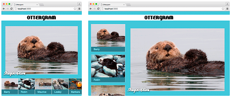
In this chapter, you will explore a technique for turning styles on and off based on the size of the browser window and other characteristics. You will provide an alternate layout for larger screens using a minimal amount of code. The browser will be able to switch between the different layouts in real time, as the browser window changes size – without reloading the page. Figure 5.1 shows the original layout and the alternate layout.
Figure 5.1 Two Ottergram layouts
The industry term for this behavior is responsive website. Unfortunately, this term is often a point of confusion. Some ...
Get Front-End Web Development: The Big Nerd Ranch Guide now with the O’Reilly learning platform.
O’Reilly members experience books, live events, courses curated by job role, and more from O’Reilly and nearly 200 top publishers.

