BAR CHARTS AND CANDLESTICKS— SAME MARKETS, DIFFERENT ANGLES
Prices reflect an ever-shifting consensus of value. Prices soar when the majority of traders eagerly pile into a security—or dive when they flee. A chart represents the sum of opinions of all market participants. Charts, such as those found in Figures 2.1 and 2.2, reflect the extremes of greed, fear, and everything in between.
FIGURE 2.1 Charts reflect crowd behavior.
PUDA, daily. • On Day 1, bullishness steadily increased, pushing prices to close near the high of the day (bar A). • On Day 2, bullishness became less intense as prices sagged to close near the midpoint of the bar, well off their intraday peak (bar B). • On Day 3, prices opened lower and were weak throughout the day, closing at the low of the day, signaling price weakness that persisted to the end of this chart (bar C).
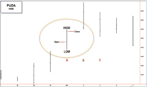
FIGURE 2.2 Candles light the markets.
Each candle consists of the body, the upper wick, and the lower wick. Opening and closing prices for any unit of time mark the upper and lower boundaries of the body. When a stock closes higher than it opened, the body is white, but if it closes lower than it opened, the body is black. The extreme points of the upper and lower wicks represent the highest and lowest prices for each candle. Some programs use other colors—for example, green instead of white or red instead of black.
The vertical ...
Get Fly Fishing the Stock Market: How to Search for, Catch, and Net the Market's Best Trades now with the O’Reilly learning platform.
O’Reilly members experience books, live events, courses curated by job role, and more from O’Reilly and nearly 200 top publishers.

