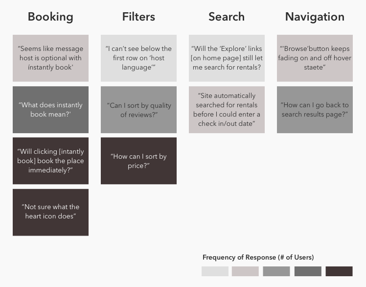
UX specialist Raghav Haran presents, on his blog, a suggestion for a visualization of user feedback results for a study that he did for Airbnb, which can also be interesting. He ordered user feedback by the level of frequency of the following type of comments, and grouped the web usability issues by category and frequency in four distinct categories.
Then, he prioritized the issues based on how important he expected them to be to users and to Airbnb's bottom line:

You can also use screenshots and add marks and notes to show user quotes, issues, and suggestions, as shown in the following example:
Using quotes from your reports ...

