Chapter 16
Ten Excel Chart Types and When to Use Them
Building a chart in Excel is not in and of itself a terribly difficult thing to do. The hard part is wrapping your mind around which types of chart to use in which situation. Excel has 11 major chart types, with variations on each type. For most business dashboards and reports, you need only a handful of the chart types available in Excel.
Here is a rundown of the chart types most frequently leveraged in dashboards and reports.
Line Chart
The line chart (see Figure 16-1) is one of the most frequently used chart types, typically used to show trends over a period of time. If you need to chart trends or changes over time, consider using a line chart.
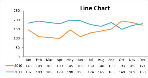
Figure 16-1: Use line charts to show trending across a time series.
Column Chart
A column chart is typically used to compare several items in a specific range of values. A column chart is ideal if you need to compare a single category of data between individual subitems. For example, you may want to compare revenue between regions, as shown in Figure 16-2.
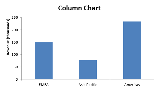
Figure 16-2: Column charts are ideal for comparing a single category of data.
Clustered Column Chart
A clustered column chart can be used if you need to compare multiple categories of data within individual subitems as well as ...
Get Excel Dashboards and Reports for Dummies, 3rd Edition now with the O’Reilly learning platform.
O’Reilly members experience books, live events, courses curated by job role, and more from O’Reilly and nearly 200 top publishers.

