Chapter 10: Components That Show Performance Against a Target
In This Chapter
• Using variance to compare performance with a target
• Displaying performance against organizational trends
• Creating a thermometer-style chart
• Creating a bullet graph
• Showing performance against a target range
No matter what business or industry you talk about, you can always point to some sort of target to measure data against. That target could be anything from a certain amount of revenue to the number of boxes shipped or phone calls made. The business world is full of targets and goals. Your job is to find effective ways to represent performance against those targets.
What is performance against a target? Imagine that your goal is to break the land speed record (currently 763 miles per hour). Your target speed is 771 miles per hour. After you jump into your car and go as fast as you can, you will have a final speed of some number. That number is considered to be your performance against the target.
In this chapter, we discuss some new and interesting ways to create components that show performance against a target.
Showing Performance with Variances
The standard way of displaying performance against a target is to plot the target and then plot the performance. This is usually done with a line chart or a combination chart, such as the one shown in Figure 10-1.
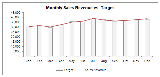
Figure 10-1: A typical chart showing ...
Get Excel Dashboards and Reports, 2nd Edition now with the O’Reilly learning platform.
O’Reilly members experience books, live events, courses curated by job role, and more from O’Reilly and nearly 200 top publishers.

