Chapter 5. Working with Trendlines and Error Bars
In This Chapter
Adding a trendline to a data series
Forecasting and predicting with trendlines
Using error bars
Adding other types of series enhancements
This chapter discusses charting features that can make certain charts more informative. A trendline is an additional line added to a chart that depicts general trends in your data. In some cases, you can forecast future data with a trendline. Error bars, used primarily in scientific applications, indicate "plus or minus" information that reflects uncertainty in the data. In addition, some chart series can display other enhancements such as series lines, drop lines, high–low lines, and up/down bars. These topics are all covered in this chapter.
Working with Trendlines
The best way to become acquainted with trendlines is to see one. Figure 5-1 shows a column chart that displays monthly income for 65 time periods. A trendline has been added to the chart. Although this data fluctuates quite a bit, the trendline indicates that income, in general, has been increasing — something that might not be readily apparent without the assistance of the trendline.
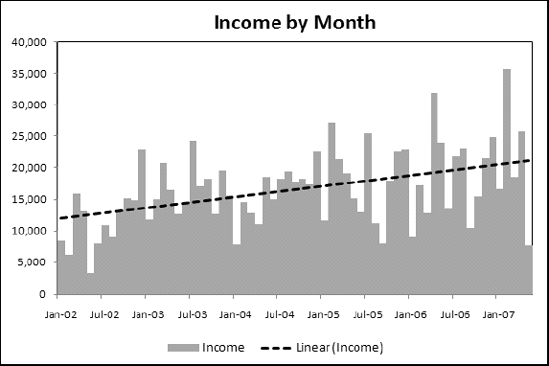
Figure 5-1. This chart displays a linear trendline.
When a trendline is added to a chart, Excel draws the line such that it minimizes the differences between each data point and the corresponding value on the trendline. In other words, the trendline ...
Get Excel® 2007 Charts now with the O’Reilly learning platform.
O’Reilly members experience books, live events, courses curated by job role, and more from O’Reilly and nearly 200 top publishers.

