Chapter 1. Building an Effective UI
Just as a finished software product never looks anything like the original plans and expectations for it, writing this book carried us in a surprising but interestingly different direction than we’d originally assumed. When you imagine what it might take to succeed at building an effective user interface (UI) built with a modern standard of user experience (UX) quality, you might think of high-end design, innovation and inspiration, and technical best practices. These are certainly all important components, but our experience helping other businesses build great products has shown us that a team’s ability to deliver on the promise of good UX is only partially dependent on its creativity and technical competency. The rest depends on creating the right climate for the team and within the company that allows the team to be effective and helps success come more reliably and easily.
Too many people have endured the pain of participating in the building of a software product in a bad climate—so many, in fact, that most are resigned to the belief that building software is an inherently difficult and disappointing undertaking. Whether you’re a business leader who’s frustrated at the frequency with which software projects disappoint or fail, or you’re a software professional who feels like execs just don’t “get it,” or that your stakeholders are their own worst enemies, then you already know what we’re talking about. Everyone is feeling a frustration that has the same root cause, but each is experiencing it from a different perspective and consequently reaching a different conclusion. The way companies have historically handled software development projects is extremely flawed, and everyone knows it without having any idea of what to do differently. And the ways IT and software engineering teams have coped with business constraints and responded to the need for better UX have also been weak and are undermined by entrenched problems and flawed approaches. These issues combine to cripple the ability of project teams—no matter how talented they may be—to produce great results. Succeeding in building a product with a superior UX quality is a particularly significant challenge that requires an intensity of design and engineering productivity, and anything that interferes with that diminishes the quality of the result.
And so as we asked ourselves how could we best assist people in succeeding at building products with great UX, we arrived at an unexpected answer: focus less on training people in how great design is done; focus more on how to create a setting where great product design can occur and succeed. If you are opening a restaurant, just having a great chef isn’t enough; the chef’s talent will be meaningless if the restaurant is in a bad location, the wait staff is poorly trained, the kitchen doesn’t have a supply of fresh food and isn’t well equipped, and the restaurant isn’t marketed effectively. The artistry of exceptional cooking can’t easily be taught in book form, but the business of being a restaurateur can. Likewise, the skills of great UX architects, visual designers, and software engineers are gained through individual professional experience rather than through books, so the most valuable information we can offer in helping people succeed in building UX-driven products is information on how to enable the success of those professionals.
If you’re one of those professionals and want to help your organization or clients become better at building software, or if you’re a businessperson trying to make a UX-driven initiative successful, we’ve written this book to be of help and reassurance to you. The best of intentions, the most cogent of business strategies, and the most talented professionals are routinely thwarted by having to operate in settings that are inherently disabled in ways that no one can quite identify or solve. So a principal goal of this book is to give you an understanding of what the most fertile and hospitable environment for UX-driven software development looks like, and to provide some tips on how to move an organization in that direction. We consistently find that success in building high-quality software products requires major changes in thinking and process across an organization. It takes much more than just one person to create the right climate for building better software, and so much of the work of creating that climate requires understanding, teaching, and advocating for the principles we’ll discuss in this book.
Building a product with a focus on UX also involves people and practices that might be new and unfamiliar to you and your company, so another principal goal in this book is to give you a general orientation and clear roadmap of what it will take to get from a concept to a successful completion. Unless you’re specialized in one of these domains, you won’t find yourself writing code, designing interfaces, or conducting user research, but understanding what to expect, what to avoid, and how all of the professional domains contribute to the forward momentum of a project will help you ensure its success.
Understanding UX
Good and bad UX is typically easy to identify but difficult to define in generalities since the medium of UX is individual, subjective human experience. But in order to understand whether your company’s products or internal systems have successful UX design and to convince skeptical executives of the value of UX, it helps to have a clear explanation of UX design and what makes its contribution valuable.
User experience is, as the name suggests, the experience a user has when interacting with software. Just as is the case with music, a software product’s UX falls somewhere along a range between subjectively good and subjectively bad. This is obvious enough, but in that simple analogy are a number of truths that are often misunderstood or overlooked in software development. The process of creating good music involves a combination of the underlying mathematical principles of music that govern how we interpret sound, the technical skill required to write and play the music, and the artistic sense required to know how to make it all come together pleasingly in the subjective consciousness of the intended audience. Take away any of those elements, and you make it impossible to bring new music into being. Also, the quality of music is not an objective one, but is specific to the subjective experience of the individual listener. A group of people might love techno and hate country, but that doesn’t mean that techno is objectively good and country is objectively bad; it just means that if you’re making music for that group, you need to bear their subjective needs in mind.
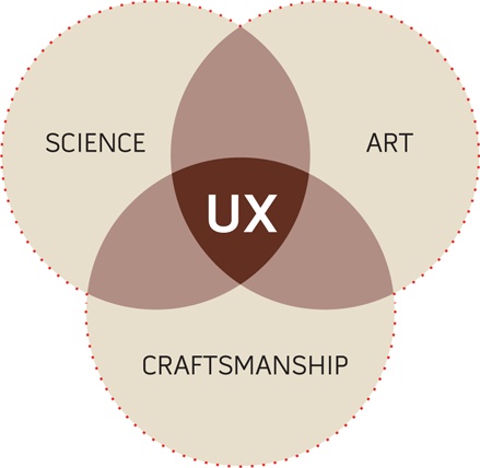
All of that is also the case in software UX. There’s no such thing as objectively bad or good UX, only subjectively bad or good experiences specific to the user. The process of creating great UX involves some combination of quasi-scientific disciplines such as human factors engineering, usability, and information architecture; the technical skills to produce not only great UX and user interface design but also the working software itself; and the artistic sense required to intuit and design for how the different subjective perspectives of different users will experience any given aspect of the software. Briefly, building great UX requires the combination of science, skilled craftsmanship, and art to address a subjective need.
In the way your company has approached the development or improvement of its software products, has it demonstrated an understanding of these concepts? Evidence of failure is easy to perceive in hindsight. If you’ve neglected the scientific aspects of building software, you’ve built products that are confusing, hard to use, cumbersome, poorly organized, and frustrating. Undervaluing the technical need on the engineering side usually means you’ve produced gorgeous UI designs but a disappointing, hacked, utterly compromised final product that performs poorly. The technical need on the UX design side—and yes, design for software is highly technical and not just subjective artistry—is also often overlooked or misunderstood. This leads to product UIs designed in ways that are graphically interesting but that cause undue difficulty in how the software will actually work and be developed. And finally, if you haven’t recognized the subjective nature of UX, it’s likely that, despite all the best of intentions and efforts, you’ve built products that users hate or reject. It also means you’ve worked with team members who narrowly focused on their own disciplines and deliverables without being constructively mindful of how their work assembles into a larger whole.
This entire book is dedicated to ways you can avoid those bad outcomes, but it’s important at the outset to point out explicitly that delivering on the promise of great UX requires that you and your company’s view of and approach to software development is sensible and correct. Just having some talented team members won’t lead to success if your general approach to the endeavor is wrongheaded. And it’s not enough to have just one person on the team who understands how things need to be done; this is knowledge that needs to be shared and needs to become part of a broader organizational competency. And so you’ll find that most of the insight you’ll gain in this book isn’t specific to innovation, design, technique, or artistry; it’s about how you can clear the way for innovation, design, technique, and artistry to come together successfully.
What Good UX Accomplishes
Having a strong UX in your software product is a good goal to have, but high-quality UX isn’t in and of itself the real goal. It’s the means to another, more important end that, though it’s easy to appreciate firsthand, is incredibly hard to describe. Good UX enhances user engagement, and UX design is the art of creating and maintaining user engagement in software. Whereas UX is an abstract concept and UX design is a professional discipline, user engagement is the all-important subjective experience.
This naturally begs the question, what is engagement? This is best explained through analogies.
Engagement as immersion
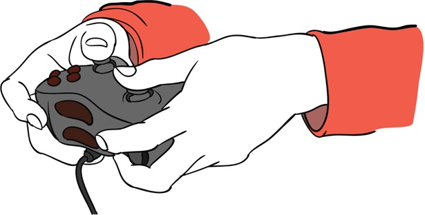
The easiest, most intuitively obvious example of engagement in software is the experience of playing a great video game. Video games—particularly those of the first-person variety—aim to create a high degree of immersion for players. Deep immersion occurs when the player becomes less and less aware of his surroundings, and his perception of the space separating him and the screen starts to fade. His experience of the game becomes one of being the character rather than just being a guy in a chair manipulating the controller. If you’ve ever seen someone leaning his body to one side to try to steer a car in a game or dodge an incoming missile, you’ve seen someone who’s heavily immersed in the game. Robbie Cooper produced a wonderful video for the New York Times Magazine showing just how immersed kids get in the game play experience: http://video.nytimes.com/video/2008/11/21/magazine/1194833565213/immersion.html.
Creating that deep immersion is an art form, and many things must be controlled lest they diminish or entirely break the immersive experience. A player can be snapped out of immersion and the game play experience can be destroyed by simple problems like controllers that are difficult to operate, jarring inconsistencies in the game’s physics or rules, badly delivered lines by voiceover actors, or any jumping and skipping in the video or audio.
The example of immersion in gaming may seem quite remote from what you’re trying to accomplish. If you’re building a new Customer Relationship Management (CRM) tool for internal use at your company, for example, your goal in focusing on the UX of the product isn’t to make your sales team so enthralled by the experience of managing their customer interactions that they forget where they are, mentally merge with the application, and stay up until 4 a.m. trying to reach the next level of enterprise marketing automation efficiency. Well, maybe that wouldn’t be so bad. But certainly most software products are meant to be useful—not entertaining.
Deep immersion is, however, just an extreme example of user engagement. In the case of games, the goal is to bring the player’s focus away from manipulating the controls or comprehending the game dynamics, and even away from being aware of playing a game, and to put it squarely and deeply on goals internal to the game: winning the race, killing the aliens, solving the puzzle, and so on.
Engagement as the fourth wall
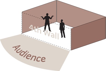
The fourth wall is a term from theater that is often used in filmmaking. The action on the stage is bounded by three walls, one in the back and two at the sides, but there is no fourth wall between the action and the audience. The audience members watching an engaging play infer and build that fourth wall in their minds, ignoring its absence. Just as the gamer loses awareness of the space between the screen and himself, and of the screen itself, the audience members become so engrossed in the action that the theater around them fades away. If an actor flubs a line, or a baby starts crying in the back of the theater, that fourth wall is “broken,” detracting from the experiential quality of the play. Rather than being engrossed in the plot and action, the audience members are suddenly reminded that they’re in a theater and have been sitting in their chairs for an uncomfortably long time.
Most filmmakers pay a tremendous amount of attention to the fourth wall. They attempt to keep the audience in a constant state of high engagement through the art of good filmmaking. The art of filmmaking helps them build and maintain engagement, and ensures that they avoid the simple little problems that break the fourth wall and remind the audience they’re in a theater watching a film—like when the boom mic briefly appears at the top of the frame, or when actors or extras look straight at the camera, or when the special effects are noticeably fake or overdone. The filmmaker wants to keep the audience immersed in what’s going on in the movie, and not on anything else outside it.
Engagement as frictionless accomplishment of goals
We’re beginning to arrive at the heart of what engagement is: an undistracted, unencumbered focus on the ultimate goal of the activity a person’s engaged in. In movies, as in video games, that goal is to be engrossed and entertained, to be carried away by a story and an experience. The point of software isn’t necessarily to engross your users in the experience of using the software, it is to keep them focused on the ultimate goals they’re trying to accomplish in using the software, rather than on the actual use of the software itself. Software is, after all, just a tool people use to accomplish certain goals. To be truly and unobtrusively useful, software must clear the straightest, most frictionless path to the accomplishment of the user’s goals.
One of the most common instances of frictionless user experience that people encounter comes while driving a familiar route, such as from work to home at the end of each weekday. Almost everyone has had the experience of arriving in their garage or driveway with no memory whatsoever of the drive. In this case, rather than the product being software, it’s the car, and instead of a keyboard and a mouse, the user is operating pedals and a steering wheel. The high degree of familiarity people have with the operation of the car allows for such a frictionless experience that their awareness of all the little tasks involved in driving slips away. On leaving work, the driver decides on the goal of returning home; the more familiar the route and the more skilled the driver, the less attention is required to accomplish the goal.
It’s easy to imagine ways in which friction could be increased and attention drawn to the tasks involved in driving. Swapping the positions of the accelerator and brake pedals, for example, would shatter the driver’s acquired easy familiarity with driving and would force her to pay very careful attention to working the pedals for the entire drive home. By changing the goal from going home to going to a restaurant in an unfamiliar part of town, the driver must focus her attention on navigation. And if something important in the car is malfunctioning—say, one of the tires is running flat—the driver will need to focus on controlling the steering wheel. Each of these will make for a more memorable experience of driving because the driver’s attention will be on managing the little tasks involved in driving.
Engagement in software
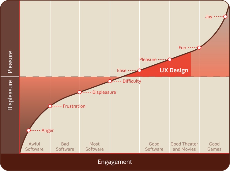
The goal of UX design in building engagement in software is to help people be more focused on and effective at the accomplishment of their goals. This involves expert combination of the science, technique, craft, and art of UX design to create user experiences that effectively engage their target users. It also involves avoiding or smoothing over things that tend to create friction and diminish or break engagement. Breaking engagement, like breaking the fourth wall, is crossing the line where the user must focus on operating the software instead of achieving her goals. Broken engagement both causes and indicates difficulty for the user, which in turn causes displeasure. Strong engagement, on the other hand, both causes and indicates ease for the user, which in turn brings about pleasure.
The aim of UX design, with its principal goal of creating and maintaining engagement, is therefore to bring software past the point of frustration, difficulty, and displeasure, to first create engagement and then to deepen it according to the needs of the user and the aims of the product. UX design tries to reduce the friction that diminishes from engagement and that interferes with a user’s ability to focus on accomplishing his goals. UX design works to apply a certain artistry that helps elevate simple engagement to higher levels of ease and pleasure, which are what make exceptional software.
Why Engagement and Good UX Matter
If you understand that positive engagement leads to greater pleasure and effectiveness for the user, and negative engagement leads to difficulty, displeasure, and wasted time, it’s easy to imagine why engagement and good UX are important in customer-facing products and internal information systems. To ask whether good UX should be a priority for an organization is essentially to ask whether assisting and pleasing customers and helping employees to be happy and effective are important goals in business. If a software product has been well conceived such that helping users accomplish their goals is directly connected to an important business goal, then reducing the friction experienced in achieving the users’ goals should be the same as reducing resistance against the accomplishment of business goals.
With the growth of the customer experience (CX) trend, there’s been an increased recognition in business that every aspect of a company’s interaction with its customers (“touch points”) is an effective, rewarding experience. There’s also an increased understanding of the importance of experience quality over just service delivery. Simply having a well-stocked, conveniently located grocery store is not enough; the store must be visually appealing and clean, the checkout process must be quick and easy, and the store must have ample and accessible parking. The corollary to this in software is that it isn’t sufficient to simply provide the user with a complete range of features; a good experience in using those features to accomplish one’s goals is also required. The grocer doesn’t want to waste his customers’ time by not having enough checkout stands, or to trouble and confuse them by not organizing and labeling the shelves properly, or to deter potential customers by being hard to access or appearing unprofessional and untrustworthy. Likewise, companies with customer-facing products should avoid wasting their customers’ time, confusing them or insulting their intelligence, or pushing them away. The linkage between acquiring and satisfying customers and business success is uncontroversial, but the direct relationship between UX quality and those goals is underappreciated.
The value of good UX and engagement extends to internal information systems and isn’t limited to customer-facing applications. The goals change, but the means of accomplishing them remain the same. In the case of internal applications, exceptional UX has the ability to increase productivity, improve the timeliness and relevance of business data flowing to decision makers, increases adoption of the product and therefore the reach of its benefits, improves employee satisfaction, and generally reduces cost and increases opportunity.
The Elements of Engaging UX
EffectiveUI has spent a long time trying to define, in concrete and measurable terms, the substance of engaging UX. Since good UX is something that’s measured subjectively and is dependent on the individual needs of the specific users of a given product, there’s no 100-point checklist of good UX design; nevertheless, it’s important to have a structure and lexicon for expressing problems and opportunities related to UX that otherwise can be recognized only at a gut level. There are a number of concepts that are focal points of good UX design, or can be fault points for bad UX. This list of elements of engaging UX can serve as an evaluation tool for assessing the UX quality of your company’s current applications, understanding where past efforts have missed the mark, and identifying where investments are needed.
Familiarity
All else being equal, it’s easier to operate a tool you’re entirely familiar with than one you’ve never used before or one that is unfamiliar in some aspects. In the example of engagement in driving from work to home, swapping the positions of the brake and accelerator pedal destroys engagement and plunges the user into difficulty, even though the change is very minor in the context of the complexity of the rest of the car. The need for familiarity appeared in an interesting way when EffectiveUI was building a desktop version of the eBay application. Because the application wasn’t delivered through a web browser but rather was deployed as desktop software that had no discrete page states like websites do, we initially didn’t think to include a “Back” button such as those found in web browsers. Though the new application broke free of the page-based constraints of the browser and offered improved, more fluid means of browsing content, users who were accustomed to the original eBay experience frequently had the experience of feeling trapped in some corner of the application without knowing how to go back. And so even though a “Back” button made little logical sense in the context of the eBay Desktop application (as it wouldn’t in a product such as Microsoft Excel), we were compelled by deference to the user’s needs to add a “Back” button to ensure that a comfortable degree of familiarity was preserved.
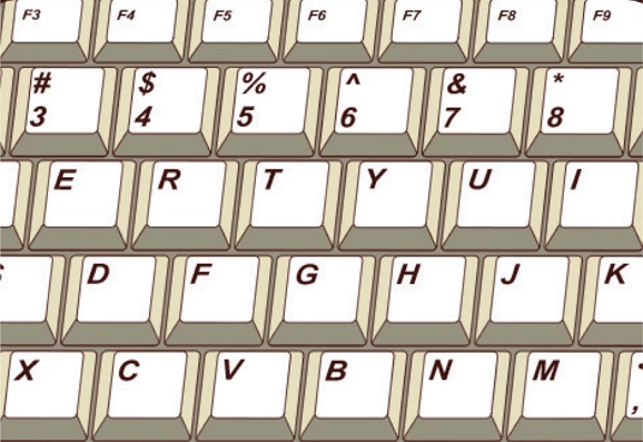
There are plenty of other examples of things that aren’t the most elegant, efficient, or sensible solution but are nevertheless the right solution for the moment because of their strong familiarity. The QWERTY keyboard layout, for example, came about because the layout helped reduce the frequency of typebar clashes in old typewriters, and not because it’s the most efficient from an ergonomic perspective. But at this point the layout has become so familiar and people have become so expert in using it that making any changes would cause nothing but frustration. One exception to this is stenotype machines, used by stenographers, which employ a radically different approach to typing because the need to type quickly (225+ words per minute) necessarily overrides taking a familiar approach.
Responsiveness and feedback
Responsiveness in software is also often referred to as providing feedback to users. This responsiveness, or feedback, is what confirms and reassures the user that the action he has taken has been effective.
Elevators provide a simple, real-world example of the importance of feedback in user interfaces. Imagine that you’d like to take an elevator from the 18th floor of a skyscraper to reach a meeting on the 32nd floor, but with this elevator all of the button lights and up/down arrow lights are burned out. When you press the “up” button on the 18th floor, though the order is successfully sent to the elevator’s controller, you receive no confirmation that an elevator has in fact been summoned to go up. The absence of this feedback suddenly diverts your attention from the goal of reaching the meeting on the 32nd floor and puts it onto the task of summoning the elevator. You mash the button a dozen times, and still receiving no response, you decide to hold the button down until the elevator arrives. Your anxiety begins to build, as your uncertainty about whether you’ll be able to accomplish your goal has increased.
When the elevator finally arrives, no “up” arrow illuminates to let you know that this elevator is in fact going up. If it’s going down, you could be in for a long ride, so your anxiety ratchets up another level. Upon boarding the elevator and pressing the “32” button, you receive no confirmation that the selection has been accepted, so you do some more button mashing and hold your breath as the doors close, waiting to see whether you go up.
At this point, you’re in such a state of uncertainty that as the elevator begins moving upward, you briefly think it’s actually going downward, and feel another small surge of panic. Still holding down the “32” button, you don’t know that everything is OK until the elevator finally arrives at the 32nd floor and you quickly jump out, irrationally worrying the doors will snap closed and whisk you away from your goal before you reach solid ground.
In this scenario, the elevator itself was, from a functional perspective, operating perfectly. It provided the necessary input mechanisms and responded correctly to its variable directives, and conveyed its user from one floor to another without incident. For you as the user, however, the experience of using the elevator has been bizarrely nerve-racking. The simple failure to provide valuable feedback pulled your focus away from your goal and forced you to focus intently on the microtasks required to accomplish the goals that, in a properly maintained elevator, you would have performed without thinking.
When we released an early version of the eBay Desktop application, several users said they had trouble determining whether the information on their screens about the status of an auction item was up-to-date. This was surprising feedback because we’d built the application to always display the most current information. With the original eBay web-based application, users needed to click the browser’s “Refresh” button to see the most current information; with the eBay Desktop application, however, the most current information was automatically displayed. But it turned out that the ability to click “Refresh” and see the page reload in the original eBay application gave users confidence that they were seeing the latest information. What was missing in the eBay Desktop application wasn’t a “Refresh” button, though; it was a feedback mechanism that gave users confidence that the information was fresh. So we added a timer to the auction pages that counted down the seconds until the auction closed. When users looked at the auction page, they saw a clear, visual, second-by-second indication that the information was current. We didn’t have to change anything else to address the data freshness concern; we needed only to provide the right kind of feedback.
Engagement in e-commerce is very important, because it correlates strongly with the user’s willingness to buy, her ability to complete transactions, and her experience of the brand. Any friction along the way leads to uncertainty, distrust, and confusion, which decrease the likelihood of the user completing the transaction or developing an affinity for the brand that would lead to repeat business. There’s another straightforward example of poor feedback that occurs frequently in e-commerce sites even to this day, though simple solutions have been found and really ought to be universally implemented. After having added the desired items to her shopping cart, and after having filled out all of the billing and shipping information, including her credit card information, the user is finally asked to press a button that submits the purchase. A lot of implied assurances should be associated with the pressing of that button: she should be able to know that her purchase has been accepted, her credit card has been charged, and that it’s no longer necessary to worry about preserving the shopping cart or to take additional steps to complete the purchase. She’s essentially made a commitment of money, time, and trust, and requires the reassurance that it has led to success.
But an inexplicably large number of e-commerce sites betray that need by failing to provide the necessary feedback. Certainly you’ve encountered sites where under the “Purchase” button there’s a note saying, “Please push this button only once; otherwise, your card may be charged twice.” This is a band-aid solution for a failure to be responsive. It takes at least a couple of seconds after you press the button to validate the order and authorize the charge with your credit card, and if during that time nothing has happened to acknowledge that you successfully submitted the purchase, your uncertainty and worry increase. If you’re not particularly tech-savvy and don’t notice that the browser has submitted something and is waiting for a response, you’ll spend a few nervous seconds wondering whether you actually pressed the button, you missed clicking on it, or your Internet connection is down, and you might decide to click it again for good measure. If the “Purchase” button had simply changed its visual state to acknowledge the click and then deactivated, you’d have some of the reassurance you need and your focus would remain on the goal of acquiring products rather than on the microtasks of submitting the purchase request. And if this experience of uncertainty leads the user to wonder whether her card has been charged twice, she’ll pick up the phone and call customer support, destroying the efficiency and cost savings sought by having an e-commerce site.
Responsiveness is important at all levels of an application, and for all features big and small. Good feedback is the UX equivalent of the polite nod or “uh-huh” that a listener provides to a speaker to reassure her that he’s still listening and understanding. Consistent, valuable responsiveness builds a sense of confidence in the user and thereby improves engagement, allowing him to focus on achieving his goals rather than fretting over whether each of his actions taken toward that end have been effective.
Performance
An application’s performance—that is, how well it handles the strains of processing, display, data traffic, and other technical considerations—can strongly affect the experience of using it. Performance issues can cause the application to stall and lag, and for certain operations to take a disruptively long time to complete. Some performance issues are inevitable as the application performs complex operations or interacts with data over the Internet, and many can be mitigated at the UX design level by extending the simple courtesy of providing good feedback through progress bars or handling heavy processes in a way where the loading and processing are more evenly distributed and less apparent to the user.
Whereas minor performance issues are irritating and diminish the UX quality and the productivity of using the product, major ones can go beyond breaking down engagement and cause the user to get upset with and distrust the product. Being forced to endure long or frequent waits, especially in settings where efficiency is important or the application is supporting repetitive tasks, can ratchet up the user’s irritation level to the point of anger. This is somewhat akin to the experience of trying to watch a scratched DVD, when your immersion in the film is constantly being broken by lagging or pixelation that pulls your attention out of the story and puts it back into your living room and onto the DVD player. Most people have also had the unfortunate experience of working in an office with a very expensive copy machine that jams every 50th copy, making it a source of disproportionate frustration and anger instead of the office efficiency miracle it was sold as.
And if the product performs poorly—if the interface lags or hangs during heavy processing, certain things happen inexplicably slowly, the user is subjected to frequent progress bars that move slowly and at inconsistent rates—besides the irritation that results from having to pay attention to the delays instead of staying goal-focused, the user’s trust of the product also begins to break down. Performance issues indicate a poorly engineered product or some sort of technical malfunction occurring behind the scenes, which leave the user to wonder about the reliability of the product and the safety of the data he’s entrusting to it. This, once again, injures the user’s ability to benefit from the product as a tool for accomplishing goals, when those goals seem to be in jeopardy because of uncertainty about the product’s reliability.
It’s also worth noting that performance quality is based on a constantly changing, subjective impression. Things that used to be considered fast in the computing world in 1999 would be agonizingly slow by modern standards—96 baud modems compared to high-speed cable Internet, 2-page-per-minute dot-matrix printing compared to 100-page-per-minute laser printers, and so on. We were also far more willing to accept a bit of technical crudeness in the products we used regularly 10 years ago because the state of the art was far from advanced. But as computer capabilities and the sophistication and quality of software have increased rapidly, our patience for poor performance has decreased enormously. Thus a product that delighted customers or employees three years ago may very easily be irritating them today.
Consistency in performance is also important. If you’re a regular patron of a fast food restaurant and every time you go in, it takes five minutes to get your meal, then five minutes becomes an acceptable waiting period. If occasionally it takes 10 minutes, those occasions cause frustration. If one day you get your meal in two minutes, then five minutes is no longer acceptable. With software, a user should be able to count on the same task taking roughly the same amount of time for each use, so the delays are familiar and are therefore less likely to break engagement.
Intuitiveness and efficiency
Intuitiveness is the degree to which the process of accomplishing a goal or performing a task within a product is obvious to the user, without explanation or confusion. It relates strongly to familiarity, because a great deal of a UI’s intuitive ease comes from functions being handled in familiar ways, buttons being in familiar places, and things having familiar names. With the goal of allowing the user to remain focused on the goal instead of having to pay attention to the microtasks of operating the product, intuitiveness allows the user to more easily slip into engagement and retain undistracted focus and productivity. Intuitiveness and the efficiency the product makes possible for the user are also strongly related, as intuitiveness allows a user to remain focused on accomplishing her goals without having to expend time figuring out or focusing on the microtasks needed to accomplish those goals.
If they’re misunderstood and misapplied, though, intuitiveness and efficiency can wind up being competing ideals. Many people view intuitiveness as the ease with which a person can figure out how to operate a product in his first few uses of it. But what may be the easiest approach to figure out on first use is likely not the most efficient long-term approach, and the most efficient application UX may be less intuitive to new users. These two ideals are both coupled and also in some degree of tension with each other, and the right balance must be struck according to the requirements of the product. Consumer products generally tend to favor intuitiveness over efficiency wherever there’s tension, because it’s important not to drive new users away by confusing them at the outset or providing them with overly complicated “Getting Started” guides. But products that are made for daily intensive use—an internal call center support application or a customer-facing CRM tool—should generally err on the side of efficiency, since the first couple of weeks using the tool are less important than the subsequent two years, and users of such applications are willing to undergo a bit of training. Some products address the tension between ease of learning and ease of long-term use by letting users switch between basic and advanced interface modes.
But despite the occasional conflict between intuitiveness and efficiency, in much of UX design, a focus on intuitiveness also yields an improved quality of efficiency, as well as lower long-term costs to training and support.
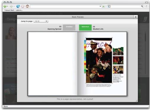
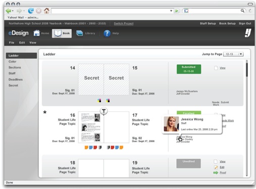
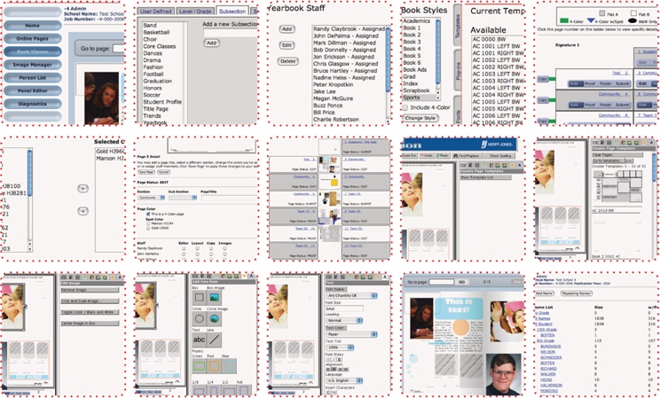
Herff Jones eDesign: Intuitiveness Versus Efficiency
Helpfulness in accomplishing real goals
Helpfulness in accomplishing real goals
Since software is a utility meant to help people and businesses accomplish their goals, the requirement that a product actually help accomplish those goals should be so obvious that we shouldn’t have to point it out. But a surprising number of products fail to help the business and the user accomplish their real goals. If a product is to succeed, both the user’s and business’ real goals need to be accounted for. If the user’s goals aren’t addressed, the product will cause frustration or won’t be used and thus won’t help the business; if the business’s goals aren’t met, the product’s development will have been a waste of money.
Companies will sometimes build a product with the hope of helping the company itself accomplish some of its goals, but don’t bother finding out whether or how those goals were aligned with actual user goals. This comes about as a result of companies undervaluing the role of user research in software design. They assume that they understand the user well enough or that their interests are the same as their users’ interests, or they underestimate the significance of the role the product plays in their customers’ relationship with the company. If this causes them to produce a product that fails to help users accomplish their real goals and causes them frustration, whatever business goal the product was intended to satisfy will also not be accomplished. Helping users accomplish their real goals is thus a stepping stone to the accomplishment of business goals.
A solid business goal that may be the basis for funding a new software initiative might be, for example, to reduce the cost to call center support operations by reducing the support volume and diverting requests to lower-cost channels. This is a perfectly legitimate starting place and basis for a new product initiative. It is, however, certainly not the explicit goal of the company’s customers to help the company save money on call centers and providing support. To be successful in meeting the business goal, a means of aligning it with a real customer goal must be found and pursued.
There are plenty of instances of big companies taking on just this sort of initiative and getting it terribly wrong. Solely focused on reducing call center costs, the companies simply make it very difficult to reach an actual phone agent. In order to obtain support, they make the user go through a long series of self-help, web-based procedures or browse through incomplete and poorly organized “knowledge bases.” If the user tries all of those things and still fails to find a solution, he’s finally provided with a “Contact Us” support form where he’s required to type a detailed request for support. Sometime within the next week, he gets a two-sentence email response from an overseas support operator who, as it turns out, is reading from the same support information the user already went through online and through the knowledge base. For users of a software product, this kind of experience is like being given the middle finger by the company. It’s clear the company’s primary interest was in reducing the cost of supporting its customers. But the company took no steps to actually address the user’s goals.
The reality is, no user wants to contact customer support. Users would much rather have an application that operates as they expect it to. When the application doesn’t operate in this way, users expect to easily find answers to their questions through sources that are instantaneous and readily intelligible. The business’s goal of reducing support costs can be achieved through helping the users accomplish their real goals, which are to have a product that is effective in helping them accomplish their goals (without the need of support) and of having answers readily at hand for common problems and questions. Rather than investing in the infrastructure necessary to divert customers and force them through tedious self-support systems—which, in effect, simply makes the customers work harder to get the support they wish they didn’t need—the business should invest in improving the overall UX quality of the product to reduce the need for support altogether. This winds up being more broadly positive, because it not only reduces the cost to support operations, but also improves the user’s experience of using the application, which in turn translates into benefits such as improved brand affinity for consumer applications or increased productivity and job satisfaction for internal applications.
That’s a pretty egregious example of how companies can myopically focus on business goals without attending to user goals, but most failures to attend to real user goals are more subtle than this and descend from the best of intentions. Businesses tend to make a lot of false assumptions about what’s important to their users and set out priorities that, while they deliver some value to the user and business, fall short as a result of failing to keep a strong focus on the user’s actual goals. Supporting a user in achieving his actual goals is always the first step to achieving related business goals.
On a recent project, EffectiveUI interviewed a large number of call center support staff and found that over half of their calls are for password resets. Evidently our client, concerned about security—or their customers’ perception of security—required users to change their passwords every 45 days. We reviewed the online password change process and found that ambiguous labels and poorly written copy were contributing to customer confusion. By interviewing users, we discovered most were irritated by the 45-day password change rule, and that most already operated under company policies that required periodic password changes on schedules that didn’t align with the product’s 45-day rule. Allowing users to set the date and frequency of their password changes solved most of the problems and reduced call center volume dramatically.
Delivery of relevant, valuable content
There are some products—Wikipedia and Craigslist, for example—where the entire purpose of the product is to deliver useful content. The quality of the experience of using those products is therefore most strongly determined by the quality, accessibility, and relevance of the content they provide. Other types of products are much more focused on capabilities rather than content and information—Adobe Photoshop and Microsoft Excel, for example. In the middle are content and capability applications, such as online investment trading tools like E*TRADE or sales force management and CRM tools.
Wherever it may fall along the spectrum of content-focus, the UX quality of a product is strongly dependent on its effectiveness in delivering appropriate, relevant content at the right times and places. This is fairly obvious in the case of the content-intensive products such as Wikipedia and Craigslist, where the role of the application is to assist the user in getting from a question to a useful answer as rapidly and easily as possible while ensuring that content is available and valuable. But even in far less content-intensive products such as Microsoft Excel, the product’s ability to deliver useful content to the user at appropriate times is very important in enhancing the experience of using the application. The necessary consequence of Excel’s breadth and depth of capabilities is that it is a rather complicated product, and taking full advantage of its capabilities requires the ability to perform some complex tasks, such as writing intricate formulas for ranges of cells in a spreadsheet. Rather than simply providing the user with a thick manual to use in trying to figure out how to write formulas, Excel provides that information directly within the application as part of the workflow. So instead of requiring the user to become an expert prior to using the product, or forcing users to constantly refer to help content, Excel delivers the information the user needs at the moment he needs it (while performing a complex task). This type of intelligent assistance can also take the form of context-specific help. Rather than requiring users to access a separate help application to find their answers, buttons and tool tips can be placed where users are likely to need assistance, giving them the exact information they’ll require at the exact spot they’ll require it.
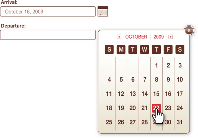
In online trading tools, there’s a pretty balanced emphasis on both the capabilities of trading and managing investments, and the content. The content—stock prices, news, market analyses, and so on—helps users understand the market, learn about specific industries and companies, and make educated decisions about their portfolios. An investment tool in which streams of accurate, timely information are presented alongside the ability to act on that information, and key content is automatically made available at junctures where it’s important to the user’s activity, is of far greater value than a product that keeps that content separate from its capabilities. Products that successfully anticipate what information and content a user will need at any given point and make it readily available will build a far greater sense of confidence and engagement in their users, helping them to remain focused on their goals rather than managing all the small details that must be assembled in the accomplishment of those goals. A simple and very useful example of this is when an application pops up a calendar when the user clicks into a date selection field, saving the user from having to break engagement and look to another resource to figure out the correct date or to have to format the date entry according to the needs of the system.
There are even opportunities within this domain to delight users and radically enhance the UX quality of the product by providing them with information that’s important to meeting their goals but that they didn’t realize was available or relevant, without their having to actively seek it out.
Internal consistency
Internal consistency requires that the application handle similar tasks in similar ways. In a CRM tool, for example, the process for adding a new customer record should be as similar as possible to the process of adding a new job record. Although the information being input is different, the essential task is still the same: inputting information to create a new record. Internal consistency can be a simple as ensuring that buttons are in the same places and have the same labels (“OK” versus “Save” versus “Submit”), and that screens are generally organized and presented in similar ways so the user knows where to look and what to expect. But it can also extend to much more complex interactions and tasks; in fact, the more complex the interaction or task is, the more important it is that it be as internally consistent with other similar interactions or tasks as possible. This will make it so the user needs to learn how to operate that type of capability of the product only once, and that knowledge can be intuitively generalized to allow him to use other, similar capabilities with ever-increasing ease.
A product should be internally consistent from a visual design perspective, too, to ensure that the user has the impression of it being a unified, well-organized, professional product. Internal consistency is often lost in large product initiatives where multiple teams are working on different aspects of the product and aren’t well coordinated, resulting in badly integrated Frankenstein products that look like the forced combination of several different products, and that require the user to master multiple approaches to accomplishing similar tasks.
A Frankenstein look-and-feel can also come about as part of the design concept process. Every professional designer has had the experience of presenting several different concepts to a stakeholder and being asked to take the best from each concept and mash them all together. Occasionally this can be lead to positive progress, but most times it leads to incoherence in the resulting design. Most people understand the problem of mixed metaphors (“I’ll bite the bullet and step up to the plate to nip it in the bud!”), and UX and visual designs for software are akin to metaphors in how they simplify complexity through appealing abstraction, and different approaches don’t mix together very well.
The internal consistency of a product should disguise a lack of consistency in the functions it’s handling. If the product is interacting with a dozen different “backend” systems, the user shouldn’t have any clue that’s the case—everything should all feel like the same experience. The same is true of products that span multiple departments or divisions of a single company. Users should be left to think about their goals without having to understand the nuances of how a company is divided and structured. For example, with a travel site, buying a plane ticket should be the same experience as reserving a hotel room. And an employee using a workplace information system to sign up for benefits shouldn’t have to perform separate, redundant tasks just because benefits enrollment involves three different departments within the company.
External consistency
External consistency in functionality is very similar to the ideal of familiarity; the more similarly the product operates compared to other products the user is already familiar with, the less of a learning curve there will be in its use, and the less jarring it will be for the user to switch between the different products he uses in any given day. Obviously, external consistenty with other products that have bad UX design shouldn’t be overemphasized beyond the limits of respecting familiarity. External consistency is actually much more of a concern when it comes to the visual design of a product, which conveys to the user on both a conscious and subconscious level a message about who and what the product is for. Software, like literature or architecture, has a recognizable set of genres. In architecture, if you see a building made out of white stone with Greek- and Roman-style columns and ornamental sculptures on the facade, you’re likely to assume that it’s a government building of some sort.
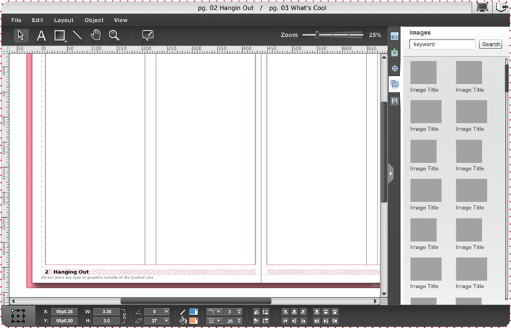
Herff Jones eDesign: Integrated Experience
If you’re browsing the shelves of a bookstore and see a book with a cover that has a painting of a muscular, shirtless man with long, flowing hair riding a horse with a flushed, swooning lady in his arms, you’d be safe in assuming you’re standing in the fiction section looking at a torrid pulp romance novel.
Likewise, the visual appearance of a software product should indicate its purpose and audience. The benefits this confers to the UX are very diffuse and hard to explain, but they have something to do with giving users the impression and confidence that the product is the right tool for their needs. When you walk into a lawyer’s office, for example, you expect to be surrounded by mahogany paneling, expensive burgundy leather chairs ornamented with brass studs, and wall-to-wall bookshelves filled with ancient-looking law books. Even though the office design has nothing at all to do with the competence of the lawyers in it, it conveys a sense of confidence in the strength and professionalism of the firm. When you walk into the offices of a creative ad and marketing design agency, you instead expect bright, cheery colors, informally dressed staff members, desks littered with art and toys, foosball tables, and bizarre modern furniture. This gives you the confidence that you’re dealing with hip, modern designers. But put the designers in the lawyers’ offices and the lawyers in the designers’ office, and you’re likely to lose all confidence in both. The visual design of software has the same general effect of first convincing the user that he’s in the right place, and then giving him confidence that the product is well suited for and effective at meeting his goals.
It’s also important to note that within the various genres of software and in the field of software UI design generally, trends and tastes are constantly evolving. Whereas in the design of law offices, there’s an emphasis on conservatism, age, and experience, it’s pretty much always the case that in software, the application should appear new and modern within the bounds of its genre. Old software is generally understood to be inferior software, and so users are looking for the visual hallmarks of modernity in the UI of the product. Because of the constantly evolving trends and tastes, a product that looked modern six months ago often is beginning to look middle-aged today. Even if the functionality has been updated and is best-in-class, if the visual design belies the modern capabilities of the product, users will tend to trust it less and have a more fretful experience using it.
This external consistency in visual design also applies to conformity with brand standards. A product built by a recognizable brand should have a design feel that’s clearly consistent with that brand. Beside the fact that the visual standards for established brands are generally very well thought out and are themselves externally consistent with the how the company wants to be seen within the broader market, consistency with brand standards also enhances the user’s trust of the product. The customer’s affinity to the brand is inherited by a visually consistent product, and the customer’s trust of the brand extends to trust in the security and value of the product. Conversely, a product that fails to match the brand’s visual standards will give the impression of being less professional, potentially less trustworthy, or may be seen as a repackaged third-party tool.
Appropriateness to context
Appropriateness to context
Software products exist within, and are thus beholden to, multiple layers of context that must be respected in UX design. Software operates on a variety of different devices and platforms, and is used in a wide range of settings and by a great diversity of people. The appropriateness of a software’s UX to a given group of users is a huge subject unto itself and is covered in depth throughout the rest of this book, but we note it here as a reminder that the constraints and needs of the people using the product must govern how it works.
Until recent years, when individuals talked about software, they were always talking about systems running on enterprise-scale servers and computer equipment or running on a personal computer. But the growth in the capabilities of web-based, mobile platform, embedded systems, and device technology have meant that software can be found on the Web, on screens embedded in refrigerators, on cell phones, in the control bridge of yachts, and strapped to the hips of FedEx delivery drivers. It may seem obvious that software UX design should be cognizant of the device, physical, and task setting that it will be used in, but quite frequently it’s not. A recent example of this has come with the massive popularity of Apple’s iPhone in the U.S., as many companies have scrambled to make an iPhone version of their product or web application available. The screen size, performance constraints, and capabilities of the iPhone are much different than other platforms, and a product built for the iPhone must embrace those differences. For example, interacting with an application using your fingers instead of a keyboard and mouse imposes new constraints, but it also opens up new opportunities. It’s important to account for the new constraints and take advantage of the new capabilities.
The context in which the software is operating also has to do with the physical place it’s being used and what’s happening in that environment while it’s being used. Not all software is meant to be used from the relative serenity of the office or home. An extreme example is a product made for soldiers on the battlefield, such as portable systems that connect soldiers directly to surveillance, weather, and situational intelligence data. The need for the software to be usable under stress, under fire, and while wearing bulky clothing in limited visibility conditions is going to put some very specific demands on the UX design of the product. In a less extreme example, point-of-sale systems for restaurants and retail stores must be designed with a keen awareness that the user will be multitasking, standing, and engaging with the customer, and will need to work very quickly. This would suggest that highly controlled and streamlined processes with large buttons (among many other specialized refinements) will lead to a better experience.
Trustworthiness
Underlying most of these elements of good UX has been the need to gain and maintain the trust of the user—trust that the product is up to snuff, that it’s secure, provides good information, is safeguarding data, is of high quality, is the best option for the user, and so on. Failing to achieve trust can deter users, and failing to maintain it can cause the user to be preoccupied with whether or not to trust the product and wondering whether his actions are having the desired effect, rather than simply being focused on his goals while assuming (trusting) that everything is working as it should.
The very same issues that break engagement also have a tendency to injure the trustworthiness of the product, so a focus on UX quality leads to greater trust in the product, which in turn reinforces the UX quality. Trust is won and lost at an emotional level that’s determined by the accumulation of all the various aspects of the UX while using the software. Design issues tend to weigh disproportionately on the user’s impression of the trustworthiness of the product, though. A study was performed where two kiosks that offered driving directions around the town were placed at opposite ends of a commercial center. Both kiosks used the same data and underlying “backend” systems, but one had a modern UI design, and the other had a design that suggested the product was older. When the users of the kiosks were asked whether they trusted the directions provided by a given kiosk, the one with the modern design got dramatically higher marks, despite the fact that its output was no different than the other kiosk.
Summing up
To fully explore all the elements of engagement and UX design would require its own book, so we’ve simplified a lot of concepts here for the sake of providing a quick, high-level understanding. This list should be useful in getting a sense of whether your company’s existing products and internal systems are passing muster and whether the right people in the company are aware of what it takes to create a strong UX in a software product. There’s a tendency for companies to relegate responsibility for UX design either to engineering teams or to web or ad design teams without understanding the full breadth of what goes into great experiences in software. If you look back over the elements of good UX in this section, you’ll note that each draws on different skills and domains of experience and study in the software world, and that they aren’t neatly compartmentalized. UX design is something that is best performed by generalists who have the wide-ranging training and experience necessary to handle the gamut of issues we’ve described. And as we’ll discuss in the next section, UX design isn’t an activity that’s exclusive to visual designers, nor even to what we call UX architects; software engineers and product managers also play a vital role in UX design and in producing products that people love.
Reviewing the elements we’ve covered in this section, it’s clear that the work of and responsibility for good UX design falls not to a single UX design team, but rather to the entire collection of professionals involved in the project. The performance element, for example, requires a strong contribution from every member of the product team. Each participates in many capacities at different points along the project.
Stakeholders and product managers
UX architects and designers
Settle on information architecture plans, interaction designs, workflows, and feedback mechanisms that avoid, diminish, or conceal from the user the negative effects of performance issues
Respond to performance issues discovered by the engineers through new UX architecture and design plans that account for the issues
Develop friendly approaches to progress bars or component state changes that help diminish the disruption caused by performance issues
Technical architects
Software engineers
Write code and design approaches that are efficient and actively mitigate performance issues
Execute faithfully on the UX and visual designs in ways that don’t impair the performance or compromise the UX quality
Actively work with stakeholders, project managers, technical architects, and UX architects to identify unforeseen risks and issues related to performance, and to figure out how to address them
Quality assurance (QA) and user acceptance testing (UAT)
A similar list can be made for each of the elements of good UX. Good UX in software arises not from simply hiring a couple of UX professionals and having them put forth perfect designs, but rather from the collective experience, skills, attention, talent, and enthusiasm of an entire team that’s working toward the single, joint ideal of producing an exceptional UX. Forrester Research has wisely said in a number of articles and whitepapers that the responsibility for good customer experience—a goal that’s very similar to that of UX, and in a sense, UX is the technological subset of CX—cannot be held by one single CX officer or an isolated CX team, but rather needs to be an organization-wide competency for it to succeed. UX design is not an isolated professional discipline; it’s a general orientation of an entire product team, and good UX is a responsibility of the entire team.
Redefining Two Fundamental Terms
We will be using two key terms in a way that differs from their normal connotations in software. Those two terms are design and development. Since these concepts are so fundamental to software and to how we recommend approaching the building of software, taking a close look at our differing understanding of the two terms gives an early glimpse into and foundation for the rest of this book. As we said in the previous section, responsibility for good UX isn’t exclusive to people with “UX” in their titles, but is rather a broader team orientation and competency. Similarly, but more broadly, it’s also the case that product design isn’t the sole domain of visual designers, nor is the development of the product strictly the domain of software engineers.
Design
When people talk about design, they usually mean visual design, and in software they usually mean graphic and UI design. Because businesspeople deal in meetings and paperwork and software engineers deal in code, there’s a tendency to assume that because they’re not producing visual works, what they’re doing isn’t design. On the other hand, people readily acknowledge that the researchers at Intel and AMD are busy working on new designs for microprocessors, or that city planners design traffic control patterns to manage congestion, even though neither of those are visual design fields. This arises from an ambiguity in the ordinary connotation of the word “design,” and confusion about this is at the heart about some very serious misapprehensions about what goes into building software.
It’s necessary to abandon the assumption that design is just concerned with visual media. Design, very broadly, is the application of creativity and intelligence against solving a problem. Often the problem is a visual one, but the means of solving it is nevertheless an intellectual and creative process. In order to create a visually appealing logo that does a good job of representing a company’s brand and goals, a graphic designer embarks on an intensive effort of thought, creativity, experimentation, and trial and error. This is no different at a fundamental level than what a software engineer does to build a component for an application. It’s only the form of the output and the experience and training required that differ. Businesspeople and product managers planning and guiding a project are also undergoing a process of design. They’ve identified a business problem and are applying their experience, intellect, and creativity against forming an initiative to respond to it, and continue to participate in design as they contemplate challenges and make decisions in shepherding the project along the way.
Holding this broader understanding of design keenly in mind is important for two very different reasons. First, it helps you appreciate what the people with “designer” in their titles, or the people whose design output is in visual form, actually do. Their area of concern is not some fuzzy, entirely subjective, artsy thing. To arrive at the visual deliverables they produce, they have applied their deep professional experience, intellect, and creativity toward solving a problem. The undervaluing of what designers do in software projects is in part the fault of fading trends in the web design world, where flashiness and high-concept design were held as greater ideals than effective problem solving in design. But if you have the good fortune to work with a talented team of visual designers, it’s important to understand that their work is carefully thought over, and is best judged according to how adeptly it solves the problem and not simply how it registers subjectively to a nondesigner.
The second reason this understanding of design is important is in better understanding what software engineers do. For some reason, people outside the software field tend to think of software engineers as being workers on an assembly line mindlessly producing units of progress at a linear rate, or as low-level construction workers who build things that other people design without applying much thought of their own. This view is terribly, terribly wrong and is one of the principal roots of why projects fail or disappoint with such great frequency. Software development is an extremely design-intensive process—that is, every increment of progress that’s made comes from an intensive effort of thought, creativity, experimentation, and trial and error. Software engineers may be working from designs passed on from other members of the team, but those designs come nowhere close to solving the problem of the actual code implementation. How to translate designs and specifications into working, stable software is a challenging task that relies on a high degree of creativity and intelligence. Software engineers are tasked with solving a mountain of problems ranging from the simple and routine to the hyper-complex and unforeseeable, and the process they go through to solve them is fundamentally a process of design.
Design does not lend itself toward linear thinking or management. Eight designers or engineers don’t produce results eight times faster than one designer or developer does; in fact, in many cases throwing more bodies at a problem only makes things worse. As we’ll discuss in depth in Chapter 3, progress in design work is very difficult to plan and predict, since so much of it relies on experimentation and discovery. Trying to force those who perform design-intensive roles to also produce with the consistency and predictability of assembly line workers ignores the true nature of the work being done and does nothing to gain any greater measure of certainty.
Development
Development in software projects usually means the phase when the software engineers are coding, and it’s normal to hear software engineers referred to as developers. Generally speaking, there’s nothing wrong with this, but we’ve found it necessary to break with this convention to give greater clarity to the approaches we advocate.
With the ordinary connotation of both design and development in software projects, design is typically a big phase that happens and finishes before development begins. This approach is a bad one, and you’ll learn more about this in Chapters Chapter 3 and Chapter 8. By understanding design in broader terms, we’ve acknowledged that visual designers design, UX architects design, and software engineers design. At this fundamental level, the work these different professionals do on a software project is the same, though the experience required and the nature of their specific contributions differ. The ideal setting for producing exceptional UX in software is one where everyone involved in the design of the product—the businesspeople, the product managers, the visual designers, the UX architects, the software engineers, and (in ideal circumstances) the target users—are working closely in tandem and collaborating to solve the myriad problems the project presents as part of a unified effort. Every feature that goes into a product has an underlying business goal, a visual design, a workflow and interaction design, a technical implementation, and a connection to user goals. It’s the complementary combination of those elements that results in great UX, and each requires the contribution of a different type of professional.
Segregating the contributions of the different participants on the product by separating their efforts into serial, distinct phases, is a setup for difficulty, increased risk, and poor results. Again, this will be discussed in great depth in the coming chapters, but it’s necessary to bring it up now because we need to settle on a word that describes the stage where the businesspeople, product managers, visual designers, UX architects, and software engineers are working together to build the product—and that word is “development.” Development, in the sense that we will use it through the rest of this book, is the stage of the project in which the product gets built, and is not, as the normal connotation holds, a time when only software engineers are working. Thus the “development” of the product is not exclusive of the contributions of everyone else on the project team.
Get Effective UI now with the O’Reilly learning platform.
O’Reilly members experience books, live events, courses curated by job role, and more from O’Reilly and nearly 200 top publishers.

