Reduce the chances of deadbeat bidders and unhappy customers by overcoming the limitations in eBay’s listing page design.
There’s a great deal of comfort in familiarity. For example, I find solace in the knowledge that there’s always a butter knife in the first drawer on the right, allowing me to stumble into my kitchen at 1 a.m. for a snack without having to undertake a full-scale utensil search. Move the knife—or worse yet, the drawer—and I’ll spend many subsequent nights cursing the change, even if the new location is ultimately more convenient when I’m actually awake.
I find that computer software invokes the same feelings, which is, I think, why people are often reluctant to upgrade (and give up all the bugs they’ve gotten used to in favor of a bunch of new ones). But visitors to web sites such as eBay don’t have that luxury; when a change is made to the site, it immediately affects everyone who uses it.
A few years ago, eBay completely redesigned the standard auction page, the page that shows the price, photos, description, and other details of any particular item you happen to be selling or bidding on. Most of the changes were significant improvements, such as the preview photo [Hack #70] and the adaptive title block [Hack #64] that shows different information to the seller than to, say, the winning bidder, or to the unlucky bloke who was just outbid.
But there were also sacrifices; problems with the design that remain to this day. For example, shipping and payment terms, once displayed near the current bid price at the top of the page, are now buried deep beneath the auction description and photos, as shown in Figure 4-11. Only after the auction is over does eBay display this essential information in the checkout box [Hack #64] at the top of the page where it belongs.
Without clear payment and shipping information in a place your customers can see it, you’re just asking for a flood of deadbeat bidders [Hack #68] who bid and find out later they can’t meet your terms (i.e., pay).
So why is the placement of your payment and shipping terms so important?
Take another look at Figure 4-11 and then imagine the sequence of events leading up to a bid:
The bidder finds the item while searching or browsing category listings, clicks the title, and is shown the top of the auction page. Without scrolling, the bidder can see—at most—the eBay logo, the header block, the seller information box [Hack #1] , the preview photo [Hack #70] , the current price, the location of the item [Hack #39] , and perhaps the first line or two of the description, if viewed on a large screen.
If the bidder is interested in your item, she might click the preview photo (or simply scroll down) to view the auction description, a larger version of the top photo, and any additional pictures.
Tip
If you’ve purchased the Picture Show listing upgrade [Hack #46] , a new window appears with larger versions of your photos when the bidder clicks the preview photo. As you can imagine, this could mean that bidders skip your description altogether.
The customer will likely scroll back up to look at the price again.
Once the bidder decides to bid, she clicks the Place Bid button (or Buy It Now) to jump to the bidding box at the very bottom of the page.
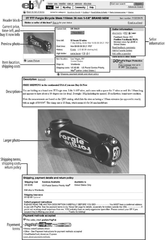
You’ll notice that the shipping and payment terms are effectively bypassed in a bidder’s hasty purchase. This can pose a problem for a bidder with a post office box who never sees the note in your payment terms explaining that you ship only with UPS (which won’t deliver to P.O. boxes). Or, perhaps a bidder outside the United States will never see that you only accept PayPal payments [Hack #85] from customers inside the United States.
The number-one rule of selling on eBay is that your customers will never read your auction description, at least not thoroughly…or at least not the part you wish they’d read when it comes time to collect payment. So the key is to make this important information more prominent rather than burying it in the single paragraph that makes up your listing description.
Now, your instinct might be to do what most people do when they don’t feel listened to: yell. And in Internet “netiquette,” yelling means TYPING IN CAPITAL LETTERS, possibly embellishing with large, bright red text. But yelling sends a hostile tone to your customers, and will likely drive many of them away. Plus, it will bully the rest of the text around it so that other information—important details—might be lost in the shuffle.
Instead, use a little carefully placed HTML [Hack #52] to clearly distinguish between your item description and your terms. For instance, here is the most basic approach:
    You are bidding on...
    <P>
    <B>Condition:</B> The condition of this item is...
    <P>
    <B>Payment terms:</B> I accept PayPal and cash, in pennies.
    <P>
    <B>Shipping terms:</B> I proudly ship with the Pony Express. Shipping is
    fixed at $4.00.
Paragraphs are separated with <P> tags, and each starts with a
section header set apart in bold text using the <B></B> structure. This is
simple, and best of all, it works.
Another, possibly more effective way of setting apart your payment and shipping terms right in the auction description involves putting each in its own little table:
    <table cellspacing=8 cellpadding=0 width="100%" border=0>
    <tr><td valign=top width="30%">
      <table cellspacing=0 cellpadding=0 width="100%" bgcolor=#2D775D border=0>
      <tr><td>
          <table cellspacing=1 cellpadding=3 width="100%" border=0>
          <tr><td bgcolor=#BAF9DB>
              <b>What's Included</b>
          </td></tr>
          <tr><td bgcolor=#ffffff>
              One toy car, original box, original manual
          </td></tr>
          </table>
      </td></tr>
      </table>
    </td><td valign=top width="30%">
      <table cellspacing=0 cellpadding=0 width="100%" bgcolor=#2D775D border=0>
      <tr><td>
          <table cellspacing=1 cellpadding=3 width="100%" border=0>
          <tr><td bgcolor=#BAF9DB>
              <b>Payment Terms</b>
          </td></tr>
          <tr><td bgcolor=#ffffff>
              I accept PayPal and cash, in pennies.
          </td></tr>
          </table>
      </td></tr>
      </table>
    </td><td valign=top width="30%">
      <table cellspacing=0 cellpadding=0 width="100%" bgcolor=#2D775D border=0>
      <tr><td>
          <table cellspacing=1 cellpadding=3 width="100%" border=0>
          <tr><td bgcolor=#BAF9DB>
              <b>Shipping Terms</b>
          </td></tr>
          <tr><td bgcolor=#ffffff>
              I proudly ship with the Pony Express. Shipping is fixed at $4.00.
          </td></tr>
          </table>
      </td></tr>
      </table>
    <td valign=top></td></tr>
    </table>
In addition to payment and shipping terms, there’s a third box to combat the other big problem with most auction pages, namely that most sellers don’t take the time to clearly spell out what’s included in the auction. This box, not surprisingly, is entitled “What’s Included,” and is illustrated with the others in Figure 4-12.
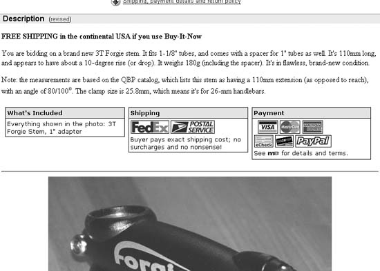
Figure 4-12. Putting important information in boxes helps set it apart from the description without burying it at the bottom of the page
Notice how these boxes stand out! Put something like this in your auction, and you’ll get fewer deadbeats, less negative feedback from displeased bidders (fewer displeased bidders, actually), and fewer dumb questions [Hack #67] while the auction is running.
As described earlier in this hack, a visitor to your listing can miss your description entirely by clicking the preview photo at the top of the page. If you like, you can solve this problem by redirecting the preview photo to any other position on the page.
Here’s how it works. Unless you’re using the Picture Show listing upgrade [Hack #46] , the small preview photo is linked to a named anchor lower down on the page, immediately above the full-size photo. The link looks something like this:
http://cgi.ebay.com/ws/eBayISAPI.dll?ViewItem&item=5974611839#ebayphotohosting
The #ebayphotohosting suffix
in the URL points to the ebayphotohosting anchor, which is located
immediately above the full-size photo. Click the little photo, and the
browser scrolls the page—past your description—so that the full-size
photo is positioned at the top of the window.
To redirect the link, just place a second anchor—with the same name—at the beginning of your description, like this:
<a name="ebayphotohosting"></a>
Thereafter, whenever visitors click the preview photo in your listing, their browsers will jump to the beginning of your description, and they’ll be less likely to miss anything important.
Get eBay Hacks, 2nd Edition now with the O’Reilly learning platform.
O’Reilly members experience books, live events, courses curated by job role, and more from O’Reilly and nearly 200 top publishers.

