The CSS-Positioning recommendation
specifies several properties that can be set as style sheet rule
attributes. These attributes are used only when the
position attribute is included in the rule;
otherwise they have no meaning. Implementation of all the CSS-P
attributes varies from browser to browser. Table 4.1 provides a summary of all the attributes
defined in the W3C recommendation as well as how those attributes are
implemented in the browsers. A separate column shows the Navigator
<LAYER> tag attribute that corresponds to
the CSS-P attribute.
Table 4-1. Summary of Positioning Attributes
The implementation of these positioning attributes is not completely
identical in both Version 4 browsers, but there is a large degree of
compatibility, with the exception of the clip and
overflow attributes.
Four attributes deal with lengths, whether they are for positioning
of the element or determining its physical dimensions on the page.
Recall from Chapter 3 (Figure 3.2) that height and
width refer to the size of the content, exclusive
of any padding, borders, or margins assigned to the element. The
left and top values, however,
apply to the location of the box edges (content + padding + border +
margin). When using the CSS syntax, each of these four attributes can
be specified as a fixed length or a percentage. Fixed-length units
are borrowed from the CSS specification, as shown in Table 4.2. Percentage values are specified with an
optional + or - symbol, a
number, and a % symbol. Percentage values are
applied to the parent element’s value.
Table 4-2. Length Value Units (CSS and CSS-P)
The length unit you choose should be based on the primary output device for the document. Most HTML pages are designed for output solely on a video display, so the pixel unit is most commonly used for length measures. But if you intend your output to be printed, you may obtain more accurate placement and relative alignment of elements if you use one of the absolute units: inch, centimeter, millimeter, point, or pica. Print quality also depends on the quality of the printing engine built into the browser.
For attributes of the <LAYER> tag that
correspond to the CSS attributes, the values you assign do not
include units. All measurements are in pixels.
Navigator 4 and Internet Explorer 4 also disagree on how to render
certain types of block elements, as described at the end of Chapter 3. Navigator closes up the height of a block
around its content, regardless of the height
setting of the element. Moreover, any content, such as text, an
image, or even a solid background color, is inset from the edges of
the element by a forced padding of about three pixels that cannot be
removed. On the other hand, if you define a positionable object via
the <LAYER> tag in Navigator, these problems
disappear, and the width and
height attributes truly set the size of the block
element.
A
clipping region is a geometric area (currently limited to rectangles)
through which you can see a positioned element’s content. For
example, if you include an image in a document, but want only a small
rectangular segment of the whole image to appear, you can set the
clip attribute of the element to limit the
viewable area of the image to that smaller rectangle. It is important
to remember that the element does not shrink in overall size for the
purposes of document flow, but any area that is beyond the clipping
rectangle becomes transparent, allowing elements below it in the
stacking to show through. If you want to position the viewable,
clipped region so that it appears without a transparent border, you
must position the entire element (whose top left corner still governs
the element’s position in the grid). Similarly, because the
clipping region encompasses viewable items such as borders, you must
nest a clipped image inside another element that sets its own border.
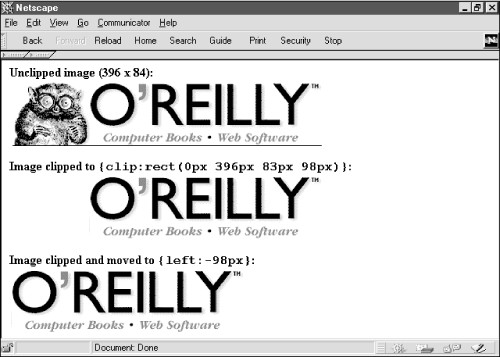
Figure 4.6 demonstrates (in three stages) the concept of a clipping region relative to an image. It also shows how positioning a clipped view requires setting the location of the element based on the element’s original size.
Setting the values for a clip region requires slightly different
thinking from how you might otherwise describe the points of an
rectangle. The clip attribute includes a shape and
four numeric values in the sequence of top, right, bottom,
left—the same clockwise sequence used by CSS to assign values
to edge-related attributes (borders, padding, and margins) of
block-level elements. Moreover, the values are entered as a
space-delimited sequence of values in this format:
clip:rect(top right bottom left)In Figure 4.6, the goal is to crop out the critter from the image and align the clipped image to the left. The original image (396 by 84 pixels) is at the top. To trim the critter requires bringing in the left clip edge 98 pixels. The bottom, one-pixel rule is also clipped:
<SPAN STYLE="position:absolute; clip:rect(0px 396px 83px 98px)">
<IMG SRC="oraImage.gif" HEIGHT=84 WIDTH=396>
</SPAN>
Then, to reposition this image so that the clipped area abuts the left edge of its positioning context, the style rule for the element must assign a negative value to take up the slack of the now blank space:
<SPAN STYLE="position:absolute; left:-98px; clip:rect(0px 396px 83px 98px)">
<IMG SRC="oraImage.gif" HEIGHT=84 WIDTH=396>
</SPAN>
If you define a fixed width and height for a relative- or
absolute-positioned element, you can tell the browser how to handle
content that extends beyond the physical dimensions of the element
block. While the overflow attribute is defined to
help in this regard, unfortunately the implementation of this
attribute is not the same in Navigator 4 and Internet Explorer 4.
Consider the following document fragment that affects how much of the
upper left corner of an image appears in the browser window:
<SPAN STYLE="position:relative; width:50; height:50">
<IMG SRC="myImage.gif" HEIGHT=90 WIDTH=120>
</SPAN>
In the previous example, even though the width and
height style attributes are set for a
SPAN wrapper around an image, the natural width
and height of the image force both browsers to show every pixel of
the image. In other words, the content overflows the edges of the
block containing the image. By adding an overflow
attribute and value to the style rule, you can instruct the browser
to cut the view at the edges of the block defined by the style rule:
<SPAN STYLE="position:relative; width:50; height:50; overflow:hidden">
<IMG SRC="myImage.gif" HEIGHT=90 WIDTH=120>
</SPAN>
Thus, any content (between the <SPAN> and
</SPAN> tag pair) is clipped to the size of
the SPAN element’s box. Navigator 4,
however, exhibits slightly different behavior in that the horizontal
dimension is never clipped by the overflow
attribute. In the preceding example, the visible portion of the image
is 50 pixels square in Internet Explorer 4 and 120 pixels wide by 50
pixels high in Navigator 4. If you truly want to clip the view of any
content, it is best to use the clip attribute
(described in the previous section) to set the viewing boundaries of
content.
Internet Explorer also supports an optional CSS-P recommendation for
setting the overflow attribute to
scroll
. This setting automatically
displays
scrollbars (a full set, unfortunately)
inside the clipped rectangle defined by the positioned
element’s height and
width attributes. Content is clipped to the
remaining visible space; the user clicks or drags the scrollbars to
maneuver through the content (image or text). This attribute setting
is not available in Navigator 4.
The purpose of the
visibility attribute is obvious: it makes an
element visible or hidden. Unless the element is under script
control, however, it is unlikely that you would bother setting the
attribute’s value (to inherit,
visible, or hidden). There is
rarely a need to load a normally visible HTML element into a page as
hidden, unless you also have a script that changes its state as the
user visits the page—perhaps in response to mouse clicks or a
timed event.
It is, however, important to understand the difference between
setting a positionable element’s visibility
attribute and setting the CSS
display
attribute to none.
When a positionable element is set to be hidden, the space occupied
by the element—whether it be a position in the stacking order
or the location for flowed content set off as a relative-positioned
element—does not go away. If you hide a relative-positioned
element that happens to be an emphasized chunk of text within a
sentence, the rest of the sentence text does not close up when the
positioned portion is hidden.
In contrast, if you set the CSS attribute of an element to
display:none, this tells the browser to ignore the
element as it flows the document. Navigator 4 does not have a
scriptable property to correspond to the display
style attribute, so you cannot modify this property on the fly
(although Navigator does recognize the display
attribute when a page loads). But in Internet Explorer 4, you can
change the display property on the fly under
script control. When you do, the content automatically reflows,
closing up any gap left by the “undisplayed” element.
This is how some DHTML-driven collapsible menus are created and
controlled.
Positioned elements can overlap each other. While overlapping text
doesn’t usually make for a good page design, overlapping opaque
elements, such as images and blocks with backgrounds, can be put to
good use, particularly when the elements are under script control.
The z-index attribute lets you direct the stacking
order (also called the z-order, where Z stands for the third
dimension, after X and Y) of elements within a positioning context.
The higher the z-index value (values are integers), the closer the
element layer is to the user’s eye.
Positioned elements—even if their z-index
attributes are not specified in their style rules—exist as a
group in a plane closer to the user’s eye than nonpositioned
content. The notable exception to this is Navigator 4’s belief
that any form element (positioned or otherwise) should exist in a
plane in front of positioned elements, regardless of z-index setting.
In other words, you cannot obscure a form element behind a positioned
element in Navigator 4.
If you do not specify the z-index attribute for
any positioned elements in a document, the default stacking order is
based on the sequence in which the positioned elements are defined in
the HTML source code. Even so, these positioned items are in front of
nonpositioned items (except form elements in Navigator 4). Therefore,
you need to specify z-index values only when the desired stacking
order is other than the natural sequence of elements in the source
code.
More commonly, z-index values are adjusted by scripts when a user
interacts with maneuverable content (by dragging or resizing), or
when a script moves an element as a form of animation. For example,
if your page allows dragging of elements (perhaps an image acting as
a piece of a jigsaw puzzle), it may be valuable to set the
z-index attribute of that element to an
arbitrarily high value as the user drags the image. This keeps the
image in front of all other positionable puzzle pieces while being
dragged (so it doesn’t “submarine” and get lost
behind other elements). When the user releases the piece, you can
reset the z-index attribute to, say, zero to move
it back among the pool of other inactive positioned elements.
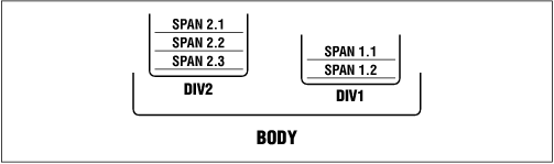
You cannot interleave elements that belong to different positioning
contexts. This is because z-index values are relative only to sibling
elements. For example, imagine you have two positioned
DIV elements named Div1 and
Div2 (see Figure 4.7).
Div1 contains two positioned
SPAN elements; Div2 contains
three positioned SPAN elements. A script can
adjust the z-index values of the elements in Div1
all they want, but the two elements are always kept together;
similarly the three elements in Div2 are always
“contiguous” in their stacking order. If you swap the
z-index values of Div1 and
Div2, the group of elements contained by each
DIV swaps positions as well.
Get Dynamic HTML: The Definitive Reference now with the O’Reilly learning platform.
O’Reilly members experience books, live events, courses curated by job role, and more from O’Reilly and nearly 200 top publishers.

