Ordinary text input via the HTML input element is by far the
most commonly used form field. Countless hours have been spent
formatting and validating what are generally small snippets of text,
and the auxiliary scripts that have supported input boxes may
single-handedly account for the most collective boilerplate that's
even been written to support web pages. If any one of those comments
resonates deep within your soul, the Dijit TextBox family will seem like a
godsend.
Let's take a look at each member of the TextBox family and improve our example form
from earlier in this chapter. The most basic member is the ordinary
TextBox itself, which comes packed
with several custom formatting operations as well as the ability to
create your own using the format
and parse extension points. The
following listing summarizes TextBox 's attributes and extension points.
A TextBox is technically a kind of
input element, so remember that the
standard HTML attributes, if not listed here, still apply.
Tip
TextBox 's attributes and
extension points are inherited by all other dijits in this family;
they are especially important to be aware of because they are widely
used.
Table 13-2
provides a listing of pertinent features to the most basic
TextBox dijit.
Table 13-2. TextBox attributes and extension points
Name | Category | Comment |
|---|---|---|
| Attribute | Removes leading and
trailing whitespace. This attribute is |
| Attribute | Converts all
characters to uppercase. This attribute is |
| Attribute | Converts all
characters to lowercase. This attribute is |
| Attribute | Converts the first
character of each word to uppercase. This attribute is
|
| Attribute | Used for passing
through the standard HTML input tag's |
| Extension point | A replaceable
function to convert a value to a properly formatted
|
| Extension point | May be used to
provide a custom parsing function to convert a formatted
|
| Method | Used to set the
|
| Method | Used to fetch the
|
Warning
As of version 1.1, _FormWidget 's setValue and getValue methods were deprecated in
favor of using the setAttribute('value', /*...*/)
function for setting values and getting values via the .value property where appropriate.
TextBox, its subclasses, and
a few other dijits, however, override the setValue and getValue methods for legitimate use.
The rule of thumb is that setValue and getValue are used for widget
values. For example, a TextBox has an obvious value (hence,
the use of setValue and
getValue ), whereas you would
use the setAttribute method
for something like a Button because it does not have a widget
value even though a value is submitted with the form.
To illustrate the most basic usage possible, Example 13-3 plugs some text
boxes into our earlier form example, and switches on the propercase and trim attributes for the first and last fields in the form.
Example 13-3. Updated form with TextBox and theming
<html>
    <head>
        <title>Register for Spam</title>

        <link rel="stylesheet" type="text/css"
          href="http://o.aolcdn.com/dojo/1.1/dojo/resources/dojo.css" />
        <link rel="stylesheet" type="text/css"
          href="http://o.aolcdn.com/dojo/1.1/dijit/themes/tundra/tundra.css" />

        <script
            djConfig="parseOnLoad:true",
            type="text/javascript"
            src="http://o.aolcdn.com/dojo/1.1/dojo/dojo.xd.js">
        </script>

        <script type="text/javascript">
            dojo.require("dojo.parser");
            dojo.require("dijit.form.TextBox");

            function help(  ) {
                var msg="Basically, we want to sell your info to a 3rd party.";
                alert(msg);
                return false;
            }

            //simple validation
            function validate(  ) {
                var f = document.getElementById("registration_form");

                if (f.first.value == "" ||
                    f.last.value == "" ||
                    f.email.value == "") {
                        alert("All fields are required.");
                        return false;
                }

                return true;
            }
        </script>
    <head>
    <body class="tundra">
        <p>Just Use the form below to sign-up for our great offers:</p>
        <form id="registration_form"
            method="POST"
            onsubmit="javascript:return validate(  )"
            action="http://localhost:8080/register/">

            First Name:
              <input dojoType="dijit.form.TextBox" propercase=true
               trim=true name="first"><br>
            Last Name:
              <input dojoType="dijit.form.TextBox" propercase=true
               trim=true name="last"><br>
            Your Email:
          <input dojoType="dijit.form.TextBox" length=25 name="email"><br>
            <button type="submit">Sign Up!</button>
            <button type="reset">Reset</button>
            <button type="button" onclick="javascript:help(  )">Help</button>
        </form>
    </body>
</html>
Warning
If you try to use dijits without properly including the
dojo.css file and the
relevant theme, your dijits may still be accessibleâbut they'll
also look horrible. A common frustration with beginners to Dijit
is either forgetting to load the CSS or forgetting to set the
appropriate class attribute in the BODY tag.
In addition to the TextBox dijit improving the appearance
of the control, it also saves you the work of implementing a dozen
or so lines of custom scripting. Of course, you could override the
format extension point to implement your own custom formatting by
simply defining a JavaScript function and passing it into format. For example, the following
formatting function would take a string and turn it into
MiXeD CaPiTaLiZaTiOn like so:
function mixedCapitalization(value) {
    var newValue = "";
    var upper = true;

    dojo.forEach(value.toLowerCase(  ), function(x) {
        if (upper)
            newValue += x.toUpperCase(  );
        else
            newValue += x;

        upper = !upper;
    });

    return newValue;

}
Using the function in the TextBox dijit is just as easy as it
should be:
<input dojoType="dijit.form.TextBox" format="mixedCapitalization"
    trim=true name="first">
If you interact with the form and cause a blur event by moving the cursor out of
it, you'll see the conversion take place. The parse function may be overridden in the
very same manner as format to
standardize values when they are returned. Common operations
include converting numeric types into Number values, or standardizing String values.
Tip
The custom format and
parse extension points are
invoked every time a setValue
or getValue operation is
calledânot just in response to explicit user interaction with
the form.
One thing that's probably on your mind is that pesky
validation function that ensures the fields are not emptyâand the
fact that it wasn't all that great in the first place since it
didn't validate an email address properly. ValidationTextBox to the rescue!
Table 13-3 includes a
complete listing of additional functionality that ValidationTextBox offers.
Table 13-3. Attributes of ValidationTextBox
Tip
The dijit.Tooltip widget
is covered in Chapter 15.
Drop-in usage for a ValiationTextBox in our example is as
straightforward as adding required attributes to the various
controls and tacking on an additional regex to validate the email
address. The change in Example 13-4 incorporates a
ValidationTextBox and eliminates
the need for all of the JavaScript that was previously written; the
Help button was also removed now that a tooltip more elegantly
accomplishes that purpose.
Example 13-4. Updated form to use ValidationTextBox
<html>
    <head>
        <title>Register for Spam</title>

        <link rel="stylesheet" type="text/css"
          href="http://o.aolcdn.com/dojo/1.1/dojo/resources/dojo.css" />
        <link rel="stylesheet" type="text/css"
          href="http://o.aolcdn.com/dojo/1.1/dijit/themes/tundra/tundra.css" />

        <script
            djConfig="parseOnLoad:true",
            type="text/javascript"
            src="http://o.aolcdn.com/dojo/1.1/dojo/dojo.xd.js">
        </script>

        <script type="text/javascript">
            dojo.require("dojo.parser");
            dojo.require("dijit.form.ValidationTextBox");
        </script>

        <!-- lots of ugly JavaScript was removed -->

    <head>
    <body class="tundra">
        <p>Just Use the form below to sign-up for our great offers:</p>
        <form  id="registration_form"
            method="POST"
            action="http://localhost:8080/register/">

            First Name:
            <input dojoType="dijit.form.ValidationTextBox"
              properCase="true" trim=true required="true"
              invalidMessage="Required." name="first"><br>

            Last Name:
            <input dojoType="dijit.form.ValidationTextBox"
              properCase="true" trim=true required="true"
              invalidMessage="Required." name="last"><br>

            Your Email:
            <input dojoType="dijit.form.ValidationTextBox"
              promptMessage="Basically, we want to sell your info to a 3rd party."
              regExp="[a-z0-9._%+-]+@[a-z0-9-]+\.[a-z]{2,4}"  required
              name="email"><br>

            <button type="submit">Sign Up!</button>
            <button type="reset">Reset</button>
            <!-- tooltip message replaced need for help button -->

        </form>
    </body>
</html>
And with very little effort, you suddenly have richer, better-looking functionality, with less code to maintain.
We still need to do some work to those buttons in the next
section, but first, let's work through the remaining members of the
TextBox family.
Two well-defined form dijit classes that are not covered in
this chapter include MappedTextBox and RangeBoundTextBox. Basically, MappedTextBox provides some methods for
serializing its data into a String value via a custom toString method, and RangeBoundTextBox facilitates ensuring
that a value is within a specified range by allowing you to pass in
max and min values to the constraints object.
Although it might intuitively seem like the "validation" in ValidationTextBox should be handling tasks
like range checking, keep in mind that ValidationCheckBox uses regular
expressions to validate String
values. RangeBoundTextBox
explicitly deals with numeric types.
In short, these two classes provide some intermediate machinery that is used to enable the remaining form dijits in this chapter and are in place largely to facilitate the internal design. While you may want to be aware of these two classes if you plan on creating a highly custom form dijit, they are not really intended for general-purpose consumption.
Custom validation routines for validating dates and times are
another implementation detail that just about any web developer who
has been around a while has had to produce at some point or another.
Although dates and times have well-defined formats that are quite
universal, the ultra-generic HTML INPUT element offers no support, and the
load is pushed off to JavaScript for validation and custom
formatting. Fortunately, Dijit makes picking dates and times just as
easy as it should be. These dijits are also preconfigured to work
with the most common locales, and extending them beyond the stock
locale collection is straightforward.
Tip
The DateTextBox and
TimeTextBox dijits use the
Gregorian calendar, which is the default for the dojo.date facilities.
Let's suppose that instead of spamming you, an organization would instead like to bother you over the telephone once you get home from a long, hard day of work. Naturally, they would like to collect information from you ahead of time so as to avoid any unnecessary overhead of their own. Assuming they're smart enough to be using Dojo to minimize costs on the programming budget, they might produce some form fields like so:
<!-- Remember to dojo.require these dijits before using them! -->

Best Day to call:
<input dojoType="dijit.form.DateTextBox"><br>

Best Time to call:
<input dojoType="dijit.form.TimeTextBox"><br>
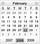
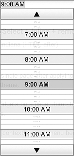
That's it! No additional effort is required. The DateTextBox in Figure 13-2 automatically pops
up a beautiful little calendar for picking a date when the cursor
enters the INPUT element, and a
scrolling list containing times, broken into 15-minute increments,
appears for the TimeTextBox in
Figure 13-3.
As a reminder, programmatic creation is just as simple:
var t = new dijit.form.TimeTextBox( );
var d = new dijit.form.DateTextBox( );

/* now place them in the page via their domNode attribute*/
In addition to ease of use, these dijits allow for customized
formatting of their displayed valuesâallowing you to do anything
that you could do via dojo.date,
which they use internally. Specifically, the formatLength, timePattern, and datePattern attributes may be specified
within the constraints object to
produce the corresponding effect.
Table 13-4 and Table 13-5 summarize the various options available. In general, either the format length or one of the time or date patterns are specified, depending on the degree of granularity desired.
Table 13-4. Attributes for DateTextBox
Attribute | Comment |
|---|---|
| Used to format a
value for the default locale. Valid values are
|
| Used to provide a custom format for all locales. Accepts a string formatted according to Java-like conventions. See http://www.w3.org/TR/NOTE-datetime. Common values with examples include:
|
| When |
| Allows for overriding
the default locale for this specific widget only. Be sure to
configure the extra local via |
| When submitting a
form, the value of |
Table 13-5. Attributes for TimeTextBox
Attribute | Comment |
|---|---|
| A |
| A |
| A |
| A
|
| Used to provide a custom format for all locales. Accepts a string formatted according to Java-like conventions. See http://www.w3.org/TR/NOTE-datetime. Common values with examples include:
|
| When |
| Allows for overriding
the default locale for this specific widget only. Be sure to
configure the extra local via |
| When submitting a form, the value of selector determines whether the date, the time, or both get passed with the submission, even though only a date or time is visible as a displayed value. By default, both are passed, specifying either date or time accordingly. |
In markup, the constraints
object is provided like any other attribute:
<input constraints="{datePattern:'MMM dd, yyyy'}" dojoType="dijit.form.DateTextBox">Just like always, the programmatic approach is a direct translation:
var d = new dijit.form.DateTextBox({datePattern:'MMM dd, yyyy'});Two additional methods that are available for TimeTextBox and DateTextBox are getDisplayedValue and setDisplayedValue. The difference
between these methods and the ordinary getValue and setValue approaches involves the
difference in what is actually displayed in the dijit versus what
data type is used internally by the dijit. Both TimeTextBox and DateTextBox use JavaScript Date objects internally, and getting
this Date object is just one
method call away.
Recall that the machinery inherited from RangeBoundTextBox also allows for
min and max values to be provided, which is
highly useful for preventing a user from ever selecting an invalid
value from the pop up. For example, to constrain a date from
December 1, 2007 through June 30, 2008:
<input constraints="{min:'2007-12', max:'2008-06', datePattern:'MMM dd, yyyy'}"
dojoType="dijit.form.DateTextBox">
Additionally, MappedTextBox wires in facilities for
serialization via the toString
method; you can also get an ISO-8601 compliant string if you
should need one, which can be quite useful for sending back to the
server.
Tip
It's important to understand the duality between datePattern, timePattern, and the ISO-8601
specification: basically, there isn't a connection. The datePattern and timePattern values are used for
opaquely manipulating user-visible formatting for widgets, while
the ISO-8601 formatting is what the parser accepts and sends to
the server for processing.
Two additional methods provided by these two dijits include
getDisplayedValue and setDisplayedValue. While setDisplayedValue produces the same
results as setAttribute('value',
/*...*/), getDisplayedValue returns the values you
see in the dijit, while resolving the dijit's .value property to return a JavaScript
Date object.
Table 13-6 provides a
quick synopsis of these additional features that both DateTextBox and TimeTextBox provide.
Table 13-6. DateTextBox and TimeTextBox commonalities
Name | Comment |
|---|---|
| Retrieves the
formatted value that is actually displayed in the form
element, whereas |
| Sets both the
displayed as well as the internal value for the dijit.
(Calling |
| Returns an ISO-8601-compliant date or time value. |
| Provided to constrain the values that are available via the pop ups. |
| An extension point
that can be used to specify a custom implementation for
the |
As it turns out, the serialize extension point can be
especially useful when transferring data to and from a server-side
component that is expecting a date to be formatted in a special
way. For example, you might use the code in Example 13-5 to extend the DateTextBox and provide a custom format
when the toString method is
used. Example 13-5 illustrates
using a custom DateTextBox to
submit a custom value that is different from what is
displayed.
Example 13-5. Custom serialization of data to the server with a DateTextBox
<html>
    <head>
        <title>Custom DateTextBox</title>

        <link rel="stylesheet" type="text/css"
          href="http://o.aolcdn.com/dojo/1.1/dojo/resources/dojo.css" />
        <link rel="stylesheet" type="text/css"
          href="http://o.aolcdn.com/dojo/1.1/dijit/themes/tundra/tundra.css" />

        <script
            djConfig="parseOnLoad:false",
            type="text/javascript"
            src="http://o.aolcdn.com/dojo/1.1/dojo/dojo.xd.js">
        </script>
        <script type="text/javascript">
            dojo.require("dojo.parser");
            dojo.require("dijit.form.DateTextBox");

            dojo.addOnLoad(function(  ) {
                dojo.declare("dtdg.CustomDateTextBox",[dijit.form.DateTextBox], {
                    serialize: function(d, options) {
                        return dojo.date.locale.format(d,
                        {
                            selector:'date',
                            datePattern:'dd-MMM-yyyy'}).toUpperCase(  );
                        }
                });
                dojo.parser.parse(dojo.body(  ));
            });
        </script>
    </head>
    <body class="tundra">
        <form action="http://localhost:8080" type="POST">
            <input dojoType="dtdg.CustomDateTextBox" name="customDate"/>
            <input type="submit" value="Submit"/>
        </form>
    </body>
</html>
A minimal CherryPy class can accept the form submission and display it for you:
import cherrypy

class Content:
    @cherrypy.expose
    def index(self, **kwargs):
        return str(kwargs)

cherrypy.quickstart(Content( ))Although the inheritance hierarchy is getting a little bit
deep by this point, recall that all of the methods inherited from
TextBox and ValidationTextBox are also available to
use and are essential for many common use cases. A review of
dojo.date, as presented in
Chapter 6, is also
helpful for brushing up on some of the finer details associated
with these dijits.
NumberTextBox inherits
all of the great features you've grown to love from RangeBoundTextBox and its ancestors and
expands upon them with customization for numeric types via the
dojo.number facilities. In a
nutshell, numeric value formatting defaults to the current locale
and allows you to provide the constraints listed in Table 13-7.
Table 13-7. NumberTextBox constraints
Name | Comment |
|---|---|
| Used to check the
bounds of the input, just like any other |
| Used to provide the number of digits to require after the decimal, along with any additional formatting, such as a percent sign that follows. |
| Used to designate
that the value should be a |
| Used to designate the number of places to require after the decimal (providing this value in addition to a custom pattern overrides the pattern). |
For example, to require a value to have exactly two places after the decimal and a percent sign, the following does the trick:
<input constraints="{pattern: '#.##%'}" dojoType="dijit.form.NumberTextBox">Although there is only a single hash before the decimal
place, note that you can have multiple digits. Should you not want
any dijits before the decimal, however, you can provide a pattern
without a leading hash, such as {pattern:'.##%'}. Also note that when
editing begins, the displayed values automatically convert to a
pure numeric value; when editing ends, the value converts back to
a formatted number.
Recall that dojo.number
as presented in Chapter 6 is your
one-stop shop for tons of custom facilities for number formatting
and related operations. NumberTextBox directly builds upon these
facilities.
The NumberSpinner was
introduced in Chapter 11, and you can think
of the NumberSpinner and a
fancier NumberTextBox with
small buttons on the edge that allow for incrementally increasing
the value. The buttons are typematic in that you can hold them
down and they will repeatedly affect the value. The NumberSpinner also has slightly
different min and max constraints in that if min and max constraints are provided, the
NumberSpinner 's buttons will
not allow you to move outside of those boundaries.
NumberSpinner offers the
attributes listed in Table 13-8.
Table 13-8. NumberSpinner attributes
Name | Comment |
|---|---|
| The number of
seconds a key or button is held down before it becomes
typematic. This attribute is |
| The fraction of
time that is used to change the typematic timer between
events. A value of |
| The value to adjust
the spinner by when using arrow keys or buttons. This
attribute is |
| The value to adjust
the spinner by when using the Page Up or Page Down keys.
This attribute is |
Creating a NumberSpinner
is just like creating any other dijit:
<input dojoType="dijit.form.NumberSpinner" smallDelta="2" largeDelta="4"
constraints="{min:100,max:120}" value="100">The CurrencyTextBox is
the farthest dijit from the common ancestor, inheriting from
NumberTextBox, and utilizes
dojo.currency for much of its
formatting handiwork.
This dijit, however, provides only one additional attribute,
currency, which is formatted
according to its specific locale. Values for currency must be one of the three letter
sequences specified in the ISO4217 currency code standard,
available from http://en.wikipedia.org/wiki/ISO_4217.
Warning
Anytime international characters such as currency symbols are used, you'll want to be especially aware of the encoding that your browser is using so that all symbols are rendered properly. There is always the possibility that the web server may not include this information in the header.
In HTML pages, the standard way of specifying an encoding
is by placing a special META
tag in the head of the page, and the Dijit project encourages
this technique as a best practice. The following example is a
META tag for the UTF-8
character set, which is almost always a safe bet:
<META http-equiv="Content-Type"
content="text/html; charset=UTF-8"/>
Note that as of version 1.1, you will need to use this tag if serving up Dojo from AOL's CDN because the server currently does not include encoding information in the headers, which is another means of achieving the same result. (Otherwise, currency and certain unicode symbols may not display properly.)
The following snippet illustrates a currency dijit for U.S.
dollars that requires a value for the cents to be explicitly
provided after the decimal point via the fractional constraint, which is the only
additional constraint of interest that this dijit provides besides
those that have already been inherited:
<input dojoType="dijit.form.CurrencyTextBox"
constraints="{min:1,max:100,fractional:true}" currency="USD"/>
Like NumberTextBox, the
values for this dijit change to vanilla numeric values when
editing begins, and format back to currency values once editing
ends via a blur event.
ComboBox provides a
drop-down list of values much like an HTML SELECT element; however, a ComboBox is based on an ordinary
input element, so if an
acceptable value is not identified by the list of possibilities,
you may opt to type in any value you'd like. ComboBox inherits from ValidationTextBox, so you have the full
gamut of features for validation available to you; some additional
enhancements are that it also provides a filtered list of possible
values based on the prefix you've entered. The list of values can
be a static list that is established a priori
or a dynamic list from a dojo.data store that may be fetched from
a server.
In its simplest manifestation, you might use a ComboBox simply to provide a static list
of common options, with the ability for the user to type in a
custom option. The following code listing illustrates static data
with the auto-complete feature enabled.
<select name="coffee" dojoType="dijit.form.ComboBox" autoComplete="true">
  <option>Verona</option>
  <option>French Roast</option>
  <option>Breakfast Blend</option>
  <option selected>Sumatra</option>

  <script type="dojo/method" event="onChange" args="newValue">
    console.log("value changed to ", newValue);
  </script>
</select>
Hooking a ComboBox to an
ItemFileReadStore is quite
simple and involves little more than pointing the ComboBox to the data source. For
example, consider a data source that contains coffee roasts and
their descriptions in the following form:
{identifier : "name",
    items : [
        {name : "Light Cinnamon", description : "Very light brown, dry, tastes
like toasted grain with distinct sour tones, baked, bready"},
        {name : "Cinnamon", description : "Light brown and dry, still toasted
grain with distinct sour acidy tones"},

        ...lots more...
    ]
}
Assume that you'd like to populate the ComboBox with a name field, and when a change occurs,
use the description in some other meaningful way. You might
accomplish this task as shown in Example 13-6.
Example 13-6. ComboBox at work
<html>
    <head>
        <title>Pick a coffee roast, any coffee roast</title>

        <link rel="stylesheet" type="text/css"
          href="http://o.aolcdn.com/dojo/1.1/dojo/resources/dojo.css" />
        <link rel="stylesheet" type="text/css"
          href="http://o.aolcdn.com/dojo/1.1/dijit/themes/tundra/tundra.css" />

        <script
            djConfig="parseOnLoad:true",
            type="text/javascript"
            src="http://o.aolcdn.com/dojo/1.1/dojo/dojo.xd.js">
        </script>

        <script type="text/javascript">
            dojo.require("dojo.parser");
            dojo.require("dojo.data.ItemFileReadStore");
            dojo.require("dijit.form.ComboBox");
            dojo.require("dijit.form.Button");
            dojo.require("dijit.form.Form");
        </script>
    <head>
    <body class="tundra">

        <div dojoType="dojo.data.ItemFileReadStore"
            jsId="coffeeStore" url="./coffee.json"></div>

        <form action="localhost" dojoType="dijit.form.Form">
            <select name="coffee" dojoType="dijit.form.ComboBox"
                store="coffeeStore" searchAttr="name">

                <script type="dojo/method" event="onChange" args="newValue">
                    console.log("value changed to ", newValue);
                    var f = function(item) {
                        console.log("new description is ",
                          coffeeStore.getValue(item, "description")
                        );
                    };
                    coffeeStore.fetchItemByIdentity(
                        {identity : newValue, onItem : f}
                    );
                </script>
            </select>
        <button dojoTyype="dijit.form.Button">Submit</button>
    </form>
    </body>
</html>
To recap, all that takes place is that you hook up the
ComboBox to the ItemFileReadStore via the store
attribute, and tell the ComboBox which field to display via the
searchAttr attribute. Then,
when a change occurs, the ComboBox 's onChange method detects and uses the new
value to look up the description from the store.
Tip
Internally, the ComboBox only implements a specialized
subset of the dojo.data.Read/Notification API that
is necessary for it to work. Specifically, it implements the
following methods:
getValueisItemLoadedfetchclosegetLabelgetIdentityfetchItemByIdentityfetchSelectedItem
For completeness, the specific attributes shown in Table 13-9 are also available for ComboBox.
Table 13-9. ComboBox attributes
Get Dojo: The Definitive Guide now with the O’Reilly learning platform.
O’Reilly members experience books, live events, courses curated by job role, and more from O’Reilly and nearly 200 top publishers.

