Chapter 1. In-Page Editing
Content on web pages has traditionally been display-only. If something needs editing, a separate form is presented with a series of input fields and a button to submit the change. Letting the user directly edit content on the page follows the principle of Make It Direct.
This chapter describes a family of design patterns[6] for directly editing content in a web page. There are six patterns that define the most common in-page editing techniques:
The most direct form of In-Page Editing is to edit within the context of the page. First, it means we don’t leave the page. Second, we do the editing directly in the page.
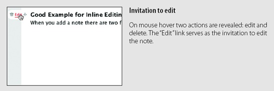
The advantage of Inline Edit is the power of context. It is often necessary for users to continue to see the rest of the information on the page while editing. For example, it is helpful to see the photo while editing the photo’s title, as explained in the next section, Single-Field Inline Edit.
It is also useful when editing an element that is part of a larger set. Disqus, a global comment service, provides inline editing for comments (Figure 1-1). After posting a comment and before anyone replies to the comment, an edit link is provided. The editing occurs within the context of the rest of the comments shown on the page.
Tip
If editing needs the context of the page, perform the editing inline.

The first two patterns, Single-Field Inline Edit and Multi-Field Inline Edit, describe techniques for bringing direct inline editing into the page.
Single-Field Inline Edit
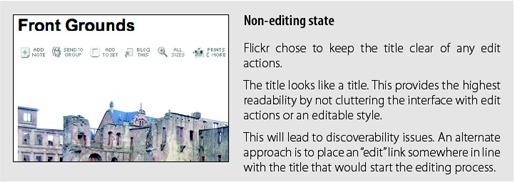
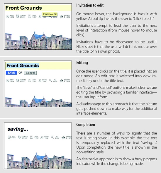
The simplest type of In-Page Editing is when editing a single field of text inline. The editing happens in place instead of in a separate window or on a separate page. Flickr provides us a canonical example of Single-Field Inline Edit (Figure 1-2).
Considerations
The flow is simple. Click on the title to start editing. When you are done, hit the “Save” button, and the title is saved in place. Flickr was one of the first sites to employ this type of in-page editing. As a testament to its usefulness, the interaction style first designed has not changed much over the last few years.
But there are some challenges to consider.
Discoverability
Just how discoverable is this feature? In this example, there are a number of cues that invite the user to edit. The invitations include:
Showing a tool tip (“Click to edit”)
Highlighting the background of the editable area in yellow
Changing the cursor to an edit cursor (I-beam)
But all these cues display after the user pauses the mouse over the title (mouse hover). Discoverability depends on the user hovering over the title and then noticing these invitations.[7]
To make the feature more discoverable, invitational cues could be included directly in the page. For example, an “edit” link could be shown along with the title. Clicking the link would trigger editing. By showing the link at all times, the edit feature would be made more discoverable.
But this has to be balanced with how much visual noise the page can accommodate. Each additional link or button makes the page harder to process and can lead to a feature not being utilized due to the sheer volume of features and their hints shown on the page.
Tip
If readability is more important than editability, keep the editing action hidden until the user interacts with the content.
Yahoo! Photos[8] took this approach for editing titles (Figure 1-3). When showing a group of photos, it would be visually noisy to display edit links beside each title. Instead, the titles are shown without any editing adornment. As the mouse hovers over a photo title, the text background highlights. Clicking on the title reveals an edit box. Clicking outside of the edit field or tabbing to another title automatically saves the change. This approach reduces the visual noise both during invitation and during editing. The result is a visually uncluttered gallery of photos.


Accessibility
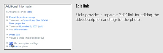
Another concern that arises from inline editing is the lack of accessibility. Accessibility affects a wider range of users than you might first consider. Assistive technologies help those with physical impairments, medical conditions, problems with sight, and many other conditions.
Assistive technologies generally parse the page’s markup to find content, anchors, alternate titles for images, and other page structure. If the inline edit feature does not contain explicit markup built into the page (such as an explicit, visible edit link), assistive technologies cannot easily discover the inline edit feature.
In a sense, relying on the mouse to discover features will prevent some users from being able to edit inline. As mentioned before, providing an explicit edit link helps with discoverability (as shown previously in Figure 1-1). But as a by-product it also makes the feature more accessible.
Tip
Providing an alternative to inline editing by allowing editing on a separate page can improve accessibility.
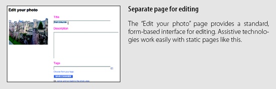
There is a natural tension between direct interaction and a more indirect, easily accessible flow. It is possible to relieve this tension by providing both approaches in the same interface. Flickr actually does this by offering an alternate, separate page for editing (Figure 1-4).
Multi-Field Inline Edit
In our previous example, a single value was being edited inline. What happens if there are multiple values, or the item being edited is more complex than a string of text and you still would like to edit the values inline?
The pattern Multi-Field Inline Edit describes this approach: editing multiple values inline.
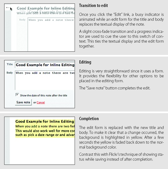
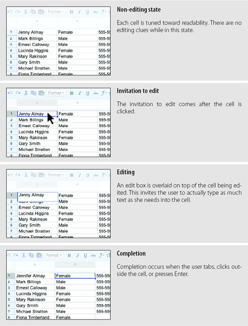
37 Signal’s Backpackit application uses this pattern for editing a note (Figure 1-5). A note consists of a title and its body. For readability, the title is displayed as a header and the body as normal text. During editing, the two values are shown in a form as input text fields with labeled prompts.
Considerations
In Single-Field Inline Edit the difference between display mode and edit mode can be more easily minimized, making the transition less disruptive. But when editing multiple fields, there is a bigger difference between what is shown in display mode and what is needed to support editing.
Readability versus editability
Readability is a primary concern during display. But the best way to present editing is with the common input form. The user will need some or all of the following:
Edit controls
Field prompts
Help text for user input
Error handling
Assistive input (e.g., calendar pop up or drop-down selection field)
Editing styles (e.g., edit fields with 3D sunken style)
The edit mode will need to be different in size and layout, as well as in the number and type of components used. This means that moving between modes has the potential to be a disruptive experience.
In our example, the form for editing the note takes up a larger space on the page than when just displaying the note.
Blending display and edit modes
Ideally you would like the two modes to blend together in a seamless manner. Bringing the edit form into the page flow will have an effect on the rest of the page content. One way to smooth out the transition is by a subtle use of animation. Backpackit does this by fading out the display view and fading in the edit view at the same time (see the cross-fade in Figure 1-5).
Another approach is to use the same amount of space for both display and edit modes. In Yahoo! 360, you can set a status message for yourself. Your current status shows up on your 360 home page as a “blast,” represented as a comic book-style word bubble. Visually it looks like a single value, but there are actually three fields to edit: the blast style, the status, and any web page link you want to provide when the user clicks on your blast. Figure 1-6 shows the blast as it appears before editing.
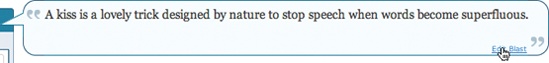
Figure 1-7 shows how the blast appears during editing. Notice that the edit form is designed to show both modes (display and editing) in the same visual space.
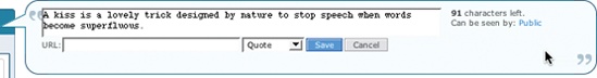
The size similarity was not an accident. During design there was a concerted effort to make the display mode slightly larger without losing visual integrity, while accommodating the editing tools in the space of the bubble.
WYSIWYG[9]
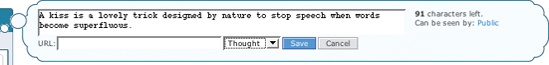
If the two modes (display and editing) are in completely separate spaces, the user may lose a sense of what effect the change will have during display. In Yahoo! 360, you can change the type of bubble and immediately see what it will look like. Switching from a “quote” bubble to a “thought” bubble is reflected while still in editing mode (Figure 1-8). This would not be possible if editing happened in a separate edit form.
Overlay Edit
The previous two patterns brought editing inline to the flow of the page. Inline editing keeps the editing in context with the rest of the elements on the page.
Overlay Edit patterns bring the editing form just a layer above the page. While still not leaving the page for editing, it does not attempt to do the editing directly in the flow of the page. Instead a lightweight pop-up layer (e.g., dialog) is used for the editing pane.
There are several reasons for choosing Overlay Edit instead of Inline Edit.
Sometimes you can’t fit a complex edit into the flow of the page. If the editing area is just too large, bringing editing inline can shuffle content around on the page, detracting from the overall experience. A noisy transition from display to edit mode is not desirable.
At other times you might choose to interrupt the flow, especially if the information being edited is important in its own right. Overlays give the user a definite editing space. A lightweight overlay does this job nicely.[10]
Tip
An Overlay Edit is a good choice if the editing pane needs dedicated screen space and the context of the page is not important to the editing task.
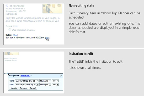
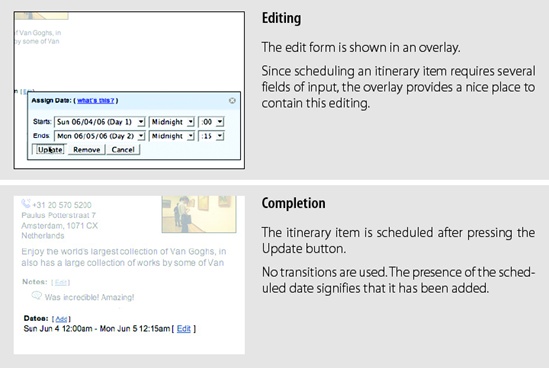
Yahoo! Trip Planner is an online place for creating and sharing trip plans. Trips contain itinerary items that can be scheduled. When scheduled, the itinerary contains the dates the item is scheduled. Each item can be edited in an overlay (Figure 1-9).
Considerations
“Sun Jun 4 12:00am—Mon Jun 5 12:00am” is easier to read than a format appropriate for editing (Figure 1-10). Using an editor prevents errors when entering the start and end dates for a specific itinerary item.
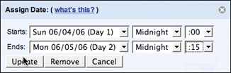
Since the range of dates is known, Trip Planner uses a series of drop-downs to pick the start and end dates along with the time.
It should be noted that using multiple drop-downs for choosing the hour and minute is not the best experience. Although not in the context of an overlay, a better example of choosing an event time when creating an event can be found at Upcoming.org (Figure 1-11).
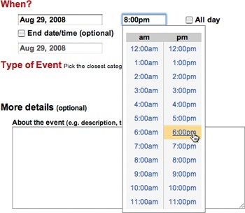
The experience of picking a time from a single list (or typing the time in) is more direct than navigating multiple drop-downs.
Why an overlay?
An overlay should be considered when:
The editing module is considerably larger than the display values.
Opening an area on the page for the editing module would be distracting or push important information down the page.
There is concern that the opened information might go partially below the fold. An overlay can be positioned to always be visible in the page.
You want to create a clear editing area for the user.
What you are editing is not frequently edited. Having to click on an edit link, adjust to the pop-up location, perform your edit, and close the dialog is a tedious way to edit a series of items. In such cases, opt to either dedicate a space on the page for each item as it is selected, or allow the editing to occur in context to remove some of the time required to deal with an overlay.
What you are editing is a single entity. If you have a series of items, you should not obscure the other similar items with an overlay. By allowing the edit to occur in context, you can see what the other item’s values are while editing.
Table Edit
Editing tables of data is less common in consumer web applications. In enterprise web applications, however, tables reign supreme. The most common request is for the table editing to work like Microsoft Excel, which long ago set the standard for editing data in a grid.
A good example of Table Edit is a Google Docs Spreadsheet (Figure 1-12).
Considerations
Presentation is the primary consideration when displaying a table of data. Editing is secondary. As a result, the editing scaffolding is hidden and only revealed when it’s clear the user wants to edit a cell.
Activation
A single mouse click is required to start editing a cell instead of a mouse hover. This is consistent with keeping the display of the grid uncluttered. Imagine how irritating it would be if every mouse motion revealed an edit box.
Tip
You should generally avoid double-click in web applications. However, when web applications look and behave like desktop applications, double-click can be appropriate.
Rendering versus editing. Google Spreadsheet displays the edit box slightly larger than the cell. This clearly indicates editability and lets the user know that input is not limited to the size of the cell (the edit box actually dynamically resizes as the user types into it). The only issue to consider is that the larger edit area covers other table cells. However, this works well in this case since editing is explicitly triggered by a mouse click. If activation had occurred on a mouse hover, the edit mode would have interfered with cell-to-cell navigation.
Group Edit
As mentioned before, it is a good idea to keep the differences between the edit mode and the display mode as minimal as possible. In fact, it is a good idea to minimize modes where possible. In honor of this principle, a former manager of mine sported a vanity plate with the phrase “NOMODES”. However, modes cannot be avoided altogether, as they do provide necessary context for completing specific tasks.
If you want to keep the display of items on the page as uncluttered as possible while still supporting editing, consider using a single mechanism to enter a special editing mode: Group Edit.
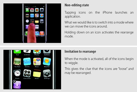
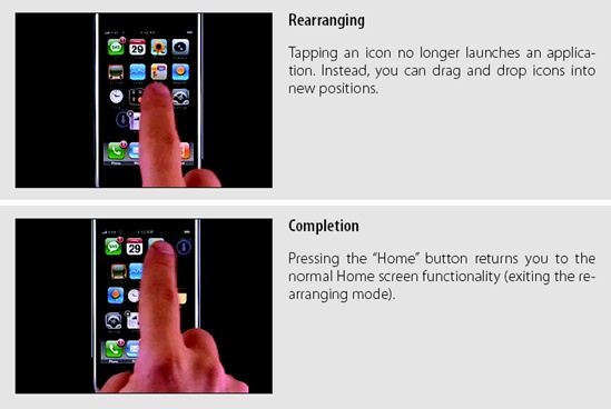
On the iPhone’s home screen, the icons are normally locked down. However, there is a way to switch into a special Group Edit mode that allows you to rearrange the icon’s positions by drag and drop. You enter the mode by pressing down continuously on an icon until the editing mode is turned on (Figure 1-13).
Considerations
The Apple technique signifies that we have entered a special editing mode. When the icons become “wiggly,” it is not a large intuitive leap that the icons have become loose and thus we can rearrange them.
Discoverability
Admittedly, the feature is not very discoverable. But it can be argued that it is straightforward once discovered. However, pressing the home button deactivates the rearranging mode. This really should operate more like a toggle. A better way to exit the “wiggly” mode would be to press and hold down on a wiggly icon. It follows the idea that you are pushing the icon back into its fixed place. Since deactivation is not the same mechanism as activation, it is a little hard to figure out how to go back into the normal display mode.
Tip
Activation and deactivation should normally follow the same interaction style. This makes it easy to discover the inverse action. This is a principle we call Symmetry of Interaction.
Another example of group editing is in the 37 Signals product, Basecamp (Figure 1-14). When sharing files with Basecamp, you can organize them into various categories. The categories are like folders. Clicking on a category link shows all the files in that “folder.” What if you want to delete a category? Or rename it? At the top of the category section there is a single “Edit” link that turns on editing for the whole area.
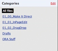
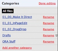
Once the Group Edit mode is entered, you can add another category, rename an existing category, or delete empty categories. Notice the “Edit” link toggled to read “Done Editing”. Clicking this link exits the group-editing mode.
Tip
Switching between edit modes should happen instantaneously. There is no point in making the user wait on an animation to finish before he can start editing.
Discoverability versus readability
The advantage of providing a toggling edit mode is that it keeps the display uncluttered with the editing scaffolding. The disadvantage is that it is less discoverable. This tension between discoverability versus readability is common and must be balanced by the needs of the user.
Symmetry of Interaction
Unlike the iPhone example, you turn off editing in the same manner and location that you switched it on. The “Done Editing” link is in the same spot as the “Edit” link was. Since both are hyperlinks, they have the same interaction style. Interactions should be symmetrical wherever possible.
Module Configuration
Popular portal sites like Yahoo! and Google’s interactive home page display specific content modules (e.g., Top Stories).
Module Configuration is a common pattern on these types of sites. Instead of modifying modules on a separate page, the sites provide ways to directly configure the amount and type of content that shows in each module. The My Yahoo! home page provides an “Edit” link that allows for Module Configuration (Figure 10-15).
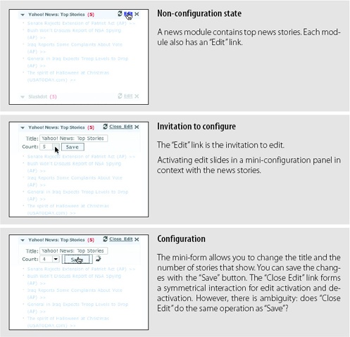
Considerations
There are some issues to consider when using Module Configuration.
Visual noise
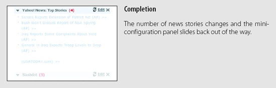
Putting edit links on each module can be visually noisy. An alternative approach is to use the Group Edit pattern (as we saw in Figure 1-14) to place an edit link at the page level that turns on edit links for each module. When the “Done Editing” link is clicked, the links for each module are hidden. Again the trade-off is between visual noise and discoverability.
Guidelines for Choosing Specific Editing Patterns
In-Page Edit provides a powerful way to make interfaces direct. Here are some general guidelines to think about when choosing an editing pattern:
Whenever you have a single field on the page that needs editing, consider using the Single-Field Inline Edit.
For multiple fields or more complex editing, use the Multi-Field Inline Edit.
If you don’t need inline context while editing, or the editing is something that demands the user’s full attention, use Overlay Edit.
When dealing with multiple items on a page, Group Edit provides a way to balance between visual noise and discoverability.
When providing direct configuring to modules, use the Module Configuration pattern.
[6] We use the term “design patterns” to denote common solutions to common problems. Design patterns originate from Christopher Alexander’s book A Pattern Language (Oxford University Press). You can read a series of essays from me (Bill) and others on design patterns at http://www.lukew.com/ff/entry.asp?347
[7] While the Yahoo! Design Pattern Library (http://developer.yahoo.com/ypatterns/) was being launched, this pattern was not included in the initial set of patterns due to an internal debate over this issue of discoverability. In fact, one of the reviewers, a senior designer and frequent user of Flickr, had only recently discovered the feature. As a result, we withheld the pattern from the public launch.
[8] Yahoo! Photos was replaced in 2007 with Flickr.
[9] What You See Is What You Get: an interface where content displayed during editing appears very similar to the final output.
Get Designing Web Interfaces now with the O’Reilly learning platform.
O’Reilly members experience books, live events, courses curated by job role, and more from O’Reilly and nearly 200 top publishers.

