Chapter 9. Sensorial
WE CONNECT WITH THE WORLD AROUND US THROUGH OUR SENSES, and describe the process of understanding something new as âmaking sense of it.â The pervasiveness of sensing makes it easy to take for granted, as we integrate our five common senses of touch, hearing, sight, smell, and taste without conscious thought or effort. Similarly, as designers create objects and interactions, it can be easy for them to overlook the richness of human sensorial capabilities. By primarily considering the senses of sight and touch, many designers seem to treat humans as little more than eyeballs and fingers.
Industrial designers, because of the physicality of their work, have historically been able to engage a broader range of senses than interaction designers. We obviously see and touch objects, but we may also hear something when we place an object on a surface, or smell certain materials when we hold them closely. Designers are even collaborating with chefs and food companies to support the smell and taste of our eating experiences.
Beyond the traditional five senses, we perceive our presence in the physical world through nontraditional and combinatorial senses as well. We have a sense of balance that helps us walk and carry objects, a sense of pain that helps us avoid damaging our bodies, and a sense of temperature that is finely tuned to our human tolerances. Our kinesthetic sense tells us the position of our body parts relative to one another, and helps us detect weight and tension when we grasp and hold an object.
All of these senses are commonly used with intention by industrial designers. The weight of a fountain pen, the balance of a snow shovel, the smell of a leather wallet, and the warm welcome of a heated car seat are all purposefully designed. In this chapter, we will demonstrate how sensorial considerations are central to industrial design by looking at the core foundations of the discipline, such as formgiving, color, materials, and finish. Weâll look at products that transition between multiple states, where engaging the senses through action feels good enough to be addictive. Weâll highlight ways that products can delight us through sensorial reaction to our input, or by preparing us for particular smells and tastes.
As digital systems escape the screen, the sensorial methods that interaction designers can utilize for both input and output will expand. How to engage this full range of human senses, in ways both obvious and subtle, is one of the most important things that interaction designers and UX professionals can learn from industrial design.
Formgiving
Fundamental to industrial design is the idea of formgiving, the process of determining the best shape, proportion, and physical architecture for a 3D object. This additional dimension, beyond the flat 2D world of a screen, presents a multitude of new challenges and sensorial possibilities. This is why industrial designers often start sketching physically first, shaving foam or wood with their hands to craft the basic depth, dimensionality, and proportions of an object before modeling it on a computer. Should an object be thick and narrow, or thin and wide? Feeling the difference in your hand is often the only way to know.
In giving an object form, a designer is trying to both meet a human need and create a product with character: something that is unique, differentiated, and valued in the marketplace. As the form evolves through the design process, it must be evaluated holistically, seeing how each change affects the front, back, and sides from every angle. Additional constraints might be informed by the way an object will be held, or what function it performs. Some challenges, such as accommodating bulky embedded electronics, might be addressed by prioritizing certain viewing angles, creating the illusion of an object being thicker or thinner when viewed from particular sightlines. A good example of this is the wedge-shaped side profile of Appleâs MacBook Air.
On-screen elements in a user interface tend to default to rectangular shapes: windows, buttons, bars, and lists. Obviously, it is possible to make interfaces with other shapes, but the very idea that there is a default can influence and limit interaction designers. Even if less conventional shapes are used within an interface, they are framed within a larger system of rectangles that a designer has little control over, not least of which is the screen itself. While some physical objects are part of a branded family, many are standalone forms that free industrial designers to consider a much wider range of shapes. This allows shape to define the personality of an object, whether round, square, sharp, soft, or organic. A productâs shape is the first thing you see.
Rarely is a product constructed from a single shape, so formgiving usually includes a process of composition as well: shaping various individual elements and then arranging them into a greater form. Consider a simple FM radio with a frequency dial, volume knob, screen, and speaker grill. The overall shape of the radio may be a starting point, but the form is not complete until all of the elements are composed in relation to the whole.
Similar to composition, the way that elements connect to one another is a key consideration in more complex formgivingâthe joint on a chair, the hinge on a laptop, the clamshell or slider on a mobile phone. For products with moving parts, these connections and architectures are fundamental to the overall form and act as a bridge between multiple states of the product. A laptop can be open or closed, and both of those states should feel related and work together.
Color, Materials, Finish (CMF)
Along with formgiving, industrial designers craft sensorial experiences by utilizing the building blocks of color, materials, and finish, or CMF. Combining these three features in an acronym makes sense, as they are often chosen and used in combination with one another to create a perception of quality, indicate affordances for use, and communicate brand identity.
All three elements involve consideration for the sense of vision, but materials and finishes provide designers with the additional opportunity to purposefully engage the sense of touch. Should an object feel hard or soft when you touch it? Should it be cold or warm against your skin? Should it be glossy or matte? Light or heavy? These characteristics are all carefully considered and often combined to create a desired product experience.
The unique properties of a material can be the catalyst for a design idea, even before explorations of formgiving have begun. However, this inspiration requires that designers have physical access to new materials so they can feel and experiment with them. In 1999, IDEO started its Tech Box project,1 which collects examples of interesting materials and mechanisms and distributes them to all of the companyâs offices. Designers can rummage through the Tech Box for inspiration when they start a new project. This kind of reference library is an important tool in allowing materials to spark new design ideas.
Like formgiving, CMF is a balancing act between the desired sensorial experience, feasibility of manufacturing at scale, and overall cost of the product. To achieve that balance, designers must maximize the impact of every CMF choice. An example of a company that has made the most of simple materials and color is Fiskars, whose classic orange-handled scissors have sold more than 1 billion units since their introduction in 1967 (Figure 9-1).
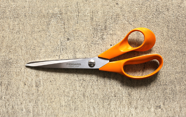
Figure 9-1. Fiskars Original Orange-Handled Scissors (photo credit: Kuen Chang)
Fiskars has been making scissors since the 1830s, originally for professional use, with wrought iron handles that matched the material of the blades, and later with brass to increase comfort.2 In the 1960s, new manufacturing capabilities made it possible to create scissors with ground metal blades that could outperform their forged counterparts. These lightweight blades were paired with another mid-century innovation, the molded plastic handle. The combination of these two materials allowed Fiskars to offer higher quality, more comfortable scissors at a price that was affordable to everyone, not just tailors and seamstresses.
The recognizable orange color of the Fiskars scissors, handle has a serendipitous origin story. At the time that the first plastic-handled scissors prototypes were made, Fiskars also had a line of juicers in production. The injection molding machine had leftover orange dye in it, so thatâs what they used to produce the initial handles. The origin of the color matters less than the companyâs disciplined use of this particular orange from that point onward.
Today, the Fiskars Orange color is a valuable asset for the company. It was registered as a trademark in the United States in 2007, following its Finish trademark in 2003.3 The color has successfully extended beyond the scissors line to include other Fiskars products, making its garden tools and crafting supplies instantly recognizable. In recognition of their simple appeal and design legacy, the classic orange-handled scissors are part of the permanent collection of the Museum of Modern Art (MoMA) in New York.4
Another company whose innovative handle design can be found in the MoMA collection is OXO,5 whose soft rubber grips with ribbed finishes transformed the commodity utensil category and launched an entire product portfolio built around the sense of touch (Figure 9-2).
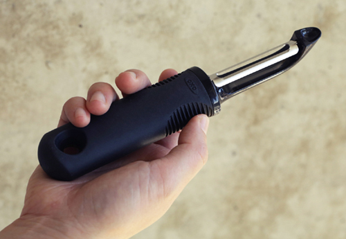
Figure 9-2. OXO Good Grips Peeler (photo credit: Kuen Chang)
The origin story of OXO comes not from the introduction of new manufacturing capabilities, like with Fiskars, but with an observation of an unmet need in the marketplace. Founder Sam Farber, who was ostensibly retired from a career in the kitchenware business, was inspired by seeing his wife Betsy struggle when using a standard metal vegetable peeler. Betsy was suffering from arthritis in her hands, and the design of the all-metal implement was optimized not for comfort or support, but to be manufactured as cheaply and easily as possible.
Farber worked with Smart Design in New York to make a better handle based on the principles of Universal Design, a philosophy that prioritizes designing for the broadest group of people possible, including those with special or marginalized needs.6 Smart Design prototyped forms that would be easy to hold, regardless of hand size, and explored materials that would support varying levels of physical capability.
The final design was a handle made of a soft rubber called Santoprene, in an oval shape that evenly distributes the userâs force during use.7 The non-slip material provides comfort and grip, even when wet, while withstanding exposure to kitchen oils and dishwashers. On the sides, small ribs or âfinsâ are cut into the rubber, providing an affordance for where to hold. These tactile elements make the OXO brand recognizable at first touch, even without looking.
The Good Grips handle design has been applied to hundreds of products since its introduction in 1990. But unlike Fiskars, which used a new material to reduce the cost of its scissors, OXO products are often more expensive than their traditional counterparts.8 Itâs a compelling demonstration that people are willing to pay for good design, and that taking a Universal Design approach can lead to products with broad appeal.
The stories of both Fiskars and OXO show how simple and disciplined use of colors, materials, and finishes can define a brand in a way that extends across an entire product line. Beyond consistency, though, it is often the CMF of a product that draws us to it. As objects become increasingly connected and computational, itâs important not to lose these positive, tactile qualities that make us want to have them in our lives. For example, instead of a raw LED providing feedback, a light might be placed under a frosted glass surface. Or, instead of a touchscreen for input, sensors might be placed under a thin veneer of wood. This is not about hiding technology, but finding ways to integrate it with the same rigor that goes into all CMF selections.
Multisensorial Products
Straightforward use of a single material can be an innovative advancement for simple tools, but just as most digital products require multiple interconnected states to result in a good experience, a more complex physical product requires bringing together a mix of sensorial moments. By engaging multiple senses, at every scale and detail, the overall experience can transcend its parts.
Cameras can inspire intense loyalty from photographers based not only on how they perform, but also how they feel. A good camera becomes an extension of the photographerâs sense of vision, capturing what they see with minimal interruption. Few brands have spawned as much obsession among photographers as the German manufacturer Leica. As French photographer Henri Cartier-Bresson famously said, âShooting with a Leica is like a long tender kiss, like firing an automatic pistol, like an hour on the analystâs couch.â
Leica has been making cameras since the mid-1800s, and even though todayâs models are digital, they feature tactile, analog controls similar to the earliest models. This decision is driven by more than nostalgia, as familiar physical controls allow photographers to keep their eyes looking through the viewfinder while they adjust the dials for shutter speed, aperture, and focus. Unlike selecting on-screen menu items, twisting an aperture control can be done without looking, and the reassuring click of each demarcation on the dial can be felt and heard.
A Leica is a triumph of engineering, but also of form and finish, the feel of each dial and marking on the camera body building muscle memory through use, avoiding a fumble that could lead to a missed shot. Itâs the integration of these tiny details, along with the build quality and craftsmanship, that fosters such passion and commands a premium price.
Leica craftsmanship is celebrated to the point of fetish. For example, the Leica T camera body is machined out of a solid block of aluminum.9 The marketing materials for the camera boast that the body is hand polished, and a video ad released by the company showcases the entire 45-minute process in closely cropped shots of gloved hands at work. The adâs voiceover boasts that it takes âaround 4,700 strokes to finish each body,â asking the viewer in the end if they can see the difference, and reassuring them that âyou can most certainly feel it.â10
The Leica M9-P, Edition Hermès, shown in Figure 9-3, is an example of how detailed finishes and subtle sensorial experiences can elevate a product to the level of luxury.11 In collaboration with the eponymous Parisian fashion house, this limited edition camera is wrapped in a soft, ochre-colored calfskin leather. The metal body underneath was redesigned for this special edition by the automotive designer Walter de Silva, and the exposed portions of the metal are even smoother than the well-polished standard edition. The contrast of materials heightens usersâ awareness of each as their fingers shift from holding the warm, soft, natural leather to adjusting the cold, hard aluminum controls.
Figure 9-3. Leica M9-P, Edition Hermès (photo credit: Leica Camera AG)
The sensorial experience extends beyond the camera itself, though, with a strap made of matching calfskin, a Hermès designed camera bag, and a two-volume book of photographs from Jean-Louis Dumas, shot with a Leica M. These items are packaged alongside the camera lenses in a fabric-coated custom display box that includes a set of white gloves, further emphasizing the museum-like quality of the overall package. All of this can be yours for only $25,000 or $50,000, depending on which limited edition package you choose.
As weâve seen, there are examples of CMF choices that can make a product more affordable, or push it well out of reach for all but the wealthiest. The more senses that a product engages, through high-quality materials or finishes, the more luxurious it may appear. However, the sensorial qualities of a design must be in line with the purpose and positioning of a product. Lightweight scissors that still cut well are desirable, but a lightweight luxury item might appear âcheap.â Even with the use of aluminum bodies, Leica makes its cameras have a significant heft, because people perceive weight as a signifier of quality. One of the studies documenting this phenomenon can be found in the journal Psychological Science, where researchers published a paper entitled âWeight as an Embodiment of Importance.â12 In their study, they found that varying the weight of a clipboard used by participants altered their behavior and influenced their opinions. Designers can make decisions about materials that capitalize on this psychology, although care should be taken that these choices are authentic to the purpose of the product.
On top of high-quality design, scarcity is often utilized to further differentiate luxurious from standard products. This sense of luxury is something that has traditionally been very difficult for interaction designers to achieve. After all, what is a luxurious interaction? For purely digital products, the ability to create unlimited copies of digital resources makes scarcity too artificial to resonate as luxurious. Offering a limited edition with an improved user experience also comes off as more unfair than special. Digital experiences seem to be evaluated through a more egalitarian lens.
However, for the increasing number of products that integrate digital and physical experiences, there are many untapped opportunities to explore and define luxurious interactions. For all of its fine materials and finishes, the Leica M9-P, Edition Hermès, uses the same firmware, on-screen graphics, and interactions on its digital screen as the less luxurious standard edition. How might the on-screen interactions better match the overall feel of the camera? How might the digital and physical be integrated in a way that seems inherent and specific to this particular camera? At what point will a luxury consumerâs changing perception of quality require stronger digital and physical integration to command a premium price?
Addictive Action
Many products reveal their full set of sensorial qualities only through use. For physical products with multiple states, such as open/closed or on/off, the transition between those states can itself be sensorially satisfying, something more than a means to an end.
The opening and closing of a Zippo lighter feels good. Zippo has used the same design throughout its 80-year history, and the âclickâ of a Zippo flipping open is recognizable enough to have served as a dramatic moment in over 1,500 television shows and films.13 Smokers who use Zippo lighters find themselves addicted to more than their cigarettes, absentmindedly flipping their lighters open and closed repeatedly. It would be hard to estimate the ratio of Zippo clicks to lit cigarettes, but itâs safe to say that it is far from 1:1.
What fosters this kind of delightfully addictive feeling? What triggers us to do something repeatedly with no apparent purpose? Is this kind of enjoyable transition something that happens by accident, or can it be intentionally designed for? In 1933, the differentiating characteristic in the design of the Zippo lighter was not its resistance to wind, but the ease of opening and lighting it with one hand. It was a success because of the experience it provided, including that distinctive click. Itâs not surprising that the company founder, George G. Blaisdell, made up the word âZippoâ primarily because he liked the way it sounded.
Another addictive transition with a satisfying sound is the repeated clicking of a ballpoint pen, the metronome for office workers everywhere. With each repeated click, the ink reservoir protrudes or retracts into the body of the pen, not always to ready the pen for writing, but simply because it feels and sounds good. The most common addictive clicker is a toggle at the top of the pen, although the classic Korean design of the MonAmi 153 ballpoint pen, shown in Figure 9-4, is even more satisfying and sensorial.
Figure 9-4. MonAmi 153 ballpoint pen (photo credit: Kuen Chang)
The MonAmi, which means âmy friendâ in French, is one of the most common items ever produced in Korea,14 with over 3.3 billion in sales since its introduction in 1963.15 The ballpoint tip of the MonAmi is revealed by pressing down on the top of the pen, but its retraction back into the body is triggered with a sliding control on the side. These two separate mechanisms create a more natural mapping between the force of the action and the direction of the ink cartridge, and the shape of the spring-loaded slider seems like itâs asking to be triggered. Each control results in a unique sound, and the possibility of alternating between single- and two-finger operation adds to the addictive cadence.
A more high-tech product where satisfying transitions played a differentiating role was in the mobile phone market of the early 21st century. The first mobile phones are often referred to as âbricks,â in reference to their bulky size as well as their horizontal shape. As phones miniaturized, this basic âbarâ form was maintained for many phones, with keyboard and screen always exposed and at the ready.
The Motorola StarTAC, released in 1996, was the first phone with a clamshell or âflipâ design that protected the keyboard while significantly reducing the overall height. Motorola not only invented the flip phone, but eight years later designed perhaps its most iconic representation, the Motorola RAZR V3. The thin design, innovative use of materials, and durable flip action helped the V3 model become the best-selling flip phone of all time.16
The flip design made mobile phones more sensorial. Answering a call with a bar-shaped phone was a matter of pressing a button, but on a flip phone the conversation could begin with a physical action, a satisfying flick of the wrist that split the clamshell open as it was lifted toward the ear. Given that people carry their mobile phones with them everywhere, itâs no surprise that this flipping action became an addictive transition that people repeatedly performed even when not answering a call.
Mobile phone manufacturers, keen to capitalize on the success of the flip phone, began a rapid exploration to patent and release phones with unique and innovative form factors. By the time that touchscreen devices eclipsed the market, a nearly exhaustive set of transition types were available. Phones could flip, slide, and swivel, but also half-swivel, flip both ways, and bottom pivot.17
All of these transitions were physical, but not all felt good enough to foster repeated, nonfunctional fiddling. Perhaps most successful by this metric were the slider phones, such as the Motorola RIZR Z3, shown in Figure 9-5. In this form factor, the numeric keypad was hidden underneath the slider mechanism, with a five-way directional pad available in a closed state. This allowed many actions to be performed without actually sliding open the phone. In practice, though, it wasnât functional necessity that caused people to slide the phone open and closed repeatedly throughout the day. They did it because it felt and sounded good.
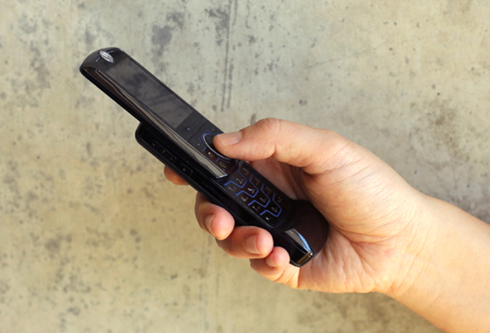
Figure 9-5. Motorola RIZR Z3 slider phone (photo credit: Kuen Chang)
Why does this mechanism feel good enough to invite repeated nonfunctional triggering? For one, the sliding movement is dampened, with a spring providing slight resistance until it reaches a catch point where the force is reversed and the cover is accelerated to its final open state. This avoids accidental opening, but also results in a satisfying âpopâ sound as the mechanism takes over and amplifies the action. Sliding is also easy to perform discreetly with one hand, without requiring wrist or arm movements.
Purely digital products can also exhibit moments that cause delight through repetition. One example is the âbounceâ animation at the bottom of a scroll view in Appleâs iOS. As the user swipes their finger upward, the list scrolls up and off the screen, but the scrolling doesnât stop abruptly when the bottom is reached. There is a subtle animation where the whole list pulls up slightly farther than the last list item, before easing back to let the final entry sit at the bottom of the screen.
The functional reason for the scroll view bounce is to act as feedback that the user has reached the bottom of the list. However, even though the animation is purely visual, it âfeelsâ good enough that one can find oneself scrolling again and again to watch the list bounce back. Some apps have built upon this expectation to provide unique and equally addictive animations. For example, the Yahoo! News Digest app has a large image at the top of each story that zooms in and then snaps back to normal size as the user scrolls upward and lets go.
In many mobile apps, a downward pulling gesture at the top of a list triggers a refresh of content from the server, usually accompanied by an animation. Although done for functional reasons, this action can be addictive as well, leading to repeated pulling well before any realistic expectation of new content being available. A client with a mobile app that has millions of users once shared that repeated pull-to-refresh was so pervasive it had to limit the actual server request to only once every 30 seconds, faking the animated feedback for repeated requests within that time period. Itâs a good reminder that addictive actions can bring delight and appeal to a product, but one should be careful of their unintended consequences, whether itâs the need for a physical hinge thatâs rated for a high number of openings or avoiding a server overload.
Delightful Reaction
Lids, switches, and sliders can be satisfying to use, providing direct sensorial feedback that confirms an action and, in the best instances, feels good in the process. However, direct feedback is only one way a product can engage our senses. By reacting to our presence, intention, and continued engagement, a product can be inviting and delightful, coming to life in unique and surprising ways.
The Danish high-end audio manufacturer Bang & Olufsen (B&O) is known for its unique product designs that push the limits of technology to explore new form factors and interaction paradigms. In 1991, as popular music was shifting from analog to digital formats, B&O released the Beosystem 2500, designed by the late David Lewis. The Beosystem 2500, shown in Figure 9-6, is an all-in-one stereo featuring a CD player, cassette deck, and AM/FM radio in an extremely flat vertical design, flanked by a pair of equally flat speakers.
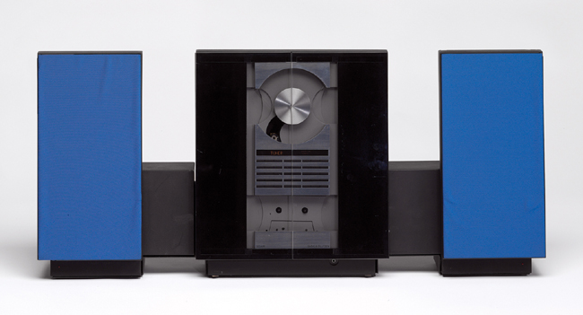
Figure 9-6. Bang & Olufsen Beosystem 2500 (photo credit: Bang & Olufsen)
Doors made of smoked glass cover the front of the Beosystem 2500, further emphasizing the flatness of the design. Raising a hand within 10 centimeters of the doors causes them to automatically glide open and turns on an interior light, illuminating the now accessible audio controls. When the hand is removed, the doors close automatically after a 15-second delay, with the lights remaining on to accompany the audio, or turning off if no music is playing.18
The use of automatic motion to signal readiness and recognition of intention gives the Beosystem 2500 a sense of life and personality. It lends the stereo a magical quality, and reframes the doors as the âfaceâ of the product, giving them a character beyond their merely functional purpose. The detection of presence and corresponding motion is fairly limited and crude in comparison to todayâs advanced capabilities, and yet it is enough to provide a sense of animation and lifelike personality.
Another design element that contributes to the sensorial quality of the Beosystem 2500 is the transparent cover on the vertically oriented compact disc holder. As the CD plays, the spinning artwork can be seen through the glass doors, providing a unique visual reference to accompany the audio experience. This celebration of the disc itself is a departure from the popular CD tray mechanisms of the time, which completely enclosed the disc, treating it as a hidden key to unlock the audio.
The Axor Starck V faucet by Hansgrohe, shown in Figure 9-7, also uses transparency to bring an experience to life, but in a more natural and analog way. Created in collaboration with the French designer Philippe Starck, this clear faucet is made of crystal glass that showcases a unique water vortex created by its base. The faucet design is minimal, acting as a platform to support and celebrate the natural beauty of the swirling water, the texture of its motion, and the sound it creates as the vortex moves upward and flows into the basin.

Figure 9-7. Axor Starck V (photo credit: Uli Maier for Axor/Hansgrohe SE)
Turning on the faucet is a delightful experience because of how it engages the senses unexpectedly, turning a mundane event into a rich and surprising experience. The Axor Starck V highlights the notion of design as an amplification of what is already there, recognizing the potential of water to engage the senses in new ways and providing support for that unique experience to happen.
Reaction Versus Feedback
These two very different products instill delight through their reaction to a personâs presence and actions, which goes beyond mapping input to output. They foster more of a conversation, where a person signals intent and the product takes over to enable or perform a multipart sensorial experience. Whether itâs the choreographed movement of doors and lighting or the swirling vortex of water with its dramatic beginning and ending scenes, the response takes place over time and relies heavily on motion to engage and communicate with us. It is a conversation, and the speaking role has briefly passed to the product, while still feeling under our control.
In a purely digital product, a change of state can be done instantaneously, but it has become common for interaction designers to utilize physics-based motion algorithms to design transitions that feel more ânatural.â One example is Tweetbot for iPhone, which allows a user to close out of an image detail view by flicking the photo in any direction, causing it to animate off screen in proportion to the speed, direction, and angle of the userâs gesture. The result feels much richer than a simple close button, although ultimately this animated reaction is an abstraction that relates only generically to physical forces, with no intrinsic relationship to the content being acted upon.
As physical products become increasingly embedded with computation and network connectivity, they are able to react not only to a userâs direct physical presence but to changes in remote data as well. Designers of such products should focus on reactions with an innate connection to the specific material or subject they are working with, resisting the full abstraction that the digital world makes possible.
Itâs great that our products can keep track of changes in remote data, but when the object reacts to a change and starts a conversation with us, it should be done in a manner that strongly communicates the meaning of the data itself. Otherwise, our environments will be full of objects trying to engage our senses without us knowing how to interpret their messages. An instructive comparison can be found in two of the simplest, and earliest, explorations of physical objects representing remote data: Ambient Orb and Availabot.
Ambient Orb, the first product made by the company Ambient Objects in 2002, is a frosted glass orb with a glowing programmable light inside of it (see Figure 9-8). The color of the light can be associated with variable data sources, and the value of the data is mapped to the glowing hue of the orb. The concept behind the design is to provide glanceable information without a screen, which the Ambient Orb achieves, but only through an abstraction that requires a person to have a clear mental model of the programmed ruleset. It works well as an early demonstration of what might be possible with networked objects, but scales poorly in a world full of such objects. Imagine everyone in your family having to remember why the orb on the kitchen counter is now glowing green when it used to be blue. Does it mean the same thing as the green orb in the bedroom?
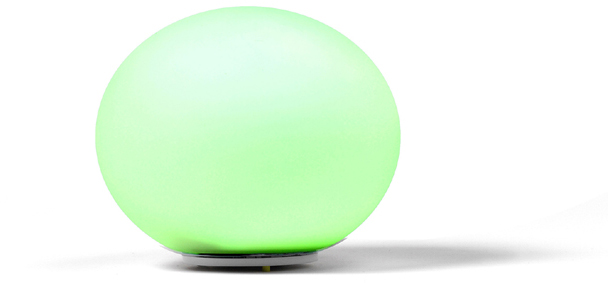
Figure 9-8. Ambient Orb (photo credit: Ambient Devices Inc.)
On the other side of the spectrum, moving from abstract to concrete representation, is Availabot,19 a physical representation of a friendâs instant messenger presence (see Figure 9-9). Created by Schulze & Webb in 2007, Availabot is a bendy, plastic avatar customized to look similar to a specific person. This hinged likeness unambiguously communicates a specific personâs availability, standing straight at attention when they are online, or collapsing in a heap when they go away. The idea was that Availabot could utilize rapid prototyping capabilities to economically create one-off representations that were truly unique for each person they represented. Unfortunately, the product was never brought to market after initial talks with a toy company.20 Regardless, it is instructive as an example of a delightful physical reaction to remote data (although of course it has the opposite problem of the Ambient Orb in that it can only ever represent one thing).
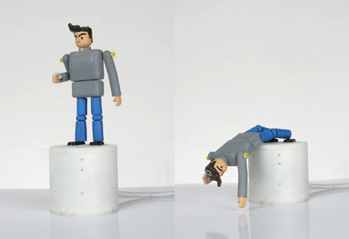
Figure 9-9. Availabot (photo credit: BERG)
Somewhere between these poles is the sweet spot for Internet of Things devices that react to remote data. Too much abstraction, and the device is speaking in hidden codes that feel too machine-like and mysterious. Too concrete, and the device is too limited to find commercial success or justify space in a personâs home.
Audio Feedback
The sounds that a physical product makes can be classified into two categories: inherent and additive. Inherent sounds emerge from choices in form and materials, while additive sounds are abstractions played through speakers. For many products, both kinds of sound must be addressed, to provide desired feedback and avoid sounds that detract from the experience.
Consider the example of a car, where the inherent sound of a door closing can convey the quality of materials and construction, while the additive sound of reminding a driver to buckle their seatbelt must get their attention without being annoying. Emar Vegt is an industrial designer and musician, working at BMW to design the aural qualities of each vehicle. He notes that there are âsounds caused by the gears and differential, and the tyres on the road, and air passing over the mirrors. All of this we can influence.â21 Beyond eliminating unwanted noise, he describes how sound is a big part of branding: âA Mini, for example, is playful and joyful and the sound of the car has to reflect that, so we modulate the exhaust to give a sporty, impulsive sound. By contrast, a 7 Series has to be very quiet. The driver wants to be in his own zone, so there is lots of damping and insulation.â22
As connected physical products begin representing more complex states and remote data, there is an increased need for additive sounds to convey more abstract feedback. Interaction designers are likely familiar with this kind of aural experience, as the sound that can augment screen-based products is always additive in nature. Still, there are new challenges with audio feedback for physical products. Sound can be intrusive, even more so when it might come from anywhere. The user isnât always nearby, so what should the volume be? What kinds of sounds are appropriate for a productâs brand? Is a recorded voice welcoming, or a creepy disembodiment? These considerations are just as important to the overall experience as anything perceived through touch or vision.
New Frontiers: Designing for Smell and Taste
Two of our richest senses, smell and taste, are not often associated with design. However, the creation of objects that support these senses is an ancient practice, embodied best by the tea set, where rituals of assembly and service lead to hints of the aroma. Holding a teacup warms your hand without burning it, and the slow sipping of the tea forms a communal bond with other participants. Outside of classic and common serving items, designers today are increasingly finding new ways to collaborate with chefs and food companies to design with smell and taste in mind, forging a new frontier for sensorial design.
Martin Kastner is the founder and principal of Crucial Detail, a studio in Chicago that specializes in custom pieces to support unique culinary experiences. Martin is best known for his work designing serviceware concepts for Alinea, the 3-star Michelin restaurant founded by chef Grant Achatz. That collaboration has extended to other restaurants owned by Achatz, including The Aviary, a cocktail bar that prides itself on serving drinks with the same level of attention as a fine dining restaurant.
At The Aviary, one of the most popular creations by Crucial Studio is the Porthole Infuser,23 a round vessel that presents the ingredients of a patronâs cocktail between two flat panes of glass, emphasizing the transformative action of the steeping process and building anticipation for the cocktailâs taste. The Porthole Infuser, shown in Figure 9-10, takes a part of the preparation process that is normally hidden and brings it directly to the table, providing time for the drinker to contemplate the ingredients on display, creating a mental checklist for the tongue to seek out when they take their first sip.
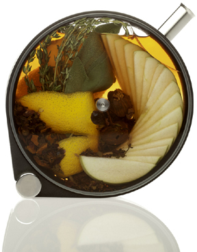
Figure 9-10. Porthole Infuser by Crucial Detail (photo credit: Lara Kastner Photography)
The popularity of the Porthole Infuser at The Aviary led Kastner to create a Kickstarter campaign24 to fund the additional design and manufacturing required to release it as a commercial product. Support for the project was dramatic, achieving 25 times more funding than originally requested. This backing set the course for a redesign that allowed the infuser to be manufactured at scale and sold for only $100, down from the several hundred dollars that each custom-constructed Aviary version cost.
The Porthole Infuser is marketed as more than a cocktail tool, working equally well to support the smell and taste of oils, teas, or other infusion recipes. It is an example of how designers can enhance the dining experience, not by crafting the smell or taste of the food itself, but by working in collaboration with a chef to heighten our awareness of those senses.
Much of what we eat today comes in packages, rectangular boxes that homogenize our food into the same shapes and textures without regard to their smell or taste. Japanese designer Naoto Fukasawa explored how food packaging could more fully engage our senses in his âHapticâ Juice Skin submission to the Takeo Paper Show in 2014 (see Figure 9-11).
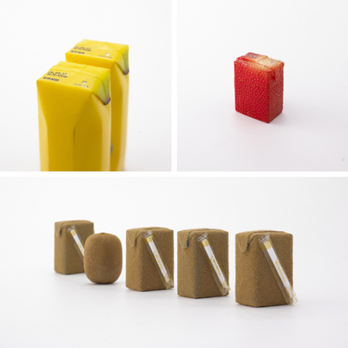
Figure 9-11. Juice Skin, âHAPTICâAwakening the Sensesâ; TAKEO PAPER SHOW 2004 (photo credit: Masayoshi Hichiwa)
Fukasawa created various juice boxes, each with a covering and structure that invokes the skin of the relevant fruit. The banana milk package has the rubbery texture of a real banana skin, along with faceted edges and the ubiquitous oval sticker on the side. The strawberry juice box is square in shape, but richly textured using real seeds. The kiwifruit juice box, as you might expect, is brown and fuzzy to emulate the unique feeling of that fruitâs natural shell.
In simulating the color and texture of the fruitâs skin, Fukasawa hoped to reproduce the feeling of real skin, invoking a more holistic sensory moment as the juice was consumed.25 Although designed as a concept for an exhibition, the banana packaging was actually produced commercially for a limited time by the TaKaRa company. The production run looked quite similar to the exhibition version, but unfortunately without the simulated texture.26
How might interaction designers support smell and taste? This is a truly new and underexplored territory, but there are signs of interest and one-off experiments happening that point toward a potential role. One of the most engaging speakers at the IxDA Interaction 2014 conference in Amsterdam was Bernard Lahousse, who gave a talk entitled âFood = Interaction.â27 Lahousse, who has a bioengineering background, works at the intersection of food and science to truly design for taste itself. He founded the The Foodpairing Company, which provides an online tool and API for chefs, mixologists, and foodies to explore and be inspired by potential food combinations through a science-based recommendation engine.28
In Lahousseâs Interaction â14 presentation he shared how itâs not only the flavor pairings themselves that contribute to the smell and taste the environment and manner in which we eat can also have a dramatic effect. The design of packaging and utensils is one part of this, but he also gave examples of chefs who are creating interactive, even game-like eating experiences. One restaurant he highlighted uses room temperature, sound, and projections to design an environment that alters and enhances the smell and taste of the food. These augmented dining environments are one area in which interaction designers could contribute their expertise to support the full range of human senses.
An Orchestration of the Senses
Interaction designers have always tried to engage peopleâs senses, but in comparison to the tangible output of industrial design, the options to do so have historically been limited. When designing for the screen the best option has often been simulation, using metaphor and connotation to invoke a sensorial experience beyond what can truly be offered.
The introduction of the graphical user interface was the first major advancement in engaging the senses through a screen. The next leap forward was the âmultimediaâ era, bringing sound, motion, and interactivity together in unique and immersive environments. Multimedia was initially made possible through cheap CD-ROM storage, which offered access to large graphics and video files that were impractical to store on small hard drives or download over slow Internet connections.
Interaction designers of the multimedia era often utilized the new capabilities of CD-ROMs to break away from standard interface conventions and mimic as many sensorial, real-world elements as possible. Map interfaces looked like faded and stained treasure maps, deep drop-shadows created virtual depth, and richly textured environments launched users into immersive 3D worlds. This was a time of widely variable interface experimentation, as designers combined text, graphics, audio, video, and animation in unique ways to make encyclopedias, video games, and educational programs that simply werenât practical before CD-ROMs.
Referencing physical materials and properties also found its way into standard programs and operating systems. Apple first introduced the brushed metal interface style, which later became a dominant feature of its OS X operating system, with QuickTime 4.0. By 2004, Apple had canonized the brushed metal in its Human Interface Guidelines (HIG), encouraging designers to use the visual treatment if their programs strove âto recreate a familiar physical deviceâcalculator or DVD player, for example.â29 This visual reference to a physical material was less sensorial than metaphorical, acting as a bridge to ostensibly enhance usability and understanding as behaviors transitioned from physical to digital devices. This was the same rationale employed for the early versions of Appleâs iOS, and over time both operating systems evolved to use simpler UI styles once users became familiar with the platforms.
Obviously, visual references to physical materials cannot engage our senses in the same way as their physical counterparts. Graphics that look like leather, felt, steel, or linen are often little more than interface decoration. The sensorial limitations of these graphic treatments highlights the distinction between interface and interaction design. Static pixels on a screen can only engage us visually, and in most instances should avoid invoking additional senses they canât deliver on. But interaction design goes beyond the interface to encompass all the moments of interaction that a person has with a system over time.
This is why interaction designers tend to think of their work in terms of âflows,â focusing equally (or more) on the connections between states, the various inputs and outputs that are possible at that moment. This focus on the in-between makes time itself a kind of design material. It is not so much that interaction designers are manipulating a userâs sense of timeâalthough elements like progress bars do try to ease waitingâbut that they are using this fourth dimension as a connective platform to combine information, choices, and responses.30 Time is a kind of stage from which to orchestrate sensorial engagement into a set of dynamic movements.
On a computer, or mobile device, this orchestration of interaction possibilities and system feedback can utilize animation, translucency, figure/ground relationships, color, sound, and standardized notifications to facilitate engagement with the system over time. But how does this work when we move beyond the screen? When a physical product is embedded with computation and network connectivity, it transforms from an object to a system. A traditional product has discrete and predictable interactions that take place within a defined session, but once it becomes a system the sequence of interactions is less predictable and takes place over a longer period of time.
Consider the previously discussed Beosystem 2500, where the opening and closing of the stereoâs doors represents three clear states, forming a beginning, middle, and end to the experience. Compare that to the range of possible states and behaviors that a connected, computationally controlled stereo might have. Beyond reacting to your raised hand, it could detect your presence in the room as a specific individual. It could respond to your gestures or voice, highlight or hide relevant modes based on nearby media or subscription status, allow for use of remote speakers, adapt the volume based on time of day, offer you new music by your favorite bands, start music playing just before you enter the houseâthe possibilities are almost limitless.
How could this hypothetical stereo enable and allow for this expanded set of interaction possibilities? One approach would be to put the majority of interactions on a screenâperhaps a tablet on a stand in the living room. However, as David Rose of the MIT Media Lab refers to it, the next era of computing is more likely to be full of âenchanted objects,â31 where interactions with our products and environment are more natural, more physical, and less reliant on a glowing rectangle to control everything.
As physical products become increasingly integrated with digital systems, interaction designers should avoid defaulting to a screen for everything. Computational sensors can be used as richer and more natural inputs, detecting and making inferences from changes in light, temperature, motion, location, proximity, and touch. Output can move beyond a screen with voice feedback, haptic actuators, light arrays, and projection.
In utilizing this mix of inputs and outputs, screen-based interaction patterns should not always be translated directly into the physical environment. Getting a notification on your phone might be unobtrusive, but having it spoken aloud in your living room might be less desirable. In the same way, there is a danger in assuming that a gesture or sensor-based input is necessarily more natural. If users need to develop a new mental model of how a product âseesâ them, or detects their presence, then the illusion breaks down. An example of this can be found in many airport or hotel bathrooms, where people wave their hands in frustration near unfamiliar sink fixtures in an attempt to discover how the sensor is triggered.
The technology may be new, but designers need not start from scratch as they wrestle with orchestrating good experiences that span the digital and physical. As more complex behaviors move off the screen, interaction designers should augment their knowledge of digital systems with over a centuryâs worth of industrial design lessons on how to engage the full range of human senses.
1 âTech Box,â IDEO, accessed January 25, 2015, http://www.ideo.com/work/tech-box/.
2 Barbro Kulvik and Antti Siltavuori, The DNA of a Design: 40 Years, 1967â2007 (Helskinki: Fiskars, 2007).
3 âOur Heritage: From 1649 to the Present,â Fiskars, accessed January 11, 2016, http://www.fiskarsgroup.com/about-us/our-heritage.
4 âOlof Backstrom. Scissors (1960),â The Museum of Modern Art, accessed January 25, 2015, http://www.moma.org/collection/object.php?object_id=3250.
5 âSmart Design, New York. Good Grips Peeler (1989),â The Museum of Modern Art, accessed January 25, 2015, http://www.moma.org/collection/object.php?object_id=3758.
6 âAbout OXO,â OXO, accessed January 25, 2015, http://www.oxo.com/AboutOXO.aspx.
7 âFAQs,â OXO, accessed January 25, 2015, http://www.oxouk.com/faq.aspx.
8 âIdentifying New Ideas for Breakthrough Products,â November 20, 2001, accessed January 25, 2015, http://www.ftpress.com/articles/article.aspx?p=24132&seqNum=4.
9 âLeica T Camera System,â Leica Camera, accessed January 25, 2015, http://bit.ly/1Ip0JE4.
10 âThe Most Boring Ad Ever Made?â Vimeo, accessed January 25, 2015, https://vimeo.com/92073118.
11 âLeica Creates M9-P Hermès 18MP Rangefinder Special Editions,â Digital Photography Review, May 10, 2012, accessed January 25, 2015, http://bit.ly/1Ip0N6S.
12 Nils B. Jostmann, Daniël Lakens, and Thomas W. Schubert, âWeight as an Embodiment of Importance,â Psychological Science 20:9 (September 2009): 1169â1174.
13 âThen and Now,â Zippo, accessed January 25, 2015, http://www.zippo.com/about/article.aspx?id=1574.
14 âProminent Designs Symbolize Generations of Korean Lives,â Korea.net, February 5, 2009, accessed January 25, 2015, http://bit.ly/1mrKmx5.
15 â[íêµë§ì ëìì¸] âêµë¯¼ ë³¼íâ 모ë미 153,â Chosun.com, February 16, 2009, accessed January 25, 2015, http://bit.ly/1mrKsEV.
16 âThe 20 Bestselling Mobile Phones of All Time,â The Telegraph, accessed January 25, 2015, http://bit.ly/1Ip135O.
17 âMobile Phone Evolution: Story of Shapes and Sizes,â GSMArena.com, July 15, 2010, accessed January 25, 2015, http://bit.ly/1mrKEUG.
18 âBeosystem 2500,â BeoPhile.com, accessed January 25, 2015, http://bit.ly/1Ip1k8Q.
19 âAvailabot,â BERG, accessed January 20, 2015, http://berglondon.com/projects/availabot.
20 âOFF=ON, or, Whatever Happened to Availabot?â BERG, September 2, 2008, accessed January 14, 2015, http://bit.ly/1mrLbpz.
21 David Baker, âDid You Know BMWâs Door Click Had a Composer? Itâs Emar Vegt, an Aural Designer,â Wired, March 21, 2013, accessed October 28, 2015, http://bit.ly/1Ip1w8f.
22 Ibid.
23 âThe Porthole Infuser by Crucial Detail,â accessed January 25, 2015, http://bit.ly/1Ip1z3J.
24 âThe Porthole,â Kickstarter, accessed January 25, 2015, http://kck.st/1Ip1DjY.
25 Naoto Fukasawa, Naoto Fukasawa (London: Phaidon, 2007), 112â113.
26 âNaoto Fukasawa JUICEPEEL Packaging (Revisited),â Box Vox, September 16, 2014, accessed January 25, 2015, http://bit.ly/1Ip1PzM.
27 âFood = interaction,â Interaction14, accessed January 25, 2015, http://bit.ly/1MllFqV.
28 âHome page,â Foodpairing, accessed January 25, 2015, http://www.foodpairing.be.
29 âBrushed Metal and the HIG,â Daring Fireball, October 16, 2004, accessed January 25, 2015, http://daringfireball.net/2004/10/brushedmetal.
30 âDefining Interaction Design,â Luke Wroblewski, Ideation + Design, April 14, 2006, accessed January 25, 2015, http://www.lukew.com/ff/entry.asp?327.
31 David Rose, Enchanted Objects: What They Are, How to Create Them, and How They Will Improve Our Lives (New York: Scribner, 2014).
Get Designing for the Internet of Things now with the O’Reilly learning platform.
O’Reilly members experience books, live events, courses curated by job role, and more from O’Reilly and nearly 200 top publishers.

