Introduction
This book aims to get you up to speed with what is, in my opinion, the most powerful data visualization stack going: Python and JavaScript. You’ll learn enough about big libraries like Pandas and D3 to start crafting your own web data visualizations and refining your own toolchain. Expertise will come with practice, but this book presents a shallow learning curve to basic competence.
Note
If you’re reading this, I’d love to hear any feedback you have. Please post it to pyjsdataviz@kyrandale.com. Thanks a lot.
You’ll also find a working copy of the Nobel visualization the book literally and figuratively builds toward at http://kyrandale.com/static/pyjsdataviz/index.html.
The bulk of this book tells one of the innumerable tales of data visualization, one carefully selected to showcase some powerful Python and JavaScript libraries and tools which together form a toolchain. This toolchain gathers raw, unrefined data at its start and delivers a rich, engaging web visualization at its end. Like all tales of data visualization, it is a tale of transformation—in this case, transforming a basic Wikipedia list of Nobel Prize winners into an interactive visualization, bringing the data to life and making exploration of the prize’s history easy and fun.
A primary motivation for writing the book is the belief that, whatever data you have and whatever story you want to tell with it, the natural home for the visualizations you transform it into is the Web. As a delivery platform, it is orders of magnitude more powerful than what came before, and this book aims to smooth the passage from desktop- or server-based data analysis and processing to getting the fruits of that labor out on the Web.
But the most ambitious aim of this book is to persuade you that working with these two powerful languages toward the goal of delivering powerful web visualizations is actually fun and engaging.
I think many potential dataviz programmers assume there is a big divide between web development and doing what they would like to do, which is program in Python and JavaScript. Web development involves loads of arcane knowledge about markup languages, style scripts, and administration, and can’t be done without tools with strange names like Gulp or Yeoman. I aim to show that, these days, that big divide can be collapsed to a thin and very permeable membrane, allowing you to focus on what you do well: programming stuff (see Figure P-1) with minimal effort, relegating the web servers to data delivery.
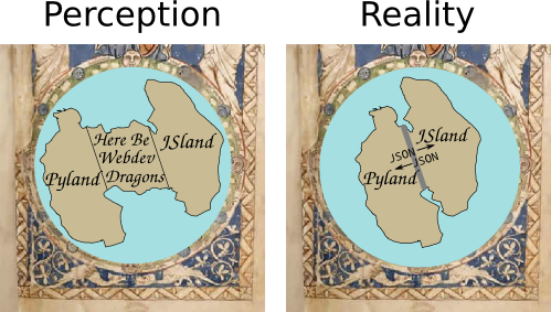
Figure P-1. Here be webdev dragons
Who This Book Is For
First off, this book is for anyone with a reasonable grasp of Python or JavaScript who wants to explore one of the most exciting areas in the data-processing ecosystem right now: the exploding field of data visualization for the Web. It’s also about addressing some specific pain points that in my experience are quite common.
When you get commissioned to write a technical book, chances are your editor will sensibly caution you to think in terms of pain points that your book could address. The two key pain points of this book are best illustrated by way of a couple of stories, including one of my own and one that has been told to me in various guises by JavaScripters I know.
Many years ago, as an academic researcher, I came across Python and fell in love. I had been writing some fairly complex simulations in C++, and Python’s simplicity and power was a breath of fresh air from all the boilerplate Makefiles, declarations, definitions, and the like. Programming became fun. Python was the perfect glue, playing nicely with my C++ libraries (Python wasn’t then and still isn’t a speed demon) and doing, with consummate ease, all the stuff that is such a pain in low-level languages (e.g., file I/O, database access, and serialization). I started to write all my graphical user interfaces (GUIs) and visualizations in Python, using wxPython, PyQt, and a whole load of other refreshingly easy toolsets. Unfortunately, although I think some of these tools are pretty cool and would love to share them with the world, the effort required to package them, distribute them, and make sure they still work with modern libraries represents a hurdle I’m unlikely to ever overcome.
At the time, there existed what in theory was the perfect universal distribution system for the software I’d so lovingly crafted—namely, the web browser. Web browsers were (and are) available on pretty much every computer on Earth, with their own built-in, interpreted programming language: write once, run everywhere. But Python didn’t play in the web browser’s sandpit and browsers were incapable of ambitious graphics and visualizations, being pretty much limited to static images and the odd jQuery transformation. JavaScript was a “toy” language tied to a very slow interpreter that was good for little DOM tricks but certainly nothing approaching what I could do on the desktop with Python. So that route was discounted, out of hand. My visualizations wanted to be on the Web, but there was no route through.
Fast forward a decade or so and, thanks to an arms race initiated by Google and their V8 engine, JavaScript is now orders of magnitude faster; in fact, it’s now an awful lot faster than Python.1 HTML has also tidied up its act a bit, in the guise of HTML5. It’s a lot nicer to work with, with much less boilerplate code. What were loosely followed and distinctly shaky protocols like Scalable Vector Graphics (SVG) have firmed up nicely, thanks to powerful visualization libraries, D3 in particular. Modern browsers are obliged to work nicely with SVG and, increasingly, 3D in the form of WebGL and its children such as THREE.js. The visualizations I was doing in Python are now possible on your local web browser, and the payoff is that, with very little effort, they can be made accessible to every desktop, laptop, smartphone, and tablet in the world.
So why aren’t Pythonistas flocking to get their data out there in a form they dictate? After all, the alternative to crafting it yourself is leaving it to somebody else, something most data scientists I know would find far from ideal. Well, first there’s that term web development, connoting complicated markup, opaque stylesheets, a whole slew of new tools to learn, IDEs to master. And then there’s JavaScript itself, a strange language, thought of as little more than a toy until recently and having something of the neither fish nor fowl to it. I aim to take those pain points head-on and show that you can craft modern web visualizations (often single-page apps) with a very minimal amount of HTML and CSS boilerplate, allowing you to focus on the programming, and that JavaScript is an easy leap for the Pythonista. But you don’t have to leap; Chapter 2 is a language bridge that aims to help Pythonistas and JavaScripters bridge the divide between the languages by highlighting common elements and providing simple translations.
The second story is a common one among JavaScript data visualizers I know. Processing data in JavaScript is far from ideal. There are few heavyweight libraries, and although recent functional enhancements to the language make data munging much more pleasant, there’s still no real data-processing ecosystem to speak of. So there’s a distinct asymmetry between the hugely powerful visualization libraries available (D3, as ever, is the paramount library), and the ability to clean and process any data delivered to the browser. All of this mandates doing your data cleaning, processing, and exploring in another language or with a toolkit like Tableau, and this often devolves into piecemeal forays into vaguely remembered Matlab, the steepish learning curve that is R, or a Java library or two.
Toolkits like Tableau, although very impressive, are often, in my experience, ultimately frustrating for programmers. There’s no way to replicate in a GUI the expressive power of a good, general-purpose programming language. Plus, what if you want to create a little web server to deliver your processed data? That means learning at least one new web-development-capable language.
In other words, JavaScripters starting to stretch their data visualization are looking for a complementary data-processing stack that requires the least investment of time and has the shallowest learning curve.
Minimal Requirements to Use This Book
I always feel reluctant to place restrictions on people’s explorations, particularly in the context of programming and the Web, which is chock-full of autodidacts (how else would one learn with the halls of academia being light years behind the trends?), learning fast and furiously, gloriously uninhibited by the formal constraints that used to apply to learning. Python and JavaScript are pretty much as simple as it gets, programming-language-wise, and are both top candidates for best first language. There isn’t a huge cognitive load in interpreting the code.
In that spirit, there are expert programmers who, without any experience of Python and JavaScript, could consume this book and be writing custom libraries within a week. These are also the people most likely to ignore anything I write here, so good luck to you people if you decide to make the effort.
For beginner programmers, fresh to Python or JavaScript, this book is probably too advanced for you, and I recommend taking advantage of the plethora of books, web resources, screencasts, and the like that make learning so easy these days. Focus on a personal itch, a problem you want to solve, and learn to program by doing—it’s the only way.
For people who have programmed a bit in either Python or JavaScript, my advised threshold to entry is that you have used a few libraries together, understand the basic idioms of your language, and can look at a piece of novel code and generally get a hook on what’s going on—in other words, Pythonistas who can use a few modules of the standard library, and JavaScripters who can not only use JQuery but understand some of its source code.
Why Python and JavaScript?
Why JavaScript is an easy question to answer. For now and the foreseeable future, there is only one first class, browser-based programming language. There have been various attempts to extend, augment, and usurp, but good old, plain-vanilla JS is still preeminent. If you want to craft modern, dynamic, interactive visualizations and, at the touch of a button, deliver them to the world, at some point you are going to run into JavaScript. You might not need to be a Zen master, but basic competence is a fundamental price of entry into one of the most exciting areas of modern data science. This book hopes to get you into the ballpark.
Why Not Python on the Browser?
There are currently some very impressive initiatives aimed at enabling Python-produced visualizations, often built on Matplotlib, to run in the browser. They achieve this by converting the Python code into JavaScript based on the canvas or svg drawing contexts. The most popular and mature of these are Bokeh and the recently open-sourced Plotly. While these are both brilliant initiatives, I feel that in order to do web-based dataviz, you have to bite the JavaScript bullet to exploit the increasing potential of the medium. That’s why, along with space constraints, I’m not covering the Python-to-JavaScript dataviz converters.
While there is some brilliant coding behind these JavaScript converters and many solid use cases, they do have big limitations:
-
Automated code conversion may well do the job, but the code produced is usually pretty impenetrable for a human being.
-
Adapting and customizing the resulting plots using the powerful browser-based JavaScript development environment is likely to be very painful.
-
You are limited to the subset of plot types currently available in the libraries.
-
Interactivity is very basic at the moment. Stitching this together is better done in JavaScript, using the browser’s developer tools.
Bear in mind that the people building these libraries have to be JavaScript experts, so if you want to understand anything of what they’re doing and eventually express yourself, then you’ll have to get up to scratch with some JavaScript.
My basic take-home message regarding Python-to-JavaScript conversion is that it has its place but would only be generally justified if JavaScript were 10 times harder to program than it is. The fiddly, iterative process of creating a modern browser-based data visualization is hard enough using a first-class language without having to negotiate an indirect journey through a second-class one.
Why Python for Data Processing
Why you should choose Python for your data-processing needs is a little more involved. For a start, there are good alternatives as far as data processing is concerned. Let’s deal with a few candidates for the job, starting with the enterprise behemoth Java.
Java
Among the other main, general-purpose programming languages, only Java offers anything like the rich ecosystem of libraries that Python does, with considerably more native speed too. But while Java is a lot easier to program in than languages like C++, it isn’t, in my opinion, a particularly nice language to program in, having rather too much in the way of tedious boilerplate code and excessive verbiage. This sort of thing starts to weigh heavily after a while and makes for a hard slog at the code face. As for speed, Python’s default interpreter is slow, but Python is a great glue language that plays nicely with other languages. This ability is demonstrated by the big Python data-processing libraries like NumPy (and its dependent, Pandas), Scipy, and the like, which use C++ and Fortran libraries to do the heavy lifting while providing the ease of use of a simple, scripting language.
R
The venerable R has, until recently, been the tool of choice for many data scientists and is probably Python’s main competitor in the space. Like Python, R benefits from a very active community, some great tools like the plotting library ggplot, and a syntax specially crafted for data science and statistics. But this specialism is a double-edged sword. Because R was developed for a specific purpose, it means that if, for example, you wish to write a web server to serve your R-processed data, you have to skip out to another language with all the attendant learning overheads, or try to hack something together in a round-hole/square-peg sort of way. Python’s general-purpose nature and its rich ecosystem mean one can do pretty much everything required of a data-processing pipeline (JS visuals aside) without having to leave its comfort zone. Personally, it is a small sacrifice to pay for a little syntactic clunkiness.
Others
There are other alternatives to doing your data processing with Python, but none of them come close to the flexibility and power afforded by a general-purpose, easy-to-use programming language with a rich ecosystem of libraries. While, for example, mathematical programming environments such as Matlab and Mathematica have active communities and a plethora of great libraries, they hardly count as general purpose, because they are designed to be used within a closed garden. They are also proprietary, which means a significant initial investment and a different vibe to Python’s resoundingly open source environment.
GUI-driven dataviz tools like Tableau are great creations but will quickly frustrate someone used to the freedom to programming. They tend to work great as long as you are singing from their songsheet, as it were. Deviations from the designated path get painful very quickly.
Python’s Getting Better All the Time
As things stand, I think a very good case can be made for Python being the budding data scientist’s language of choice. But things are not standing still; in fact, Python’s capabilities in this area are growing at an astonishing rate. To put it in perspective, I have been programming in Python for over 15 years and have grown used to being surprised if I can’t find a Python module to help solve a problem at hand, but I find myself surprised at the growth of Python’s data-processing abilities, with a new, powerful library appearing weekly. To give an example, Python has traditionally been weak on statistical analysis libraries, with R being far ahead. Recently a number of powerful modules, such as StatsModel, have started to close this gap fast.
So Python is a thriving data-processing ecosystem with pretty much unmatched general purpose, and it’s getting better week by week. It’s understandable why so many in the community are in a state of such excitement—it’s pretty exhilarating.
As far as visualization in the browser, the good news is that there’s more to JavaScript than its privileged, nay, exclusive place in the web ecosystem. Thanks to an interpreter arms race that has seen performance increase in staggering leaps and bounds and some powerful visualization libraries such as D3, which would complement any language out there, JavaScript now has serious chops.
In short, Python and JavaScript are a wonderful complement for data visualization on the Web, each needing the other to provide a vital missing component.
What You’ll Learn
There are some big Python and JavaScript libraries in our dataviz toolchain, and comprehensive coverage of them all would require a number of books. Nevertheless, I think that the fundamentals of most libraries, and certainly the ones covered here, can be grasped fairly quickly. Expertise takes time and practice but the basic knowledge needed to be productive is, so to speak, low-hanging fruit.
In that sense, this book aims to give you a solid backbone of practical knowledge, strong enough to take the weight of future development. I aim to make the learning curve as shallow as possible and get you over the initial climb with the practical skills needed to start refining your art.
This book emphasizes pragmatism and best practice. It’s going to cover a fair amount of ground, and there isn’t enough space for too many theoretical diversions. I will aim to cover those aspects of the libraries in the toolchain that are most commonly used, and point you to resources for the other stuff. Most libraries have a hard core of functions, methods, classes, and the like that are the chief, functional subset. With these at your disposal, you can actually do stuff. Eventually, you’ll find an itch you can’t scratch with those, at which time good books, documentation, and online forums will be your friend.
The Choice of Libraries
I had three things in mind while choosing the libraries used in the book.
-
Open source and free as in beer—you shouldn’t have to invest any extra money to learn with this book.
-
Longevity—generally well-established, community-driven, and popular.
-
Best of breed (assuming good support and an active community), at the sweet spot between popularity and utility.
The skills you learn here should be relevant for a long time. Generally, the obvious candidates have been chosen—libraries that write their own ticket, as it were. Where appropriate, I will highlight the alternative choices and give a rationale for my selection.
Preliminaries
A few preliminary chapters are needed before beginning the transformative journey of our Nobel dataset through the toolchain. These cover the basic skills necessary to make the rest of the toolchain chapters run more fluidly. The first few chapters cover the following:
- Chapter 2
-
Building a language bridge between Python and JavaScript
- Chapter 3
-
How to pass around data with Python, through various file formats and databases
- Chapter 4
-
Covering the basic web development needed by the book
These chapters are part tutorial, part reference, and it’s fine to skip straight to the beginning of the toolchain, dipping back where needed.
The Dataviz Toolchain
The main part of the book demonstrates the data-visualization toolchain, which follows the journey of a dataset of Nobel Prize winners from raw, freshly scraped data to engaging, interactive JavaScript visualization. During the collection process, the refinement and transformation of a number of big libraries are demonstrated, summarized in Figure P-2. These libraries are the industrial lathes of our toolchain: rich, mature tools that demonstrate the power of the Python+JavaScript dataviz stack. The following sections contain a brief introduction to the five stages of our toolchain and their major libraries.
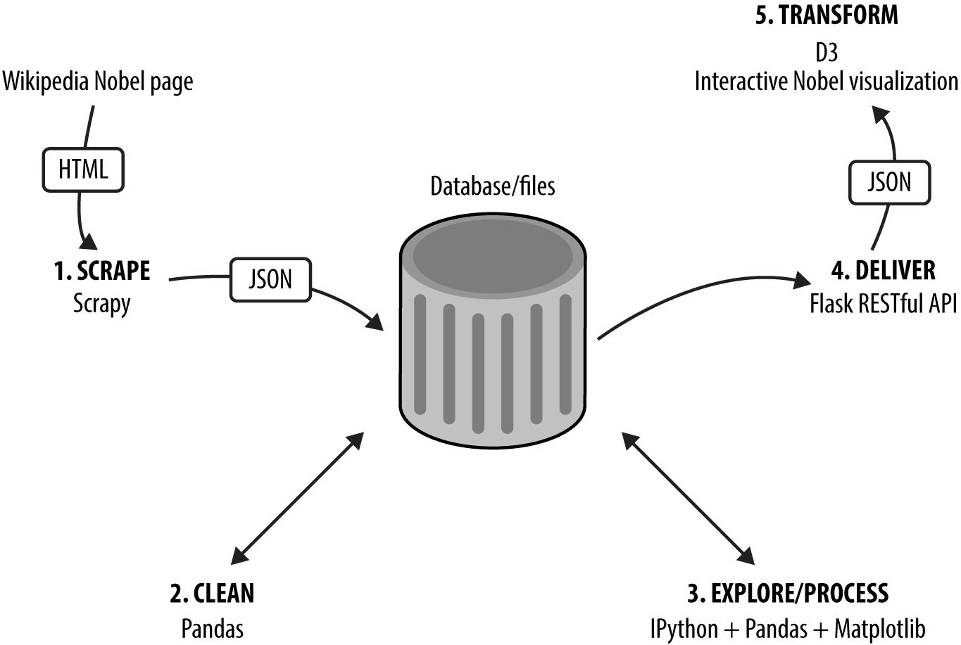
Figure P-2. The dataviz toolchain
1. Scraping Data with Scrapy
The first challenge for any data visualizer is getting hold of the data they need, whether by request or to scratch a personal itch. If you’re very lucky, this will be delivered to you in pristine form, but more often than not you have to go find it. I’ll cover the various ways you can use Python to get data off the Web (e.g., web APIs or Google spreadsheets). The Nobel Prize dataset for the toolchain demonstration is scraped from its Wikipedia pages using Scrapy.2
Python’s Scrapy is an industrial-strength scraper that does all the data throttling and media pipelining, which are indispensable if you plan on scraping significant amounts of data. Scraping is often the only way to get the data you are interested in, and once you’ve mastered Scrapy’s workflow, all those previously off-limits datasets are only a spider away.3
2. Cleaning Data with Pandas
The dirty secret of dataviz is that pretty much all data is dirty, and turning it into something you can use may well occupy a lot more time than anticipated. This is an unglamorous process that can easily steal over half your time, which is all the more reason to get good at it and use the right tools.
Pandas is a huge player in the Python data-processing ecosystem. It’s a Python data-analysis library whose chief component is the DataFrame, essentially a programmatic spreadsheet. Pandas extends NumPy, Python’s powerful numeric library, into the realm of heterogeneous datasets, the kind of categorical, temporal, and ordinal information that data visualizers have to deal with. As well as being great for interactively exploring your data (using its built-in Matplotlib plots), Pandas is well suited to the drudge-work of cleaning data, making it easy to locate duplicate records, fix dodgy date-strings, find missing fields, and so on.
3. Exploring Data with Pandas and Matplotlib
Before beginning the transformation of your data into a visualization, you need to understand it. The patterns, trends, and anomalies hidden in the data will inform the stories you are trying to tell with it, whether that’s explaining a recent rise in year-by-year widget sales or demonstrating global climate change.
In conjunction with IPython, the Python interpreter on steroids, Pandas and Matplotlib (with additions such as Seaborn) provide a great way to explore your data interactively, generating rich, inline plots from the command line, slicing and dicing your data to reveal interesting patterns. The results of these explorations can then be easily saved to file or database to be passed on to your JavaScript visualization.
4. Delivering Your Data with Flask
Once you’ve explored and refined your data, you’ll need to serve it to the web browser, where a JavaScript library like D3 can transform it. One of the great strengths of using a general-purpose language like Python is that it’s as comfortable rolling a web server in a few lines of code as it is crunching through large datasets with special-purpose libraries like NumPy and Scipy.4 Flask is Python’s most popular lightweight server and is perfect for creating small, RESTful5 APIs that can be used by JavaScript to get data from the server, in files or databases, to the browser. As I’ll demonstrate, you can roll a RESTful API in a few lines of code, capable of delivering data from SQL or NoSQL databases.
5. Transforming Data into Interactive Visualizations with D3
Once the data is cleaned and refined, we have the visualization phase, where selected reflections of the dataset are presented, ideally allowing the user to explore them interactively. Depending on the data, this might involve bar charts, maps, or novel visualizations.
D3 is JavaScript’s powerhouse visualization library, arguably one of the most powerful visualization tools irrespective of language. We’ll use D3 to create a novel Nobel Prize visualization with multiple elements and user interaction, allowing people to explore the dataset for items of interest. D3 can be challenging to learn, but I hope to bring you quickly up to speed and ready to start honing your skills in the doing.
Smaller Libraries
In addition to the big libraries covered, there is a large supporting cast of smaller libraries. These are the indispensable smaller tools, the hammers and spanners of the toolchain. Python in particular has an incredibly rich ecosystem, with small, specialized libraries for almost every conceivable job. Among the strong supporting cast, some particularly deserving of mention are:
requests-
Python’s go-to HTTP library, fully deserving its motto “HTTP for humans.”
requestsis far superior to urllib2, one of Python’s included batteries. SQLAlchemy-
The best Python SQL toolkit and object-relational mapper (ORM) there is. It’s feature rich and makes working with the various SQL-based databases a relative breeze.
Seaborn-
A great addition to Python’s plotting powerhouse Matplotlib, adding some very useful plot types including some statistical ones of particular use to data visualizers. It also adds arguably superior aesthetics, overriding the Matplotlib defaults.
crossfilter-
Even though JavaScript’s data-processing libraries are a work in progress, a few really useful ones have emerged recently, with
crossfilterbeing a stand-out. It enables very fast filtering of row-columnar datasets and is ideally suited to dataviz work, which is unsurprising because one of its creators is Mike Bostock, the father of D3.
Using the Book
Although the book’s different parts follow a process of data transformation, this book doesn’t need to be read cover to cover. The first part provides a basic toolkit for Python- and JavaScript-based web dataviz and will inevitably have content that is familiar to many readers. Cherry-pick for the stuff you don’t know and dip back as required (there will be link backs further on, as required). The language learning bridge between Python and JavaScript will be unnecessary for those seasoned in both languages, although there may still be some useful nuggets.
The remaining parts of the book, following our toolchain as it transforms a fairly uninspiring web list into a fully fledged, interactive D3 visualization, are essentially self-contained. If you want to dive immediately into Part III and some data cleaning and exploration with Pandas, go right ahead, but be aware that it assumes the existence of a dirty Nobel Prize dataset. You can see how that was produced by Scrapy later if that fits your schedule. Equally, if you want to dive straight into creating the Nobel-viz app in parts Part IV and Part V, be aware that they assume a clean Nobel Prize dataset.
Whatever route you take, I suggest eventually aiming to acquire all the basic skills covered in the book if you intend to make dataviz your profession.
A Little Bit of Context
This is a practical book and assumes that the reader has a pretty good idea of what he or she wants to visualize and how that visualization should look and feel, as well as a desire to get cracking on it, unencumbered by too much theory. Nevertheless, drawing on the history of data visualization can both clarify the central themes of the book and add valuable context. It can also help explain why now is such an exciting time to be entering the field, as technological innovation is driving novel dataviz forms, and people are grappling with the problem of presenting the increasing amount of multidimensional data generated by the Internet.
Data visualization has an impressive body of theory behind it and there are some great books out there that I recommend you read (see “Recommended Books” for a little selection). The practical benefit of understanding the way humans visually harvest information cannot be overstated. It can be easily demonstrated, for example, that a pie chart is almost always a bad way of presenting comparative data and a simple bar chart is far preferable. By conducting psychometric experiments, we now have a pretty good idea of how to trick the human visual system and make relationships in the data harder to grasp. Conversely, we can show that some visual forms are close to optimal for amplifying contrast. The literature, at its very least, provides some useful rules of thumb that suggest good candidates for any particular data narrative.
In essence, good dataviz tries to present data, collected from measurements in the world (empirical) or as the product of abstract mathematical explorations (e.g., the beautiful fractal patterns of the Mandlebrot set), in such a way as to draw out or emphasize any patterns or trends that might exist. These patterns can be simple (e.g., average weight by country), or the product of sophisticated statistical analysis (e.g., data clustering in a higher dimensional space).
In its untransformed state, we can imagine this data floating as a nebulous cloud of numbers or categories. Any patterns or correlations are entirely obscure. It’s easy to forget but the humble spreadsheet (Figure P-3 a) is a data visualization—the ordering of data into row-columnar form an attempt to tame it, make its manipulation easier, and highlight discrepancies (e.g., actuarial bookkeeping). Of course, most people are not adept at spotting patterns in rows of numbers so more accessible, visual forms were developed to engage with our visual cortex, the prime human conduit for information about the world. Enter the bar chart, pie chart,6 and line chart. More imaginative ways were employed to distill statistical data in a more accessible form, one of the most famous being Charles Joseph Minard’s visualization of Napoleon’s disastrous Russian campaign of 1812 (Figure P-3 b).
The tan-colored stream in Figure P-3 b shows the advance of Napoleon’s army on Moscow; the black line shows the retreat. The thickness of the stream represents the size of Napoleon’s army, thinning as casualties mounted. A temperature chart below is used to indicate the temperature at locations along the way. Note the elegant way in which Minard has combined multidimensional data (casualty statistics, geographical location, and temperature) to give an impression of the carnage, which would be hard to grasp in any other way (imagine trying to jump from a chart of casualties to a list of locations and make the necessary connections). I would argue that the chief problem of modern interactive dataviz is exactly the same as that faced by Minard: how to move beyond conventional one-dimensional bar charts (perfectly good for many things) and develop new ways to communicate cross-dimensional patterns effectively.
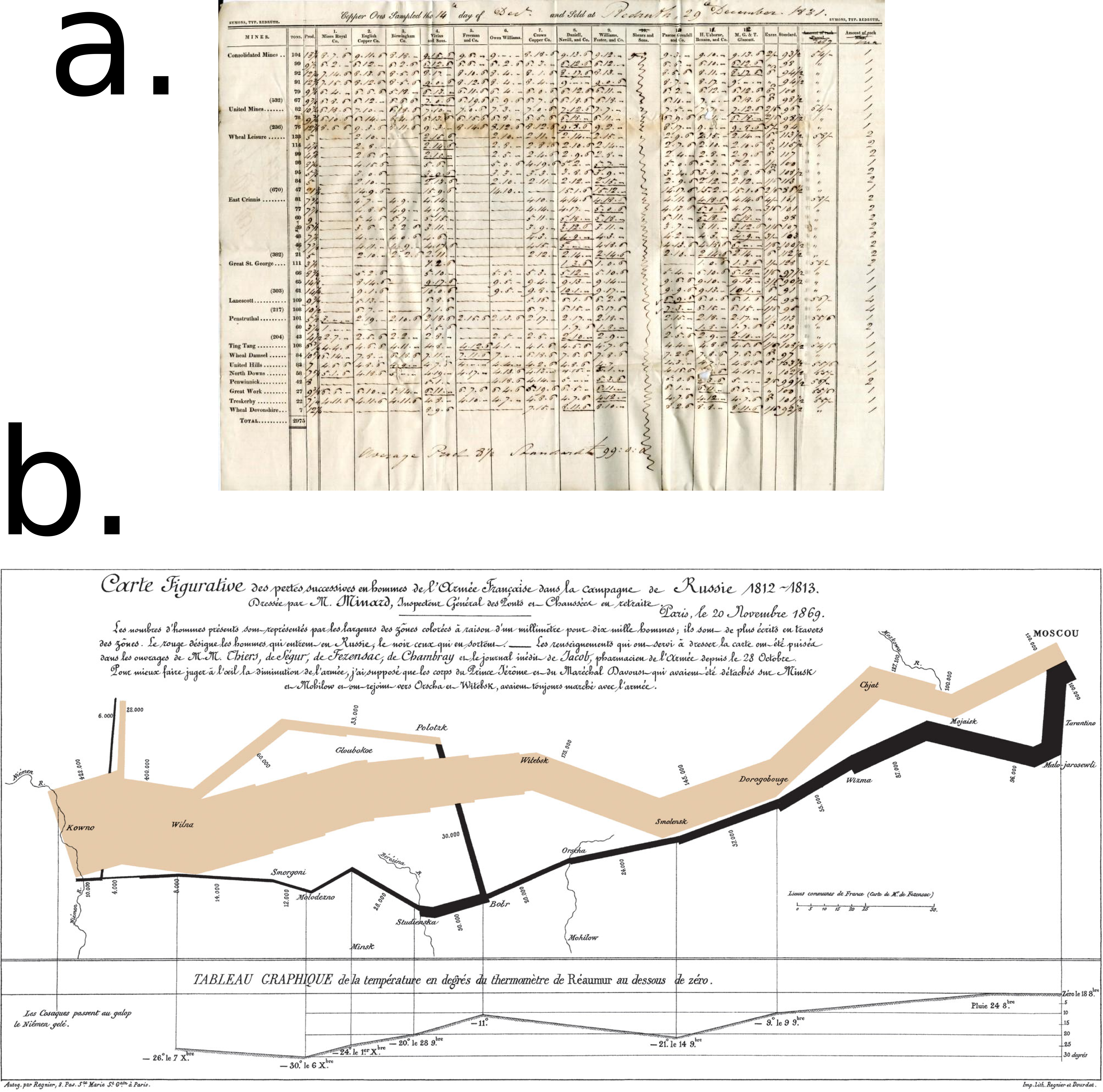
Figure P-3. (a) An early spreadsheet and (b) Joseph Minard’s visualization of Napoleon’s Russian campaign of 1812
Until quite recently, most of our experience of charts was not much different from those of Charles Minard’s audience. They were pre-rendered and inert, and showed one reflection of the data, hopefully an important and insightful one but nevertheless under total control of the author. In this sense, the replacement of real ink points with computer screen pixels was only a change in the scale of distribution.
The leap to the Internet just replaced newsprint with pixels, the visualization still being unclickable and static. Recently, the combination of some powerful visualization libraries (D3 being preeminent among them) and a massive improvement in JavaScript’s performance have opened the way to a new type of visualization, one that is easily accessible and dynamic, and actually encourages exploration and discovery. The clear distinction between data exploration and presentation is blurred. This new type of data visualization is the focus of this book and the reason why dataviz for the Web is such an exciting area right now. People are trying to create new ways to visualize data and make it more accessible/useful to the end user. This is nothing short of a revolution.
Summary
Dataviz on the Web is an exciting place to be right now with innovations in interactive visualizations coming thick and fast, and many (if not most) of them being developed with D3. JavaScript is the only browser-based language, so the cool visuals are by necessity being coded in it (or converted into it). But JavaScript lacks the tools or environment necessary for the less dramatic but just as vital element of modern dataviz: the aggregation, curation, and processing of the data. This is where Python rules the roost, providing a general-purpose, concise, and eminently readable programming language with access to an increasing stable of first-class data-processing tools. Many of these tools leverage the power of very fast, low-level libraries, making Python data processing fast as well as easy.
This book introduces some of those heavyweight tools, as well as a host of other smaller but equally vital tools. It also shows how Python and JavaScript in concert represent the best dataviz stack out there for anyone wishing to deliver their visualizations to the Internet.
Up next is the first part of the book, covering the preliminary skills needed for the toolchain. You can work through it now or skip ahead to Part II and the start of the toolchain, referring back when needed.
Recommended Books
Here are a few key data-visualization books to whet your appetite, covering the gamut from interactive dashboards to beautiful and insightful infographics.
-
Tufte, Edward. The Visual Display of Quantitative Information. Graphics Press, 1983.
-
Ware, Colin. Information Visualization: Perception for Design. Morgan Kaufmann, 2004.
-
Rosenberg, Daniel. Cartographies of Time: A History of the Timeline. Princeton Architectural Press, 2012.
-
Few, Stephen. Information Dashboard Design: Displaying Data for at-a-glance Monitoring. Analytics Press, 2013.
-
Cairo, Alberto. The Functional Art. New Riders, 2012.
-
Bertin, Jacques. Semiology of Graphics: Diagrams, Networks, Maps. Esri Press, 2010.
1 See here for a fairly jaw-dropping comparison.
2 Web scraping is a computer software technique to extract information from websites, usually involving getting and parsing web pages.
3 Scrapy’s controllers are called spiders.
4 The scientific Python library, part of the NumPy ecosystem.
5 REST is short for Representational State Transfer, the dominant style for HTTP-based web APIs and much recommended.
6 William Playfair’s Statistical Breviary of 1801 having the dubious distinction of originating the pie chart.
Get Data Visualization with Python and JavaScript now with the O’Reilly learning platform.
O’Reilly members experience books, live events, courses curated by job role, and more from O’Reilly and nearly 200 top publishers.

