Helping your audience understand scale
A big part of visualizing data is conveying scale and differences in magnitude. The following few examples do this particularly well.
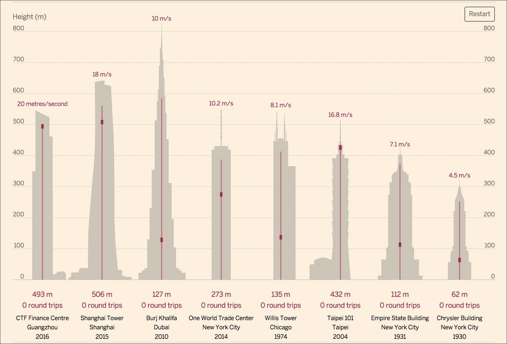
To start with, please view John Burn-Murdoch's graphic on high-speed elevators for the at http://www.ft.com/cms/s/2/1392ab72-64e2-11e4-ab2d-00144feabdc0.html.
The following screengrab doesn't really do it justice:

If the above were the live visualization, you would see the elevators in each building endlessly rise and fall, with a counter beneath tracking how many times the elevator has gone up and down while you were looking at the page. A nice bit of easing at the top and bottom ...
Get D3.js: Cutting-edge Data Visualization now with the O’Reilly learning platform.
O’Reilly members experience books, live events, courses curated by job role, and more from O’Reilly and nearly 200 top publishers.

