Applying Floats to Your Layouts
Now that you've learned a basic two-column liquid layout, you can adapt it in countless ways. Converting it into a fixed-width layout is a snap. Simply wrap all the tags within the page's body inside another <div> (like <div id="wrapper">). Then, create a style for that new container element that has a set width such as 760 pixels (see Figure 11-4, bottom). That width setting constrains everything inside the container box.
Expanding it into a three-column design isn't difficult, either (Figure 11-5). First, add another <div> between the two columns and float it to the right. Then add a right margin to the middle column, so that if the text in the middle column runs longer than the new right sidebar, it won't wrap underneath the sidebar.
The rest of this section explores more CSS layout techniques that use float-based layouts.
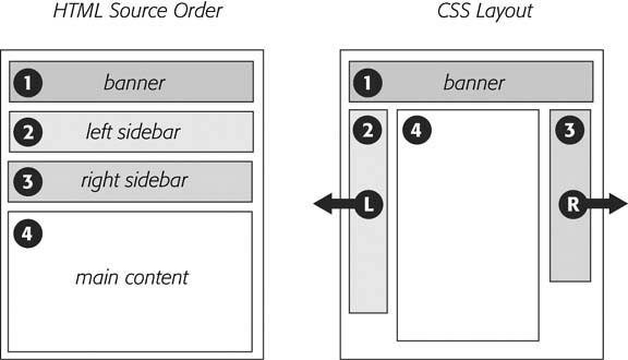
Figure 11-5. A three-column design uses the same concepts used to create a two-column design. In this case, you float both the left and right sidebars and add both left and right margins to the center column. The left-hand diagram shows the order of the HTML; the right side shows what the Web page looks like.
Get CSS: The Missing Manual now with the O’Reilly learning platform.
O’Reilly members experience books, live events, courses curated by job role, and more from O’Reilly and nearly 200 top publishers.

