Chapter 1. CSS and Documents
Cascading Style Sheets (CSS) are a powerful way to affect the presentation of a document or a collection of documents. Obviously, CSS is basically useless without a document of some sort, since it would have no content to present. Of course, the definition of “document” is extremely broad. For example, Mozilla and related browsers use CSS to affect the presentation of the browser chrome itself. Still, without the content of the chrome—buttons, address inputs, dialog boxes, windows, and so on—there would be no need for CSS (or any other presentational information).
The Web’s Fall from Grace
Back in the dimly remembered, early years of the Web (1990–1993), HTML was a fairly lean language. It was composed almost entirely of structural elements that were useful for describing things like paragraphs, hyperlinks, lists, and headings. It had nothing even remotely approaching tables, frames, or the complex markup we assume is necessary to create web pages. HTML was originally intended to be a structural markup language, used to describe the various parts of a document; very little was said about how those parts should be displayed. The language wasn’t concerned with appearance—it was just a clean little markup scheme.
Then came Mosaic.
Suddenly, the power of the World Wide Web was obvious to almost anyone who spent more than 10 minutes playing with it. Jumping from one document to another was no more difficult than pointing the cursor at a specially colored bit of text, or even an image, and clicking the mouse. Even better, text and images could be displayed together, and all you needed to create a page was a plain-text editor. It was free, it was open, and it was cool.
Web sites began to spring up everywhere. There were personal journals, university sites, corporate sites, and more. As the number of sites increased, so did the demand for new HTML elements that would each perform a specific function. Authors started demanding that they be able to make text boldfaced or italicized.
At the time, HTML wasn’t equipped to handle those sorts of desires. You could declare a bit of text to be emphasized, but that wasn’t necessarily the same as being italicized—it could be boldfaced instead, or even normal text with a different color, depending on the user’s browser and preferences. There was nothing to ensure that what the author created was what the reader would see.
As a result of these pressures, markup elements like <FONT> and <BIG> started to
creep into the language. Suddenly, a structural language started to become
presentational.
What a Mess
Years later, we have inherited the problems of this
haphazard process. Large parts of HTML 3.2 and HTML 4.0, for example, were devoted to
presentational considerations. The ability to color and size text through the
font element, to apply background colors and
images to documents and tables, to use table
attributes (such as cellspacing), and to make text
blink on and off are all the legacy of the original cries for “more control!”
For an example of the mess in action, take a quick glance at almost any corporate
web site’s markup. The sheer amount of markup in comparison to actual useful
information is astonishing. Even worse, for most sites, the markup is almost entirely
comprised of tables and font elements, neither of
which conveys any real semantic meaning as to what’s being presented. From a
structural standpoint, these pages are little better than random strings of letters.
For example, let’s assume that for page titles, an author uses font elements instead of heading elements like h1:
<font size="+3" face="Helvetica" color="red">Page Title</font>
Structurally speaking, the font tag has no
meaning. This makes the document far less useful. What good is a font tag to a speech-synthesis browser, for example? If
an author uses heading elements instead of font
elements, though, the speaking browser can use a certain speaking style to read the
text. With the font tag, the browser has no way to
know that the text is any different from other text.
Why do authors run roughshod over structure and meaning this way? Because they want readers to see the page as they designed it. To use structural HTML markup is to give up a lot of control over a page’s appearance, and it certainly doesn’t allow for the kind of densely packed page designs that have become so popular over the years. But consider the following problems with such an approach:
Unstructured pages make content indexing inordinately difficult. A truly powerful search engine would allow users to search only page titles, or only section headings within pages, or only paragraph text, or perhaps only those paragraphs that are marked as important. To accomplish such a feat, however, the page contents must be contained within some sort of structural markup—exactly the sort of markup most pages lack. Google, for example, does pay attention to markup structure when indexing pages, so a structural page will increase your Google rank.
Lack of structure reduces accessibility. Imagine that you are blind and rely on a speech-synthesis browser to search the Web. Which would you prefer: a structured page that lets your browser read only section headings so that you can choose which section you’d like to hear more about; or a page that is so lacking in structure that your browser is forced to read the entire thing with no indication of what’s a heading, what’s a paragraph, and what’s important? Let’s return to Google—the search engine is, in effect, the world’s most active blind user, with millions of friends who accept its every suggestion about where to surf and shop.
Advanced page presentation is possible only with some sort of document structure. Imagine a page in which only the section headings are shown, with an arrow next to each. The user can decide which section heading applies to him and click on it, thus revealing the text of that section.
Structured markup is easier to maintain. How many times have you spent several minutes hunting through someone else’s HTML (or even your own) in search of the one little error that’s messing up your page in one browser or another? How much time have you spent writing nested tables and
fontelements, only to get a sidebar with white hyperlinks in it? How many linebreak elements have you inserted trying to get exactly the right separation between a title and the following text? By using structural markup, you can clean up your code and make it easier to find what you’re looking for.
Granted, a fully structured document is a little plain. Due to that one single fact, a hundred arguments in favor of structural markup won’t sway a marketing department from using the type of HTML that was so prevalent at the end of the 20th century, and which persists even today. What we need is a way to combine structural markup with attractive page presentation.
CSS to the Rescue
Of course, the problem of polluting HTML with presentational markup was not lost on the World Wide Web Consortium (W3C), which began searching for a quick solution. In 1995, the consortium started publicizing a work-in-progress called CSS. By 1996, it had become a full Recommendation, with the same weight as HTML itself. Here’s why.
Rich Styling
In the first place, CSS allows for much richer document appearances than HTML ever allowed, even at the height of its presentational fervor. CSS lets you set colors on text and in the background of any element; permits the creation of borders around any element, as well as the increase or decrease of the space around them; lets you change the way text is capitalized, decorated (e.g., underlining), spaced, and even whether it is displayed at all; and allows you to accomplish many other effects.
Take, for example, the first (and main) heading on a page, which is usually the title of the page itself. The proper markup is:
<h1>Leaping Above The Water</h1>
Now, suppose you want this title to be dark red, use a certain font, be italicized
and underlined, and have a yellow background. To do all of that with HTML, you’d have
to put the h1 into a table and load it up with a
ton of other elements like font and U. With CSS, all you need is one rule:
h1 {color: maroon; font: italic 2em Times, serif; text-decoration: underline;
      background: yellow;}
That’s it. As you can see, everything you did in HTML can be done in CSS. There’s no need to confine yourself to only those things HTML can do, however:
h1 {color: maroon; font: italic 2em Times, serif; text-decoration: underline;
      background: yellow url(titlebg.png) repeat-x;
      border: 1px solid red; margin-bottom: 0; padding: 5px;}
You now have an image in the background of the h1 that is only repeated horizontally, and a border around it, separated
from the text by at least five pixels. You’ve also removed the margin (blank space)
from the bottom of the element. These are feats that HTML can’t even come close to
matching—and that’s just a taste of what CSS can do.
Ease of Use
If the depth of CSS doesn’t convince you, then perhaps this will: style sheets can drastically reduce a web author’s workload.
First, style sheets centralize the commands for certain visual effects in one
handy place, instead of scattering them throughout the document. As an example, let’s
say you want all of the h2 headings in a document
to be purple. Using HTML, the way to do this would be to put a font tag in every heading, like so:
<h2><font color="purple">This is purple!</font></h2>
This must be done for every heading of level two. If you have 40 headings in your
document, you have to insert 40 font elements
throughout, one for each heading! That’s a lot of work for one little effect.
Let’s assume that you’ve gone ahead and put in all those font elements. You’re done, you’re happy—and then you decide (or your
boss decides for you) that those h2 headings
should really be dark green, not purple. Now you have to go back and fix every single
one of those font elements. Sure, you might be
able to find-and-replace, as long as headings are the only purple text in your
document. If you’ve put other purple font elements
in your document, then you can’t find-and-replace because you’d
affect those, too.
It would be much better to have a single rule instead:
h2 {color: purple;}Not only is this faster to type, but it’s easier to change. If you do switch from purple to dark green, all you have to change is that one rule.
Let’s go back to the highly styled h1 element
from the previous section:
h1 {color: maroon; font: italic 2em Times, serif; text-decoration: underline;
      background: yellow;}
This may look like it’s worse to write than HTML, but consider a case where you
have a page with about a dozen h2 elements that
should look the same as the h1. How much markup
will be required for those 12 h2 elements? A lot.
On the other hand, with CSS, all you need to do is this:
h1, h2 {color: maroon; font: italic 2em Times, serif; text-decoration: underline;
          background: yellow;}
Now the styles apply to both h1 and h2 elements, with just three extra keystrokes.
If you want to change the way h1 and h2 elements look, the advantages of CSS are even more
striking. Consider how long it would take to change the HTML markup for an h1 and 12 h2
elements, compared to changing the previous styles to this:
h1, h2 {color: navy; font: bold 2em Helvetica, sans-serif;
          text-decoration: underline overline; background: silver;}
If the two approaches were timed on a stopwatch, I’m betting the CSS-savvy author would easily beat the HTML jockey.
In addition, most CSS rules are collected into one location in the document. It is possible to scatter them throughout the document by grouping them into associated styles or individual elements, but it’s usually far more efficient to place all of your styles into a single style sheet. This lets you create (or change) the appearance of an entire document in one place.
Using Your Styles on Multiple Pages
But wait—there’s more! Not only can you centralize all of the style information for a page in one place, but you can also create a style sheet that can then be applied to multiple pages. This is accomplished by a process in which a style sheet is saved to its own document and then imported by any page for use with that document. Using this capability, you can quickly create a consistent look for an entire web site. All you have to do is link the single style sheet to all of the documents on your web site. Then, if you ever want to change the look of your site’s pages, you need only edit a single file and the change will be propagated throughout the entire server—automatically!
Consider a site where all of the headings are gray on a white background. They get this color from a style sheet that says:
h1, h2, h3, h4, h5, h6 {color: gray; background: white;}Now let’s say this site has 700 pages, each of which uses the style sheet that says the headings should be gray. At some point, the site’s webmaster decides that the headings should be white on a gray background. So she edits the style sheet to say:
h1, h2, h3, h4, h5, h6 {color: white; background: gray;}Then she saves the style sheet to disk and the change is made. That sure beats
having to edit 700 pages to enclose every heading in a table and a font tag, doesn’t it?
Cascading
That’s not all! CSS also makes provisions for conflicting rules; these provisions are collectively referred to as the cascade. For instance, take the previous scenario in which you import a single style sheet into several web pages. Now inject a set of pages that share many of the same styles, but also include specialized rules that apply only to them. You can create another style sheet that is imported into those pages, in addition to the already existing style sheet, or you could just place the special styles into the pages that need them.
For example, on one page out of the 700, you might want headings to be yellow on dark blue instead of white on gray. In that single document, then, you could insert this rule:
h1, h2, h3, h4, h5, h6 {color: yellow; background: blue;}Thanks to the cascade, this rule will override the imported rule for white-on-gray headings. By understanding the cascade rules and using them to your advantage, you can create highly sophisticated sheets that can be changed easily and come together to give your pages a professional look.
The power of the cascade is not confined to the author. Web surfers (or readers) can, in some browsers, create their own style sheets (called reader style sheets, obviously enough) that will cascade with the author’s styles as well as the styles used by the browser. Thus, a reader who is colorblind could create a style that makes hyperlinks stand out:
a:link, a:visited {color: white; background: black;}A reader style sheet can contain almost anything: a directive to make text large enough to read if the user has impaired vision, rules to remove images for faster reading and browsing, and even styles to place the user’s favorite picture in the background of every document. (This isn’t recommended, of course, but it is possible.) This lets readers customize their web experience without having to turn off all of the author’s styles.
Between importing, cascading, and its variety of effects, CSS is a wonderful tool for any author or reader.
Compact File Size
Besides the visual power of CSS and its ability to
empower both author and reader, there is something else about it that your readers
will like. It can help keep document sizes as small as possible, thereby speeding
download times. How? As I’ve mentioned, a lot of pages have used tables and font elements to achieve nifty visual effects.
Unfortunately, both of these methods create additional HTML markup that drives up the
file sizes. By grouping visual style information into central areas and representing
those rules using a fairly compact syntax, you can remove the font elements and other bits of the usual tag soup.
Thus, CSS can keep your load times low and your reader satisfaction high.
Preparing for the Future
HTML, as I pointed out earlier, is a structural language, while CSS is its complement: a stylistic language. Recognizing this, the W3C, the body that debates and approves standards for the Web, is beginning to remove stylistic elements from HTML. The reasoning for this move is that style sheets can be used to create the effects that certain HTML elements now provide, so who needs them?
Thus, the XHTML specification has a
number of elements that are deprecated—that is, they are in the process of being
phased out of the language altogether. Eventually, they will be marked as obsolete,
which means that browsers will be neither required nor encouraged to support them.
Among the deprecated elements are <font>,
<basefont>, <u>, <strike>, <s>, and <center>. With the advent of style sheets, none of these elements
are necessary. And there may be more elements deprecated as time goes by.
As if that weren’t enough, there is the possibility that HTML will be gradually
replaced by the Extensible Markup Language
(XML). XML is much more complicated than HTML, but it is also
far more powerful and flexible. Despite this, XML does not provide any way to declare
style elements such as <i> or <center>. Instead, it is quite probable that XML
documents will rely on style sheets to determine their appearance. While the style
sheets used with XML may not be CSS, they will probably be whatever follows CSS and
very closely resemble it. Therefore, learning CSS now gives authors a big advantage
when the time comes to make the jump to an XML-based web.
So, to get started, it’s very important to understand how CSS and document structures relate to each other. It’s possible to use CSS to affect document presentation in a very profound way, but there are also limits to what you can do. Let’s start by exploring some basic terminology.
Elements
Elements are the basis of document structure. In HTML, the most
common elements are easily recognizable, such as p, table, span, a, and div. Every single element in a document plays a part in its
presentation. In CSS terms, at least as of CSS2.1, that means each element generates a
box that contains the element’s content.
Replaced and Nonreplaced Elements
Although CSS depends on elements, not all elements are created equally. For
example, images and paragraphs are not the same type of element, nor are span and div. In CSS,
elements generally take two forms: replaced and nonreplaced. The two types are
explored in detail in Chapter 7, which covers
the particulars of the box model, but I’ll address them briefly here.
Replaced elements
Replaced elements are those where the element’s content is
replaced by something that is not directly represented by document content. The
most familiar XHTML example is the img element,
which is replaced by an image file external to the document itself. In fact,
img has no actual content, as you can see by
considering a simple example:
<img src="howdy.gif" />
This markup fragment contains no actual content—only an element name and an
attribute. The element presents nothing unless you point it to some external
content (in this case, an image specified by the src attribute). The input element is
also replaced by a radio button, checkbox, or text input box, depending on its
type. Replaced elements also generate boxes in their display.
Nonreplaced elements
The majority of HTML and XHTML elements are nonreplaced
elements.
This means that their content is presented by the
user agent (generally a browser) inside a box generated by the element itself. For
example, <span>hi there</span> is a
nonreplaced element, and the text “hi there” will be displayed by the user agent.
This is true of paragraphs, headings, table cells, lists, and almost everything
else in XHTML.
Element Display Roles
In addition to replaced and nonreplaced elements, CSS2.1 uses two other basic types of elements: block-level and inline-level. These types will be more familiar to authors who have spent time with HTML or XHTML markup and its display in web browsers; the elements are illustrated in Figure 1-1.
Block-level elements
Block-level elements generate an element box that (by
default) fills its parent element’s content area and cannot have other elements at
its sides. In other words, it generates “breaks” before and after the element box.
The most familiar block elements from HTML are p and div. Replaced elements can be
block-level elements,
but they usually are
not.
List items are a special case of block-level elements. In addition to behaving in a manner consistent with other block elements, they generate a marker—typically a bullet for unordered lists and a number for ordered lists—that is “attached” to the element box. Except for the presence of this marker, list items are in all other ways identical to other block elements.
Inline-level elements
Inline-level elements generate an element box within a line
of text and do not break up the flow of that line. The
best inline element example is the a element in
XHTML. Other candidates are strong and em. These elements do not generate a “break” before
or after themselves, so they can appear within the content of another element
without disrupting its display.
Note that while the names “block” and “inline” share a great deal in common with block- and inline-level elements in XHTML, there is an important difference. In HTML and XHTML, block-level elements cannot descend from inline-level elements. In CSS, there is no restriction on how display roles can be nested within each other.
To see how this works, let’s consider a CSS property, display.
You may have noticed that there are a lot of values, only three of which I’ve
even come close to mentioning: block, inline, and list-item. We’re not going to explore the others now, mostly because
they are covered in some detail in Chapter 2
and Chapter 7.
For the moment, let’s just concentrate on block and inline. Consider the
following markup:
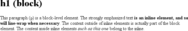
<body>
<p>This is a paragraph with <em>an inline element</em> within it.</p>
</body>
Here we have two block elements (body and
p) and an inline element (em). According to the XHTML specification, em can descend from p, but the reverse is not true. Typically, the XHTML hierarchy works
out such that inlines can descend from blocks, but not the other way around.
CSS, on the other hand, has no such restrictions. You can leave the markup as it is but change the display roles of the two elements like this:
p {display: inline;}
em {display: block;}
This causes the elements to generate a block box inside an inline box. This is perfectly legal and violates no specification. The only problem would be if you tried to reverse the nesting of the elements:
<em><p>This is a paragraph improperly enclosed by an inline element.</p></em>
No matter what you do to the display roles via CSS, this is not legal in XHTML.
While changing the display roles of elements can be useful in XHTML documents, it becomes downright critical for XML documents. An XML document is unlikely to have any inherent display roles, so it’s up to the author to define them. For example, you might wonder how to lay out the following snippet of XML:
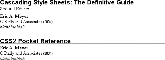
<book>
 <maintitle>Cascading Style Sheets: The Definitive Guide</maintitle>
 <subtitle>Second Edition</subtitle>
 <author>Eric A. Meyer</author>
 <publisher>O'Reilly and Associates</publisher>
 <pubdate>2004</pubdate>
 <isbn>blahblahblah</isbn>
</book>
<book>
 <maintitle>CSS2 Pocket Reference</maintitle>
 <author>Eric A. Meyer</author>
 <publisher>O'Reilly and Associates</publisher>
 <pubdate>2004</pubdate>
 <isbn>blahblahblah</isbn>
</book>
Since the default value of display is
inline, the content would be rendered as
inline text by default, as illustrated in Figure 1-2. This isn’t a terribly useful display.
You can define the basics of the layout with display:
book, maintitle, subtitle, author, isbn {display: block;}
publisher, pubdate {display: inline;}
You’ve now set five of the seven elements to be block and two to be inline.
This means each of the block elements will be treated much as div is treated in XHTML, and the two inlines will be
treated in a manner similar to span.
This fundamental ability to affect display roles makes CSS highly useful in a variety of situations. You could take the preceding rules as a starting point, add a number of other styles, and get the result shown in Figure 1-3.
Throughout the rest of this book, we’ll explore the various properties and values that allow presentation like this. First, though, we need to look at how one can associate CSS with a document. After all, without tying the two together, there’s no way for the CSS to affect the document. We’ll explore this in an XHTML setting since it’s the most familiar.
Bringing CSS and XHTML Together
I’ve mentioned that HTML and XHTML documents have an inherent structure, and that’s a point worth repeating. In fact, that’s part of the problem with web pages of old: too many of us forgot that documents are supposed to have an internal structure, which is altogether different than a visual structure. In our rush to create the coolest-looking pages on the Web, we bent, warped, and generally ignored the idea that pages should contain information with some structural meaning.
That structure is an inherent part of the relationship between XHTML and CSS; without the structure, there couldn’t be a relationship at all. To understand it better, let’s look at an example XHTML document and break it down by pieces:
<html>
<head>
<title>Eric's World of Waffles</title>
<link rel="stylesheet" type="text/css" href="sheet1.css" media="all" />
<style type="text/css">
@import url(sheet2.css);
h1 {color: maroon;}
body {background: yellow;}
/* These are my styles! Yay! */
</style>
</head>
<body>
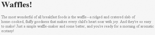
<h1>Waffles!</h1>
<p style="color: gray;">The most wonderful of all breakfast foods is
the waffle—a ridged and cratered slab of home-cooked, fluffy goodness
that makes every child's heart soar with joy. And they're so easy to make!
Just a simple waffle-maker and some batter, and you're ready for a morning
of aromatic ecstasy!
</p>
</body>
</html>This markup is shown in Figure 1-4.
Now, let’s examine the various ways this document connects to CSS.
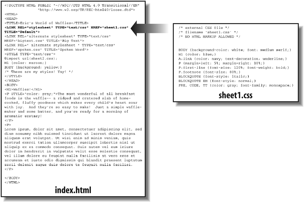
The link Tag
First,
consider the use of the link tag:
<link rel="stylesheet" type="text/css" href="sheet1.css" media="all" />
The link tag is a little-regarded but
nonetheless perfectly valid tag that has been hanging around the HTML specification
for years, just waiting to be put to good use. Its basic purpose is to allow HTML
authors to associate other documents with the document containing the link tag. CSS uses it to link style sheets to the
document; in Figure 1-5, a style sheet
called sheet1.css is linked to the document.
These style sheets, which are not part of the HTML document but are still used by it, are referred to as external style sheets. This is because they’re style sheets that are external to the HTML document. (Go figure.)
To successfully load an external style sheet, link must be placed inside the head
element but may not be placed inside any other element, rather like title. This will cause the web browser to locate and
load the style sheet and use whatever styles it contains to render the HTML document
in the manner shown in Figure 1-5.
And what is the format of an external style sheet? It’s simply a list of rules, just like those we saw in the previous section and in the example XHTML document, but in this case, the rules are saved into their own file. Just remember that no XHTML or any other markup language can be included in the style sheet—only style rules. Here are the contents of an external style sheet:
h1 {color: red;}
h2 {color: maroon; background: white;}
h3 {color: white; background: black;
 font: medium Helvetica;}
That’s all there is to it—no HTML markup or comments at all, just plain-and-simple style declarations. These are saved into a plain-text file and are usually given an extension of .css, as in sheet1.css.
Warning
An external style sheet cannot contain any document markup at all, only CSS rules and CSS comments, both of which are explained later in the chapter. The presence of markup in an external style sheet can cause some or all of it to be ignored.
The filename extension is not required, but some older browsers won’t recognize
the file as containing a style sheet unless it actually ends with
.css, even if you do include the correct
type of text/css in the link element. In fact,
some web servers won’t hand over a file as text/css unless its filename ends with .css, though
that can usually be fixed by changing the server’s configuration files.
Attributes
For the rest of the link tag, the attributes and values are fairly
straightforward. rel stands for “relation,” and
in this case, the relation is stylesheet.
type is always set to text/css. This value describes the type of data that
will be loaded using the link tag. That way,
the web browser knows that the style sheet is a CSS style sheet, a fact that will
determine how the browser deals with the data it imports. After all, there may be
other style languages used in the future, so it’s important to declare which
language you’re using.
Next, we find the href attribute. The value of this attribute is the URL of your style
sheet. This URL can be either absolute or relative, depending on what works for
you. In our example, of course, the URL is relative. It just as easily could have
been something like http://www.meyerweb.com/sheet1.css.
Finally, we have a media
attribute. The value used in this case, all,
means that the style sheet should be applied in all presentation media. CSS2
defines a number of allowed values for this attribute:
-
all Use in all presentational media.
-
aural Use in speech synthesizers, screen readers, and other audio renderings of the document.
-
braille Use when rendering the document with a Braille device.
-
embossed Use when printing with a Braille printing device.
-
handheld Use on handheld devices like personal digital assistants or web-enabled cell phones.
-
print Use when printing the document for sighted users and also when displaying a “print preview” of the document.
-
projection Use in a projection medium, such as a digital projector used to present a slideshow when delivering a speech.
-
screen Use when presenting the document in a screen medium like a desktop computer monitor. All web browsers running on such systems are screen-medium user agents.
-
tty Use when delivering the document in a fixed-pitch environment like teletype printers.
-
tv Use when the document is being presented on a television.
The majority of these media types are not supported by any
current web browser. The three most widely supported ones are all, screen, and
print. As of this writing, Opera also
supports projection, which allows a document to
be presented as a slideshow.
You can use a style sheet in more than one medium by providing a comma-separated list of the media in which it applies. Thus, for example, you can use a linked style sheet in both screen and projection media:
<link rel="stylesheet" type="text/css" href="visual-sheet.css"
   media="screen, projection" />
Note
that there can be more than one linked style sheet associated with a document. In
these cases, only those link tags with a
rel of stylesheet will be used in the initial display of the document. Thus,
if you wanted to link two style sheets named basic.css and
splash.css, it would look like
this:
<link rel="stylesheet" type="text/css" href="basic.css" />
<link rel="stylesheet" type="text/css" href="splash.css" />
This will cause the browser to load both style sheets, combine the rules from each, and apply them all to the document. (We’ll see exactly how the sheets are combined in Chapter 3, but for now, let’s just accept that they’re combined.) For example:
<link rel="stylesheet" type="text/css" href="basic.css" />
<link rel="stylesheet" type="text/css" href="splash.css" />

<p class="a1">This paragraph will be gray only if styles from the
stylesheet 'basic.css' are applied.</p>
<p class="b1">This paragraph will be gray only if styles from the
stylesheet 'splash.css' are applied.</p>
The
one attribute that is not in your example markup, but could be, is the title attribute. This attribute is not often used,
but it could become important in the future and, if used improperly, can have
unexpected effects. Why? We will explore that in the next section.
Alternate style sheets
It’s also
possible to define alternate
style sheets.
These are defined by making the value of the rel attribute alternate stylesheet,
and they are used in document presentation only if selected by the
user.
Should a browser be able to use alternate style
sheets, it will use the values of the link elements’ title attributes to generate a list of style alternatives. So you could
write the
following:
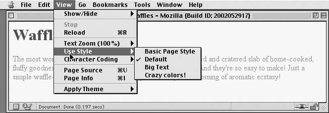
<link rel="stylesheet" type="text/css"
   href="sheet1.css" title="Default" />
<link rel="alternate stylesheet" type="text/css"
   href="bigtext.css" title="Big Text" />
<link rel="alternate stylesheet" type="text/css"
   href="zany.css" title="Crazy colors!" />
Users could then pick the style they want to use, and the browser would switch from the first one (labeled “Default” in this case) to whichever the user picked. Figure 1-6 shows one way in which this selection mechanism is accomplished.
Tip
Alternate style sheets are supported in most Gecko-based browsers like Mozilla and Netscape 6+, and in Opera 7. They can be supported in Internet Explorer through the use of JavaScript but are not natively supported by those browsers.
It is also possible to group alternate style sheets together by giving
them the same title value. Thus, you make it
possible for the user to pick a different presentation for your site in both
screen and print media. For
example:
<link rel="stylesheet" type="text/css"
   href="sheet1.css" title="Default" media="screen" />
<link rel="stylesheet" type="text/css"
   href="print-sheet1.css" title="Default" media="print" />
<link rel="alternate stylesheet" type="text/css"
   href="bigtext.css" title="Big Text" media="screen" />
<link rel="alternate stylesheet" type="text/css"
   href="print-bigtext.css" title="Big Text" media="print" />
If a user selects “Big Text” from the alternate style sheet selection mechanism in a conforming user agent, then bigtext.css will be used to style the document in the screen medium, and print-bigtext.css will be used in the print medium. Neither sheet1.css nor print-sheet1.css will be used in any medium.
Why is that? Because if you give a link with a rel of stylesheet a title, then you are designating that
style sheet as a preferred style sheet. This means that its
use is preferred to alternate style sheets, and it will be used when the document
is first displayed. Once you select an alternate style sheet, however, the
preferred style sheet will not be
used.
Furthermore, if you designate a number of style sheets as preferred, then all but one of them will be ignored. Consider:
<link rel="stylesheet" type="text/css"
   href="sheet1.css" title="Default layout" />
<link rel="stylesheet" type="text/css"
   href="sheet2.css" title="Default text sizes" />
<link rel="stylesheet" type="text/css"
   href="sheet3.css" title="Default colors" />
All
three link elements now refer to preferred
style sheets,
thanks to the
presence of a title attribute on all three, but
only one of them will actually be used in that manner. The other two will be
ignored completely. Which two? There’s no way to be certain, as neither HTML nor
XHTML provide a method of determining which preferred style sheets should be
ignored or which should be used.
If you simply don’t give a style sheet a title, then it becomes a persistent style sheet and is always used in the display of the document. Often, this is exactly what an author wants.
The style Element
The style element is one way to include a style sheet, and
it appears in the document itself:
<style type="text/css">
style should always use the attribute type; in the case of a CSS document, the correct value
is "text/css", just as it was with the link element.
The style element should always start with
<style type="text/css">, as shown in the
preceding example. This is followed by one or more styles and is finished with a
closing </style> tag. It is also possible to
give the style element a media attribute, with the same allowed values as previously discussed
for linked style sheets.
The styles between the opening and closing style tags are referred to as the document style
sheet, or the embedded
style sheet since this style sheet is embedded within the
document. It will contain many of the styles that will apply to the document, but it
can also contain multiple links to external style sheets using the @import directive.
The @import Directive
Now we’ll
discuss the stuff that is found inside the style
tag. First, we have something very similar to link: the @import directive:
@import url(sheet2.css);
Just like link, @import can be used to direct the web browser to load an external style
sheet and use its styles in the rendering of the HTML document. The only major
difference is in the actual syntax and placement of the command. As you can see,
@import is found inside the style container. It must be placed there, before the
other CSS rules, otherwise it won’t work at all. Consider this example:
<style type="text/css">
@import url(styles.css); /* @import comes first */
h1 {color: gray;}
</style>
Like link, there can be more than one @import statement in a document. Unlike link, however, the style sheets of every @import directive will be loaded and used; there is no
way to designate alternate style sheets with @import. So, given the following markup:
@import url(sheet2.css);
@import url(blueworld.css);
@import url(zany.css);
all three external style sheets will be loaded, and all of their style rules will be used in the display of the document.
Warning
Many older browsers cannot process varying forms of the @import directive. This fact can actually be used to
one’s advantage in “hiding” styles from these browsers. For more details, see
http://w3development.de/css/hide_css_from_browsers.
As with link, you can restrict imported style
sheets to one or more media by listing the media to which it should be applied after
the style sheet’s URL:
@import url(sheet2.css) all;
@import url(blueworld.css) screen;
@import url(zany.css) projection, print;
@import can be highly useful if you have an
external style sheet that needs to use the styles found
in other external style sheets. Since external style sheets cannot contain any
document markup, the link element can’t be
used—but @import can. Therefore, you might have an
external style sheet that contains the following:
@import url(http://example.org/library/layout.css);
@import url(basic-text.css);
@import url(printer.css) print;
body {color: red;}
h1 {color: blue;}
Well, maybe not those exact styles, but you get the idea. Note the use of both
absolute and relative URLs in the previous example. Either URL form can be used, just
as with link.
Note also that the @import directives appear at
the beginning of the style sheet, as they did in our example document. CSS requires
the @import directive to come before any other
rules in a style sheet. An @import that comes
after other rules (e.g., body {color: red;}) will be ignored by conforming user agents.
Actual Style Rules
After
the @import statement in our example, we find some
ordinary style rules. What they mean
doesn’t actually matter for this discussion, although you can probably guess that
they set h1 elements to be maroon and body elements to have a yellow background:
h1 {color: maroon;}
body {background: yellow;}
Styles such as these comprise the bulk of any embedded style sheet—simple and
complex, short and long. Rarely will you have a document where the style element does not contain any rules.
Backward accessibility
For those of you concerned about making your documents accessible to older
browsers, there is an important warning to consider. You’re probably aware that
browsers ignore tags they don’t recognize; for example, if a web page contains a
blooper tag, browsers will completely ignore
the tag because it isn’t one they recognize.
The same is true with style sheets. If a browser does not recognize <style> and </style>, it will ignore them altogether. However, the
declarations within those tags will not necessarily be ignored because they look
like ordinary text as far as the browser is concerned. So your style declarations
will appear at the top of your page! (Of course, the browser should ignore the
text because it isn’t part of the body element,
but this is never the case.)
To combat this problem, it is recommended that you enclose your declarations in
a comment tag. In the example given here, the beginning of the comment tag appears
just after the opening style tag, and the end
of the comment appears just before the closing style tag:
<style type="text/css"><!--
@import url(sheet2.css);
h1 {color: maroon;}
body {background: yellow;}
--></style>
This should cause older browsers to completely ignore the declarations as well
as the style tags because HTML
comments
are not displayed. Meanwhile, those
browsers that understand CSS will still be able to read the style sheet.
CSS Comments
CSS also allows for comments. These are very
similar to C/C++ comments in that they are surrounded by /* and */:
/* This is a CSS1 comment */
Comments can span multiple lines, just as in C++:
/* This is a CSS1 comment, and it
can be several lines long without
any problem whatsoever. */
It’s important to remember that CSS comments cannot be nested. So, for example, this would not be correct:
/* This is a comment, in which we find
 another comment, which is WRONG
   /* Another comment */
 and back to the first comment */
However, it’s hardly ever desirable to nest comments, so this limitation is no big deal.
Warning
One way to create “nested” comments accidentally is to temporarily comment out a large block of a style sheet that already contains a comment. Since CSS doesn’t permit nested comments, the “outside” comment will end where the “inside” comment ends.
If you wish to place comments on the same line as markup, then you need to be careful about how you place them. For example, this is the correct way to do it:
h1 {color: gray;}   /* This CSS comment is several lines */
h2 {color: silver;} /* long, but since it is alongside */
p {color: white;}   /* actual styles, each line needs to */
pre {color: gray;}  /* be wrapped in comment markers. */
Given this example, if each line isn’t marked off, then most of the style sheet will become part of the comment and thus will not work:
h1 {color: gray;}   /* This CSS comment is several lines
h2 {color: silver;}  long, but since it is not wrapped
p {color: white;}    in comment markers, the last three
pre {color: gray;}   styles are part of the comment. */
In this example, only the first rule (h1
{color: gray;}) will be applied to the
document. The rest of the rules, as part of the comment, are ignored by the browser’s
rendering engine.
Moving on with the example, you see some more CSS information actually found inside an XHTML tag!
Inline Styles
For cases where you want to simply assign a few
styles to one individual element, without the need for embedded or external style
sheets, employ the HTML attribute style to set an
inline style:
<p style="color: gray;">The most wonderful of all breakfast foods is
the waffle--a ridged and cratered slab of home-cooked, fluffy goodness...
</p>
The style attribute can be associated with any
HTML tag whatsoever, except for those tags that are found outside of body (head or
title, for instance).
The syntax of a style attribute is fairly
ordinary. In fact, it looks very much like the declarations found in the style container, except here the curly braces are
replaced by double quotation marks. So <p
style="color: maroon; background:
yellow;"> will set the text color to be
maroon and the background to be yellow for that paragraph only.
No other part of the document will be affected by this declaration.
Note that you can only place a declaration block, not an entire style sheet,
inside an inline style attribute. Therefore, you
can’t put an @import into a style attribute, nor can you include any complete rules.
The only thing you can put into the value of a style attribute is what might go between the curly braces of a rule.
Use of the style attribute is not generally
recommended. Indeed, it is marked as deprecated by XHTML 1.1 and is very unlikely to
appear in XML languages other than XHTML. Some of the primary advantages of CSS—the
ability to organize centralized styles that control an entire document’s appearance
or the appearance of all documents on a web server—are negated when you place styles
into a style attribute. In many ways, inline
styles are not much better than the
font tag, although they do have a good deal
more flexibility.
Summary
With CSS, it is possible to completely change the way elements are presented by a
user agent. This can be executed at a basic level with the display property, and in a different way by associating style sheets with
a document. The user will never know whether this is done via an external or embedded
style sheet, or even with an inline style. The real importance of external style sheets
is the way in which they allow authors to put all of a site’s presentation information
in one place, and point all of the documents to that place. This not only makes site
updates and maintenance a breeze, but it helps to save bandwidth since all of the
presentation is removed from documents.
To make the most of the power of CSS, authors need to know how to associate a set of styles with the elements in a document. To fully understand how CSS can do all of this, authors need a firm grasp of the way CSS selects pieces of a document for styling, which is the subject of the next chapter.
Get CSS: The Definitive Guide, 3rd Edition now with the O’Reilly learning platform.
O’Reilly members experience books, live events, courses curated by job role, and more from O’Reilly and nearly 200 top publishers.

