5 Typography
20 Hyphenation
The problem
Designers love text justification. If you look at any stunningly designed magazine or book, you will see it everywhere. However, on the Web, justification is very sparingly used, and even less so by skilled designers. Why is that, given that we’ve had text-align: justify; since CSS 1?
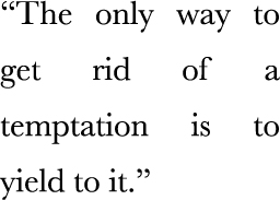
The reason becomes apparent if you look at Figure 5.1. Look at all the “rivers of white” created by adjusting spacing to justify the text. Not only does this look bad, it also hinders readability. In print, justification always goes hand in hand with hyphenation. Because hyphenation allows words to be broken down into syllables, much less white-space adjustment is needed, resulting in the text looking much more natural.

FIGURE 5.1 The default effect of CSS justification
Until recently, there were ways to hyphenate text on the Web, but they were the kind of solution that is worse than the problem. The usual way involved using server-side code, JavaScript, online generators, or even just our bare hands and lots of patience to insert soft hyphens (­) between syllables, so that the browser knows where each word could be broken. Usually, such an overhead was not worth it so the designer decided to go with a different kind of text alignment instead.
The solution
In CSS Text Level 3, a new property came along: hyphens. It accepts three values: none, manual, and ...
Get CSS Secrets now with the O’Reilly learning platform.
O’Reilly members experience books, live events, courses curated by job role, and more from O’Reilly and nearly 200 top publishers.

