Chapter 1. Basic Concepts
Adding Styles to HTML and XHTML
Styles can be applied to documents in three distinct ways, as discussed in the following sections.
Inline Styles
In HTML and XHTML, style information can be specified for an individual
element via the style attribute. The
value of a style attribute is a
declaration block (see the section “Rule Structure”)
without the curly braces:
<p style="color: red; background: yellow;">Look out!
This text is alarmingly presented!</p>
Note that, as of this writing, a full style sheet cannot be placed
into a style attribute. Only the
content of a single declaration block can be used as a style attribute value. For example, it is not
possible to place hover styles (using :hover) in a style attribute, nor can one use @import in this context.
Although typical XML document languages (e.g., XHTML 1.0, XHTML
1.1, and SVG) support the style
attribute, it is unlikely that all
XML languages will support a similar capability. Because of this and
because it encourages poor authoring practices, authors are generally
discouraged from using the style
attribute.
Embedded Style Sheets
A style sheet can be embedded at the top of an HTML or XHTML document using the
style element, which must appear
within the head element:
<html><head><title>Stylin'!</title>
<style type="text/css">
h1 {color: purple;}
p {font-size: smaller; color: gray;}
</style>
</head>
   ...
</html>
XML languages may or may not provide an equivalent capability; always check the language DTD to be certain.
External Style Sheets
Styles can be listed in a separate file. The primary advantage to a separate file is that by collecting commonly used styles in a single file, all pages using that style sheet can be updated by editing a single style sheet. Another key advantage is that external style sheets are cached, which can help reduce bandwidth usage. An external style sheet can be referenced in one of the following three ways:
@import directive
One or more @import directives
can be placed at the beginning of any style sheet. For HTML and XHTML
documents, this would be done within an embedded style sheet:
<head><title>My Document</title>
<style type="text/css">
@import url(site.css);
@import url(navbar.css);
@import url(footer.css);
body {background: yellow;}
</style>
</head>
Note that @import directives
can appear at the top (and, according to the specification,
only at the top) of any style sheet. Thus, one
style sheet could import another, which in turn would import a
third.
link element
In HTML and XHTML documents, the link element can
be used to associate a style sheet with a document. Multiple link elements are permitted. The media attribute
can be used to restrict a style sheet to one or more media:
<head>
<title>A Document</title>
<link rel="stylesheet" type="text/css" href="basic.css"
  media="all">
<link rel="stylesheet" type="text/css" href="web.css"
  media="screen">
<link rel="stylesheet" type="text/css" href="paper.css"
  media="print">
</head>
It is also possible to link to alternate style sheets. If alternate style sheets are supplied, it is up to the user agent (or the author) to provide a means for the user to select one of the alternates:
<head>
<title>A Document</title>
<link rel="stylesheet" type="text/css" href="basic.css">
<link rel="alternate stylesheet" title="Classic"
   type="text/css" href="oldschool.css">
<link rel="alternate stylesheet" title="Futuristic"
   type="text/css" href="3000ad.css">
</head>
As of this writing, most or all known user agents load all linked style sheets, including the alternate style sheets, regardless of whether the user ever implements them. This can have implications for bandwidth use and server load.
xml-stylesheet processing instruction
In XML documents (such as XHTML documents sent with a mime-type
of “text/xml,” “application/xml,” or “application/xhtml+xml”),
an xml-stylesheet
processing instruction can be used to associate a style sheet with a
document. Any xml-stylesheet
processing instructions must be placed in the prolog of an XML
document. Multiple xml-stylesheet
processing instructions are permitted. The media pseudo-attribute can be used to restrict a style sheet to one or more
forms of media:
<?xml-stylesheet type="text/css" href="basic.css"
  media="all"?>
<?xml-stylesheet type="text/css" href="web.css"
  media="screen"?>
<?xml-stylesheet type="text/css" href="paper.css"
  media="print"?>
It is also possible to link to alternate style sheets with the
xml-stylesheet processing
instruction:
<?xml-stylesheet type="text/css" href="basic.css"?>
<?xml-stylesheet alternate="yes" title="Classic"
  type="text/css" href="oldschool.css"?>
<?xml-stylesheet alternate="yes" title="Futuristic"
  type="text/css" href="3000ad.css"?>
HTTP Link headers
The last (and least common by far) way of associating an
external style sheet with your pages is to use an HTTP
Link header. In CSS terms, this is a way of replicating the effects of
a link element using HTTP
headers.
Adding a line such as this to the .htaccess file at the root level of your server will make this
happen for all pages on the site:
Header add Link
   "</style.css>;rel=stylesheet;type=text/css;media=all"
As an alternative to using .htaccess, which has been known to cause
performance hits, you can edit your httpd.conf file to
do the same thing:
<Directory /usr/local/username/httpdocs>
Header add Link
   "</ style.css>;rel=stylesheet;type=text/css;media=all"
</Directory>
...where /usr/local/username/httpdocs is replaced
with the UNIX pathname of your website’s actual home directory.
As of this writing, HTTP headers were not supported by all user agents, most notably Internet Explorer and Safari. Thus, this technique is usually limited to production environments based on other user agents and the occasional Easter egg for Firefox and Opera users.
Rule Structure
A style sheet consists of one or more rules that describe how page elements should be presented. Every rule has two fundamental parts: the selector and the declaration block. Figure 1-1 illustrates the structure of a rule.

Figure 1-1. Rule structure
On the left side of the rule, we find the selector, which selects
the parts of the document to which the rule should be applied. Selectors can stand singly or be grouped as a comma-separated list; e.g., to select the top three heading levels at once, the selector group would be
h1, h2, h3. On the right side of the rule, we have the declaration block.
A declaration block is made up of one or
more declarations; each declaration is a
combination of a CSS property and a
value of that property.
The declaration block is always enclosed in curly braces. A
declaration block can contain several declarations; each declaration must
be terminated with a semicolon (;). The exception is the
final declaration in a declaration block, for which the semicolon is
optional.
Each property, which represents a particular stylistic parameter, is
separated from its value by a colon (:). Property names in
CSS are not case-sensitive. Legal values for a property are defined by the property description.
Chapter 4 provides details on acceptable
values for CSS properties.
Comments
Including comments in CSS is simple. You open with /* and end
with */, like this:
/* This is a comment! */
Comments can be multiple lines long:
/* This is a comment!
  This is a continuation of the comment.
 And so is this. */
They can also occur anywhere within a style sheet except in the middle of a token (property name or value):
h1/* heading-level-1 */ {color /* foreground color */:
   rgba(23,58,89,0.42) /* RGB + opacity */;}
HTML (properly SGML) comments (<!-- such as this
-->) are permitted in style sheets so as to hide the styles
from browsers so old that they don’t understand HTML 3.2. They do
not act as CSS comments; that is, anything contained
in an HTML comment will be seen and interpreted by the CSS parser.
Style Precedence
A single HTML or XHTML document can import and link to multiple external style sheets, contain one or more embedded style sheets, and make use of inline styles. In the process, it is quite possible that some rules will conflict with one another. CSS uses a mechanism called the cascade to resolve any such conflicts and arrive at a final set of styles to be applied to the document. Two key components of the cascade are specificity and inheritance.
Specificity Calculations
Specificity describes the weight of a selector and any declarations associated with it. The following table summarizes the components of specificity summation.
| Selector type | Example | Specificity |
|---|---|---|
Universal selector Combinator |
|
|
Element identifier Pseudo-element identifier |
|
|
Class identifier Pseudo-class identifier Attribute identifier |
|
|
|
ID identifier |
|
|
|
Inline |
|
|
Specificity values are cumulative; thus, a selector containing two
element identifiers and a class identifier (e.g., div.aside p) has a specificity of
0,0,1,2. Specificity values are
sorted in right-to-left precedence; thus, a selector containing 11
element identifiers (0,0,0,11) has a
lower specificity than a selector containing just a single class
identifier (0,0,1,0).
The !important directive
gives a declaration more weight than nonimportant
declarations. The declaration retains the specificity of its selectors
and is used only in comparison with other important declarations.
Inheritance
The elements in a document form a treelike hierarchy with the root element
at the top and the rest of the document structure spreading out below it
(which makes it look more like a tree root system, really). In an HTML
document, the html element is at the
top of the tree, with the head and
body elements descending from it. The rest of the
document structure descends from those elements. In such a structure,
elements lower down in the tree are descendants of the ancestors, which
are higher in the tree.
CSS uses the document tree for the mechanism of
inheritance, in which a style applied to an element
is inherited by its descendants. For example, if the body element is set to have a color of red, that value propagates down the document
tree to the elements that descend from the body element. Inheritance is interrupted only
by a style rule that applies directly to an element. Inherited values
have no specificity at all (which is not the same
as having zero specificity).
Note that some properties are not inherited. A property will always
define whether it is inherited. Some examples of noninherited properties
are padding, border, margin, and background.
The Cascade
The cascade is how CSS resolves conflicts between styles; in other words, it is the mechanism by which a user agent decides, for example, what color to make an element when two different rules apply to it and each one tries to set a different color. The following steps constitute the cascade:
Find all declarations that contain a selector that matches a given element.
Sort by explicit weight all declarations applying to the element. Those rules marked
!importantare given greater weight than those that are not. Also, sort by origin all declarations applying to a given element. There are three origins: author, reader, and user agent. Under normal circumstances, the author’s styles win out over the reader’s styles.!importantreader styles are stronger than any other styles, including!importantauthor styles. Both author and reader styles override the user agent’s default styles.Sort by specificity all declarations applying to a given element. Those elements with a higher specificity have more weight than those with lower specificity.
Sort by order all declarations applying to a given element. The later a declaration appears in a style sheet or a document, the more weight it is given. Declarations that appear in an imported style sheet are considered to come before all declarations within the style sheet that imports them, and have a lower weight than those in the importing style sheet.
Any presentational hints that come from non-CSS sources (e.g., the preference dialog within a browser) are given the same weight as the user agent’s default styles (see step 2 above).
Element Classification
Broadly speaking, CSS groups elements into two types: nonreplaced and replaced. Although the types may seem rather abstract, there actually are some profound differences in how the two types of elements are presented. These differences are explored in detail in Chapter 7 of CSS: The Definitive Guide, third edition (O’Reilly).
Nonreplaced Elements
The majority of HTML and XHTML elements are nonreplaced elements, which means
their content is presented by the user agent inside a box generated by
the element itself. For example, <span>hi
there</span> is a nonreplaced element, and the text
hi there will be displayed by the
user agent. Paragraphs, headings, table cells, lists, and almost
everything else in HTML and XHTML are nonreplaced elements.
Replaced Elements
In contrast, replaced elements are those whose
content is replaced by something not directly represented by document
content. The most familiar HTML example is the img element, which is replaced by an image
file external to the document itself. In fact, img itself has no actual content, as we can
see by considering a simple example:
<img src="howdy.gif" alt="Hi">
There is no content contained in the element—only an element name
and attributes. Only by replacing the element’s lack of content with
content found through other means (in this case, loading an external
image specified by the src attribute)
can the element have any presentation at all. Another example is the
input element, which may be replaced
with a radio button, checkbox, or text input box, depending on its type.
Replaced elements also generate boxes in their display.
Element Display Roles
In addition to being replaced or not, there are two basic types of element display roles in CSS3:
block-level and inline-level.
All CSS3 display values fall into one
of these two categories. It can be important to know which general role a
box falls into, since some properties only apply to one type or the
other.
Block-Level
Block-level boxes are those where the element box (by default) fills its
parent element’s content area width and cannot have other elements to
its sides. In other words, block-level elements generate “breaks” before
and after the element box. The most familiar block elements from HTML
are p and div. Replaced elements can be block-level
elements but usually are not.
List items are a special case of block-level elements. In addition to behaving in a manner consistent with other block elements, they generate a marker—typically a bullet for unordered lists or a number for ordered lists—which is “attached” to the element box. Except for the presence of this marker, list items are identical to other block elements.
The display values that create
block boxes are: block, list-item, table, table-row-group, table-header-group, table-footer-group, table-row, table-column-group, table-column, table-cell, table-caption, flex, and grid
Inline-Level
Inline-level boxes are those where an element box is generated within a line
of text and does not break up the flow of that line. Perhaps the
best-known inline element is the a
element in HTML and XHTML. Other examples are span and em. These elements do not generate a break
before or after themselves, so they can appear within the content of
another element without disrupting its display.
Note that although the CSS block and inline elements have a great deal in common with HTML and XHTML block- and inline-level elements, there is an important difference. In HTML and XHTML, block-level elements cannot descend from inline-level elements, whereas in CSS, there is no restriction on how display roles can be nested within each other.
The display values that create
inline boxes are: inline, inline-block, inline-table, and ruby. As of this writing, it was not
explicitly defined that the various Ruby-related values (e.g., ruby-text) also generate inline boxes, but
this seems the most likely outcome.
Run-In
A special case is run-in boxes, defined by display:
run-in, which can generate either a block or an inline box
depending on the situation. The rules that decide the outcome
are:
If the run-in itself contains a block box, the run-in generates a block box.
If that’s not the case, and the run-in is immediately followed by a sibling block box that is neither floated nor absolutely positioned, the run-in box becomes the first inline box of the sibling block box.
If neither condition applies, the run-in generates a block box.
In the case where a run-in is inserted as the first inline of its
sibling block box (rule 2 above), it does not
inherit property values from that block box. Instead, it continues to
inherit from its structural parent element. Thus, if the sibling block
box has color: green applied to it,
the green will not be inherited by the run-in element even though it is
visually a part of the block box.
Basic Visual Layout
CSS defines algorithms for laying out any element in a document. These algorithms form the underpinnings of visual presentation in CSS. There are two primary kinds of layout, each with very different behaviors: block-level and inline-level layout.
Block-Level Layout
A block-level box in CSS generates a rectangular box called the element box, which describes the amount of space occupied by an element. Figure 1-2 shows the various components of an element box.

Figure 1-2. Box model details
The following rules apply to an element box:
The background of the element box extends to the outer edge of the border, thus filling the content, padding, and border areas. If the border has any transparent portions (e.g., it is dotted or dashed), the background will be visible in those portions. The background does not extend into the margin areas of the box. Any outlines are drawn in the margin area and do not affect layout.
Only the margins,
height, andwidthof an element box may be set toauto.Only margins can be given negative values.
The padding and border widths of the element box default to
0(zero) andnone, respectively.If
box-sizingiscontent-box(the default value), the propertywidthdefines only the width of the content area; any padding, borders, or margins are added to it. The same is true forheightwith respect to the height.If
box-sizingisborder-box, the propertywidthdefines the total width of the content, padding, and borders; any margins are added to it. The same is true forheightwith respect to the height.
Inline Layout
An inline-level box in CSS generates one or more rectangular boxes called inline boxes, depending on whether the inline box is broken across multiple lines. The following rules apply to inline box:
For the properties
left,right,top,bottom,margin-left,margin-right,margin-top, andmargin-bottom, any value ofautois converted to0(zero).widthandheightdo not apply to nonreplaced inline boxes.For replaced inline boxes, the following rules apply:
If
heightandwidthare bothautoand the element has an intrinsic width (e.g., an image), that value ofwidthis equal to the element’s intrinsic width. The same holds true forheight.If
heightandwidthare bothautoand the element does not have an intrinsic width but does have an intrinsic height and layout ratio, thenwidthis set to be the intrinsic height times the ratio.If
heightandwidthare bothautoand the element does not have an intrinsic height but does have an intrinsic width and layout ratio, thenheightis set to be the intrinsic width divided by the ratio.
There are a few rules even more obscure than those last two, which are too lengthy to include here; see http://w3.org/TR/css3-box/#inline-replaced for details.
All inline elements have a line-height, which has
a great deal to do with how the elements are displayed. The height of a
line of text is determined by taking into account the following factors:
- Anonymous text
Any string of characters not contained within an inline element. Thus, in the markup:
<p> I'm <em>so</em> happy!</p>
…the sequences “I’m ” and “ happy!” are anonymous text. Note that the spaces are part of the anonymous text, as a space is a character like any other.
- Em-box
The em-box defined in the given font; otherwise known as the character box. Actual glyphs can be taller or shorter than their em-boxes, as discussed in Chapter 5 of CSS: The Definitive Guide, third edition (O’Reilly). In CSS, the value of
font-sizedetermines the height of each em-box.- Content area
In nonreplaced elements, the content area can be the box described by the em-boxes of every character in the element, strung together, or else the box described by the character glyphs in the element. The CSS2.1 specification allows user agents to choose either. This text uses the em-box definition for simplicity’s sake. In replaced elements, the content area is the intrinsic height of the element plus any margins, borders, or padding.
- Leading
The leading is the difference between the values of
font-sizeandline-height. Half this difference is applied to the top and half to the bottom of the content area. These additions to the content area are called, not surprisingly, half-leading. Leading is applied only to nonreplaced elements.- Inline box
The box described by the addition of the leading to the content area. For nonreplaced elements, the height of the inline box of an element will be equal to the value for
line-height. For replaced elements, the height of the inline box of an element will be equal to the content area, as leading is not applied to replaced elements.- Line box
The shortest box that bounds the highest and lowest points of the inline boxes that are found in the line. In other words, the top edge of the line box will be placed along the top of the highest inline box top, and the bottom of the line box is placed along the bottom of the lowest inline box bottom. (See Figure 1-3.)
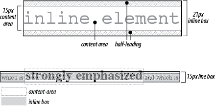
Figure 1-3. Inline layout details
Floating
Floating allows an element to be placed to the left or right of its containing block (which is the nearest block-level ancestor element), with following content flowing around the element. Any floated element automatically generates a block box, regardless of what type of box it would generate if not floated. A floated element is placed according to the following rules:
The left (or right) outer edge of a floated element may not be to the left (or right) of the inner edge of its containing block.
The left (or right) outer edge of a floated element must be to the right (or left) of the right (left) outer edge of a left-floating (or right-floating) element that occurs earlier in the document’s source, unless the top of the later element is below the bottom of the former.
The right outer edge of a left-floating element may not be to the right of the left outer edge of any right-floating element to its right. The left outer edge of a right-floating element may not be to the left of the right outer edge of any left-floating element to its left.
A floating element’s top may not be higher than the inner top of its containing block.
A floating element’s top may not be higher than the top of any earlier floating or block-level element.
A floating element’s top may not be higher than the top of any line box with content that precedes the floating element.
A left (or right) floating element that has another floating element to its left (right) may not have its right (left) outer edge to the right (left) of its containing block’s right (left) edge.
A floating element must be placed as high as possible.
A left-floating element must be put as far to the left as possible, and a right-floating element as far to the right as possible. A higher position is preferred to one that is farther to the right or left.
Positioning
When elements are positioned, a number of special rules come into play. These rules govern not only the containing block of the element, but also how it is laid out within that element.
Types of Positioning
- Static positioning
The element’s box is generated as normal. Block-level elements generate a rectangular box that is part of the document’s flow, and inline-level boxes generate one or more line boxes that flow within their parent element.
- Relative positioning
The element’s box is offset by some distance. Its containing block can be considered to be the area that the element would occupy if it were not positioned. The element retains the shape it would have had were it not positioned, and the space that the element would ordinarily have occupied is preserved.
- Absolute positioning
The element’s box is completely removed from the flow of the document and positioned with respect to its containing block, which may be another element in the document or the initial containing block (described in the next section). Whatever space the element might have occupied in the normal document flow is closed up, as though the element did not exist. The positioned element generates a block box, regardless of the type of box it would generate if it were in the normal flow.
- Fixed positioning
The element’s box behaves as though set to
absolute, but its containing block is the viewport itself.
The Containing Block
The containing block of a positioned element is determined as follows:
The containing block of the root element (also called the initial containing block) is established by the user agent. In HTML, the root element is the
htmlelement, although some browsers may usebody.For nonroot elements, if an element’s
positionvalue isrelativeorstatic, its containing block is formed by the content edge of the nearest block-level, table-, cell-, or inline-block ancestor box. Despite this rule, relatively positioned elements are still simply offset, not positioned with respect to the containing block described here, and statically positioned elements do not move from their place in the normal flow.For nonroot elements that have a
positionvalue ofabsolute, the containing block is set to the nearest ancestor (of any kind) that has apositionvalue other thanstatic. This happens as follows:If the ancestor is block-level, the containing block is that element’s outer padding edge; in other words, it is the area bounded by the element’s border.
If the ancestor is inline-level, the containing block is set to the content edge of the ancestor. In left-to-right languages, the top and left of the containing block are the top and left content edges of the first box in the ancestor, and the bottom and right edges are the bottom and right content edges of the last box. In right-to-left languages, the right edge of the containing block corresponds to the right content edge of the first box, and the left is taken from the last box. The top and bottom are the same.
If there are no ancestors as described in 3a and 3b, the absolutely positioned element’s containing block is defined to be the initial containing block.
Layout of Absolutely Positioned Elements
In the following sections, these terms are used:
- Shrink-to-fit
Similar to calculating the width of a table cell using the automatic table layout algorithm. In general, the user agent attempts to find the minimum element width that will contain the content and wrap to multiple lines only if wrapping cannot be avoided.
- Static position
The place where an element’s edge would have been placed if its
positionwerestatic.
Horizontal layout of absolutely positioned elements
The equation that governs the layout of these elements is:
left + margin-left + border-left-width + padding-left +
width + padding-right + border-right-width +
margin-right + right + vertical scrollbar width (if any) =
width of containing block
The width of any vertical scrollbar is determined by the user agent and cannot be affected with CSS.
For nonreplaced elements, the steps used to determine horizontal layout are:
If all of
left,width, andrightareauto, first reset anyautovalues formargin-leftandmargin-rightto0. Then, ifdirectionisltr, setleftto the static position and apply the rule given in step 3c. Otherwise, setrightto the static position and apply the rule given in step 3a.If none of
left,width, andrightisauto, pick the rule that applies from the following list:If both
margin-leftandmargin-rightare set toauto, solve the equation under the additional constraint that the two margins get equal values.If only one of
margin-leftormargin-rightis set toauto, solve the equation for that value.If the values are overconstrained (none is set to
auto), ignore the value forleftifdirectionisrtl(ignorerightifdirectionisltr) and solve for that value.
If some of
left,width, andrightareauto, but others are not, reset anyautovalues formargin-leftandmargin-rightto0. From the following list, pick the one rule that applies:If
leftandwidthareautoandrightis not, the width is shrink-to-fit. Solve the equation forleft.If
leftandrightareautoandwidthis not, then ifdirectionisltr, setleftto the static position (otherwise, setrightto the static position). Solve the equation forleft(if direction isrtl) orright(ifdirectionisltr).If
widthandrightareautoandleftis not, the width is shrink-to-fit. Solve the equation forright.If
leftisautoandwidthandrightare not, solve the equation forleft.If
widthisautoandleftandrightare not, solve the equation forwidth.If
rightisautoandleftandwidthare not, solve the equation forright.
For replaced elements, the steps used to determine horizontal layout are:
Determine the value of
widthas described for inline replaced elements (see “Inline Layout”).If both
leftandrightare set toauto, then ifdirectionisltr, setleftto the static left position. Ifdirectionisrtl, setrightto the static right position.If either or both of
leftandrightare set toauto, reset anyautovalues formargin-leftandmargin-rightto0.If neither
leftnorrightis set toautoand bothmargin-leftandmargin-rightare set toauto, solve the equation under the additional constraint that the two margins get equal values.If the values are overconstrained (none is set to
auto), ignore the value forleftifdirectionisrtl(ignorerightifdirectionisltr) and solve for that value.
Vertical layout of absolutely positioned elements
The equation that governs the layout of these elements is:
top + margin-top + border-top-width + padding-top + height
+ padding-bottom + border-bottom-width + margin-bottom +
bottom + horizontal scrollbar height (if any) =
height of containing block
The height of any horizontal scrollbar is determined by the user agent and cannot be affected with CSS.
For nonreplaced elements, the steps used to determine vertical layout are:
If all of
top,height, andbottomareauto, settopto the static position and apply the rule given in step 3c.If none of
top,height, andbottomisauto, pick the one rule that applies from the following list:If both
margin-topandmargin-bottomare set toauto, solve the equation under the additional constraint that the two margins get equal values.If only one of
margin-topormargin-bottomis set toauto, solve the equation for that value.If the values are overconstrained (none is set to
auto), ignore the value forbottomand solve for that value.
If some of
top,height, andbottomareauto, but others are not, pick the one rule that applies from the following list:If
topandheightareautoandbottomis not, the height is based on the element’s content (as it would be in the static flow). Reset anyautovalues formargin-topandmargin-bottomto0and solve the equation fortop.If
topandbottomareautoandheightis not, settopto the static position. Reset anyautovalues formargin-topandmargin-bottomto0and solve the equation forbottom.If
heightandbottomareautoandtopis not, the height is based on the element’s content (as it would be in the static flow). Reset anyautovalues formargin-topandmargin-bottomto0and solve the equation forbottom.If
topisautoandheightandbottomare not, reset anyautovalues formargin-topandmargin-bottomto0and solve the equation fortop.If
heightisautoandtopandbottomare not, reset anyautovalues formargin-topandmargin-bottomto0and solve the equation forheight.If
bottomisautoandtopandheightare not, reset anyautovalues formargin-topandmargin-bottomto0and solve the equation forbottom.
For replaced elements, the steps used to determine vertical layout are:
Determine the value of
heightas described for inline replaced elements (see “Inline Layout”).If both
topandbottomare set toauto, settopto the static top position.If the values are overconstrained, ignore the value for
bottomand solve for that value.
Table Layout
The layout of tables can get quite complicated, especially because CSS defines two different ways to calculate table and cell widths, as well as two ways to handle the borders of tables and elements internal to the table. Figure 1-4 illustrates the components of a table.
Table Arrangement Rules
In general, a table is laid out according to the following principles:
Each row box encompasses a single row of grid cells. All of the row boxes in a table fill the table from top to bottom in the order they occur in the source document. Thus, the table contains as many grid rows as there are row elements.
A row group’s box encompasses the same grid cells as the row boxes that it contains.
A column box encompasses one or more columns of grid cells. Column boxes are placed next to each other in the order they occur. The first column box is on the left for left-to-right languages and on the right for right-to-left languages.
A column group’s box encompasses the same grid cells as the column boxes that it contains.
Although cells may span several rows or columns, CSS does not define how that happens. It is instead left to the document language to define spanning. Each spanned cell is a rectangular box one or more grid cells wide and high. The top row of this rectangle is in the row that is parent to the cell. The cell’s rectangle must be as far to the left as possible in left-to-right languages, but it may not overlap any other cell box. It must also be to the right of all cells in the same row that are earlier in the source document in a left-to-right language. In right-to-left languages, a spanned cell must be as far to the right as possible without overlapping other cells and must be to the left of all cells in the same row that come after it in the document source.
A cell’s box cannot extend beyond the last row box of a table or row group. If the table structure causes this condition, the cell must be shortened until it fits within the table or row group that encloses it.
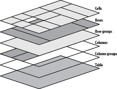
Figure 1-4. Table layout components
Fixed Table Layout
The fixed-layout model is fast because its layout doesn’t depend on the contents
of table cells; it’s driven by the width values of the table, columns, and cells
within the first row of the table. The fixed-layout model uses the
following simple steps:
Any column element whose
widthproperty has a value other thanautosets the width for that column.If a column has an
autowidth, but the cell in the first row of the table within that column has awidthother thanauto, that cell sets the width for that column. If the cell spans multiple columns, the width is divided equally among the columns.Any columns that are still auto-sized are sized so that their widths are as equal as possible.
At that point, the width of the table is set to be either the
value of width for the table or the
sum of the column widths, whichever is greater. If the table turns out
to be wider than the column widths, the difference is divided by the
number of columns and added to each of them.
Automatic Table Layout
The automatic-layout model, although not as fast as the fixed-layout, is likely to be
much more familiar to authors because it’s substantially the same model
that HTML tables have used for years. In most current user agents, use
of this model will be triggered by a table with a width of auto, regardless of the value of table-layout—although this is not
assured.
The details of the model can be expressed in the following steps:
For each cell in a column, calculate both the minimum and maximum cell width.
Determine the minimum width required to display the content. In determining the minimum content width, the content can flow to any number of lines, but it may not stick out of the cell’s box. If the cell has a
widthvalue that is larger than the minimum possible width, the minimum cell width is set to the value ofwidth. If the cell’swidthvalue isauto, the minimum cell width is set to the minimum content width.For the maximum width, determine the width required to display the content without any line-breaking, other than that forced by explicit line-breaking (e.g., due to the
<br>element). That value is the maximum cell width.For each column, calculate both the minimum and maximum column width.
The column’s minimum width is determined by the largest minimum cell width of the cells within the column. If the column has been given an explicit
widthvalue that is larger than any of the minimum cell widths within the column, the minimum column width is set to the value ofwidth.For the maximum width, take the largest maximum cell width of the cells within the column. If the column has been given an explicit
widthvalue that is larger than any of the maximum cell widths within the column, the maximum column width is set to the value ofwidth. These two behaviors recreate the traditional HTML table behavior of forcibly expanding any column to be as wide as its widest cell.
In cases where a cell spans more than one column, the sum of the minimum column widths must be equal to the minimum cell width for the spanning cell. Similarly, the sum of the maximum column widths must equal the spanning cell’s maximum width. User agents should divide any changes in column widths equally among the spanned columns.
In addition, the user agent must take into account that when a
column width has a percentage value for its width, the percentage is calculated in
relation to the width of the table—even though that width is not known
yet. The user agent must hang on to the percentage value and use it in
the next part of the algorithm. Once the user agent has determined how
wide or narrow each column can be, it can calculate the width of the
table. This happens as follows:
If the computed width of the table is not
auto, the computed table width is compared to the sum of all the column widths plus any borders and cell-spacing. (Columns with percentage widths are likely calculated at this time.) The larger of the two values is the final width of the table. If the table’s computed width is larger than the sum of the column widths, borders, and cell-spacing, all columns are increased in width by an equal amount so they fill the computed width of the table.If the computed width of the table is
auto, the final width of the table is determined by summing up the column widths, borders, and cell-spacing. This means the table will be only as wide as needed to display its content, just as with traditional HTML tables. Any columns with percentage widths use that percentage as a constraint, but it is a constraint that a user agent does not have to satisfy.
Once the last step is completed, then (and only then) can the user agent actually lay out the table.
Collapsing Cell Borders
The collapsing cell model largely describes how HTML tables have always been laid out when they have no cell-spacing. The following rules govern this model:
Table elements cannot have any padding, although they can have margins. Thus, there is never separation between the border around the outside of the table and its outermost cells.
Borders can be applied to cells, rows, row groups, columns, and column groups. The
tableelement itself can, as always, have a border.There is never any separation between cell borders. In fact, borders collapse into each other where they adjoin so that only one of the collapsing borders is actually drawn. This is somewhat akin to margin-collapsing, where the largest margin wins. When cell borders collapse, the “most interesting” border wins.
Once they are collapsed, the borders between cells are centered on the hypothetical grid lines between the cells.
Collapsing borders
When two or more borders are adjacent, they collapse into each other, as shown in Figure 1-5. There are strict rules governing which borders will win and which will not:
If one of the collapsing borders has a
border-styleofhidden, it takes precedence over all other collapsing borders: all borders at this location are hidden.If one of the collapsing borders has a
border-styleofnone, it takes the lowest priority. There will be no border drawn at this location only if all of the borders meeting at this location have a value ofnone. Note thatnoneis the default value forborder-style.If at least one of the collapsing borders has a value other than either
noneorhidden, narrow borders lose out to wider ones. If two or more of the collapsing borders have the same width, the border style is taken in the following order, from most preferred to least:double,solid,dashed,dotted,ridge,outset,groove,inset. Thus, if two borders with the same width collapse and one isdashedwhile the other isoutset, the border at that location will be dashed.If collapsing borders have the same style and width but differ in color, the color used is taken from an element in the following list, from most preferred to least: cell, row, row group, column, column group, table. Thus, if the borders of a cell and a column—identical in every way except color—collapse, the cell’s border color (and style and width) will be used. If the collapsing borders come from the same type of element—such as two row borders with the same style and width, but different colors—the one farthest to the left and top wins in left-to-right languages; in right-to-left languages, the cell farthest to the right and top wins.
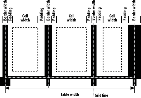
Figure 1-5. Collapsing cell borders model
Vertical Alignment Within Cells
The following describes the detailed process for aligning cell contents within a row:
If any of the cells are baseline-aligned, the row’s baseline is determined and the content of the baseline-aligned cells is placed.
Any top-aligned cell has its content placed. The row now has a provisional height, which is defined by the lowest cell bottom of the cells that have already had their content placed.
If any remaining cells are middle- or bottom-aligned, and the content height is taller than the provisional row height, the height of the row is increased by lowering the baseline in order to enclose the tallest of those cells.
All remaining cells have their content placed. In any cell with contents shorter than the row height, the cell’s padding is increased in order to match the height of the row.
Get CSS Pocket Reference, 4th Edition now with the O’Reilly learning platform.
O’Reilly members experience books, live events, courses curated by job role, and more from O’Reilly and nearly 200 top publishers.

