10.5. Building a Panoramic Image Presentation
Problem
You want the width of an image to increase or decrease as a user resizes his browser window, as shown in Figure 10-9.
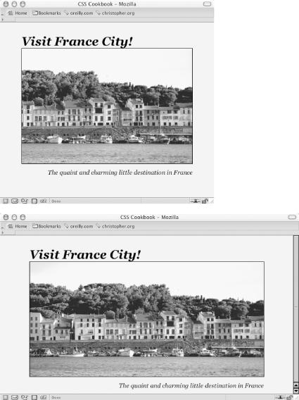
Figure 10-9. Browser window increased in size to show more of the panoramic image
Solution
Place an image element that refers to a panoramic image into the background of a block-level element (see Figure 10-10):
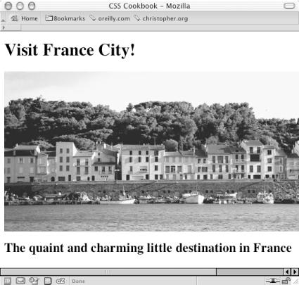
Figure 10-10. Panoramic photo placed on a web page
<h1>Visit France City!</h1>
<div><img src="frenchtown.jpg" alt=" " /></div>
<h2>The quaint and charming little destination in France</h2>
Position the image element in the upper right corner of the
block-level element and then hide the image by setting the
display to none:
div {
 background-image: url(frenchtown.jpg);
 background-repeat: no-repeat;
 background-position: top right;
 height: 300px;
 border: 1px solid black;
 max-width: 714px;
}
div img {
 display: none;
}
When the image is placed as a background image, it will be resized based on the size of the browser window.
Discussion
To create a panoramic presentation, you need a wide photograph. You
then need to position the image element in the upper right corner of
the block-level element so that the image will grow or shrink
depending on the size of the browser window. The use of
max-width
property constrains the width ...
Get CSS Cookbook now with the O’Reilly learning platform.
O’Reilly members experience books, live events, courses curated by job role, and more from O’Reilly and nearly 200 top publishers.

