7.2. Building a One-Column Layout
Problem
You want to build a layout that consists of one main column, as in Figure 7-3.
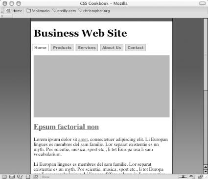
Figure 7-3. One-column page reinforced by increased margin
Solution
Apply a percentage value to the left and right
margins of the web
document’s body element:
body {
 margin-left:15%;
 margin-right: 15%;
}
Discussion
When you apply a percentage value to the left and right margins of the body, the column width becomes flexible. This allows the content to stretch to the width of the user’s browser.
To create a fixed-width column, use the
width property for the body
element:
body {
 width: 600px;
}
This technique aligns the column to the left side of the
user’s browser. If you want to center a column with
a fixed width, wrap a div element around the
entire contents of the web document with a specific, unique
id attribute such as a frame:
<div id="frame">
 [...]
</div>
Then, in the CSS rules, apply a 50% value to the left padding of the body:
body {
 width: 600px;
 padding-left: 50%;
}
Through an id selector, set the width of the
column, then set a negative left margin equal to half the column
width:
#frame {
 /* set the width of the column */
 width: 600px;
 margin-left: -300px;
}
You might think to just set the left and right margins to
auto:
#frame {
 width: 600px;
 margin-left: auto;
 margin-right: auto;
}
This straightforward approach doesn’t work in Internet Explorer for Windows, however. ...
Get CSS Cookbook now with the O’Reilly learning platform.
O’Reilly members experience books, live events, courses curated by job role, and more from O’Reilly and nearly 200 top publishers.

