Scatter plots
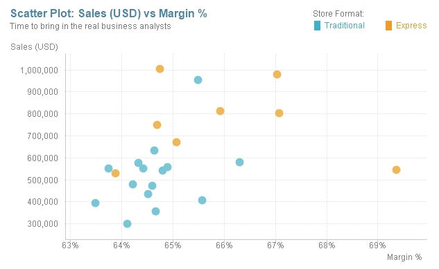
Scatter plots are one of the strongest allies that you will find when it comes to real data discovery. These visualizations can help you find correlations, identify clusters, and spot outliers. Even though their simplest structure compares only two variables (the x and y axes), it is possible to add a third one by changing the bubble size and even a fourth one by animating the chart.
Example: Sales vs Margin % scatter plot divided by store format.
Relevant features: Color encoding and text as popup.
To create such a chart, perform the following steps:
- Create a new scatter chart using
Storeas the dimension and click on Next. - As you can ...
Get Creating Stunning Dashboards with QlikView now with the O’Reilly learning platform.
O’Reilly members experience books, live events, courses curated by job role, and more from O’Reilly and nearly 200 top publishers.

