Chapter 4. CSS in Mozilla Applications
This chapter describes how Cascading Style Sheets (CSS) are used to create the look and feel of a Mozilla application's interface. Although XUL has a central role in creating a structure for an application's interface, defining widgets and their functionality, and creating the basic application code, it is CSS that creates the visible portion of an application. XUL and CSS often work so closely together that they seem inseparable, but XUL is generally responsible for the structure of an application's interface and CSS is responsible for the application's presentation. As described in the next sections, it is not until an XPFE application has been “skinned,” or styled with stylesheets, that it has a usable interface.
The first few sections in this chapter provide basic information about using CSS and some examples of how the Mozilla interface is created. They include reference material you can refer back to as you learn more. Starting with the “Creating New Skins” section, you can dive in, have some fun with CSS, and begin to create your own skins. The xFly package example created earlier in the book shows how to add custom styles to the XUL files you created in Chapters Chapter 2 and Chapter 3.
4.1. Interface Basics
Before describing the practice of using CSS, let's get some basic theory out of the way. When we talk about the interface of an application, we mean all of the parts of the application that are displayed and allow the user to interact. Buttons, windows, pages, menus, sliders, and descriptive text are all parts of the interface. In Mozilla, XUL usually defines the basic structure of the interface and CSS defines its presentation. These two aspects of the interface -- the way it's organized and the way it's presented -- are kept as distinct from one another as possible in Mozilla and in many good programming environments. Indeed, this separation is what gives rise to the concept of skins -- coherent, separate, and typically swappable “looks” for the same underlying structure. Mozilla uses Cascading Style Sheets, a quickly evolving series of standards already common in HTML web page presentation, to define the skin of XUL application interfaces.
4.1.1. Skins Versus Themes
When we say skin in this chapter, we refer to the look of the interface -- to the CSS styles and its relationship to the XUL structure underneath. The term theme is also used often in conjunction with interfaces and skins. These words are used interchangeably, although there are some differences in their meaning.
A single, overall theme is made up of many skins. The Navigator component's skin described in navigator.css, for example, is part of the overall Modern theme of Mozilla. Following this definition, the Modern theme may be made up of as many as 20 or 30 different skins corresponding to the major components and major UI features within those components. In addition to navigator.css, for example, there are stylesheets for toolbar.css, linkToolbar.css, and others, which collectively make up the Navigator skin. The CSS files may also be described as skins, as when this book instructs you to “open the messenger.css skin in a text editor.” All skins of a particular kind or look organized together comprise a single theme.
Themes are also often used to refer to the different looks that you can download and install for Mozilla and Netscape 6.x and 7.x. (To get new themes for the Mozilla browser go to View > Apply Themes > Get New Themes.) Any application created with Mozilla, though, can have different themes that users can install and select to customize the look of that application.
This distinction between a skin and a theme is not enforced -- or even acknowledged -- by many people in the Mozilla community, so you will see a profligate use of these terms in practice. Try to remain calm. The terminology differences aren't important. What is important is that you can create one (or many) looks for your application using CSS. This chapter will show you how.
4.1.2. Limitations of a Skin
Skins are used to style the structure of an interface that has been created with XUL. Once the interface has been defined in XUL, that structure is set and CSS can be used to change how that structure will look, but can't be used to change the structure itself. In practice, this means that you can use CSS to change the way a button looks -- but to move a button from one toolbar to another within the interface, you need to edit your XUL code. Skins generally affect the usability or appearance, but not the functionality of an interface, though the use of XBL in CSS is an exciting exception to this rule, as you will see.
This separation of the style and the content of an application means that there are a number of things you can't change in an application using CSS. Here are some examples of the kinds of interface elements that cannot be manipulated with a skin.
- The position and contents of menus and menu items and the functionality they trigger.
- The overall layout and functionality of buttons.
- The general layout of the application (although you can use CSS to hide sections of an interface).
While the underlying structure of menus and buttons cannot be changed in the process of editing a theme, you can, of course, change the appearance of things quite radically. In fact, you can change whether an element -- say, an item in a menu -- has any visibility using the visibility or display CSS properties. One of the Mozilla extensions to CSS, -moz-box-ordinal, lets you set the order in which the elements in a container are displayed. We describe these extensions and others later in this chapter in the section Section 4.2.3.
4.1.3. Theme Abstraction (or Building Good Skins)
One of the most important parts of a well-written theme is that it be as separate as possible from the actual structure of the interface -- that it be abstracted as a layer so it can be switched or updated without affecting or forcing you to edit the underlying XUL. Keeping an application's style separate is not mandatory, however, and you can have all presentation code in your XUL files, although we explain why this isn't a good idea.
As we have tried to stress, at the most basic level, abstraction means that the XUL should describe the structure and the CSS should describe the presentation, or look, of the interface. In reality, of course, the presentation layer is itself divided into different layers, where lower, more basic files like xul.css describe the look and feel of common UI elements such as buttons and menus, and higher-level CSS files consistently describe the layout and stylistic details of a component. When working on a theme or skin for your application, you should use as few inline style attributes as you can, as well as ensure that your themes are organized into component subdirectories and that one skin does not depend on another that is farther down in the “skin hierarchy.” (This is discussed later in this chapter in the Section 4.3.1 section.).
Planning Your Interface
Before you begin using CSS and images to style your XUL application code, it's important to have a sense of where your interface is heading. Begin by asking yourself some questions. What should the buttons look like? Do you want to give users the ability to switch skins in your application, as they can in the Mozilla browser? How will your application be affected when the user switches skins in Mozilla? What, if any, are the differences on the different platforms on which you expect users to run your application?
Although creating interfaces using XUL and CSS is fun and fast, it's best to do a mockup of your interface before you begin so you know where you are heading (both Adobe Photoshop and the GIMP are excellent tools for creating sophisticated images and mock-ups). The creators of the Modern and Classic themes do lots of visualization of the themes in image editing software and go through several iterations of testing and feedback.
One of the great advantages of using such an approach is that you will undoubtedly develop images and icons for your interface anyway, and you can slice and dice your mockup to get, for example, the icons for your buttons, the background images, and other real parts of the interface. You may find that you can actually use most of the mockup in your actual interface! See Section 4.2.4 later in this chapter for an explanation of how this image slicing can work in an advanced way when you have XBL-based widgets that use GIF images that are stitched together.
Because the overall theme of an application will most likely consist of a large number of individual graphic elements and widgets, pay special attention to considerations of color palette, web-optimized file formats such as .gif and .png, and file size to make sure your interface looks good and loads quickly.
4.1.4. Cross-Platform Interface Considerations
Often in traditional interface development, you try to make things look and work right on a single platform. Using something like MFC on Windows, for example, you can drop in the widget it provides and be reasonably assured that the interface will look like a Windows application interface whenever and wherever your application is run.
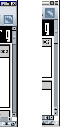
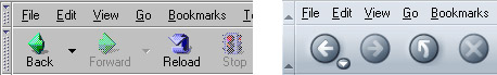
When you do cross-platform user interface development, you need to be aware of how your application will look on the platforms on which it will be used. One common difference, for example, is the layout of scrollbars in Windows applications and in Macintosh applications. On Windows, scrollbars typically have buttons at either end that advance the scrollbar button itself. On the classic Macintosh, the scrollbars are configured so that the buttons are clustered together. The difference is subtle, but it is a source of huge contention in the Mozilla world. Figure 4-1 shows the difference between the scrollbars on the two platforms. (This figure also shows a small notch in the lower righthand corner that is part of all classic Macintosh application windows and that shifts part of the Mozilla interface over to the left.)
Figure 4-1. Scrollbars on Windows and on the Macintosh
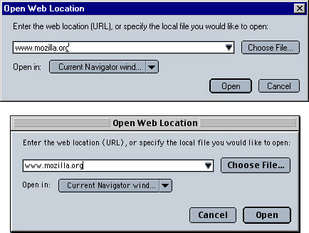
When you use the XPFE, you use a single code base to deploy on any number of different platforms. In the Mozilla code, there are some tricks for making things work differently on different platforms. Like scrollbars, the layout of buttons in dialogs is another important area of platform difference. The layout code for the Open Web Location dialog, for example, is defined in platform-specific files, and slightly different dialog layouts are deployed transparently to users (depending on their platform). Figure 4-2 illustrates the differing layouts of this dialog on different platforms (note the different positions of the Open and Cancel buttons in the two images).
Figure 4-2. The Open Web Location dialog in Windows and the Macintosh
If you look in the global resources area of the xpfe in the source code (using a tool like Mozilla's LXR), you can see the platform subdirectories where the buttons in the dialogs are arranged with <spacer /> elements and different alignments:
mozilla/xpfe/global/resources/content/
  mac/
    platformDialogOverlay.xul
  os2/
    platformDialogOverlay.xul
  unix
    platformDialogOverlay.xul
  win
    platformDialogOverlay.xul
These platform-specific files allow the application developer to write XUL that works the same way on every platform, but preserves subtler aspects of an interface that users expect from their platform.
4.2. Introduction to CSS in Mozilla
Now that you have absorbed some of the most important basic aspects of interface design, we can begin to discuss how Mozilla uses CSS and images to make actual interfaces out of the structure defined in the XUL files. Though XUL contains the widgets and structure upon which the interface rests, it is not until at least some basic skin information has been loaded into the XUL that the interface becomes visible and editable by the user. In addition to this, CSS binds XBL widgets to the basic structure of the XUL code, allowing extended content to appear in your document. For more information about XBL, see Chapter 7.
4.2.1. Basic XUL + CSS Interaction
XUL and CSS interact at two basic levels in Mozilla. At the file level, XUL picks up CSS information by explicitly loading CSS stylesheets at runtime. At the element level, selectors bind CSS rules to specific XUL elements or groups of elements. For an XUL element to pick up a style defined in a CSS file, the XUL file must load the CSS file, and an element or group of elements in the XUL must match a selector in the CSS rule. We discuss these basic levels of interaction in the following two sections.
4.2.1.1. CSS and XUL file interaction
Like HTML, XUL loads style information by including a specific processing instruction somewhere at the top of the file. There are various ways to apply style to HTML pages, including the common example below, in which a <link /> element with a URI loads an external stylesheet that holds the style information for the web page.
<link rel="stylesheet" href="../style.css" type="text/css">
In XUL, however, you must use one or more special processing instructions at the top of the XUL file to load the CSS stylesheet information, or skin, into the XUL.
<?xml-stylesheet href="chrome://global/skin" type="text/css"?>
Note that the XUL stylesheet loading supports the use of http:// and file:// type URLs, but most often, the chrome:// type URL is used, which points to files that are available in the application's chrome subdirectory and that are registered with the chrome registry. The example above uses a special feature of this chrome type URL, which resolves directory pointers to files within those directories that have the same name as the directory itself (thus serving as a shorthand for main theme stylesheets). The chrome URL chrome://global/skin, in other words, loads a stylesheet found at chrome://modern.jar:/global/skin/global.css.
XUL also supports the use of inline styles, which is style information that is applied to individual elements with a style attribute. However, this practice is generally frowned upon, since it overrides the skin information and makes it very difficult for new skins to be applied correctly.
Actually, the chrome URL in the example does more than this. Another important function of the chrome registry is that it keeps track of which packages you have installed, which skin you have applied to your application, and resolves URLs like chrome://global/skin into the global skin information for the currently selected skin. If you apply the modern skin, for example, then this URL loads the global skin file from the modern.jar; if you apply the Classic skin, then the chrome URL actually resolves to chrome://classic.jar:/global/skin/global.css instead. This flexibility in the chrome registry abstracts the structure in the XUL files from the skin information and allows you to create and apply different skins.
4.2.1.2. Applying style rules to XUL
In CSS, selector refers to the element or group of elements to which a style rule is bound -- to the thing that is selected for styling. In some cases, the selector is an actual XUL element. The following style rule, for example, says that all XUL <menu/> elements in the XUL file(s) into which this CSS is loaded will have a red background color:
menu {
  background-color: red;
}
In this case, the element selector names an element (menu) directly: all elements of that type match and are styled with the rule. In the next few sections, we describe the main types of selectors and the style rules that can be applied to them. With a couple of notable exceptions (see Section 4.2.3 later in this chapter), the CSS you use with XUL is the same one you use for HTML elements.
4.2.1.3. Inline styles
Another way to apply style to XUL elements is to use inline style rules. Use inline styles with caution. All XUL elements have a style attribute that can be used to define styles directly for that element. In the following example, the style attribute is used (in a common but somewhat deprecated manner) to hide the XUL element -- to apply a style that suppresses rendering of the element (though it still takes up space in the UI):
<menuitem id="e_src"
  label="&editsrc.label;"
  style="visibility: none;" />
When you use inline styles, the syntax does not include the brackets, but you can still add multiple style rules by using the semicolon. The item before the colon is the property, and the item after it is its value. The format of inline styles is as follows:
style="style attribute1: value[; style attribute2: value; etc...]"
The reason why inline styles are frowned upon in XUL and skin development is that they can be extremely difficult to locate and work around when you design a new skin and want to change the appearance of an element that has an inline style. The style attribute takes precedence over styles applied from other sources -- inline styles are the last rule in the cascade of style rules -- so they cascade over styles defined in a skin and may “break” the overall look of that skin.
Besides this problem, many tricks for which application developers use the inline style can be done using XUL attributes. It's very common to use the CSS attribute-value pairs display: none; or visibility: none; to hide elements in order to change what's available from the interface. However, smart XUL developers use the hidden or the collapse attribute instead, thereby keeping structural matters as separate from style matters as possible.
4.2.2. Stylesheet Syntax
Cascading Style Sheets are the blueprints for Mozilla skins. In Cascading Style Sheets, style definitions take the following basic form:
element {
  style attribute1: value;
  style attribute2: value;
style attribute3: value;
}
For example, the following definition makes all XUL menus appear with a one-pixel border, a light-blue background, and ten-point fonts:
menu {
  border: 1px;
  background-color: lightblue;
  font-size: 10pt;
}
This is an example of using the element itself -- in this case, a “menu” -- as a selector (the item to which the style definition is applied). In addition to the basic element selector and style rules, CSS provides the application of style information to classes of elements, element IDs, and elements with particular attributes or states. The following three sections demonstrate the basic format for these three common style selectors.
4.2.2.1. The element selector
The element selector is the most basic kind of selector. It is just the name of the element to be styled at the front of the style rule. In the previous example, the <menuitem /> element, defined in a XUL file that loads this style rule, will have a light blue background color:
element { attribute: value; }
menuitem  { background-color: lightblue; }
4.2.2.2. The pseudoelement selector
The pseudoelement selector selects a piece of an element for styling. While a selector like menuitem picks up all menu items in a given XUL document, a pseudoelement selector like menuitem:first-letter binds the rule's styles to only the first letter in a menuitem value.
menuitem:first-letter { text-decoration: underline; }
description:first-line { margin-left: .25in; }
The first style rule above gives all menu items to which it applies the look of being accesskey enabled. The second creates an indentation in the first line of a XUL description element's text. Menu access keys let you open and choose items from a menu by using the underlined letters and modifiers (e.g., “F” and <alt> to open the File menu).
4.2.2.3. The class selector
The class selector applies the style rule to all XUL widgets of a given class. In the XUL files that define the structure of Netscape 7, the class is specified with the class attribute (e.g., <menu class="baseline">) and in CSS with the dot notation:
element.class { attribute: value;}
menu.baseline {   border: 0px;   font-size: 9pt; }
In this example, all menus with a XUL baseline class have no borders and a nine-point font size. Note that you can use the class without the preceding XUL element to skin all XUL elements with a given class. In Example 4-1, both the XUL box and the XUL menu pick up the style given in the “redbox” class style definition.
Example 4-1. Class selector in CSS
.redbox {
  border: 2px solid red;
  font-size: 9pt;
}
<box class="redbox">
    <menu class="redbox">
    <menu class="bluebox">
</box>
4.2.2.4. The ID selector
The CSS ID selector applies the style rule to a unique XUL element. As with class, the ID is specified in the XUL with an attribute (e.g., <menu id="file_menu">) and in the CSS with the pound sign preceding the ID itself. In this example, the menu with an ID of edit has a red color:
element#id { attribute: value;}
menu#edit { color: red;}
In the example above, both the element type and the element ID are given. You can also identify elements anonymously (though still uniquely) by using just the selector:
#whitey {
    background-color: white;
    margin: .25in;
}
In the case of IDs, these selectors are identical, since IDs need to be unique across the whole XUL file. When you use classes, however, the typeless style rule is a good way to apply your style information to a range of elements.
4.2.2.5. The attribute selector
The attribute selector allows you to style XUL elements with particular attributes or with attributes of a particular value. In Example 4-2, all elements with a disabled attribute set to true will have a light-grey color.
Example 4-2. Attribute selector in CSS
element [attribute=value] { attribute: value; }
element [attribute~=value] { attribute: value; }
*[disabled="true"]
{
  color: lightgrey;
}
menu[value="File"] {
  font-weight: bold;
}
[id~="my"] { color: red; }
Note that Example 4-2 uses the * character for selecting all elements. This “wildcard” selector can be combined with attribute and other selectors to make a powerful filter in your CSS stylesheets -- but of course, in an example like Example 4-2, it could be omitted and [disabled=true] would still apply to all elements with that attribute set to that value.
Example 4-2 also uses ~= to match attributes that contain the given fragment. In this case, any elements that have an ID with the fragment “my” have text colored red, as when you want to see all your customized elements for debugging purposes.
4.2.2.6. Pseudoclass selectors
Another feature of CSS-2 that Mozilla makes extensive use of is the pseudoclass. In CSS, pseudoclasses are used to represent different states for elements that are manipulated by the user, such as buttons. The states -- represented by pseudoclasses such as active, focus, and hover -- change when the user interacts with an element. The pseudoclasses actually correspond to events on the interface elements.
The : character is used to add these pseudoclasses in the CSS notation:
#forwardButton:hover
{
  list-style-image      : url("chrome://navigator/skin/forward-hover.gif");
}
The pseudoclass is often appended to another style. Since specific CSS style rules inherit from more general rules (see the section Section 4.3.1 later in this chapter for more information about this inheritance), the example above picks up any styles defined for the button with the id of forwardButton (and any class-based information, as well as the basic CSS for a button), but substitutes whatever image is used with this special GIF that represents a button being moused or hovered over.
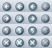
In Mozilla's Modern skin, the pseudoclasses work collectively to give buttons their appearance and behavior. Each of the following button images in Figure 4-3 is associated with a different pseudoclass (or attribute, as we discuss in the next section). As soon as the pseudoclass is changed by user interaction (e.g., the user hovers the mouse over the button), the state changes and the effect is one of seamless transition.
Figure 4-3. The different states for buttons in the Modern theme
4.2.2.7. Element relation selectors
Contextual subgroups -- elements appearing within other elements, such as italicized text within a <p> element or a <body> in HTML -- can be grouped in CSS, but this is an extremely inefficient way to style XUL. CSS2 also provides ways to group elements for styling based on their relationship in the object model. Table 4-1 lists these relational selectors.
Table 4-1. Relational selectors
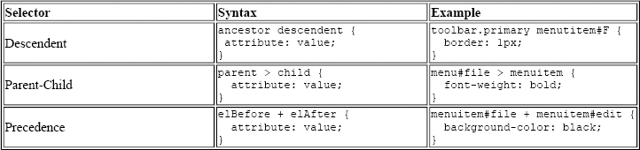
In the descendent example in Table 4-1, the “F” menuitem has a border only when it appears within the toolbar whose class is given as “primary.” In the parent-child example, all menu items in a menu with the id “file” are made bold. Using +, the precedence selector says that the “edit” menu should have a black background only when it comes after the “file” menu. You can use these element relation selectors to create longer descensions (e.g., toolbar.primary > menu#file > menuitem#new), but remember that the processing gets more expensive with each new level, and that the descendent operation is particularly processor-intensive.
4.2.2.8. The !important keyword
As you might imagine, when you have a technology with such strong notions of precedence as Cascading Style Sheets (the ID-based style trumps the class-based style, inline style attributes trump those loaded from an external stylesheet, etc.), you may need to identify and set aside certain styles as the most important, regardless of where they are found in the cascade.
This is the role played by the !important keyword. Sitting to the right of a style value, it specifies that style rule should take precedence over all of its competitors and that it should be applied all the time. Example 4-3 demonstrates how no borders are rendered on treecells of the class treecell-editor because of the !important keyword.
Example 4-3. !important keyword in CSS
.treecell-editor,
.treecell-editor > box {
  margin: 0px !important;
  padding: 0px !important;
}
.treecell-editor {
  border: 0px !important;
}
You can search for the !important keyword in the LXR Mozilla source code tool and see its use in the Mozilla CSS.
4.2.2.9. The inherits value
CSS uses inheritance all over the place. Inheritance is implicit in the way style rules are applied, stylesheets are organized in the chrome, and skins borrow from one another in Mozilla. However, a special CSS value indicates that the selector explicitly inherits its value from the parent element.
When a CSS property has a value of inherit, that property's real value is pulled from the parent element:
.child {
  color: darkblue;
  height: inherit;
  background-color: inherit;
}
This block specifies a dark blue color for the font, but the values of the other two properties are inherited from the parent. In many cases, this has the same effect as not specifying any value at all for the child and letting the style rules above the current one in the document inheritance chain cascade down. However, not all style rules are inherited. Properties such as !important, left, and height are not inherited automatically by child elements, so you must use the inherit keyword to pick them up.
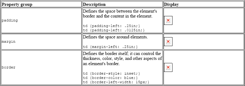
4.2.2.10. Box layout properties in CSS
People sometimes get confused about the various element spacing properties in CSS, such as border, padding, and margin. Though they work together a lot and often affect or overlap one another, these properties specify different things, as Table 4-2 shows.
Table 4-2. CSS spacing and layout properties
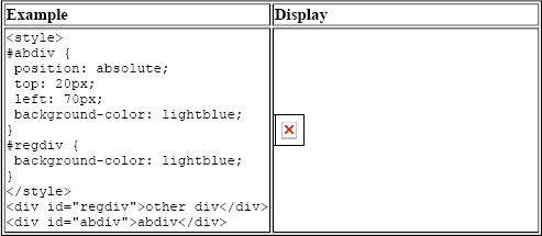
4.2.2.11. The position property
position is a special CSS property that specifies whether the given selector uses absolute or relative positioning. Unless you set the position property to absolute, you cannot use the related top and left properties to set the position of the current selector within its parent, as the example in Table 4-3 demonstrates. The top and left properties, when activated by the absolute position, specify the amount of distance from the top and left of the document, respectively. You can also set position to fixed to make it stay in one place as other content or UI is scrolled or moved.
Table 4-3. The position property
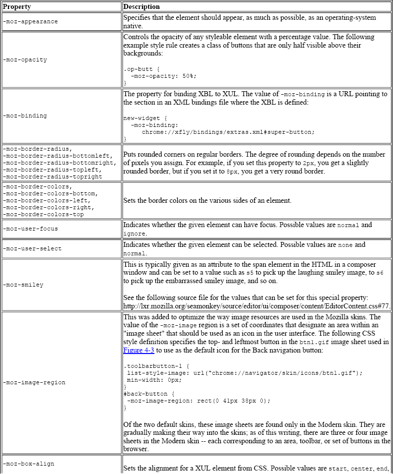
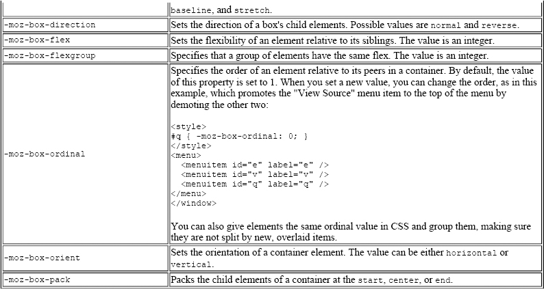
4.2.3. Special Mozilla Extensions
Mozilla skins extend upon the CSS standards in just a few notable ways. These Mozilla CSS extensions take the form of special selectors and properties with the special -moz- prefix, indicating that they are not part of the actual CSS specifications. You can find a complete list of these CSS keywords by searching for the file nsCSSKeyWordList.h in LXR.
Generally, these extensions are used to define CSS style and color values that are hardcoded into the C++ code and available for reuse in particular places in the Mozilla themes. You can use a few -moz- extensions, such as properties or special values or even, in some cases, style-related attributes in the XUL (e.g., span[-moz-smiley="s1"], which grabs span elements in the HTML editor whose -moz-smiley attribute is set to s1 and styles them accordingly). Actually, you can use any value in that CSS keyword list. Trial and error or a look in the C++ code will reveal what these values are. The values, like -moz-fieldtext and -moz-mac-menushadow, usually refer to actual color values. A list of some Mozilla CSS extensions appears in Table 4-4.
Table 4-4. Mozilla CSS extensions
4.2.4. Referencing Images in CSS
Another basic function of the CSS in any Mozilla skin is to incorporate images into the user interface. A Mozilla skin can contain literally thousands of images, which are all referenced from particular style statements in the CSS. It's common for a single element to point to different versions of an image to reflect different states -- as when a second image is used to give a button a pushed-down look as it is clicked -- to create dynamism and provide feedback to the user. Example 4-4 shows the following two style statements handle the regular and active -- or depressed -- states, respectively.
Example 4-4. Image in CSS
button.regular {
    list-style-image: url(chrome://global/skin/arrow.gif);
    background-image: url(chrome://global/skin/regbutton.gif);
}
button.regular:active
{
    background-image: url(chrome://global/skin/button_pushed.gif);
}
In Example 4-4, the second of the two definitions inherits from the first, so it implicitly includes the arrow.gif as a foreground image. The second style definition says that when the XUL button of class regular is active, the image button_pushed.gif is used in place of regbutton.gif for the background.
Example 4-4 also illustrates the two common stylesheet properties that reference images: list-style-image and background-image. The list-style-image property specifies an image to go in the foreground of the selector; the background-image property specifies a separate image for the background. The availability of these two properties allows you to fine-tuning the images used to style the UI, as in this example, where the arrow icon is preserved and the wider, underlying button is swapped out.
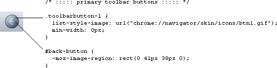
In fact, the navigation buttons in the Modern skin are created by using both properties. In this case, the background is the basic round disk as seen in Figure 4-4, defined in the toolbarbutton-1 class in communicator\skin\button.css, and the list-style-image is the arrow portion of the button, defined in the button ID and sliced out of a button image sheet with the special -moz-image-region property (see Section 4.2.3 later in this chapter for a description of image sheets).
Figure 4-4. Composite styles for the reload button
4.2.5. Menu Skinning
As an example of using CSS in applications, Example 4-5 combines many common selectors described in this chapter in a set of rules for defining the look and basic behavior of menus. The CSS handles the basic look of the menus, their color and style, the look of the menu items when they are hovered over, and the look when they are selected.
Example 4-5. Mixing CSS and XUL
<menu id="sample">
  <menupopup>
    <menuitem class="m" label="File" />
    <menuitem class="m" label="Edit" />
    <menuitem class="m" id="q" label="Quit" />
  </menupopup>
</menu>
.m { background-color: lightgray; font-size: 9pt; }
.m:hover  { border: 1px; }
.m:active { background-color: gray; color: white; }
#q:active { background-color: black }
When you hover over any of the items in the menu generated by the code in Example 4-5, they display a border. When you select the item, it appears momentarily with a dark gray background and white lettering, like reverse video. The Quit menu item, unlike others, appears with a black background. Note that it also picks up the same white lettering as the other items of the m class, since this style information is inherited.
4.3. Mozilla Skins
At an earlier point in Mozilla's history, all interface files -- the XUL, the CSS, and the images -- were stored in directories named after the main Mozilla packages in the application chrome directory. The best way to look at a skin was just to poke around in those directories, change things in the CSS files you found, and reload to see what had changed in the browser. The CSS files are no longer stored in regular directories.
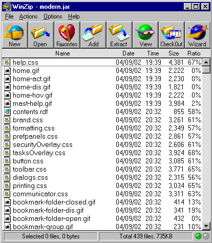
To organize things better and make a smaller footprint for Mozilla, all chrome is stored in special compressed archives in the chrome directory. These archives are Java Archive (JAR) files, whose subdirectory structure reflects the structure of Mozilla's major components, to some extent. There is one JAR archive for every theme. By default, Mozilla is distributed with the Classic and Modern themes, represented in the chrome as classic.jar and modern.jar. Figure 4-5 shows some of the contents of the modern.jar file in a zip utility.
Figure 4-5. The contents of the modern.jar file
4.3.1. CSS and Skin Hierarchies
You have already seen some of the structure inherent to CSS in the previous examples. When an element has both a class-based and an id-based rule, for example (as well as a basic element “look and feel” defined in the global skin), the element style is applied. Then, the more specific class-based rule is applied and overwrites the properties of the general rule if they conflict. Finally, the ID-based rule is applied and overwrites whatever conflicting style values are in the more general selectors. In this way, the most specific style rules inherit from the most basic. This is the “cascade” in Cascading Style Sheets. In addition to this definition, the syntax of CSS allows you to specify selector relationships -- such as when you create a parent-child selector and apply a style rule to only the selectors that have some other particular element as a parent in the XUL content model. However, there is also a strong inheritance mechanism in the way that the Mozilla browser uses CSS -- in the way skin files are organized in the chrome and applied to the XUL. The strong hierarchical structure present in Mozilla's CSS and the XUL allow the chrome registry to maintain the skin and the various components that get skinned as different modules, but find and apply the right resources whenever they are called for. This structure is described in the Section 4.3.2 section later in this chapter.
4.3.1.1. Skin inheritance and skin modularization
For the sake of discussion, this book describes two kinds of inheritance: the more basic form, in which a specific skin like navigator.css inherits all style rules from global.css, and modularization, in which navigator skin rules specific to the toolbar are distributed into widget-specific CSS files (e.g., toolbar.css is part of the global skin). The global skin -- once a large, unmodular set of style rules contained in global.css -- is now spread out over several modularized CSS files, as Figure 4-6 shows.
Figure 4-6. XUL file and skin loading
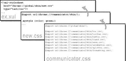
This modularization makes it possible for a XUL file to load the global.css file in a single statement and use any of the style rules defined in these skins. We will discuss the global skin in more detail in the section Section 4.3.4.2 later in this chapter. Skin inheritance and skin modularization work together to give skins their structure and make it possible to create new skins or apply CSS only to particular parts of the application.
Figure 4-6 shows a very specific skin, new.css, inheriting the style information from communicator.css and then being loaded into the XUL file. In a situation like this, ex.xul can use any style rule defined in the communicator.css file (or in any CSS file that it imports).
4.3.2. Basic Skin Structure
Though they look very different, the Modern and Classic themes that are installed with Mozilla have similar structures. This is because the structure of a theme reflects, in many ways, the structure of the components to which it applies. So, for example, both themes have subdirectories (in the JAR files in which they are stored) where the CSS and image resources for each of the main components are stored. Modern, for example, has a communicator component subdirectory, and that subdirectory has subdirectories representing the various parts of the communicator interface: bookmarks, help, search, sidebar, and so on. Example 4-7 shows the Modern and Classically themed Navigation bars side by side.
Figure 4-7. Classic and Modern Navigation toolbars
Both themes are complete. They each contain all skin resources for the major components of the application.[1] The resources themselves vary, but their structures are almost identical. This ability is what makes the skins dynamically changeable.
Skin developers can, for example, create a skin for a single component in Mozilla (e.g., messenger) and let the Modern theme continue to take care of the other components for which they have not created any new CSS information. Which components are skinned by which themes is specified in the installed-chrome.txt file, where a single entry represents the application of the appropriate theme resources to a single component, such as navigator. (See Chapter 6 for more information about this file and about how themes and other packages are registered and applied in Mozilla.) This situation does not apply to new applications like xFly, however, for which the XUL is typically a single package and the CSS that applies to it is another single package. Unlike the Mozilla browser, your application will probably have a single manifest and content subdirectory and a single manifest and skin subdirectory:
xfly.jar:
    content/
        contents.rdf
        <xul content here>
    skin/
        contents.rdf
        <css content here>
An important difference here is that your skin requires a single manifest whereas the Mozilla themes use as many manifests as they have major components to skin. When the application that needs to be skinned is as large as the Mozilla browser, modularity is almost imperative -- particularly if that application supports add-on applications (like xFly itself, which will be accessible from the Mozilla Tasks menu when you are done).
4.3.3. The Modern and Classic Themes
If you haven't already looked at it, using the skin-switching UI (View Menu > Apply Theme > Modern) in Mozilla will give you an idea about the differences between the two skins that come preinstalled with the browser. The Classic skin is modeled after earlier versions of the Mozilla UI and of the Netscape 4.x Communicator product. It has the familiar light grey box look, with the larger, primary-colored navigation button and a squared-off geometry. The Modern theme is a newer take on the browser interface. It has a smoother overall look, with rounded edges on many of the widgets, subtle color differentiations, gradients, and 3D icons.
However, both skins sit on top of the same XUL. With one notable exception -- a powerful feature of CSS in Mozilla discussed later in this chapter in the Section 4.5.1 section -- the applications themselves are identical, and themes themselves provide all the differences in the browser's look and behavior.
4.3.4. Skin Files
Obviously, we cannot describe even a fraction of the CSS files that go into making up a single, overall theme. There are, however, some CSS files that help determine how the Mozilla browser looks. In this section, we will go over some of those files so you can see how they relate to one another, where the browser gets its look, and what strategies you might use to create your own complete skin.
The following sections provide a brief, representative sampling of the Modern theme. The global skin, the navigator skin, and the communicator skin are discussed as they pertain to the Modern theme in the Mozilla browser.
4.3.4.1. Navigator skin
One of the most specific and complex skin files in the Modern theme hierarchy is the navigator.css file, which contains style information for the browser itself. When you look through this skin, you will see rules for such things as the Print button. In Example 4-6, note how several selectors are grouped with a single style rule, and how the parent-child relationship between elements (see the earlier section Section 4.2.2.7 for an explanation of this selector) is used to style print buttons appearing in different places (i.e., under different element parents) in the UI.
Example 4-6. CSS for print button in navigator skin
#print-button
  {
    -moz-binding :
      url("chrome://communicator/skin/menubuttonBindings.xml#menubutton-dual-foo");
    list-style-image : url("chrome://global/skin/print.gif");
    margin           : 6px 6px 0px 6px;
  }
#print-button[disabled="true"],
#print-button[disabled="true"]:hover,
#print-button[disabled="true"]:hover:active,
#print-button[disabled="true"] > .menubutton-dual-stack > .menubutton-dual-button,
#print-button[disabled="true"] > .menubutton-dual-stack >
    .menubutton-dual-button:hover,
#print-button[disabled="true"] > .menubutton-dual-stack >
    .menubutton-dual-button:hover:active
  {
    list-style-image      : url("chrome://global/skin/print-disabled.gif");
  }
#print-button > .menubutton-dual-stack > .menubutton-dual-button:hover
  {
    list-style-image      : url("chrome://global/skin/print-hover.gif");
  }
#print-button > .menubutton-dual-stack > .menubutton-dual-button:hover:active
  {
    list-style-image      : url("chrome://global/skin/print-clicked.gif");
  }
#print-button > .menubutton-dual-stack > .menubutton-dual-dropmarker-box
  {
    margin-left       : 19px;
    margin-top        : 22px;
  }
4.3.4.2. Global skin
Almost all of the most specific skin files (e.g., navigator.css) inherit from the global skin, which includes but is not limited to the global.css file located in chrome://modern.jar!/skin/global/skin/.
The global skin includes other stylesheets that define localizable settings and general global formatting, which the global.css file loads at runtime. If you look at the top of the global.css file as shown in Example 4-7, you can see the stylesheet import statements that collect these skins into a single global skin:
Example 4-7. CSS Import statements in global skin
/* ===== global.css ======================================================
   == Styles that apply everywhere.
   ======================================================================= */
/* all localizable skin settings shall live here */
@import url("chrome://global/locale/intl.css");
@import url("chrome://global/skin/formatting.css");
@namespace url("http://www.mozilla.org/keymaster/gatekeeper/there.is.only.xul");
/* ::::: XBL bindings ::::: */
toolbarbutton[type="menu-button"] {
   -moz-binding: url("chrome://global/skin/globalBindings.xml#toolbar-menu-button");
}
.menulist-compact {
   -moz-binding:
      url("chrome://global/content/bindings/menulist.xml#menulist-compact");
}
...
The global.css serves as a base into which these other skins can be loaded. When you load global.css into your XUL file by means of a xul-stylesheet processing instruction, you in effect load these skins.
Also included in Example 4-7 are a couple of binding attachments, which attach content to elements that match certain style rules. On a related note, most global skins on a widget-per-widget basis are now included in the binding themselves, as opposed to being imported in a global skin, which used to be the case. Take this button stylesheet inclusion from the XBL file button.xml as a case in point:
<resources>
  <stylesheet src="chrome://global/skin/button.css"/>
</resources>
Here the XBL specific <stylesheet> element includes the stylesheet, which can be included in a binding and then inherited by other button bindings.
4.3.4.3. The communicator skin
Like global.css, the communicator.css file (Example 4-8) is another CSS file that does imports to build up the communicator skin. The CSS style rules in the file itself are minimal, but if you look at the top, you can see that many styles that the communicator component uses come from the CSS files also located in the communicator subdirectory of the current skin.
Example 4-8. CSS information from communicator.css
/* ==== communicator.css ====================================================
   == Styles shared everywhere throughout the Communicator suite.
   ========================================================================== */
@import url("chrome://global/skin/");
@import url("chrome://communicator/content/communicator.css");
@import url("chrome://communicator/skin/brand.css");
@import url("chrome://communicator/skin/button.css");
@import url("chrome://communicator/skin/formatting.css");

@namespace url("http://www.mozilla.org/keymaster/gatekeeper/there.is.only.xul");

/* ::::: online/offline icons ::::: */

#offline-status[offline="true"] {
  list-style-image: url("chrome://communicator/skin/icons/offline.gif");
}

#offline-status {
  list-style-image: url("chrome://communicator/skin/icons/online.gif");
}

/* ::::: directional button icons ::::: */

.up {
  min-width: 0px;
  list-style-image: url("chrome://global/skin/arrow/arrow-up.gif");
}

.up[disabled="true"] {
  list-style-image: url("chrome://global/skin/arrow/arrow-up-dis.gif");
}

.down {
  min-width: 0px;
  list-style-image: url("chrome://global/skin/arrow/arrow-dn.gif");
}
.down[disabled="true"] {
  list-style-image: url("chrome://global/skin/arrow/arrow-dn-dis.gif");
}

.up {
  list-style-image:url("chrome://global/skin/scroll-up.gif");
  min-width: 0px;
}
.up[disabled="true"] {
  list-style-image:url("chrome://global/skin/scroll-up-disabled.gif");
}
.down {
  min-width: 0px;
  list-style-image:url("chrome://global/skin/scroll-down.gif");
}
.down[disabled="true"] {
  list-style-image:url("chrome://global/skin/scroll-down-disabled.gif");
}
.sidebarTree {
  border: none;
  margin: 0px !important;
}
/* ::::: download manager ::::: */
#downloadView > treechildren:-moz-tree-image(Name) {
  margin-right: 2px;
}
Notes
4.4. Creating New Skins
You have already created the highest level of the directory structure you will need to create a skin for the xFly application (See “Creating the Hello xFly Package” in Chapter 2). So far, you have created three subdirectories corresponding to different parts of the package and you have added XUL to the xfly/content subdirectory. In the xfly/skin subdirectory, you will tell the xFly content where to expect to find its skin resources. As just mentioned, Mozilla applications outside of the browser itself typically restrict their skin to a single subdirectory and their skin manifest to a single RDF/XML file.
Since the skin subdirectory in your xFly package is already registered, you can create a new CSS file called xfly.css, save it in the skins subdirectory, and load it from your xfly.xul file by adding the following stylesheet loading instruction at the top:
<?xml-stylesheet href="chrome://xfly/skin" type="text/css" ?>
You will recall that the chrome pointer in the href resolves to a file named xfly.css (named after the directory) in the following registered directory in the chrome:
chrome/xfly/skin/
This CSS file will be the worksheet for all CSS for the xFly application. Any style rules you add here and associated with XUL elements in the xFly XUL code will affect the layout and presentation of that code on restart.
4.4.1. Importing the Global Skin
As you create a new skin for your application, the first step is to make sure that the application imports the global skin in which the most basic look and feel of the XUL widgets is defined. Even if you create a skin that looks completely different than the skins installed with Mozilla, you should import the global skin to avoid having to recreate so much of the basic presentation and behavior of the XUL widgets.
As much as possible, the global skin avoids providing theme-specific styles, and instead provides just enough information to make buttons, for example, look like buttons and menu items look like menu items. Increasingly, basic styles are also being defined in the XBL bindings for widgets. For instance, when you use a toolbar widget, you use a binding in which certain intrinsic looks and behaviors are defined in a way that's transparent to you and to the user of the application. The style for these bindings is located in the content subdirectories with the binding XML files. In this way, they “stay with” the widget and not with the selected skin. You can easily extend or overwrite any of the style information you pick up from the global skin, but loading the skin is a good place to start.
To do this, verify that you have the following line at the top of the xfly.xul file:
<?xml-stylesheet href="chrome://global/skin" type="text/css" ?>
If you do not have this line, add it now to the xfly.xul file and restart Mozilla. You ought to see a plain, UI-like collection of widgets in the XUL window. In the screenshots in Figure 4-8, you can see how loading the global skin affects the XUL file.
Figure 4-8. Stylesheet additions to a XUL file
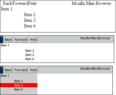
The first screenshot in Figure 4-8 shows a XUL file loaded in Mozilla with no skin information. The second is the same XUL file with the global skin loading instruction at the top. The third is a screenshot of that XUL file with an instruction for loading your own stylesheet, which in turn imports the global skin:
<?xml-stylesheet href="chrome://xfly/skin/sample.css" type="text/css" ?>
The CSS information in the skin file sample.css loaded above looks like this:
@import url(chrome://global/skin/)
box#bbox { background-color: lightgrey; }
button#rd { background-color: red; color: white; }
Taking advantage of the modularity of Mozilla skins, you can design a decent interface (if the last screenshot above can count as that) with just a few lines of code.
Once you import the global skin and see what it buys you in terms of look and feel, you can begin to create your own skin for the xFly, overriding global styles where appropriate, extending them by “cascading” new, more specific style rules for your widgets, or adding new styles.
Before you begin to add styles to the xfly.css file, import it (as a blank skin) into xfly.xul so you can see your progress as you go. Add the following line to the top of the xfly.xul file to import the xFly skin from the proper subdirectory of the xFly package:
<?xml-stylesheet href="chrome://xfly/skin" type="text/css" ?>
You won't see anything extra when you quit and restart the application, but you now have the skin structure in place so you can see your work progress.
4.4.2. Getting Started with Custom Styles
When you make a new skin, it's a good idea to define the most general styles for your application first. As we described above, more specific CSS rules tend to inherit from more general ones. For the xFly application, the most general aspects of the style are the rules that apply to the xFly windows themselves. You can create styles for all windows using the element name, window, or you can define different classes for windows if your application supports them. In the xfly.xul file, for example, the root <window> element has the attribute class="main", so it will pick up style rules given for window.main, as shown in Example 4-9.
The xFly application has both a main window and pop-up windows, so you might create style rules like the ones that follow to establish the basic look of the xFly application.
Example 4-9. CSS rules for xFly window
window.main {
   background-color:            #cccccc;
    display:                    block;
    overflow:                   hidden;
    font:                       small arial,helvetica,sans-serif,tahoma;
    padding:                    0px;
}
window.popup{

    background-color:           #cccccc;
display:                    block;
    overflow:                   hidden;
    font:                       small arial,helvetica,sans-serif,tahoma;
    padding:                    2px;
    width:                      auto;
    height:                     auto;
}
Now, with the two stylesheets (global.css and the xfly.css) referenced at the top, you already have a window that is starting to look like an application.
4.4.3. Creating Styles for the xFly Buttons
Now that you have created a single custom style for the xFly application, you can see how easy it is to associate cascading style rules with any element in your interface. The next logical step is to style the buttons in the xFly sample application, since they make up such a large portion of the interface itself.
When you use the button widget without any extra style information, you already get a lot of the button-like presentation and behavior. The button has different looks, for example, when you hover over it and when you click it, and it has a basic three-dimensional shape as seen in Figure 4-9.
Figure 4-9. XUL button with no style
A common update to regular XUL buttons is to give them images, like the navigation buttons in the main Mozilla browser window. Adding the class-based style rule in Example 4-10 to the xFly stylesheet (and, of course, the GIF image itself to the skin subdirectory) will give all the “fly” buttons background images with flies in them.
Example 4-10. Custom styles for buttons
button.fly {
  list-style-image: url("chrome://xfly/skin/btnfly.gif");
}
button.fly[disabled="true"] {
  list-style-image: url("chrome://xfly/skin/btnfly-dis.gif ");
}
button.fly#hover {
  list-style-image: url("chrome://xfly/skin/btnfly-hov.gif ");
}
4.4.4. Describing the Skin in RDF
As described in Chapter 6, a manifest must accompany and describe the skin so it can be found and registered. The manifest is an RDF file called contents.rdf that sits at the highest level of the skin (i.e., at the top of the JAR or immediately under the modern directory when extracted to disk). Since the content, skin, and locale of an application are considered different packages, each must have its own manifest.
The listing in Example 4-11 shows the contents.rdf manifest that accompanies the xFly skin resources in the xfly.jar!/skin/ directory.
Example 4-11. Skin manifest for the xFly sample
<?xml version="1.0"?>
<RDF:RDF xmlns:RDF="http://www.w3.org/1999/02/22-rdf-syntax-ns#
   xmlns:chrome="http://www.mozilla.org/rdf/chrome#">
  <RDF:Seq about="urn:mozilla:skin:root">
    <RDF:li resource="urn:mozilla:skin:classic/1.0" />
  </RDF:Seq>
  <RDF:Description about="urn:mozilla:skin:classic/1.0">
    <chrome:packages>
      <RDF:Seq about="urn:mozilla:skin:classic/1.0:packages">
        <RDF:li resource="urn:mozilla:skin:classic/1.0:xfly"/>
      </RDF:Seq>
    </chrome:packages>
  </RDF:Description>
</RDF:RDF>
As you can see, the basic form of the manifest is something like, “This is the classic skin we have (given as a direct child of the RDF root element), which applies to the following packages: xfly.” The second group of RDF in this manifest provides a list of packages to which the skin should apply. In the case of the xFly application, all XUL code is a single package. In Mozilla, a contents.rdf file in a package subdirectory of the modern.jar, for example, would describe the communicator package in a similar way, but it would be a composite of other package manifests in the theme to create a single, overarching manifest for the whole theme. Example 4-12 shows the manifest for just the Mozilla communicator package.
Example 4-12. Manifest for the communicator package of the modern skin in Mozilla
<?xml version="1.0"?>
<RDF:RDF xmlns:RDF="http://www.w3.org/1999/02/22-rdf-syntax-ns#"
         xmlns:chrome="http://www.mozilla.org/rdf/chrome#">
  <!-- List all the skins being supplied by this theme -->
  <RDF:Seq about="urn:mozilla:skin:root">
    <RDF:li resource="urn:mozilla:skin:modern/1.0" />
  </RDF:Seq>
  <!-- Modern Information -->
  <RDF:Description about="urn:mozilla:skin:modern/1.0">
    <chrome:packages>
      <RDF:Seq about="urn:mozilla:skin:modern/1.0:packages">
        <RDF:li resource="urn:mozilla:skin:modern/1.0:communicator"/>
      </RDF:Seq>
    </chrome:packages>
  </RDF:Description>
</RDF:RDF>
This RDF/XML file describes a skin to the chrome registry so it can be registered properly. All new packages must be accompanied by these sorts of RDF-based descriptions if they will be made available to users.
4.5. What Is Possible in a Skin?
In this final section, we describe a few things that make CSS in Mozilla particularly powerful and cases when this power is curtailed because of the security restrictions.
4.5.1. Binding New Widgets to the Interface Using XBL
A description of skins wouldn't be complete without a mention of binding widgets by using XBL, a very powerful feature of CSS in Mozilla. The -moz-binding keyword described in Table 4-4 is the key to binding special, prefabricated widgets to your XUL. The language in which these widgets are defined is another XML-based language called the Extensible Bindings Language. Chapter 7 describes this language in more detail.
To see how XBL works, go back and look at the first style rule for “print-button” in Example 4-6. The first style statement in that block has a property called -moz- binding. This property defines a binding for the XUL element styled by this style rule. The chrome URL that the -moz-binding property points to is where an XBL-based definition of a print button is located.
Creating a style rule in which your XUL element (in this case, a button in which the ID is “print-button") and the use of the -moz-binding to point to the XBL defines new properties, behavior, or content for that XUL element, you can add to or totally recreate any widget in your interface. The binding itself is described in XBL, but XBL also provides structures (such as the <content> and <handlers> child elements) in which you can define new XUL content, new JavaScript, and new XPConnected interfaces. CSS glues the XUL together with the XBL.
In the first part of the snippet in Example 4-13, for example, the CSS rule binds the toolbar button to an XBL binding called menu-button, which adds a button and an image.
Example 4-13. CSS and XBL example
// In the CSS:
toolbarbutton[type="menu-button"] {
   -moz-binding: url("chrome://global/content/bindings/toolbarbutton.xml#menu-button");
}
// In the XBL file toolbarbutton.xml:
<binding id="menu-button" display="xul:menu"
    extends="chrome://global/content/bindings/button.xml#menu-button-base">
  <resources>
    <stylesheet src="chrome://global/skin/toolbarbutton.css"/>
  </resources>
<content>
    <children includes="observes|template|menupopup|tooltip"/>
    <xul:toolbarbutton class="box-inherit toolbarbutton-menubutton-button"
                       anonid="button" flex="1" allowevents="true"
                       xbl:inherits="disabled,crop,image,label,accessKey,command,
                                     align,dir,pack,orient"/>
    <xul:dropmarker type="menu-button" class="toolbarbutton-menubutton-dropmarker"
                        xbl:inherits="align,dir,pack,orient,disabled"/>
  </content>
</binding>
When you use the Modern skin, you can see in Figure 4-10 that the menu button is a composite of the toolbar button, a dropmarker image resource, and a menupopup making the drop-down history available.
Figure 4-10. Modern menu button
You might also notice in Example 4-13 that this binding pulls in an external stylesheet (toolbarbutton.css), which is contained in the <resources> section of the binding. This stylesheet provides all the styles and theme information for a toolbar button, including the type of menu-button. More information on stylesheets in XBL can be found in Chapter 7.
4.5.2. User Stylesheets
In addition to the many CSS stylesheets that give the user interface its look, Mozilla also lets you create personal stylesheets that apply to all of the chrome and content you view in the browser. Two CSS files, userChrome.css and userContent.css, located in the chrome subdirectory of your user profile, can define rules that apply to all of the Mozilla application interfaces and all web pages you view, respectively. When these two files are present -- sometimes they are installed in the user profile and sometimes you create them yourself -- they come with example rules that are commented out. However, you can uncomment them and add your own rules to personalize the look of the browser and its content.
Example 4-14 shows the default commented rules in userChrome.css. Note the use of the !important keyword to specify that these rules should take precedence over rules that come from stylesheets in the current theme.
Example 4-14. userChrome.css style rules
/*
 * This file can be used to customize the look of Mozilla's user interface
 * You should consider using !important on rules which you want to
 * override default settings.
 */
/*
 * example: make the UI look a little more like Irix (nice readable
 *          slanted-helvetical menus, funny pink color on text fields)
 *
 * input {
 *   color: black !important;
 *   background-color: rgb(255, 225, 175) !important;
 * }
 *
 * menubar {
 *   font-family: helvetica !important;
 *   font-style: italic !important;
 *   font-weight: bold !important;
 *   font-size: 4mm !important;
 * }
 */
/*
 * For more examples see http://www.mozilla.org/unix/customizing.html
 */
If you want to make the content in all your menu widgets white so you can read them better, get rid of these defaults and do something like this:
menu {
  background-color: white !important;
  color: darkblue !important;
padding: 5px !important;
}
You can also use these stylesheets to change or do away with aspects of the user interface you don't like. The following rule, for example, shrinks the navigation buttons in the Modern theme:
.toolbarbutton-menubutton-button > .toolbarbutton-box,
.toolbarbutton-1 > .toolbarbutton-box
{
  max-width: 40px !important;
  text-align: center !important;
}
Or, if you can think of the appropriate selectors, you can use userContent.css to change the way banner images are displayed (or not displayed), how basic text is presented, or where certain elements of a web page are positioned.
4.5.3. Theme Security Restrictions
To prevent the wholesale overriding of the basic XUL application, various restrictions are placed on themes. In other words, you can do some things in XUL that you cannot do in CSS. The two preinstalled themes in Mozilla, Modern, and Classic use technologies like XBL, JavaScript, and XPConnect to provide additional behavior to the application. They are considered full-blown packages, like entirely separate interfaces (see Chapter 6 for a description the various types of packages and installations). When you install new themes, however, those themes do not have “script access” and have limited access to XBL bindings.
Code in the <implementation> and <handler> structures of an XBL binding are ignored, as are event handlers written in the <content> structures.
You can write these XBL goodies into your theme if you want (or develop a theme out of the Modern theme, where there is plenty of XBL, and see them disabled in your theme when they were working in that preinstalled version), but Mozilla will not read or execute them. You can use XBL to define new XUL content for a widget by way of CSS, but unless you create an “evil skin,” that content has to be simple XUL to show up in your theme at all.
Evil Skins
In the Mozilla community, the term “evil skins” is sometimes used to describe skins with unlimited script access. An evil skin is a skin for which the security restrictions above do not apply. They can access the DOM of the web page and XUL content, use XPConnect to connect to the Mozilla services in XPCOM, or implement new application code in XBL widgets.
Remember that when you develop skins for Mozilla and package them for installation as skins, the script part of your skins will be disabled. However, if you create a skin and then install it as a new package, your skin will not be as limited, and you will have full access to XBL, XPConnect, and the script. To see how to install an evil skin and other new packages in Mozilla, see Chapter 6.
[1] There are just a couple of exceptions to this rule. The content directory of a package (typically the place where just the XUL and JS are stored) sometimes holds a file called xul.css. This file defines style information that is so fundamental to the way widgets are rendered -- more fundamental, even, then global.css and its siblings -- that it is set apart from the regular skin and put in with the content, where it is loaded automatically. It's not a good idea to edit this file.
Get Creating Applications with Mozilla now with the O’Reilly learning platform.
O’Reilly members experience books, live events, courses curated by job role, and more from O’Reilly and nearly 200 top publishers.

