Appendix: Chart interpretations
Figure A4.23: Lihir Gold (LHG) 6-month OHLC chart
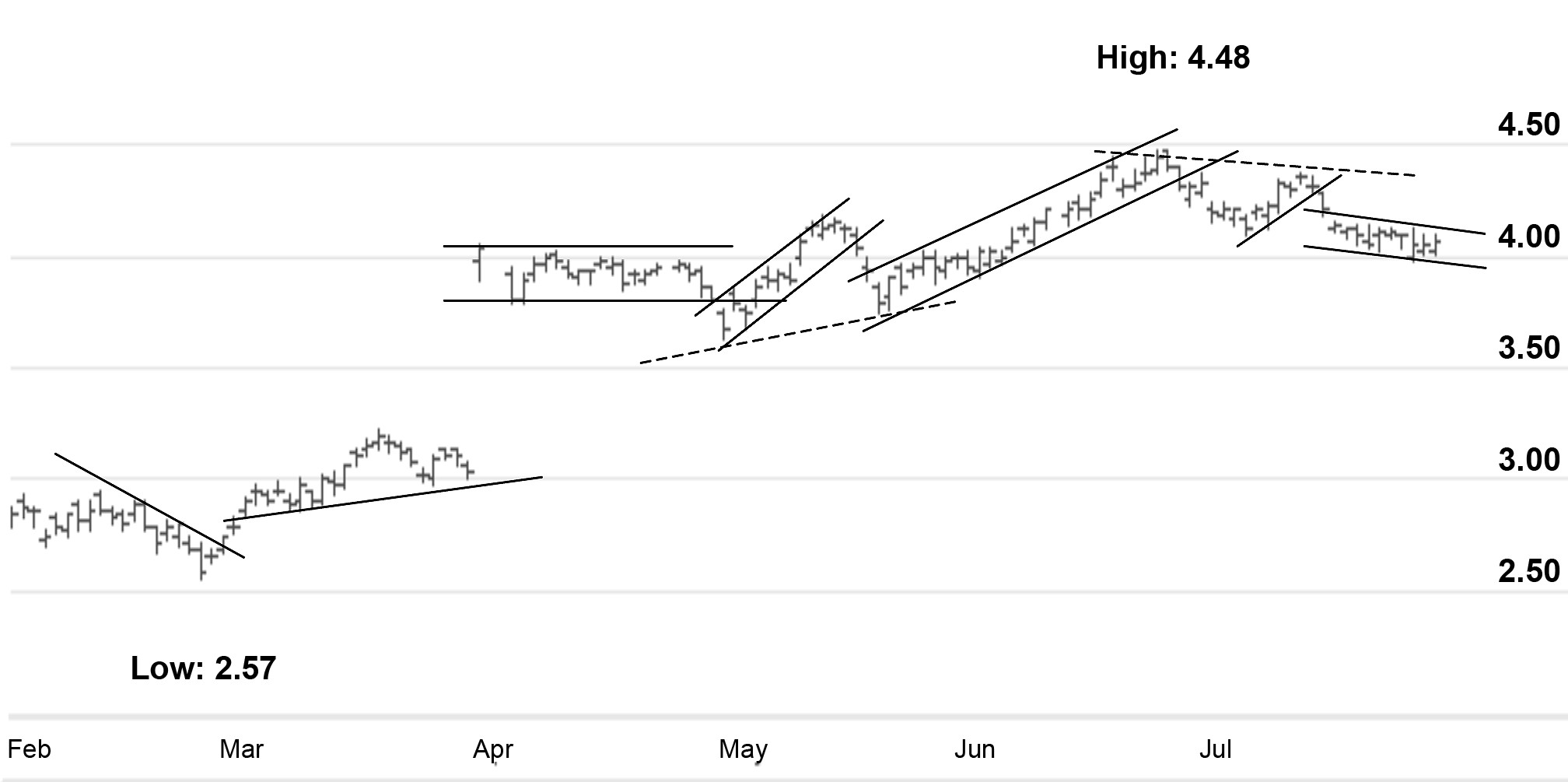
Source: www.CommSec.com.au
I see this chart as a slight downtrend, followed by a break out to a slight uptrend. This uptrend could also have been interpreted as a double bottom. Then there’s a big gap due to a takeover offer which took the price to a new high, after which a series of channels formed. I’ve also shown with dashed lines what you might interpret as inclined double bottoms and tops.
Figure A4.24: OZ Minerals (OZL) 6-month OHLC chart
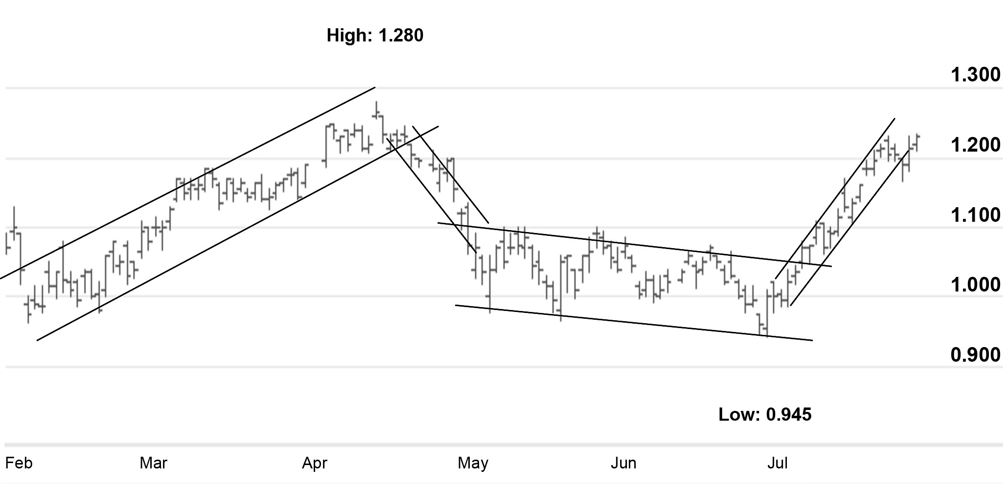
Source: www.CommSec.com.au ...
Get Charting Made Simple: A Beginner's Guide to Technical Analysis now with the O’Reilly learning platform.
O’Reilly members experience books, live events, courses curated by job role, and more from O’Reilly and nearly 200 top publishers.

