Lesson 3
Making Controls Arrange Themselves
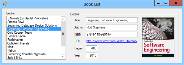
Lesson 2 explained how to add controls to a form and arrange them nicely. Using those techniques, you can create forms like the one shown in Figure 3.1. (Although we haven't covered the code behind that program's form yet.)
That form looks okay in Figure 3.1, but what if the user enlarges the form as shown in Figure 3.2? Pretty lame, huh? Although the form is bigger, the areas that contain data are not.
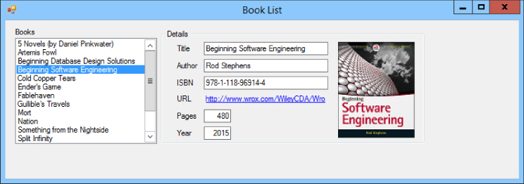
The URL for the book selected in Figure 3.2 is too long to fit within the GroupBox, so it is truncated even though the form has extra wasted space on the right. The ListBox isn't big enough to display all of its items even though there's wasted space at the bottom. It would be nice if the controls rearranged themselves to use the available space and display the entire URL and more list items.
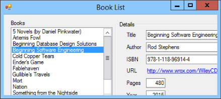
Figure 3.3 shows another problem with this form. If the user shrinks the form, the TextBoxes and URL LinkLabel are chopped off, the Year Label and TextBox are chopped in half vertically, the ListBox doesn't fit, and the cover picture is completely missing.
The program would look nicer if the controls were ...
Get C# 24-Hour Trainer, 2nd Edition now with the O’Reilly learning platform.
O’Reilly members experience books, live events, courses curated by job role, and more from O’Reilly and nearly 200 top publishers.

