Chapter 4. Animation
Android apps have a number of distinctive animation characteristics that add context and meaning for the user. For example, pages slide left as users drill down through links, and slide right as they navigate back. In this chapter, you’ll learn how to add characteristic behaviors like sliding, page flip, and more to your web app. These changes will make your web app almost indistinguishable from a native application.
With a Little Help from Our Friend
I’ll be honest: making a web page animate like a typical native app is hard. Fortunately, an enterprising young lad named David Kaneda has created a JavaScript library called jQTouch that makes mobile web development a whole heckuva lot easier. jQTouch is an open source jQuery plug-in that handles virtually everything we learned in the previous chapter, as well as a boatload of much more complex stuff that would be truly painful to write from scratch.
Note
You can download the latest version of jQTouch at http://jqtouch.com/. In the interest of full disclosure, you should know David recently asked me to be the official maintainer for jQTouch—an honor I happily accepted.
Sliding Home
We are going to build a simple calorie-tracking application called Kilo that allows the user to add and delete food entries for a given date. All told, there will be five panels: Home, Settings, Dates, Date, and New Entry. We’ll start off with two panels and work our way up as we go.
Note
We will be assigning CSS classes to some of
the HTML elements (e.g., toolbar, edgetoedge,
arrow, button, back). In every
case, these classes correspond to predefined CSS class selectors that
exist in the default jQTouch theme. Bear in mind that you can create and
use your own classes by modifying existing jQTouch themes or creating
your own from scratch; we’re just using the defaults in the examples
here.
We’re going to start from scratch here, so you can put aside the files you created in the preceding chapters. To begin, let’s create a file named index.html and add the HTML given in Example 4-1 for the Home and About panels.
<html>
<head>
<title>Kilo</title>
</head>
<body>
<div id="home"> <div class="toolbar">
 <h1>Kilo</h1>
</div>
<ul class="edgetoedge">
<h1>Kilo</h1>
</div>
<ul class="edgetoedge"> <li class="arrow"><a href="#about">About</a></li>
 </ul>
</div>
<div id="about">
<div class="toolbar">
<h1>About</h1>
<a class="button back" href="#">Back</a>
</ul>
</div>
<div id="about">
<div class="toolbar">
<h1>About</h1>
<a class="button back" href="#">Back</a> </div>
<div>
<p>Kilo gives you easy access to your food diary.</p>
</div>
</div>
</body>
</html>
</div>
<div>
<p>Kilo gives you easy access to your food diary.</p>
</div>
</div>
</body>
</html>The HTML here basically amounts to a head with a title and a body with two
children, both divs:
-
This
div(as well as theaboutdivthat appears a few lines down) will become a panel in the application by virtue of the fact that they are direct descendants of the body.-
Inside each panel
div, there is adivwith a class oftoolbar. Thistoolbarclass is specifically predefined in the jQTouch themes to style an element like a traditional mobile phone toolbar.-
This unordered list tag has the class
edgetoedge. Theedgetoedgeclass tells jQTouch to stretch the list all the way from left to right in the viewable area.-
On this line there is an
lithat contains a link with itshrefpointing at the About panel. Including thearrowclass on theliis optional; doing so will add a chevron to the right side of the item in the list.-
The toolbar elements each contain a single
h1element that will become the panel title. On this line, there are links with the classesbuttonandback, which tell jQTouch to make the button look and act like a Back button.
Note
The href on the Back
button is set to #. Normally, this would tell the browser
to return to the top of the current document. But when using jQTouch, it
navigates back to the previous panel instead. In more advanced
scenarios, you might want to use a specific anchor, such as
#home, which instructs the Back button to navigate to a
particular panel regardless of what the previous panel was.
With the basic HTML in place, it’s time to add jQTouch to the party. Once you’ve downloaded jQTouch and unzipped it into the same directory as the HTML document, just add a few lines of code to the head of your page (Example 4-2).
Note
For this and other examples in this book, you will need to download jQTouch at http://www.jqtouch.com, unzip it, and move the jqtouch and themes directories into the same directory as your HTML document. You will also need to go into the jqtouch directory and rename the jQuery JavaScript file (such as jquery.1.3.2.min.js) to jquery.js.
<link type="text/css" rel="stylesheet" media="screen" href="jqtouch/jqtouch.css">
-
This line includes the jqtouch.css file. This file defines some hardcore structural design rules that are very specific to handling animations, orientation, and other Android-specific minutiae. This file is required and there should be no reason for you to edit it.
-
This line specifies the CSS for the selected theme, in this case, the “jqt” theme, which comes with jQTouch. The classes that we’ve been using in the HTML correspond to CSS selectors in this document. jQTouch comes with two themes available by default. You can also make your own by duplicating a default theme and making changes to it or writing a new one from scratch.
-
jQTouch requires jQuery, so it is included here. jQTouch comes with its own copy of jQuery (which you need to rename to jquery.js, as described earlier), but you can link to another copy if you prefer.
-
This is where we include jQTouch itself. Notice that you have to include jQTouch after jQuery or ain’t nothin’ gonna work.
-
This brings us to the script block where we initialize the jQTouch object and send in a property value:
icon.jQTouch exposes several properties that allow you to customize the behavior and appearance of your app. You’ll see several throughout the course of this book, and they are all optional. However, you’ll pretty much always be using at least a few of them.
In this case,
icontells jQTouch where to look for the custom home screen icon.
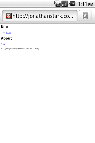
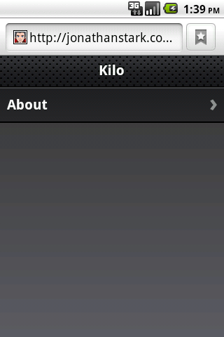
The difference between the application before jQTouch (Figure 4-1) and after (Figure 4-2) is dramatic, but the truly astonishing change is that you’ve just added gorgeous left/right sliding to your app with 10 lines of code. jQTouch is awesome, and we’re just getting started.
Adding the Dates Panel
Let’s add the Dates panel. The Dates panel will have a list of relative
dates beginning with today and going back to five days ago (Figure 4-3). Add the HTML for the Dates panel (shown in
Example 4-3) right after the About panel, just before the closing </body> (in a moment, I’ll show you how
to add a link to this from the Home panel).
<div id="dates">
<div class="toolbar">
<h1>Dates</h1>
<a class="button back" href="#">Back</a>
</div>
<ul class="edgetoedge">
<li class="arrow"><a id="0" href="#date">Today</a></li>
<li class="arrow"><a id="1" href="#date">Yesterday</a></li>
<li class="arrow"><a id="2" href="#date">2 Days Ago</a></li>
<li class="arrow"><a id="3" href="#date">3 Days Ago</a></li>
<li class="arrow"><a id="4" href="#date">4 Days Ago</a></li>
<li class="arrow"><a id="5" href="#date">5 Days Ago</a></li>
</ul>
</div>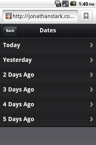
Like the About panel, the Dates panel has a
toolbar with a title and Back button. After the toolbar, there is an
unordered edgetoedge list of links. Notice that all of the
links have unique IDs (i.e., 0 through
5) but the same href (i.e.,
#date)—more on that in a bit.
Next, you have to update the Home panel with a link to the Dates panel. Add the line shown in bold to the Home panel in index.html:
<div id="home">
<div class="toolbar">
<h1>Kilo</h1>
</div>
<ul class="edgetoedge">
<li class="arrow"><a href="#dates">Dates</a></li>
<li class="arrow"><a href="#about">About</a></li>
</ul>
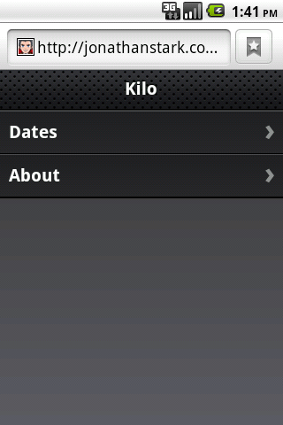
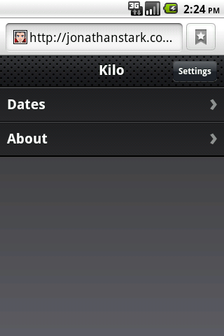
</div>And just like that, we’ve added a new panel to the app (Figure 4-4). Clicking on an item on the Dates panel doesn’t do anything yet. Let’s rectify that situation by adding a panel to display a date item (the Date panel).
Adding the Date Panel
The Date panel looks a lot like the previous panels, with a couple of
exceptions (refer to Example 4-4). Add the HTML
for the Date panel right after the Dates panel, just before the closing
</body>.
<div id="date">
<div class="toolbar">
<h1>Date</h1>
<a class="button back" href="#">Back</a>
<a class="button slideup" href="#createEntry">+</a>
</div>
<ul class="edgetoedge">
<li id="entryTemplate" class="entry" style="display:none">
<span class="label">Label</span>
<span class="calories">000</span>
<span class="delete">Delete</span>
</li>
</ul>
</div>-
The Date panel toolbar has an additional button. When clicked, this button will display the New Entry panel (which we have not yet built). The link has a class of
slideup, which tells jQTouch that we want the target panel to slide up from the bottom of the screen, rather than in from the left or right like normal navigation.-
The other unusual aspect of this panel is that we define a list item with the style set to
display:none, effectively making it invisible.As you’ll see in a bit, we’ll use this invisible list item as a template to display entries once they are created. At this point, there are no entries, so the panel will be empty aside from the toolbar.
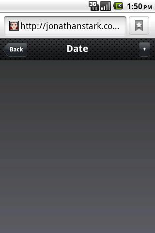
Now that you’ve added the Date panel, clicking any item on the Dates panel will slide the empty Date panel (Figure 4-5) into view.
Adding the New Entry Panel
Example 4-5
shows the source code for the New Entry panel. Add this code to the end of
index.html, before the closing
</body>.
<div id="createEntry">
<div class="toolbar">
<h1>New Entry</h1>
<a class="button cancel" href="#">Cancel</a>
</div>
<form method="post">
<ul class="rounded">
<li><input type="text" placeholder="Food" name="food" id="food"
autocapitalize="off" autocorrect="off" autocomplete="off" /></li>
<li><input type="text" placeholder="Calories" name="calories" id="calories"
autocapitalize="off" autocorrect="off" autocomplete="off" /></li>
<li><input type="submit" class="submit" name="action"
value="Save Entry" /></li>
</ul>
</form>
</div>-
The first thing to point out about the New Entry panel is that rather than having a Back button, it has a Cancel button.
Note
Cancel buttons in jQTouch behave just like back buttons: they remove the current page from view with the reverse animation that it came into view. However, cancel buttons are not shaped like a left arrow the way back buttons are.
I used a Cancel button here for the New Entry panel because it slides up on the way in and will therefore slide down on the way out. It would be counterintuitive to click a left-pointing Back button and then have the panel slide down.
-
This HTML form contains an unordered (bulleted) list of three items: two text fields and a submit button. Embedding form controls in an
liallows the jqt theme to style the form as shown in Figure 4-6.Each of the text inputs has quite a few attributes defined:
type="text"Defines the form control to be a single line text entry field.
placeholderA string of text to display in the form input when the input is empty.
nameThe name that will be associated with the value provided by the user when the form is submitted.
idA unique identifier for the element in the context of the entire page.
autocapitalizeAllows you to control the autocapitalization feature in Mobile Safari on the iPhone. Has no effect on Android.
autocorrectAllows you to control the spelling correction feature in Mobile Safari on the iPhone. Has no effect on Android.
autocompleteAllows you to control the autocomplete feature in Mobile Safari on the iPhone. Has no effect on Android.
-
The
classattribute of the submit input button needs explanation. The Android phone will display a keyboard whenever the user’s cursor is in a field. The keyboard has a Go button in the bottom right-hand corner that submits the form when clicked. When you are hijacking the submit function as we are doing here, submitting from the Go button on the keyboard does not remove the cursor from the active field and therefore, the keyboard does not slide out of view. To remedy this, jQTouch offers a convenience method that automatically removes the cursor from the active field when a form is submitted. To take advantage of this feature, add thesubmitclass to the submit element of the form.
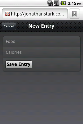
Figure 4-7 shows the New Entry form in action. At this point, we’ve done nothing to actually save the entry when the user clicks Save Entry. We’ll cover that in Chapter 5.
Adding the Settings Panel
We haven’t yet created a button that will allow users to navigate to a Settings panel, so let’s add one to the toolbar on the Home panel. All it takes is a single line of HTML, shown in bold:
<div id="home">
<div class="toolbar">
<h1>Kilo</h1>
<a class="button flip" href="#settings">Settings</a>
</div>
<ul class="edgetoedge">
<li class="arrow"><a href="#dates">Dates</a></li>
<li class="arrow"><a href="#about">About</a></li>
</ul>
</div>
... remaining HTML not shown ...-
This is the line of HTML that adds the button (Figure 4-8). Notice that we’ve assigned the
flipclass to the link. Theflipclass instructs jQTouch to transition from the Home panel to the Settings panel by rotating the page on its vertical axis. To give an added dimension to the process, the page actually zooms out a bit during the animation. Fancy, no?
After working on the New Entry panel, the HTML for the Settings panel is going to look pretty similar (Example 4-6). There is one more text input and some of the attributes have been omitted or have different values, but conceptually they are identical. Add this to your HTML document just as you’ve done with the HTML for the other panels.
As with the New Entry form, the Settings form does not currently save any of the information associated with it (see Figure 4-9). Its submission handler will be described in the next chapter.
<div id="settings">
<div class="toolbar">
<h1>Settings</h1>
<a class="button cancel" href="#">Cancel</a>
</div>
<form method="post">
<ul class="rounded">
<li><input placeholder="Age" type="text" name="age" id="age" /></li>
<li><input placeholder="Weight" type="text" name="weight" id="weight" /></li>
<li><input placeholder="Budget" type="text" name="budget" id="budget" /></li>
<li><input type="submit" class="submit" name="action"
value="Save Changes" /></li>
</ul>
</form>
</div>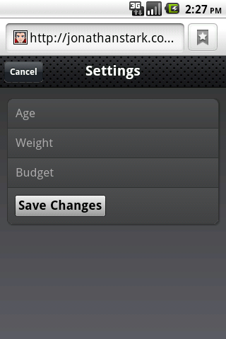
Putting It All Together
So, there you have it. With fewer than 100 lines of code, we’ve created a native-style UI for a five-panel application complete with three different page transition animations. See Example 4-7 for a complete listing of the final HTML. Not too shabby, right?
<html>
<head>
<title>Kilo</title>
<link type="text/css" rel="stylesheet" media="screen" href="jqtouch/jqtouch.css">
<link type="text/css" rel="stylesheet" media="screen" href="themes/jqt/theme.css">
<script type="text/javascript" src="jqtouch/jquery.js"></script>
<script type="text/javascript" src="jqtouch/jqtouch.js"></script>
<script type="text/javascript">
    var jQT = $.jQTouch({
        icon: 'kilo.png'
    });
</script>
</head>
<body>
<div id="home">
<div class="toolbar">
<h1>Kilo</h1>
<a class="button flip" href="#settings">Settings</a>
</div>
<ul class="edgetoedge">
<li class="arrow"><a href="#dates">Dates</a></li>
<li class="arrow"><a href="#about">About</a></li>
</ul>
</div>
<div id="about">
<div class="toolbar">
<h1>About</h1>
<a class="button back" href="#">Back</a>
</div>
<div>
<p>Kilo gives you easy access to your food diary.</p>
</div>
</div>
<div id="dates">
    <div class="toolbar">
        <h1>Dates</h1>
        <a class="button back" href="#">Back</a>
    </div>
    <ul class="edgetoedge">
        <li class="arrow"><a id="0" href="#date">Today</a></li>
        <li class="arrow"><a id="1" href="#date">Yesterday</a></li>
        <li class="arrow"><a id="2" href="#date">2 Days Ago</a></li>
        <li class="arrow"><a id="3" href="#date">3 Days Ago</a></li>
        <li class="arrow"><a id="4" href="#date">4 Days Ago</a></li>
        <li class="arrow"><a id="5" href="#date">5 Days Ago</a></li>
    </ul>
</div>
<div id="date">
    <div class="toolbar">
        <h1>Date</h1>
        <a class="button back" href="#">Back</a>
        <a class="button slideup" href="#createEntry">+</a>
    </div>
    <ul class="edgetoedge">
        <li id="entryTemplate" class="entry" style="display:none">
            <span class="label">Label</span>
            <span class="calories">000</span>
            <span class="delete">Delete</span>
        </li>
    </ul>
</div>
<div id="createEntry">
    <div class="toolbar">
        <h1>New Entry</h1>
        <a class="button cancel" href="#">Cancel</a>
    </div>
    <form method="post">
        <ul class="rounded">
            <li><input type="text" placeholder="Food" name="food" id="food"
                 autocapitalize="off" autocorrect="off" autocomplete="off" /></li>
            <li><input type="text" placeholder="Calories" name="calories" id="calories"
                 autocapitalize="off" autocorrect="off" autocomplete="off" /></li>
            <li><input type="submit" class="submit" name="action"
                 value="Save Entry" /></li>
        </ul>
    </form>
</div>
<div id="settings">
    <div class="toolbar">
        <h1>Settings</h1>
        <a class="button cancel" href="#">Cancel</a>
    </div>
    <form method="post">
        <ul class="rounded">
            <li><input placeholder="Age" type="text" name="age" id="age" /></li>
            <li><input placeholder="Weight" type="text" name="weight" id="weight" /></li>
            <li><input placeholder="Budget" type="text" name="budget" id="budget" /></li>
            <li><input type="submit" class="submit" name="action"
                 value="Save Changes" /></li>
        </ul>
    </form>
</div>
</body>
</html>Customizing jQTouch
You can customize the jQTouch default behavior by sending a variety
of property settings into the constructor. You saw this previously with
the icon property, but there are several others that you
should be aware of (Table 4-1).
Get Building Android Apps with HTML, CSS, and JavaScript now with the O’Reilly learning platform.
O’Reilly members experience books, live events, courses curated by job role, and more from O’Reilly and nearly 200 top publishers.

