Basic Design with Images
Getting or creating images is one thing. Knowing the right images to get (or to make) is another, and knowing what to do with them is perhaps most important of all. Misusing graphics — using either too many or too few — can make an otherwise outstanding Web site into an unpleasant mess. This section explores the proper use of images in Web page design.
Placing images for maximum effectiveness
It’s easy to overdo any element on a Web page. It’s not uncommon to run across sites that are all, or almost all, text, which is fine for some technical material, but pretty dicey if you’re trying to appeal to the general public. At the opposite extreme, you’ll find pages that are nothing but one image after another, with perhaps a small bit of text that often leaves you more confused than when you started.
Balancing visual elements with text is key to good Web site design. The CNN.com front page illustrates this point well. It’s functional, eye catching, and well balanced. Figure 7-15 shows the top portion of the Web page. Note that it’s strongly graphical. Even the text and links are all tied in to their attendant graphical background, their colors nicely suiting the overall look of the page.
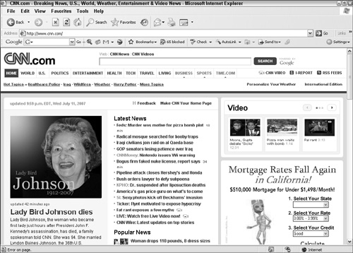
The major image at the top, a photo and its surrounding frame, is the largest single ...
Get Building a Web Site For Dummies®, 3rd Edition now with the O’Reilly learning platform.
O’Reilly members experience books, live events, courses curated by job role, and more from O’Reilly and nearly 200 top publishers.

