Chapter 3. Bootstrap Layout Components
In addition to all of the markup provided in the previous chapter, Bootstrap provides a toolkit of flexible components that can be used in designing application interfaces, web features, and more. All of the plugins are available in one separate JavaScript file, or you can use the Bootstrap customizer to pick and choose which plugins you want. Personally, on the projects that I build, I lump them all together. That way I have options.
Dropdown Menus
Dropdown menus are toggleable, contextual menus for displaying links in a list format. The dropdowns can be used on a variety of different elements, navs, buttons, and more. You can have a single dropdown or extend the dropdown into another submenu. You can see a basic dropdown menu in Figure 3-1.
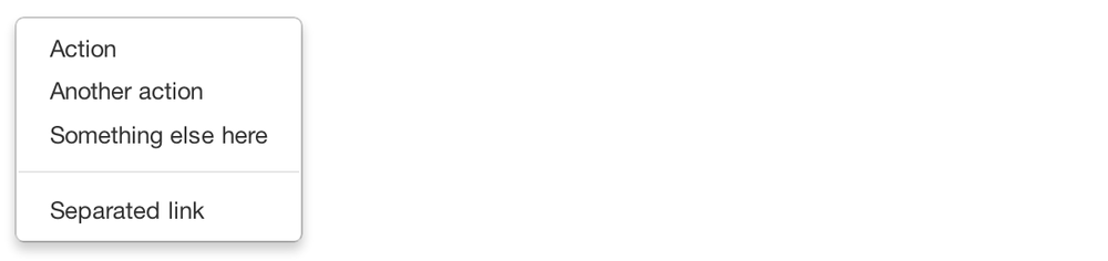
Figure 3-1. Basic dropdown menu
The following code creates a basic dropdown menu:
<ulclass="dropdown-menu"role="menu"aria-labelledby="dropdownMenu"><li><atabindex="-1"href="#">Action</a></li><li><atabindex="-1"href="#">Another action</a></li><li><atabindex="-1"href="#">Something else here</a></li><liclass="divider"></li><li><atabindex="-1"href="#">Separated link</a></li></ul>
Options
Right-align
Add .pull-right to a .dropdown-menu to right-align the dropdown menu to the parent object:
<ulclass="dropdown-menu pull-right"role="menu"aria-labelledby="dLabel">...</ul>
Submenu
If you would like ...
Get Bootstrap now with the O’Reilly learning platform.
O’Reilly members experience books, live events, courses curated by job role, and more from O’Reilly and nearly 200 top publishers.

