Adjusting the products grid
Let's make our products grid look as it should. If you inspect the markup for our product items, you'll see that each has been given a class of col-sm-4:
<div class="product-item col-sm-4">While this constrains the width of each of our product items, it has failed to produce an effective grid.
The primary problem here is that our items have varying heights. Thus, when trying to float left, as Bootstrap grid components do, these items bump into one another. This results in a broken, uneven layout as shown in the following screenshot:
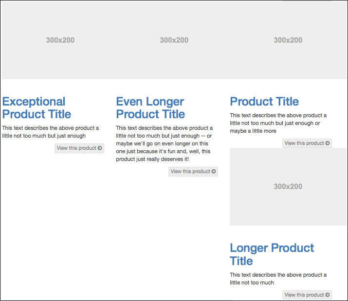
Currently, in a medium and large viewport, product items 4 to 7 refuse to float neatly due ...
Get Bootstrap Site Blueprints now with the O’Reilly learning platform.
O’Reilly members experience books, live events, courses curated by job role, and more from O’Reilly and nearly 200 top publishers.

