Cards
With Bootstrap 4, wells, panels, and thumbnails have been replaced by cards. A card is a flexible container for many kinds of content. It includes customization options for headers, footers, and colors.
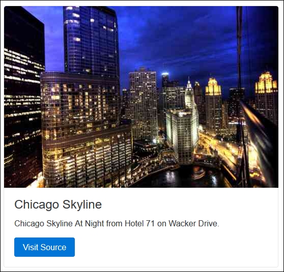
An example of a Bootstrap card component that contains an image, a title, and text content is illustrated in the following screenshot:
The markup required to generate the Bootstrap card is as follows:
<div class="card"> <img class="card-img-top" src="~/img/skyline.jpg" alt="Card image cap"> <div class="card-block"> <h4 class="card-title">Chicago Skyline</h4> <p class="card-text">Chicago Skyline At Night from Hotel 71 on Wacker Drive.</p> <a href="http://publicdomainarchive.com/free-stock-photos-chicago- ...
Get Bootstrap for ASP.NET MVC - Second Edition now with the O’Reilly learning platform.
O’Reilly members experience books, live events, courses curated by job role, and more from O’Reilly and nearly 200 top publishers.

