Building our scaffolding
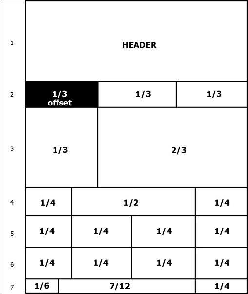
For our landing page, we will use the grid presented in the following image. As you can see, it is represented by seven rows, each containing a different number of columns. In this first example, we will use a nonmobile viewport, which we will discuss in the next chapter.
Setting things up
To start that, let's use our default layout presented in Chapter 1, Getting Started. Add inside the div.container tag another div with the .row class:
<!DOCTYPE html> <html> <head> <meta charset="utf-8"> <meta http-equiv="X-UA-Compatible" content="IE=edge"> <meta name="viewport" content="width=device-width, initial-scale=1"> <title>Landing ...
Get Bootstrap 4 By Example now with the O’Reilly learning platform.
O’Reilly members experience books, live events, courses curated by job role, and more from O’Reilly and nearly 200 top publishers.

