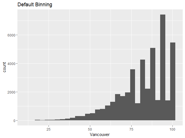
Let's use the humidity data and the first plot that we created. It looks like the humidity values are discrete, which is why you can see discrete peaks in the data. In this section, we'll analyze the differences between unbinned and binned histograms.
Let's begin by implementing the following steps:
- Choosing a different type of binning can make the distribution more continuous; use the following code:
ggplot(df_hum,aes(x=Vancouver))+geom_histogram(bins=15)
You'll get the following output. Graph 1:
Graph 2:


