In this section, we'll use layers to customize a histogram.
Let's begin by implementing the following steps:
- Plot the two preceding histograms.
- Change the x-axis title: Add another layer to change the x-axis title (remove the _ in the variable name), and save it in a plot (p4).
- Try plotting them individually (as p1, p2, p3, and p4) on the command line.
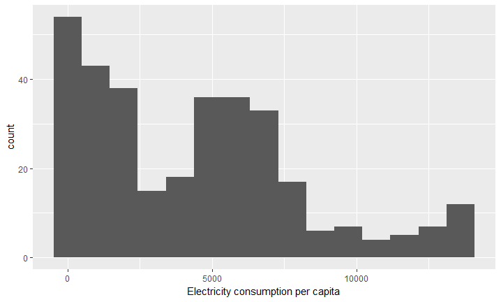
The outcome will be four plots, and the final plot should look as follows: