In this section, we'll make a correlation plot for all continuous variables in the gapminder dataset. Let's begin by implementing the following steps:
- Choose only continuous variables by using the following command:
dfs1 <- dfs[,colnames(dfs)[4:9]]
- Remove all NAs; otherwise, the correlation will not work, because it requires finite values:
dfs1 <- na.omit(dfs1)
- Get the correlation matrix, M, using the following command:
M <- cor(dfs1)
- Plot the correlation matrix using the following command:
corrplot(M,method="circle")
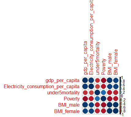
The plot will look as follows:
- The preceding plot looks messy because of its long names. ...

