This visual was chosen because Topic is a categorical variable, and I wanted to see the frequency of each topic:
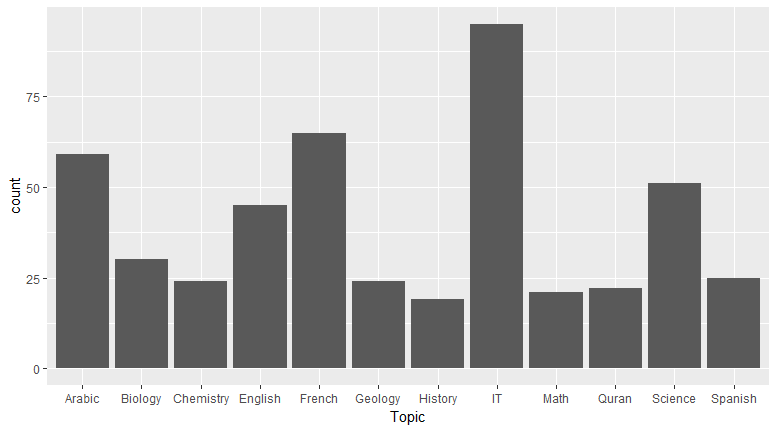
Observation
You can see that IT is the most popular subject:
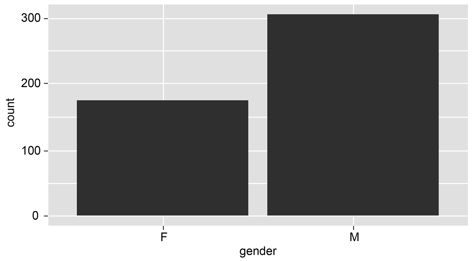
gender is a categorical variable; you can chose a bar chart because you wanted to see the frequency of each topic.
Observation
You can observe that more males are registered in this institute from the following histogram:
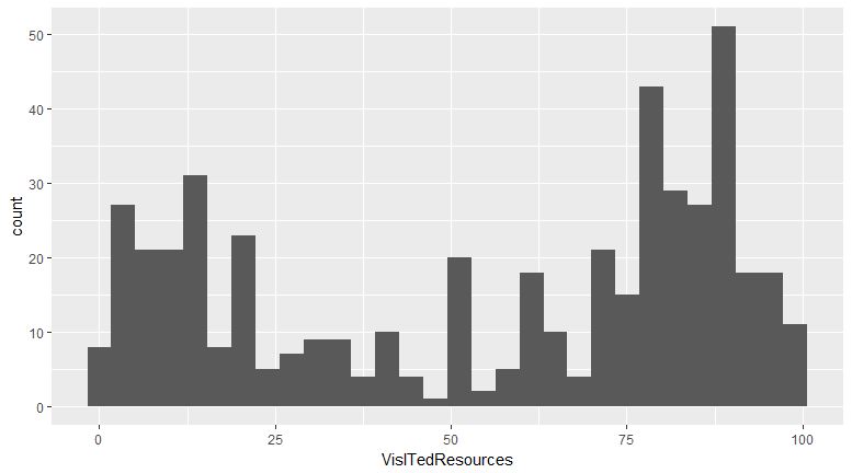
VisitedResources is numerical ...

