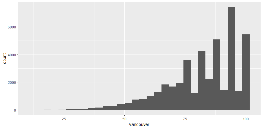
In this section, we want to visualize the humidity distribution for the city of Vancouver. We'll create a histogram for humidity data using qplot and ggplot.
Let's begin by implementing the following steps:
- Create a plot with RStudio by using the following command: qplot(df_hum$Vancouver):
- Use ggplot to create the same plot using the following command:
ggplot(df_hum,aes(x=Vancouver))
This command does not do anything; ggplot2 requires the name of the object that we wish to make. To make a histogram, we have to specify the geom type (in other words, a histogram). aes stands for aesthetics, or ...

