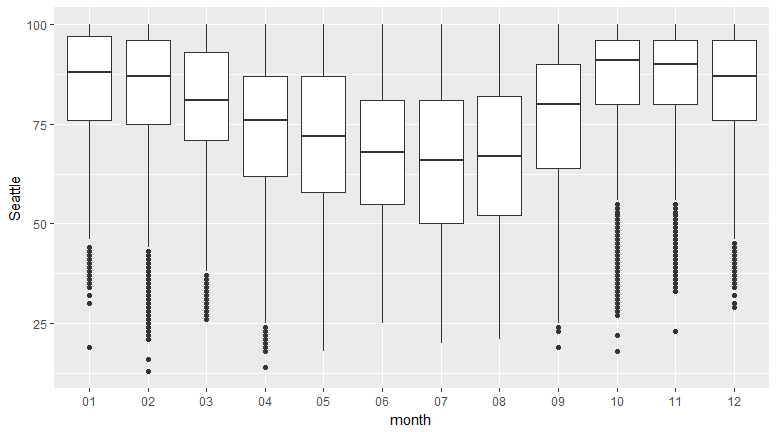
In this section, we'll create a boxplot for monthly temperature data for Seattle and San Francisco, and compare the two (given two points).
Let's begin by implementing the following steps:
- Create the two boxplots.
- Display them side by side in your Word document.
- Provide two points of comparison between the two. You can comment on how the medians compare, how uniform the distributions look, the maximum and minimum humidity, and so on.
Refer to the complete code at https://goo.gl/tu7t4y.
The following observations can be noted:
The humidity is more uniform for San Francisco:
The median humidity for San ...

