All UIs you design and build should be mobile-first UIs. This is not just to serve mobile phone browsers, but also cases where a laptop user may use your application side by side with another one. There are many nuances to getting mobile-first design right.
The following is the Mozilla Holy Grail Layout, which demonstrates "the ability to dynamically change the layout for different screen resolutions" while optimizing the display content for mobile devices.
You can read more about Basic concepts of Flexbox at https://mzl.la/2vvxj25.
This is a representation of how the UI looks on a large screen:
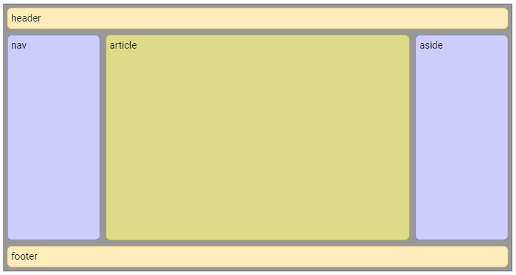
Mozilla Holy Grail Layout ...

