Desktop and Mobile Versions of Websites
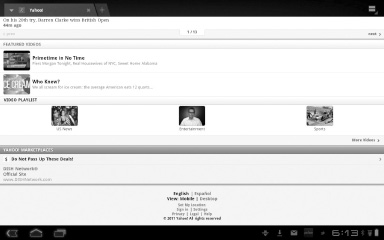
Sometimes when you look at websites, you’ll notice that two-finger gesturing does not work, and the display looks sparse and spread out. What you may be seeing is the mobile version of the website, such as the mobile version of Yahoo! shown on the left. It looks fine on a phone, but it’s not so pretty on a 10-inch tablet.
Browsers have a User Agent that tells websites the type of device you’re using. Google specifies that the User Agent for Android tablets is “Android” as opposed to “Android Mobile,” which is used for phones. This means websites can treat tablets differently than phones. That’s the theory, ...
Get Android Tablets Made Simple now with the O’Reilly learning platform.
O’Reilly members experience books, live events, courses curated by job role, and more from O’Reilly and nearly 200 top publishers.

