Chapter 11
Forms
Data entry on a small screen is fascinating, but customer inputs must be combined together in forms to ultimately enable interaction. Luke Wroblewski made an eloquent statement about filling out forms in Web Form Design: Filling in the Blanks (2008, Rosenfeld Media): “Forms suck.” That’s the reality. This chapter is mostly about how to make them suck less on Android devices—and in some cases, even make filling out Android forms downright fun.
11.1 Pattern: Inline Error Message
Whenever an error occurs when you fill out a form, the Inline Error Message pattern provides the standard way to help the customer out of it.
How It Works
When an input error occurs, the system notifies the customer which fields need to be corrected. Generally you can recognize two components of the Inline Error Message: a field-level error indicator and a general error message (usually on top of the screen).
Example
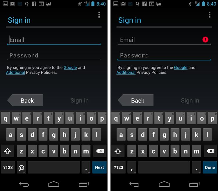
Visual error indicators differ greatly between apps. My favorites are positive visual indicators such as icons combined with the traditional red color, such as the reference implementation from the registration flow of the Calendar app (see Figure 11-1), which adds a red round (!) icon on the right side of the textbox if the person attempts to move past the e-mail field.
Figure 11-1: This implementation of the Inline Error Message pattern is from the Calendar app.
The Calendar ...
Get Android Design Patterns: Interaction Design Solutions for Developers now with the O’Reilly learning platform.
O’Reilly members experience books, live events, courses curated by job role, and more from O’Reilly and nearly 200 top publishers.

