Chapter 4. Modeling
In the last chapter we used the past to predict the future. This works well for simple situations, but things are often more complicated. Most things depend on other things. Forecasting stock prices, credit scoring, predicting the weather, and designing a direct mail campaign all depend on independent data that influences the thing being predicted. If you want to predict tomorrowâs weather in Chicago, you have to consider todayâs weather further west. They are connected.
In this chapter we look at using Excel to model a complex situation. We consider selecting independent data items and preparing them for use. It is not always easy to decide what value to predict, so we examine this process. Finally, we go through the steps and techniques needed to build a working model.
Regression
For more complex kinds of problems, a technique called regression is used. Excel has a regression tool from Tools â Data Analysis â Regression. If Data Analysis is not showing up on the Tools menu, select Add-Ins and check Analysis ToolPak.
The first example predicts a stock price. We have 223 days of technical data for a stock including the opening price, the high, the low, the closing price, and the volume for each day. We predict tomorrowâs closing price using this information.
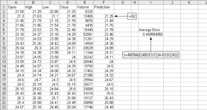
We build a model using regression. But we will need a way to know if our model is any good. So, we start by making a simple prediction. Then we can compare the accuracy of our model to the simple prediction. If our model is not more accurate than the simple prediction, it does not add any value and we might as well just use the simple prediction. For the simple prediction, we assume the closing stock price tomorrow will be the same as todayâs closing price. Figure 4-1 shows the setup.
The array formula in cell I7 gives the average error amount for the prediction. On average we are off by about $0.46 everyday. But we have six pieces of information about the stock, not just the closing price, so next we make the prediction using all six.
We assume all six metrics add some value to the prediction. Each metric is multiplied by a weight, and then they are added up. An additional value, called the intercept, is added to the sum to get the final prediction. Figure 4-2 below shows how the problem is set up in Excel.

The formula in F3 multiplies the opening price in column A by the weight in cell F1. We start in row 3 because that is where we started in the calculations in Figure 4-1. This way we can compare the accuracy of the regression to the simpler method for exactly the same days. This formula fills right to column J, and down to the end of the data at row 224.
In cell K3, the weighted metrics are summed with the intercept. The value in K3 is the prediction. The weights are all 1, the intercept is 0, and the average error is a little on the high side. Next we set the weights and intercept using Excelâs regression tool. When Regression is clicked on the Data Analysis sub-menu, the dialog in Figure 4-3 is displayed.
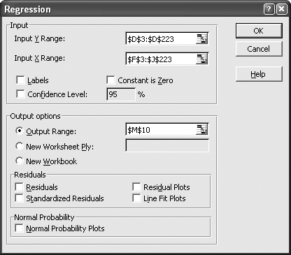
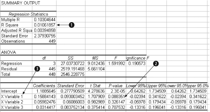
The Input Y Range is the value we want to predict. Here it is the next dayâs closing stock price from Figure 4-2. The Input X Range contains the metrics used to make the prediction. The Output Range is selected as the output option and cell M10 is entered. This means that the Regression tool will put its output in a cell range starting at M10, as shown by the results in Figure 4-4.
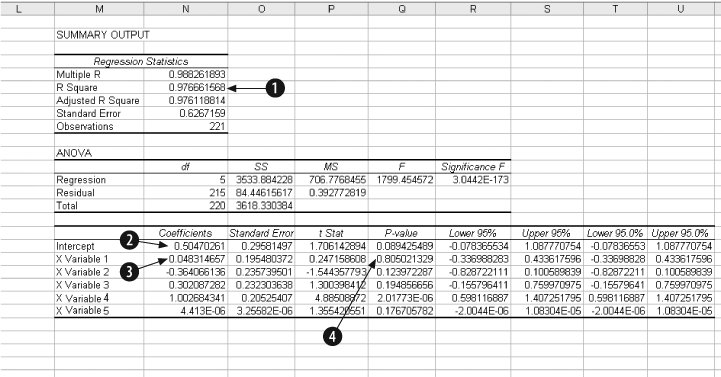
In the Regression results, item 1, R Square, tells us the model has predictive ability. This value is always between 0 and 1. The higher the value the better, and 0.97666 is about as good as it gets. Item 2 is the intercept. Item 3 is the weight for the first metric, Opening Price. The other weights are below in the same column.
Item 4, P value, tells us how much importance each of the metrics has in the model. With this item, low values are good. The P Value for the first metric, Opening Price, is over 0.8. This is too high and suggests Opening Price is not adding much value to the prediction. So, it makes sense that the weight for opening prices is small, 0.048. The best metric is variable 4, the Closing Price. It has a P value of 0.000002 and has the highest weight.
Next we use Copy and Paste Special (Transpose) to move the weights to the model, and copy and paste the intercept. This results in Figure 4-5.
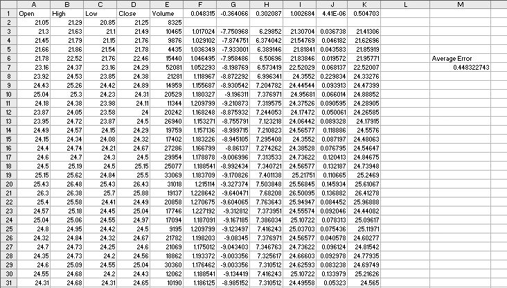
The average error is $0.448 per day. This is just a little better than the $0.46 average error for the simple prediction, because the regression model is using more information. The six metrics working together do a better job.
But are these the best metrics? We have more past information and could consider how many days in a row the stock has been up or down, where the price is with respect to the 50 day moving average, or any number of other things. Selecting good metrics is critical.
Regression assumes the relationships are linear . What if they arenât? Are we sure that tomorrowâs closing price is the best thing to predict? Perhaps it is better to predict how much the stock price will change or whether it will move more than 2%. Some things are easier to predict, some metrics work better in a model. To make a good model you have to make good choices.
Understanding how to use regression is just the beginning. To go further, weâll use a different but analogous example.
Defining the Problem
We start with a question. Can we predict the results of a dog race? The first challenge is to figure out what the question means. We could predict which dog is most likely to win, or finish in the top two or three positions. We could predict the first and second dogs in a race. But predicting which dog will win may not be the point. The real issue is probably money. If we are looking at dog races, we want to know which bets are most likely to be profitable, so we need to predict how much a dog will pay along with its chances of winning.
We can build a model to predict this, but how will we know if the model is any good? In this case itâs easy. If we can make a profit using the model, then it is good; otherwise, it is useless. If we build a credit scoring model, we have the same problem. It is not enough to identify accounts that are most risky. As a group these accounts may still be profitable, and a model would need to consider the impact to the bottom line, not just the level of risk. The same problem occurs when modeling stock prices. What do we really need to know? If we are trading options, we donât need to know the future price of the stock. All we need is the probability that it will trade above or below a price in a given period of time.
There is another important consideration here. Some things are easier to model than others. For example, if we try to build a model that predicts which dog will win in a race, we are trying to identify one winner out of eight dogs. When we look at the data there will be seven times more losers than winners. This makes modeling difficult. It is easier to get a good result when there is an even mix of outcomes in the data.
Next we consider the data used to build the model. What data is available? In most business situations there will be historical data. If we are modeling collections calls to increase dollars collected per call, we will need data on past collections calls and their outcomes. For stocks there is plenty of historical data available. With dog races, the data is on the racing form.
Which metrics are best at predicting the value we are interested in? Since we are looking at dog racing, presumably we want to know if a dog is in the habit of winning races. The racing form tells us how many races each dog has been in and how many first, second, and third places the dog has achieved.
It also has detailed information about each dogâs last six races. From this information we take the number of first places the dog has out of the last six races and the fastest speed the dog has run in the last six races.
Perhaps starting position makes a difference. The dog in the first position starts on the inside and that could be an advantage. And what about experience? If a dog has run more races maybe they will have a better chance.
Racing forms are available on the Internet at several betting and track web sites. The report extracting macro explained in Chapter 9 was used to extract data from racing forms for 6,204 races. Each race has eight dogs so there are 52,032 rows of data, one for each dog.
Most of the data items come straight from the form, but in two cases some logic is involved. First is running speed. On the racing form the running time for each of the dogâs last six races is given. But not all races are the same length. The distance for each race is given, so we could divide the distance by the time to get running speed. But converting race distances (as they appear on the form) into yards is difficult. There is an easier way.
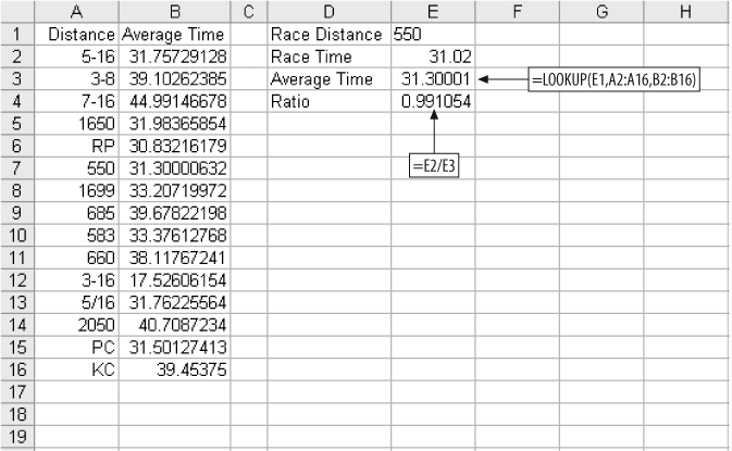
We convert the running time to a ratio by dividing the dogâs time by the average time for all dogs running that distance. The technique is shown in Figure 4-6.
We have a list of distances and average times taken from historical data in columns A and B of Figure 4-6. For each dogâs last six races we have the distance and the time. We use the LOOKUP function to find the average time for a race of that distance and then divide the dogâs time by the average time. In Figure 4-6, the dog has run a 550 yard race about 1% faster than average. This technique eliminates the need to understand data like the distance given as RP. It is probably a race course name, but knowing that still doesnât give us the distance in yards. Converting the times to ratios makes the actual distance unimportant.
This works for much more than dog races. If you are modeling a direct mail campaign, you might have response rates by ZIP code from previous mailings. This is good information but there are thousands of ZIP codes and, since ZIP codes have no numeric meaning, they cannot be used directly in a model. You can, however, substitute ratios for the ZIP codes and use the ratios in the model. This technique can convert most categorical items into metrics that can be used in a model.
In our example, the ratios for the dogâs six previous races are calculated and the lowest ratio (best time) is kept. We donât use an average because we are interested in how fast the dog can run under ideal conditions. The second calculated item is the number of first places the dog has scored out of the last six races. This is a number from zero to six.
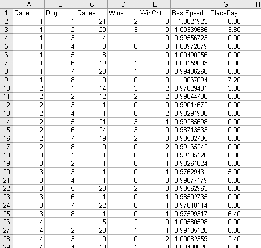
The rest of the data comes straight from the racing form and is shown in Figure 4-7.
The race number in column A is just a number to keep the races separate. Next is the dog number, which is also the position number. Dog 1 starts on the inside next to the rail. Dog 8, on the outside, has the longest distance to run. Column C, Races, is the number of races the dog has run. A big number here means the dog is older and more experienced. Column D, Wins, is the total number of times the dog has come in first. Column E, WinCnt, is the number of races out of the last six the dog has won; this is a measure of how well the dog has done recently.
There are inconsistencies in this data. On row 28 in Figure 4-7 the data tells us the dog has won two out of its six most recent races, but Races for this dog is 0, meaning it has never been in a race. Modeling requires large amounts of data. In this example we have over 50,000 rows and before we are done we will wish we had more. Inconsistencies in data are a common problem. In this case some of the information, probably recorded by hand, is simply wrong. Our options are to eliminate suspicious rows or to use them. It is a judgment call, and in this case we will use what we have.
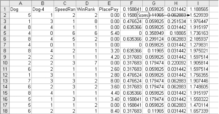
The BestSpeed column is the lowest ratio for the dog in its last six races. PlacePay is the amount the dog paid as a place bet. A place bet pays if the dog comes in first or second, so there are two paid amounts in each race. In the first race a $2.00 bet on dog 3 paid $3.80 and on dog 8 it paid $7.20.
The problem is now defined: to predict the amount that a place bet will pay using the available data. Our model is a success if it results in an average payout above $2.00.
Refining Metrics
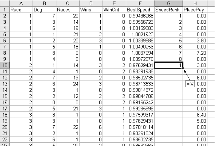
BestSpeed tells us how fast a dog can run, but not how that speed compares to the speeds of the other dogs in a race. There are eight dogs in each race and one is the fastest. We need a way to rank the dogs in each race by speed. We start by sorting the data by Race and BestSpeed, as in Figure 4-8.
We insert a column between BestSpeed and PlacePay and label it SpeedRank. For the first race we enter the numbers 1â8. Then in cell G9 we enter the formula =G2, and fill this formula down to the bottom of the data, as in the Figure 4-9. Next, Copy and Paste Special (Values) on the G column.

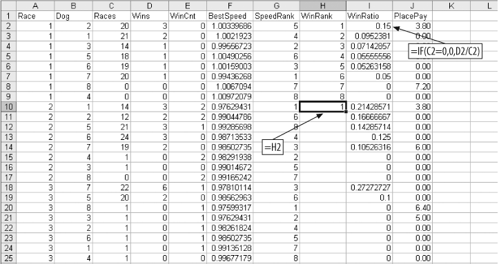
We also need a ranking by how often the dogs win. For this we use the Races and Wins columns. We create a new column called WinRatio. The value is Wins divided by Races for each dog. If a dog has no races, we set this value to zero since we cannot divide by zero. We then sort by Races and WinRatio and build a WinRank column just as we built SpeedRank. The setup is shown in Figure 4-10.
Once the WinRank column is filled down and columns H and I are copied and pasted as values, the data is ready to use.
Analysis
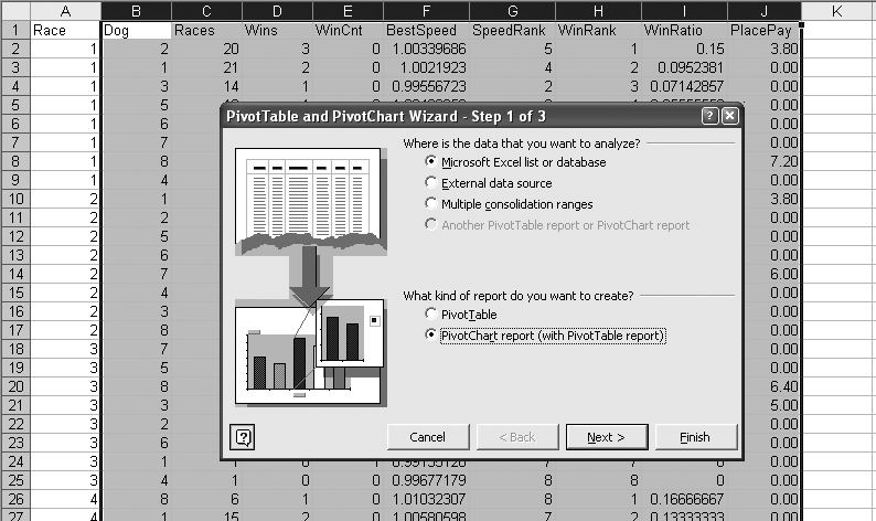
We still do not know if the metrics can predict the payout. We hope the data can make the prediction, but we need more information about the relationships in the data. The Pivot Table tool makes it easy to explore these relationships. We select all rows for columns B thru J. Then we select PivotTable and PivotChart Report from the Data menu. The PivotTable dialog opens up, and we select Pivot Chart Report as in Figure 4-11.
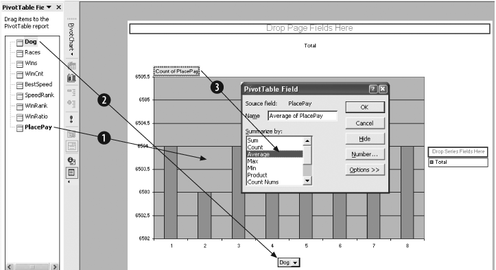
After Finish is clicked, the Pivot Chart is displayed. We are interested in the relationships between the payout and the other metrics. So, we drag PlacePay to the Data area in the center of the chart, labeled as Item 1 in Figure 4-12. By default the count of the data item, PlacePay, is displayed. We change to average by double-clicking on the Count of PlacePay button and selecting Average (Item 3). Next we drag Dog to the Category area at the bottom (Item 2).
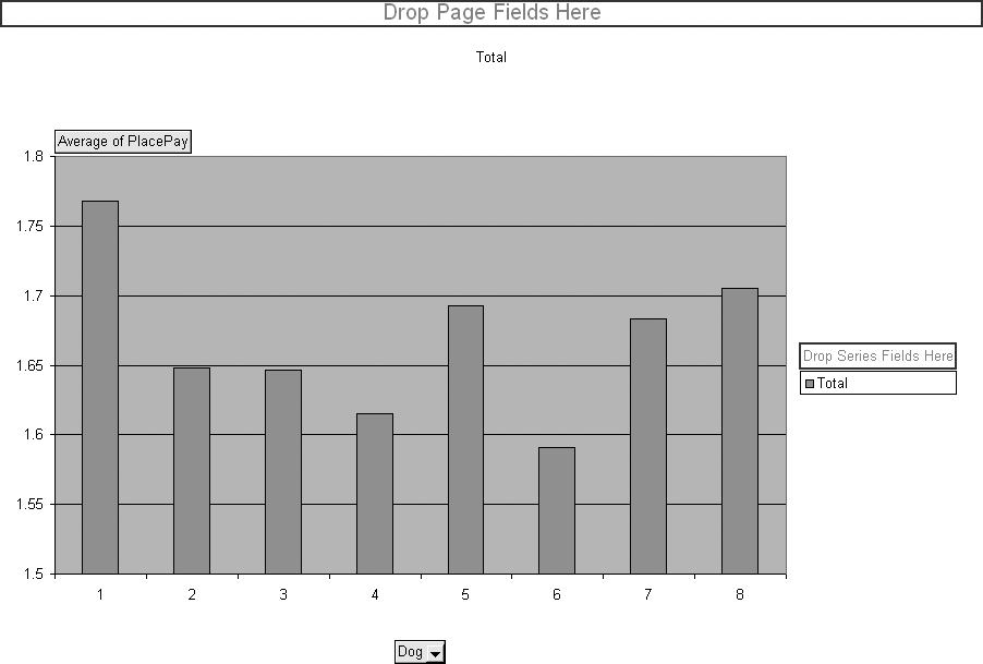
This results in the chart in Figure 4-13, showing how post position relates to payout. On average, the dog in position 1 pays more. So, if you bet dogs running in position 1, you will lose less money. The minimum bet is $2.00, thus there is a profit if the average of PlacePay is more than $2.00.
We use this chart to check the relationship between our metrics and the payout to find ones with the greatest predictive power. The metric Dog is dragged back to the list of metrics and the other metrics are dragged to the category box one by one. Races, Wins, and BestSpeed look odd because they have a large number of possible values. The metric that gives the best result is WinCnt, the number of wins out of the last six races.
In Figure 4-14, which displays WinCnt, there are two important pieces of information. First, there is a definite increase for values five and six. And second, this metric comes closest to making a profit. The bar for WinCnt five is above $1.90. Of all the metrics WinCnt is the most predictive and powerful. But it still cannot make a profitable betting decision.
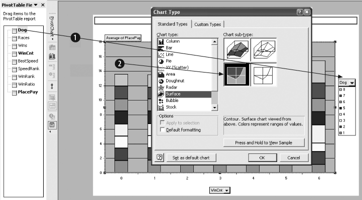
WinCnt is our best metric. But how well does it predict the payout when combined with other metrics? To check, we change the chart. We drag Dog to the series area on the right side of the chart as shown in Item 1 of Figure 4-15. Then we right-click on the data region (Item 2), and select Chart Type from the dialog. We select Surface chart as shown.

The result is Figure 4-16, and we see two regions of profitability; i.e., two areas where the average payout is over $2.00. The fact that there are two areas suggests that either we do not have enough data to get a good representation or the relationship between WinCnt, Dog, and PlacePay is complex. Either way, we now know a profitable model can be built if we can figure out how to do it.

Checking the other metrics with WinCnt we find two more, SpeedRank and Winrank, with profitable regions, as shown in Figure 4-17.
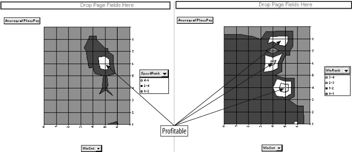
Before we start building a model, we need to make the problem as simple as possible. Regression is a good tool but it needs all the help it can get. In all the charts in Figures 4-16 and 4-17, the profitable areas have a WinCnt of four or higher. In Figure 4-15 we see that WinCnt is the best predictor. We can simplify the problem by only looking at dogs that have a WinCnt of four or higher. This group is the closest to profitable to start with, and we already know that by combining it with other metrics it is possible to make a profit.
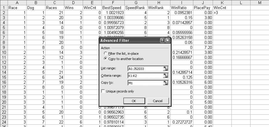
We eliminate the rows that have a WinCnt less than four by using a filter. First, we build the criteria for the filtering operation. In Figure 4-18 the criteria is in cell range K1:K2. It is simply the column heading of the column to be filtered and the condition that we want (i.e., greater than 3). Next we select Data â Filter â Advanced Filter and the dialog box in Figure 4-18 is displayed. Since we are eliminating tens of thousands of rows, we use the âCopy to another locationâ option. The List range is the range of cells that contain the data we are looking at. The Criteria range points to the criteria in K1:K2. âCopy toâ is the location that the filtered data will be in. After OK is clicked, a copy of columns A-J will be in columns M-V. The data in M-V will only have rows with a WinCnt of four or more. We then delete columns A-L and are left with the data we want. Earlier we saw an inconsistency between Races and WinCnt, and now Races is out of the model.
This leaves us with 710 rows. We are looking at results for the place bet, so in the general population 25% of the dogs would win. There are eight dogs in a race and two will win the place bet, since the place bet covers both first and second. The filtered population, dogs that have won at least four of their last six races, wins the place bet 47% of the time. This means that about half of the rows in the filtered data have a payout. This is important because regression works best when there is a good mix of values in the data. The average payout for the general population is $1.67, but for the filtered group it is $1.78.
Building the Model
We need to limit the number of metrics. If we use too many, the model will over-train. If this happens, the model will be overly influenced by unusual or isolated data. There might be one or two dogs that win with a very high payout. Two out of seven hundred doesnât mean much. But regression is not a magic formula, and it is not guaranteed to find the relationships in the data. It is just a mathematical technique that draws a bunch of lines based on the best fit to the data. With too much flexibility it will, in effect, memorize the data rather than learn how to solve the problem.
To guard against this we test the results. The data is separated into two groups. One group is used to build the model and the other is used for testing. If we get good results when we build the model but worse results when we test, the model is over-trained and useless.
We have 710 data items. We will use 449 to build the model and the remaining 261 will be reserved for testing. We have already used WinCnt to limit the data. We now build a worksheet with just the columns needed for the model. We know that Dog (running position), SpeedRank, and WinRank are the metrics to use. But there is a problem with Dog. In Figure 4-16 we see that Dog produces two distinct profitable regions. This seems to mean that the middle positions are less profitable than one, two, seven, and eight. Since we know that this situation exists, we should make a change in the Dog metric. Figure 4-19 shows the resulting sheet.
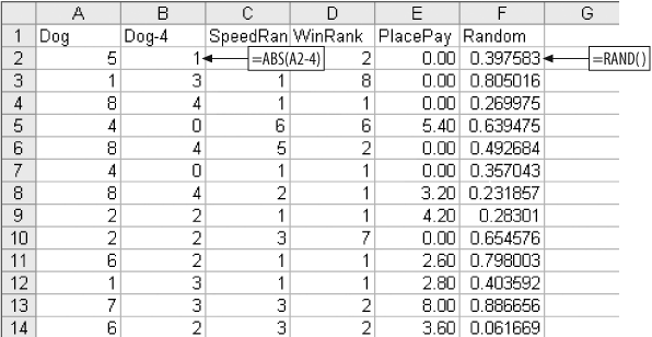
We insert a new column named Dog-4 containing the absolute value of the difference between the dogâs running position and 4.
We need to be sure the rows are assigned to the model and test groups randomly. Therefore, we add a new column called Random and fill it with random numbers. Next we sort the data on Random. This will ensure that each row has the same chance of being assigned to the model group or the test group. After sorting on the Random column, it is deleted.
We start the model like we did the stock example in Figure 4-2. The resulting sheet is shown in Figure 4-20.
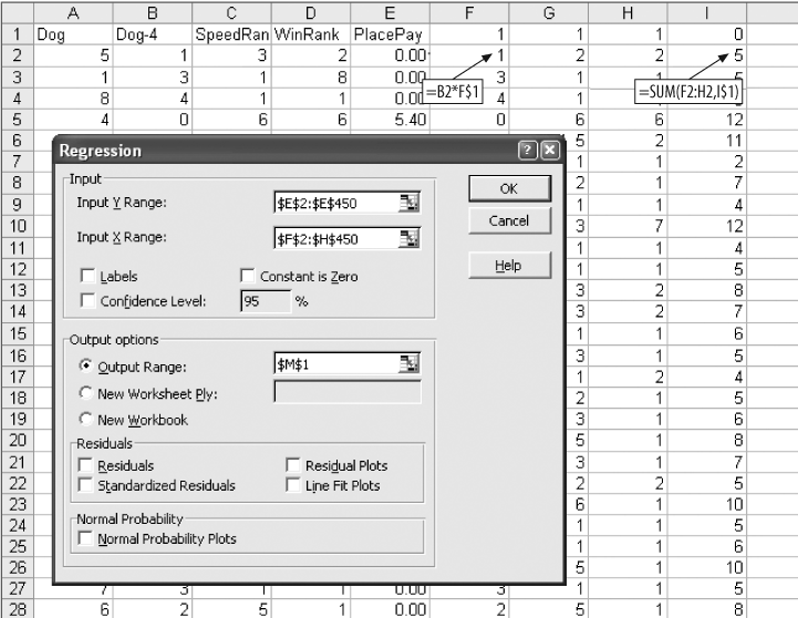
The calculations in columns F-I could be handled in a single column using the SUMPRODUCT function, or even reduced to a single cell using an array formula. But, keeping the calculations separate makes this process easier to understand. We have 710 rows of data but in the Input Ranges we only use rows 2â450. The Y Range is PlacePay in column E. The regression output is shown in Figure 4-21.
In Item 1, the overall performance of the model is low. In general, the metrics are not great at predicting the payout. But R Square measures the modelâs performance across all 449 rows. We are interested in setting a threshold that divides the dogs into two groups, and only one group has to be profitable. The model can do this without a complete understanding of the relationships. A high value for R Square would be better, but this may be good enough.
The P-values in Item 2 for Dog-4 are encouraging.
Item 3 gives the weights and intercept. We copy and paste them into the model resulting in Figure 4-22. The values in column I are the scores. A high value in column I means our model predicts that the dog is more likely to be a profitable bet.
Is it? We find out by testing. We need to know if there is a score above which we can bet profitably. We used 449 rows to set the weights, so there are 449 scores to consider. Perhaps the top half is profitable.
To make testing easy, we start by creating logic to analyze the modelâs performance.
Analyzing the Results
To see if the model is working, we rank the dogs by their scores and only consider half of them, the ones with the highest scores. The mid-point is not likely to be the best threshold, and we will want to experiment with different splits. So, the sheet shown in Figure 4-23 is set up to allow different percentages to be tested.
The number 50 is entered in cell L1. This indicates that we are going to test a 50% split. In cell L2, we calculate how many of the 449 model dogs are in the top half. The formula is =INT(450*(L1/100)). The result is 225.
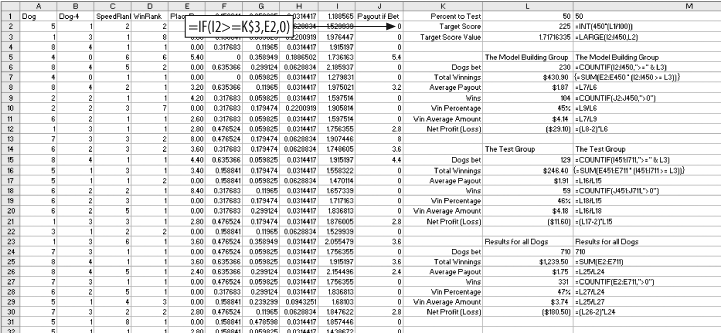
The threshold for this test is the 225th highest score. The formula in L3 is =LARGE(I2:I450,L2). This gives the value we need. With these formulas in place we can easily test any percentage. If we enter 15 in cell L1, the value in L3 gives us the value to test the top 15%.
In the range L6:L12 are details of the modelâs performance for the top 449 rows. The first formula is =COUNTIF(I2:I450,">=" & L3). This counts the number of scores equal to or greater than the threshold. It tells how many bets we make if we bet the top half of the scores.
In column J, the formula =IF(I2>=L$3,E2,0) gives the payout for each dog. If the dogâs score is less than the threshold, it is not bet and the payout is zero. To get the total payout for the model group, we use the formula =SUM(J2:J450) in cell L7.
We get the average payout by dividing L7 by L6. In this case it is $1.87 in cell L8. The number of wining bets is calculated in cell L9 using =COUNTIF(J2:J450,">0"). The win rate, the percentage of bets that win, is in L10. The formula is =L9/L6.
We also want to know the average amount of a winning payout. We get it with =L7/L9 in L11. Finally, the formula =(L8-2)*L6 in cell L12 gives the total profit or loss for the 449 model dogs. We subtract 2 because the bet is $2.00 and we are interested in the profit.
The same details for the test group are in the range L15:L21. We can now compare the performance of the model group and the test group. If they are not similar, the model may be over-trained.
To test the effectiveness of the model we need to see how it compares to the whole population. In cells L24:L30 we calculate the same details for all dogs. The formulas in this area are a little different because we do not consider the threshold in this area. Here we want to see what would happen if we just bet all the dogs.
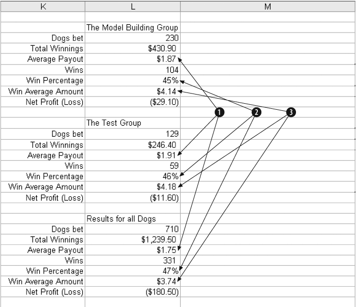
In Figure 4-24 we consider the results.
In Item 1 the average payout for all dogs is $1.75, but for the top 50% scores the results are better. The model group paid out $1.87 and for the test group it was $1.91. This is good news for two reasons. It suggests that the model is working and that it is not over-trained.
Item 2 shows that the percentage of wins is a bit lower for the dogs in the top 50%. This is probably because the model is finding the dogs with higher payouts. Item 3 shows this clearly. The average amount paid for a winner is $3.74 overall, but for the top scoring dogs it is above $4.00.
The model works, but is not profitable at 50%. The next step is to find a profitable threshold.
We started with tens of thousands of rows, but now we are down to a modest amount of information. We know the model is capable of making good predictions and there is no evidence of over-training. We need to know how the modelâs performance changes as we change the threshold.
We test this by changing the value in cell L1. Starting with 50 and working down to 5 in steps of 5, we build Figure 4-25.
Item 1 is the threshold being tested. The Profit/Loss amounts for both groups are added together (Item 2), building an area to populate a chart. We add the amount together because the groups are small. At the 5% threshold there are only three wins in the test group.

In Item 3 we can see the overall shape of the curve. The profit tops out at about 25%, and that is probably the best threshold for the model.
Testing Non-Linear Relationships
Regression assumes that the relationships in the data are linear. This is usually a safe assumption, but sometimes you can get a more accurate model if you allow for non-linear relationships . We can use the solver to test the potential value of using non-linear terms in the model.
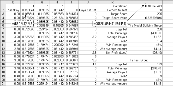
We start by inserting a row at the top of the worksheet, setting it up as shown in Figure 4-26.
This is a classification problem . We are dividing the population of dogs into two groups. As long as we can set a good threshold, we do not care how well the model predicts the exact value.
This means the intercept is not adding any value. The model will do just as well without it because we are only interested the correlation between the score and the payout. If we substitute a zero for the intercept in cell I2, the performance of the model does not change.
The results in Figure 4-26 are exactly the same as in Figure 4-23. Only the threshold is different. In row one of columns F, G, and H we enter 1. We change the formula in F3 from =B3*F$1 to =(B3^F$1)*F$2), and fill this new formula across to column H and down to row 712.
At the top of the L column we add the formula =CORREL(I3:I451,E3:E451) to measure the correlation between the scores in column I and the payouts in column E. The value is 0.103. This means the scores are positively correlated with the payouts, but the correlation is not especially strong.
We want to see if changing the values in F1:H1 can increase the correlation. For this we use the Solver, which is on the Tools menu. If the Solver does not appear as one of the items on the Tools menu, it may be necessary to select Add-Ins and make sure the Solver Add-In is checked.
The Solver dialog is filled out as shown in Figure 4-27.
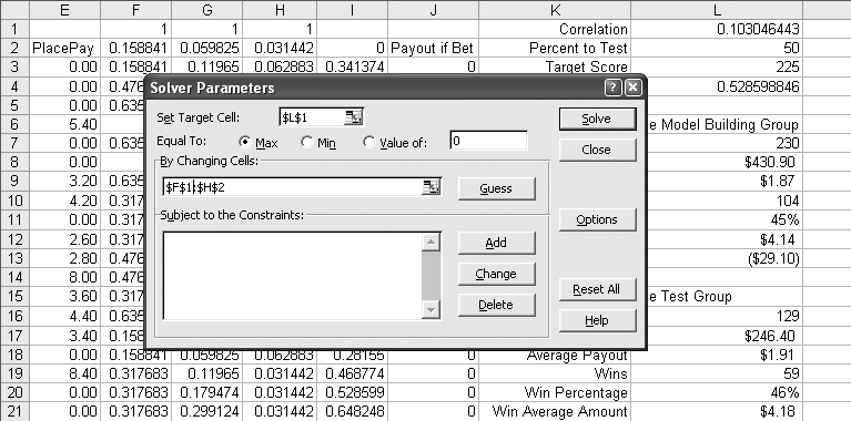
The target cell is L1. This is the cell with the correlation formula and is the value we want to improve. Equal to Max is selected because we want the highest value possible for correlation.
The By Changing Cells field is set to the range F1:H2. This means Solver is allowed to change the values in this range to get the maximum possible value in L1.
In Figure 4-28 the results are compared to the best results for the non-linear model.
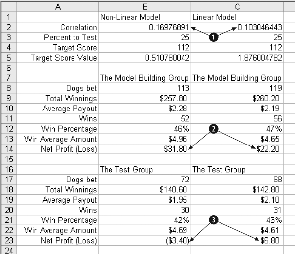
In Item 1 the correlation is increased from 0.103 to 0.1976. This is a significant increase and could mean the model will now do a better job. In Item 2 the Profit for the model group has gone up from $22.20 to $31.80. That is great, but the test group in Item 3 tells a different story. In the test group the profit of $6.80 has turned into a loss of $3.40. This suggests that the additional flexibility of the non-linear terms has caused the model to over-train.
In this case the linear model is the right one to use.
Get Analyzing Business Data with Excel now with the O’Reilly learning platform.
O’Reilly members experience books, live events, courses curated by job role, and more from O’Reilly and nearly 200 top publishers.

