Chapter 6. Visualizing Data with Charts
In the next step, our second agile sprint, we will start building charts from our data (Figure 6-1).
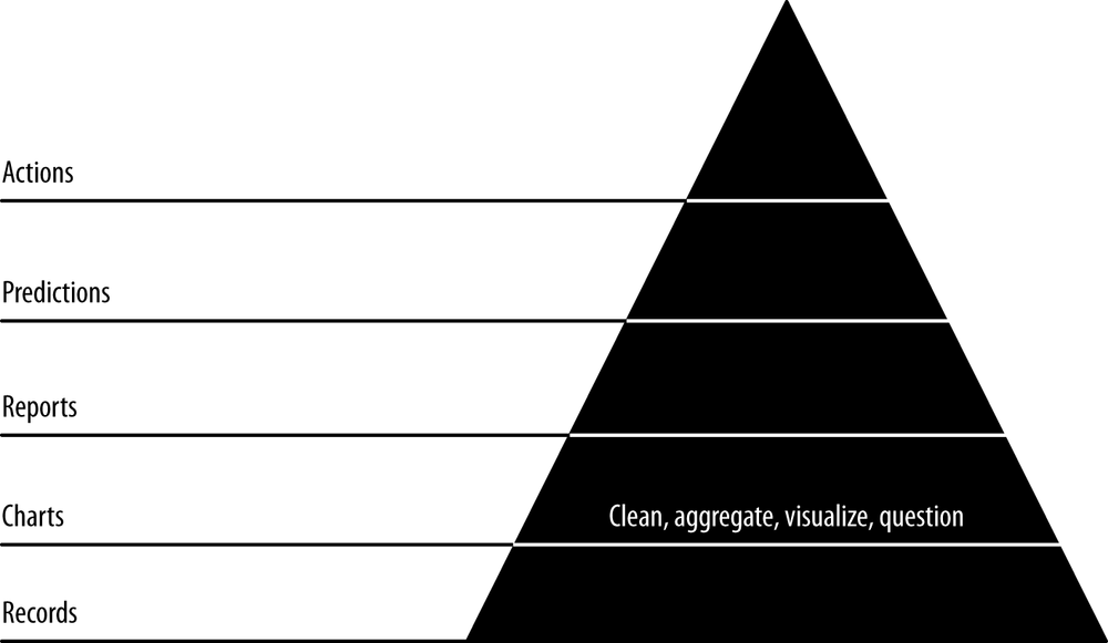
Charts are our first view into our data in aggregate, mapping the properties of many records into visual representations that help us understand and navigate further and expose entities and concepts in our data. Our goals in this step are to publish charts to generate interest in our data and get users interacting with it, to build reusable tools that will help us explore our data interactively in reports in the next step, and to begin extracting structure and entities from our data so that we can create new features and insights with this structure.
Code examples for this chapter are available at https://github.com/rjurney/Agile_Data_Code/tree/master/ch06. Clone the repository and follow along!
git clone https://github.com/rjurney/Agile_Data_Code.git
Good Charts
A good chart is anything users find interesting enough to visualize and that users respond to. Expect to throw many charts away until you find good ones—don’t try to specify them up front or you will be disappointed. Instead, try to use your intuition and curiosity to add charts organically.
You can create charts in an ad hoc way at first, but as you progress, your workflow should become increasingly automated and reproducible.
Well-formed URLs with ...
Get Agile Data Science now with the O’Reilly learning platform.
O’Reilly members experience books, live events, courses curated by job role, and more from O’Reilly and nearly 200 top publishers.

