Physical accessibility is slightly different from visual and audio accessibility: the user can see the website and can hear all the audio, so information isnât hidden from them. Making a website physically accessible often boils down to the actual usability of the website. How hard is it to navigate? Are applications frustrating to use? This, of all the types of accessibility, benefits the most, as the guidelines laid out make a better experience for even typical users.
Physical accessibility covers any user who might have trouble using traditional forms of input for their computer. This can range from those who are paralyzed to those who have broken their dominant arm and must use their off hand to use a mouse. Following a few standards also helps those who are suffering from a broken trackpad or mouse, and have to use a keyboard as their only navigation. Some common use cases:
A disorder might cause shaking or jerking, such as some forms of cerebral palsy and Parkinsons.
A disorder might slow the userâs motions, such as some forms of cerebral palsy and some brain traumas.
A user might have lost the use of a dominant limb, causing them to lose accuracy while learning to use their non-dominant limb.
A user might be completely unable to use a mouse, but still have use of their keyboard. Sites would be navigated by tabbing through the elements, or using arrow keys.
Those that are physically disabled might use a variety of alternate devices:
Eye-tracking devices, that move a mouse based on where the user is looking
Keyboard-only inputs, when a user cannot use a mouse
One-handed keyboards, which may make certain combinations of keys impossible
Mice that are set up for those who might shake or jerk
Itâs important to keep in mind that in spite of the availability of specialized equipment, a physically disabled user might be forced to use a less-than-optimal setup. Like screen readers for the blind, a developer cannot assume that a user has the latest and greatest equipment.
Those with physical disabilities often have trouble with the following:
Interfaces that require the mouse
Interfaces that require the keyboard
Items that need a high level of precision
Items that trigger easily, but are difficult to close
If your site includes a form, thereâs a good chance it includes radio buttons or check boxes. Checking on the box or button itself is difficult for someone with a motion disorder (and can be annoying for a user with normal motion control). There are typically two solutions to this issue: be tab- and arrow-friendly, and allow the user to click on the text of an item to make a selection.
Making a form tab-friendly comes down to making certain all form fields are accessible through pressing the Tab key, and that the fields are tabbed to in a sensible order.
Also, forms should be one element after another on a page rather than elements placed next to each other, like they might be on a paper form. If a user is tabbing, they shouldnât have to hunt for where their cursor went. Figures 4-1 and 4-2 show forms with poor layout and good layout.
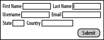
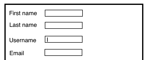
A form with fields displayed vertically is much easier for most people to follow and has a more predictable tab order.
If, for whatever reason, your form must have elements next to each
other, then the tab order should take the user through the form from
left to right, as they might read it. This is done by adding a
tabindex attribute to the inputs, as seen in Example 4-1.
Example 4-1. TABINDEX
<form action="..." method="post">
    <p>
        <input tabindex="1" type="text" name="field1" />
        <input tabindex="2" type="text" name="field2" />
        <input tabindex="3" type="submit" name="submit" />
    </p>
</form>
With radio buttons, tabbing to that form element should hit only
the first of the radio elements. If the user hits Tab again, she should
move to the next form element, not the next radio button. The user would
select a radio element by using arrow keys rather than by using tab.
This allows her to move around the form quickly, rather than getting
caught up in a long radio list. Example 4-2 shows how
tabindex can be added to radio buttons within a
form.
Example 4-2. TABINDEX and radio buttons
<form>
    <input tabindex="1" type="text name="Full name" />
    <input tabindex="2" type="radio" name="sex" value="Male" /> Male <br />
    <input type="radio" name="sex" value="Female" /> Female <br />
</form>
The same is also true for groups of check boxes, as seen in Example 4-3. The user should not be forced to tab through each
one. Add a tabindex only to the first one, ignoring
the rest.
Example 4-3. TABINDEX and check boxes
<form>
    <input tabindex="1" type="text" name="Favorite Game" />
    <input tabindex="2" type="checkbox" name="system" value="xbox360">XBox 360 />
    <input type="checkbox" name="system" value="PS3" />PS3
    <input type="checkbox" name="system" value="Wii" />Wii
</form>
Even with the ability to skip sections of a form, a section with too many elements can become tedious for a user without a mouse. While there is no hard and fast rule, if a set of radio buttons has become tiresome to arrow through, itâs best to replace it with a select drop-down. These can be navigated quickly by typing into them, if theyâre set up correctly.
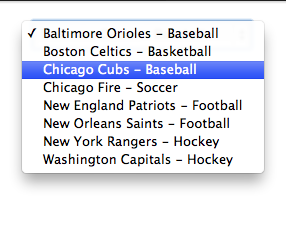
Since a user can start typing and get to the element she wants, itâs best if the items donât begin with redundant information. As seen in Figure 4-3, if you have a list of teams from several sports, donât start with the sport name. Begin with the team name, which is unique. This way, the user isnât forced to type the sport name and any separators before getting to her selection.
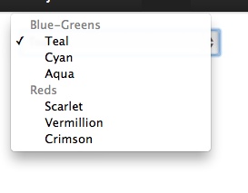
One unfortunate side effect to doing this is that elements are no longer as visually ordered as they might have been before. One solution to use group entries using OPTGROUP, shown in Example 4-4. The items will appear together under the OPTGROUP heading, but the heading itself wonât be selectable. A user can still type to move quickly around the form.
Example 4-4. Using OPTGROUP
<select name="color" id="color">

<optgroup label="Blue-Greens">

        <option value="bgteal">Teal</option>
        <option value="bgcyan">Cyan</option>
        <option value="bgaqua">Aqua</option>

</optgroup>

<optgroup label="Reds">

        <option value="rscarlet">Scarlet</option>
        <option value="rvermillion">Vermillion</option>
        <option value="rcrimson">Crimson</option>

</optgroup>

</select>
Appears as:
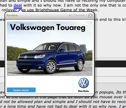
Pop-ups, whether a purposeful part of a web application or as a form of advertising, can pose a special challenge to users with motion disorders. Not only can they switch the userâs focus, but they can be difficult to close. Figure 4-4 shows a pop-up that is not only easy to trigger (it comes up when the user mouses over a link), but itâs also difficult to close, since it requires clicking on a rather small button.
Pop-ups that open in their own windows pose the least issues. While potentially annoying, these can be closed with a simple keyboard command. With advancing browser capabilities, however, many web applications now have pop-ups appear within the current window, ensuring that they get the userâs attention. Many times, they will require the user to click a small X to close them, something that can be incredibly difficult for a user with a motion disorder. If these pop-ups occur due to a roll-over, this can be even more frustrating, as a shaky user might have trouble avoiding these rollovers.
Purposeful pop-ups can also be problematic. If the user is using a keyboard to navigate, itâs possible that he wonât be able to tab to the pop-up, rendering the site unusable. If the pop-up must be closed by hitting a button, and the button is small, a user using a mouse would the same issues as he would above.
Do these annoyances mean pop-ups should never be used? No, but they should be crafted carefully so as not to annoy users. A well-designed pop-up can be a boon to a website, for any user.
The first thing to consider is how the user is to close the window. Keep in mind that the user can be using either a mouse or a keyboard to navigate the site. For the keyboard users, the most elegant solution (that is also helpful to typical users) is to allow the user to close the window with a keystroke. The ESC key is a popular choice, as it doesnât require dexterous hands to hit two keys at once. Whatever key is chosen, however, do not depend on the popularity of your choice: make certain to spell out that the user can hit it to close the window. Example 4-5 shows some sample code for closing a window upon hitting ESC.
Example 4-5. Code sample: hitting ESC to close a pop-up
$(document).keydown(function(e) {
    // ESCAPE key pressed
    if (e.keyCode == 27) {
        window.close();
    }
});
Note
The above uses jQuery.
If the user is using a mouse, keep in mind that he may not have the option of using a keyboard, or using a keyboard may be extremely difficult for him. This is why a visual indicator should always be included with any pop-up. Ideally, the indicator should be large enough for a user to click, even with an unpredictable pointer, but not so large as to disrupt the design.
In general, an icon that is 13x13 pixels should be large enough for those with motion issues. As an additional advantage, itâs large enough for those using touch screens, which includes adaptive devices as well as tablets.
Elements that drop down have become increasingly popular in the world of web design. This allows for a clean high-level navigation that can easily get the user to deeper sections of the site, or allow them to browse the siteâs content without having to load a new page. These navigations, however, can be problematic for a user who is struggling to use a mouse. With CSS and modern browsers, theyâve become incredibly simple to make, helping their propagation on the Internet.
One common feature that quickly becomes an issue is a menu that snaps back like a rubber band if the mouse moves off of the menu. A user with an unsteady hand might have finally navigated to the element he wants, only to have it disappear due to an involuntary tremor. He must then return to the original navigation element to try again.
A more user-friendly behavior would be menus that stay dropped down once they have been activated, or that at least have tolerance for a wavering mouse.
Superfish is one library that offers extremely tolerant drop-downs. When a user triggers a drop-down, the menu comes down. If the userâs mouse wavers off of it, it stays down for several seconds before fading away.
If a sticky or tolerant drop-down canât be incorporated, at the very least consider having only one level of drop-downs. This way, the user wonât be frustrated by carefully navigating several sets of sub-menus, only to lose his progress. These are a boon to users with normal mouse control, as drop-down menus that are overly complex can be aggravating to any user.
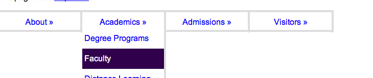
If a user isnât using a mouse, but is instead tabbing through the site, all elements, including the drop-down elements, need to be available. If a user tabs onto an element that has drop-down items, those items should show immediately, as seen in Figure 4-5. Should he hit Tab again, those items should be cycled through (hitting the down arrow key would just move the entire page down). This is another reason not to make drop-down navigation too complex: it would take a keyboard dependent user too long to move through it.
One distressing phenomenon thatâs been spreading through the design community is the tendency to set outline to none in a siteâs global CSS. The code shown in Example 4-6 should never be introduced into a siteâs code base.
Designers usually reason that outline can be overridden in other parts of the CSS. Most CSS resets will include setting outline to zero, with a reminder to the designer to add focus back in. Most never do.
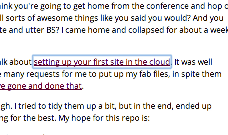
What does focus do? It allows a keyboard user to move around a page to see where her current focus is. Links or items that have focus will have a faint outline around them, as seen in Figure 4-6.
This outline can be styled by the designer, but if itâs set to 0, nothing will be displayed. The outline should, at the very least, be left alone. If it must be styled, then it should be obvious where the userâs focus is. It should never be completely obliterated.
Itâs important to keep in mind that a user with a physical disability might be slower at inputting data than a typical user. While this doesnât affect most websites, there are some use cases where timing is important. For example, a site that sells tickets to a popular event might allow a user only a set amount of time to enter their information and submit payment. Another might use a CAPTCHA to ensure that the user isnât a robot, but the CAPTCHA must be filled in before too long or the user will be timed out.
If a feature of your application requires that the user be timed, try to be generous with that amount of time. If a typical user can fill out the form in 5 minutes, try allowing much more than that, like 15. If this would break the application, then allow the user to request more time and be clear that the form is being timed and what the consequences are if time runs out.
If the form times out, try to retain all the content of the form so that the user can at least try again. While sensitive data, such as credit card information, may need to be removed, see if itâs possible to simply obscure it. Move the user to the top of the form, showing a summary of reasons why her form wasnât submitted, and clearly show which fields must be filled out again.
Also, consider removing timeouts altogether, if the application can tolerate it. Does a comment form need a CAPTCHA that times out after just a few minutes? Can an alternative method of catching spam be used?
Testing a site for accessibility for physical disabilities comes down to using the site with the similar restrictions as someone who has issues using a mouse or is completely dependent on the keyboard. Unlike testing for the blind, however, there are few, if any, currently available applications that test for physical accessibility. This is left completely up to the tester.
Emulating a user who cannot use a mouse is very easy: the tester should disable his mouse. Though simply not using it is an option, many people are so used to using a mouse that they reach for it instinctively. Unplugging it and disabling any trackpads ensures that the tester cannot accidentally use a mouse to get out of a sticky situation.
After the mouse has been disabled, the tester should attempt to navigate the site using only tabs and arrow keys. Some things to take note of:
Can the tester get to all items in the navigation?
If there is a form, can the user get to all items in the form?
Is the form order logical, or does the focus move around the page?
If the form is timed, how much time is allotted for the user? Can the user tell how much time they have to submit a form?
After letting a form fail, is it easy for the user to resubmit the form?
Some users will still choose to use a mouse, but due to a motion disorder, wonât have the accuracy of a typical user. One of the simplest ways to emulate these issues is for the tester to use his or her mouse...but with their non-dominant hand (if the tester is ambidextrous, this obviously wonât work). To emulate a user with a steady but slower hand, increase the sensitivity of the mouse to the maximum the system allows.
These methods are imperfect, but they do allow the tester to truly evaluate how difficult using a website might be for this kind of user. Some things to consider:
If there are drop-down menus on the site, how long do they stay down after the mouse has moved on? How many levels are there to the drop-down menus?
If there are pop-ups, how difficult is it to close them? How long does it take, compared to a typical user?
On forms, does clicking the text for a check box select or deselect the check box?
On forms, does clicking the text for a radio button select that radio button?
Get Accessibility Handbook now with the O’Reilly learning platform.
O’Reilly members experience books, live events, courses curated by job role, and more from O’Reilly and nearly 200 top publishers.

