Tip 84: Understanding Recommended Charts
One of the new features in Excel 2013 is Recommended Charts. Select your data, choose InsertâCharts⇒Recommended Charts, and Excel responds by displaying the Recommended Charts of the Insert Chart dialog box (see Figure 84-1). This dialog box displays a preview of your data using several chart type options.
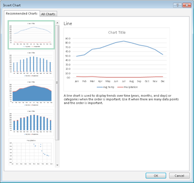
Figure 84-1: The Recommended Charts feature displays your data using several different chart types.
How does it work? According to the Excel Help:
Want us to recommend a good chart to showcase your data? Select data in your worksheet and click this button to get a customized set of charts that we think will fit best with your data.
Donât believe it. Excel uses some simple algorithms to make its suggestions, but donât expect any advanced artificial intelligence. In other words, you will probably never see a recommended chart that will make you say, âWhy didnât I think of that!â
The recommended charts seem to be limited to the basic chart types: column charts, line charts, area charts, bar charts, pie charts, and scatter charts.
The recommendations donât seem to take the magnitude of the data into account. For example, if you select two data series that vary drastically in scale, a combination chart would be a good recommendation. But Iâve never seen Excel recommend a combination chart. Rather, it recommends a column or ...
Get 101 Excel 2013 Tips, Tricks and Timesavers now with the O’Reilly learning platform.
O’Reilly members experience books, live events, courses curated by job role, and more from O’Reilly and nearly 200 top publishers.

