50. Red and Blue Together Are Hard on the Eyes
When lines or text of different colors are projected or printed, the depths of the lines may appear to be different. One color may jump out, whereas another color appears recessed. This effect is called chromostereopsis. The effect is strongest with red and blue, but it can also happen with other colors; for example, red and green. These color combinations can be hard and tiring to look at or read. Figure 50.1 shows some examples of chromostereopsis.
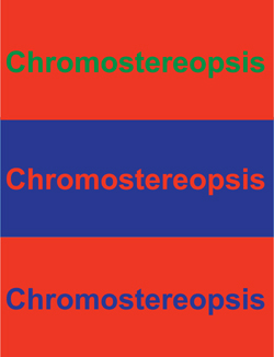
Figure 50.1. Chromostereopsis can be hard on the eyes.
Get 100 Things Every Presenter Needs to Know About People now with the O’Reilly learning platform.
O’Reilly members experience books, live events, courses curated by job role, and more from O’Reilly and nearly 200 top publishers.

