Positioning the sidebars
In this example, only the left and right sidebars are positioned. Margins are used on the remaining main content and footer elements to make room for the resulting column (Figure 24-5). The advantage here is that it is possible to keep the footer information below the content, although the footer still does not run across the whole bottom of the page as in the float example.
It should be noted that if the main content element were also positioned, it too would be removed from the document flow. This would cause the footer to float up to the top of the page. There are JavaScript workarounds for positioning a footer element below absolutely positioned elements, but they are beyond the scope of this chapter.
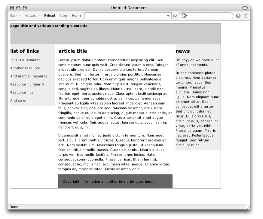
Figure 24-5. Positioning the sidebars only
The style sheet that makes this layout happen is provided here.
Comments have been inserted to point out key style rule functions. The
first thing to notice is that the container div has been relatively positioned (but not
moved) to establish it as the containing block for its positioned
descendant elements.
    body {margin:10px; padding: 10px; }

    #container {
        position: relative;  /* establishes containing block */
        width: 700px;
        border: solid 1px; }  /* border added to show container edges */

    #masthead {
        height: 70px;
        background: #CCC; }

    #main {
        margin: 0 160px; } /* makes space left and right for the sidebars */   ...
Get Web Design in a Nutshell, 3rd Edition now with the O’Reilly learning platform.
O’Reilly members experience books, live events, courses curated by job role, and more from O’Reilly and nearly 200 top publishers.

