Using Absolute Positioning
You can also use absolute positioning to create a
multicolumn page. This method absolutely positions the sidebar div element in its place on the right side of
the page and gives the main content div a right margin wide enough to make a space
for the newly positioned box. With absolute positioning, the order of
the source document is not as critical as it was in the float method,
because boxes can be picked up and placed anywhere. However, absolutely
positioned elements can overlap one another, which isn’t an issue with
floating.
This example starts with the same markup as before, but places the sidebar on the right using absolute positioning. The resulting layout is shown in Figure 24-3. Again, the masthead and footer elements could be omitted for a simple two-column format. This example uses percentage width values to create a fluid design that resizes with the browser window.
    <div class="masthead">
    Masthead and headline
    </div>

    <div class="main">
    Main article...
    </div>>

    <div class="sidebar">
    list of links
    </div>

    <div class="footer">
    copyright information
    </div>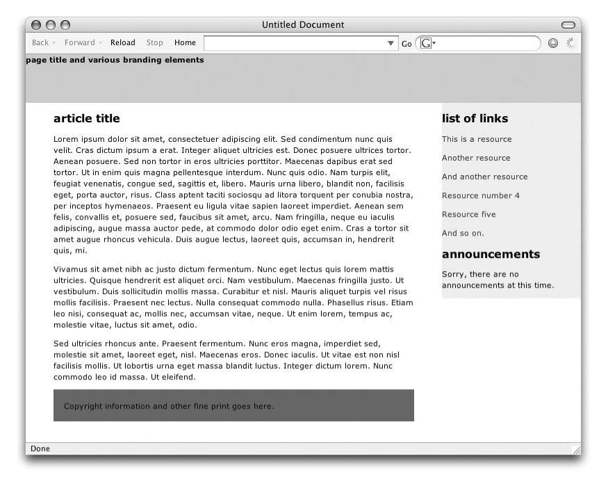
Figure 24-3. Two-column layout with absolute positioning
This is the style sheet that positions the elements as shown in Figure 24-3. Comments throughout explain the effects of significant rules.
    body {margin: 0; padding: 0;}  /* clears default spacing around the page */

    .masthead {
        height:
Get Web Design in a Nutshell, 3rd Edition now with the O’Reilly learning platform.
O’Reilly members experience books, live events, courses curated by job role, and more from O’Reilly and nearly 200 top publishers.

