Pull-down menus
The select element displays as a pull-down menu of options when no size specification is listed (the default) or when size="1". In a pull-down menu, only one item may be selected at a time. (Note that adding the multiple attribute turns the menu into a scrolling list, as described in the next section.) Clicking on the arrows or bar pops up the full menu, as shown in Figure 15-12.
    <p>What is your favorite ice cream flavor?</p>
    <select name="ice_cream">
    <option>Rocky Road</option>
    <option>Mint Chocolate Chip</option>
    <option>Pistachio</option>
    <option selected="selected">Vanilla</option>
    <option>Chocolate</option>
    <option value="swirl">Fudge Ripple</option>
    <option label="Praline Pecan">Super-duper Praline Pecan Smashup</option>
    <option>Bubblegum</option></select>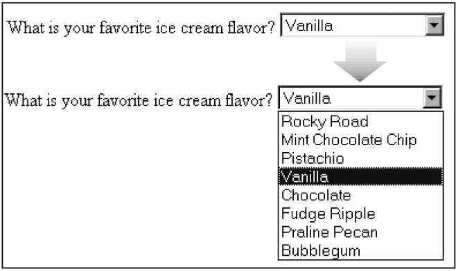
Figure 15-12. Items in a select menu can be set to display after the menu is collapsed
By default, the first option element in the list displays when the form loads. Use the selected attribute in an option element to make it the default value for the menu (the option will be highlighted when the form loads).
The text within each option element is the value that is sent to the server. If you want to send a value for that choice that is not displayed in the list, provide it with the value attribute in the option element. In the sixth option element in the example, users will see “Fudge Ripple,” but the value “swirl” ...
Get Web Design in a Nutshell, 3rd Edition now with the O’Reilly learning platform.
O’Reilly members experience books, live events, courses curated by job role, and more from O’Reilly and nearly 200 top publishers.

