We just discussed one issue that we run into often: the use of the
font element to create the appearance
of a heading. The greater issue is that almost any element can be styled
to look like a heading. Another concern arises when images of text are
used to display specific fonts.
We mentioned in the previous section that some tools allow people to navigate by headings. This may seem odd to you, but consider how someone who can see skims or scans a page. If you can see, your eye is naturally drawn to items that stand out because of differences in color, size, shape, and movement. Someone who cannot see well or at all cannot employ that same strategy to discern important items. Using semantic markupâseparating presentation from structureâa tool can then make some of those judgments for the user and provide stepwise paths through the content.
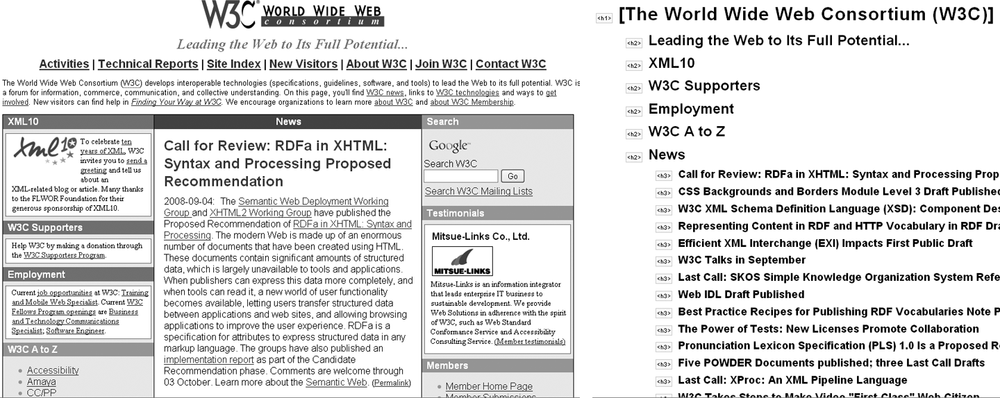
Have you ever looked at an outline of a page from your site? Consider Figure 4-1. On the left is the W3C home page as it appears in most browsers. Note the different sections. How do you know they are sections? Because the use of color and borders makes them stand out. On the right is an outline of the W3C home page generated using the Firefox Web Developer Toolbarâs âView document outline.â This may not be exactly the same order in which a seeing eye would move through the page, but it does allow someone to discern the major sections such that they donât need to read the page top-to-bottom.
Get Universal Design for Web Applications now with the O’Reilly learning platform.
O’Reilly members experience books, live events, courses curated by job role, and more from O’Reilly and nearly 200 top publishers.

