Chapter 6. Delivering Data

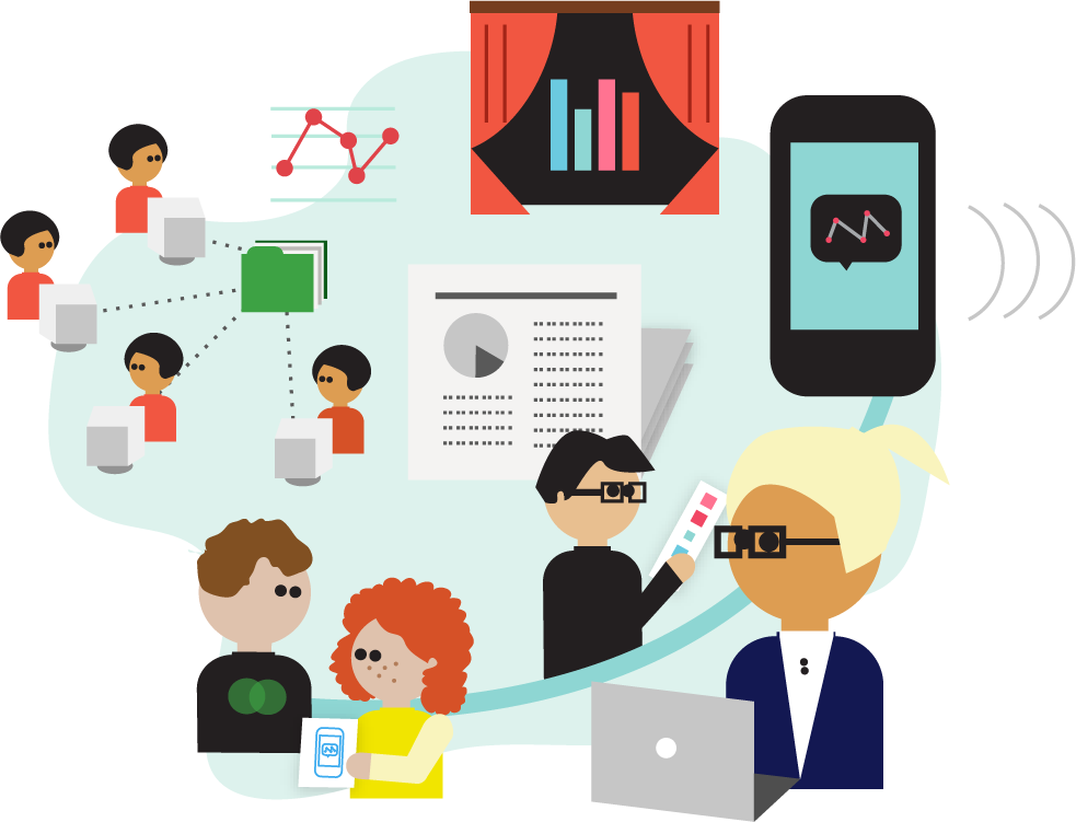
Once you’ve had a good look at your data and decided that there’s something interesting to write about, how can you deliver it to the public? This section opens with short anecdotes about how leading data journalists have served their data up to their readers—from infographics to open data platforms to download links. Then we take a more extended look at how to build news apps, and the ins and outs of data visualization. Finally, we take a look at what you can do to engage your audience around your project.
Presenting Data to the Public
There are lots of different ways to present your data to the public—from publishing raw datasets with stories, to creating beautiful visualizations and interactive web applications. We asked leading data journalists for tips on how to present data to the public.
To Visualize or Not to Visualize?
There are times when data can tell a story better than words or photos, and this is why terms like “news application” and “data visualization” have attained buzzword status in so many newsrooms of late. Also fueling interest is the bumper crop of (often free) new tools and technologies designed to help even the most technically challenged journalist turn data into a piece of visual storytelling.
Tools like Google Fusion Tables, Many Eyes, Tableau, Dipity, and others make it easier than ever to create maps, charts, graphs, or even full-blown ...
Get The Data Journalism Handbook now with the O’Reilly learning platform.
O’Reilly members experience books, live events, courses curated by job role, and more from O’Reilly and nearly 200 top publishers.

