Chapter 8. Axes
The x- and y-axes provide context for interpreting the displayed data. Ggplot2 will display the axes with defaults that look good in most cases, but you might want to control, for example, the axis labels, the number and placement of tick marks, the tick mark labels, and so on. In this chapter, I’ll cover how to fine-tune the appearance of the axes.
Swapping X- and Y-Axes
Problem
You want to swap the x- and y-axes on a graph.
Solution
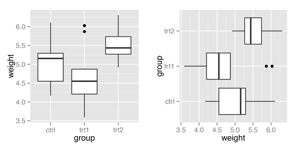
Use coord_flip() to flip
the axes (Figure 8-1):
ggplot(PlantGrowth,aes(x=group,y=weight))+geom_boxplot()ggplot(PlantGrowth,aes(x=group,y=weight))+geom_boxplot()+coord_flip()
Discussion
For a scatter plot, it is trivial to change what goes on the
vertical axis and what goes on the horizontal axis: just exchange the
variables mapped to x and y. But not all the geoms in ggplot2 treat the
x- and y-axes equally. For example, box plots summarize the data along
the y-axis, the lines in line graphs move in only one direction along
the x-axis, error bars have a single x value and a
range of y values, and so on. If you’re using these
geoms and want them to behave as though the axes are swapped, coord_flip() is what you need.
Sometimes when the axes are swapped, the order of items will be the reverse of what you want. On a graph with standard x- and y-axes, the x items start ...
Get R Graphics Cookbook now with the O’Reilly learning platform.
O’Reilly members experience books, live events, courses curated by job role, and more from O’Reilly and nearly 200 top publishers.

